Custom designing EditText
Use the below code in your rounded_edittext.xml
<?xml version="1.0" encoding="utf-8"?>
<shape xmlns:android="http://schemas.android.com/apk/res/android" >

    <solid android:color="#FFFFFF" />

    <stroke
        android:width="1dp"
        android:color="#2f6699" />
    <corners
        android:radius="10dp"
        />

</shape>
This should work
Customize the design for EditText in android
<?xml version="1.0" encoding="utf-8"?>
<layer-list xmlns:android="http://schemas.android.com/apk/res/android" >

<item>
    <shape>
        <solid android:color="@color/gray" />
    </shape>
</item>

<item
    android:bottom="1px"
    android:left="0px">
    <shape android:shape="rectangle" >
        <solid android:color="#FFFFFF" />
    </shape>
</item>

</layer-list>
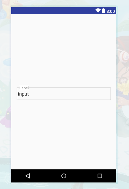
Custom edit text with borders
Try this:
<?xml version="1.0" encoding="utf-8"?>
<LinearLayout xmlns:android="http://schemas.android.com/apk/res/android"
android:layout_width="match_parent"
android:layout_height="match_parent"
android:gravity="center">
<RelativeLayout
    android:layout_width="match_parent"
    android:layout_height="60dp"
    android:layout_marginLeft="20dp"
    android:layout_marginRight="20dp">
    <EditText
        android:layout_width="match_parent"
        android:layout_height="match_parent"
        android:layout_marginTop="15dp"
        android:background="@drawable/boarder"
        android:paddingLeft="5dp"
        android:text="input" />
    <TextView
        android:layout_width="wrap_content"
        android:layout_height="wrap_content"
        android:layout_marginLeft="10dp"
        android:layout_marginTop="7dp"
        android:background="#ffffff"
        android:text="Label" />
</RelativeLayout>
boarder.xml :
<?xml version="1.0" encoding="UTF-8"?>
<shape xmlns:android="http://schemas.android.com/apk/res/android">

<stroke
    android:width="2dp"
    android:color="#03A6F0" />

<corners android:radius="12dp" />
Custom EditText
Try this
  <android.support.design.widget.TextInputLayout
                android:layout_marginTop="10dp"
                style="@style/Widget.MaterialComponents.TextInputLayout.OutlinedBox"
                android:layout_width="match_parent"
                android:layout_height="wrap_content"
                android:layout_marginBottom="8dp"
                android:minWidth="400dp">
            <android.support.design.widget.TextInputEditText
                    android:id="@+id/editTitle"
                    android:layout_width="match_parent"
                    android:layout_height="wrap_content"
                    android:hint="@string/hint_title_required"/>
        </android.support.design.widget.TextInputLayout>
Creating a custom EditText with text view in bordered linear layout
Try this
<?xml version="1.0" encoding="utf-8"?>
<android.support.v7.widget.CardView xmlns:android="http://schemas.android.com/apk/res/android"
    xmlns:app="http://schemas.android.com/apk/res-auto"
    android:layout_width="match_parent"
    android:layout_height="wrap_content"
    android:orientation="vertical"
    app:cardCornerRadius="10dp"
    app:cardElevation="10dp">

    <LinearLayout
        android:layout_width="match_parent"
        android:layout_height="wrap_content"
        android:layout_gravity="center"
        android:orientation="vertical">

        <LinearLayout
            android:layout_width="match_parent"
            android:layout_height="wrap_content">

            <TextView
                android:layout_width="0dp"
                android:layout_height="wrap_content"
                android:layout_weight="1"
                android:background="@android:color/holo_green_light"
                android:gravity="end"
                android:text="Name" />

            <EditText
                android:layout_width="0dp"
                android:layout_height="wrap_content"
                android:layout_weight="2"
                android:background="@android:color/transparent"
                android:text="Name" />

        </LinearLayout>

        <View
            android:layout_width="match_parent"
            android:layout_height="1dp"
            android:background="@color/colorPrimary" />
    </LinearLayout>

</android.support.v7.widget.CardView>
Custom style for all Edit Texts in the application
Your approach is correct. Just remove android: from the editText's attribute name:
<item name="editTextStyle">@style/arabicEditText</item>
I cannot explain this though. I guess appCompat things don't reuse android attributes, but add another ones with similiar names. Same goes with colorPrimary, srcCompat and others.
Related Topics
Padding Between Actionbar's Home Icon and Title
Eclipse, Android, Scala Made Easy But Still Does Not Work
Android: Adb Pull File on Desktop
Android Gridview Draw Dividers
How to Make an Fm Radio Application in Android
Android Seekbar with Two Thumbs
Android: Picasso Load Image Failed . How to Show Error Message
How to Delete Other Applications Cache from Our Android App
Illegalstateexception: Can't Change Container Id of Fragment
Cache.Properties (The System Cannot Find the File Specified)
Login Error: There Is an Error in Logging You into This Application. Please Try Again Later
How to Avoid Delay in Android Gcm Messages/Change Heartbeat
Android Logcat Logs Chatty Module Line Expire Message
Parcelable Encountered Ioexception Writing Serializable Object Getactivity()
Offline Mode for Android App Using the Google Maps API
How to Use Recyclerview.Scrolltoposition() to Move the Position to the Top of Current View
Calling Startintentsenderforresult from Fragment (Android Billing V3)