CSS Float Logic
Here's the part of the linked answer that's most relevant to your question:
When you float a block element, you are telling the browser to position it next to the previous floated object, so long as the container is wide enough (otherwise it will drop below the previous object).
As the author mentions this is a crude simplification. Section 9.5.1 of the spec has a list of all the precise rules, but I'm not going to quote the entire thing here as it is a very long read and only certain points are relevant here. I'll quote the relevant points as I step through exactly what is happening in your fiddle.
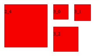
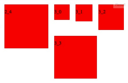
Compare your two screenshots. Pay attention to the two boxes that have changed positions, 3_2 and 3_3, as well as their surrounding boxes, 2_4, 3_0 and 3_1.
Before
After
When the screen is made bigger, you make room for 3_2 to move from its original position next to 2_4, upward and next to 3_1:
- A left-floating box that has another left-floating box to its left may not have its right outer edge to the right of its containing block's right edge. (Loosely: a left float may not stick out at the right edge, unless it is already as far to the left as possible.) An analogous rule holds for right-floating elements.
- A floating box must be placed as high as possible.
- A left-floating box must be put as far to the left as possible, a right-floating box as far to the right as possible. A higher position is preferred over one that is further to the left/right.
This in turn makes room for the next floating box to occupy the space as far up top and as far to the left as possible, following the same rule as above. As a result, 3_3 floats up, stopping just shy of 3_2, then it floats as far to the left as possible along the horizontal axis, stopping just shy of 2_4. Notice that even though it seems like 3_3 should be able to fit between 2_4 and 3_2, it does not, because the margins have to be respected (this is what is meant by "outer edge" above).
At this point, the following items apply, in addition to items #8 and #9 above:
- If the current box is left-floating, and there are any left-floating boxes generated by elements earlier in the source document, then for each such earlier box, either the left outer edge of the current box must be to the right of the right outer edge of the earlier box, or its top must be lower than the bottom of the earlier box. Analogous rules hold for right-floating boxes.
- The outer top of a floating box may not be higher than the outer top of any block or floated box generated by an element earlier in the source document.
As 3_3 is so large, it creates a noticeable downward protrusion from the first line of floating boxes. This effectively increases the height of the first line. All the other floating elements following 3_3 must remain on their own line, and this second line of floats must not intersect the bottom margin edge of 3_3. This is mostly governed by item #5.
CSS float logic( inner text not moved)
The blue box is a block level box and its position is explained by the following:
Since a float is not in the flow, non-positioned block boxes created before and after the float box flow vertically as if the float did not exist.
(http://www.w3.org/TR/CSS21/visuren.html#floats)
The text "b" is a line box or a line of text, this means it will flow around the float under normal circumstances:
A line box is next to a float when there exists a vertical position that satisfies all of these four conditions: (a) at or below the top of the line box, (b) at or above the bottom of the line box, (c) below the top margin edge of the float, and (d) above the bottom margin edge of the float.
(http://www.w3.org/TR/CSS21/visuren.html#floats)
This can be seen if we remove the width restriction in your example:
<div style="width:300px;height:100px;border:1px solid gray;"> <div style="width:50px;height:50px;float:left;border:1px solid gray">a</div> <div style="height:25px;background:blue">b</div></div>CSS Float explanation
When you float a block element, you are telling the browser to position it next to the previous floated object, so long as the container is wide enough (otherwise it will drop below the previous object).
When you float an object, you are essentially taking it out of the document flow. A floated object is part of the parent container, but it's box model styling (width, height etc.) is not calculated into the parent container. So if a parent container has a bunch of floated elements in it, it's height will be equal to zero (if height is not fixed), because the height of the floated element is ignored.
To fix this, you need to clear the floats, which basically means order will be restored.
Either put a div with clear:both; in the bottom of the parent container, or put this clearfix class on the parent container:
/* Contain floats: nicolasgallagher.com/micro-clearfix-hack/ */
.clearfix:before, .clearfix:after { content: ""; display: table; }
.clearfix:after { clear: both; }
.clearfix { zoom: 1; }
This has been a brutally simplified explanation. Read more about floats and clearing here: http://dev.opera.com/articles/view/35-floats-and-clearing/
Why do elements need to be floated right before left when in the same container with a centred element?
I will provide you with a simple example here, let's assume that you are not assigning the middle div any width so see what it will be actually doing
Demo
<div style="width:100%">
   <div style="width:20px;height:20px;background-color:red;float:left;border: 3px solid #000;"></div>
   <div style="height:20px;background-color:red;margin:0 auto auto;border: 3px solid #000;"></div>
   <div style="width:20px;height:20px;background-color:red;float:right;border: 3px solid #000;"></div>
</div>
Why this happens?
div is a block-level element, it takes up the entire horizontal space on the page, if you know, when you float any element either left or right it won't take 100% anymore and it will take only the space assigned by using width, or the content it holds, so in this case, left floated div will take 20px width leaving other space unused. Now you have another div which IS NOT FLOATED but it will take the rest of the available horizontal space, making your right floated div element to push down.
So what to do in order to solve this?
You need to float all the div to the left, or it may be enough if you make the middle div float to the left or to the right. Now I am aware that you want to have 2 div, 1 floated to left and other to right, but this is not the right way to do that, if you want, you can wrap the elements inside a container div, or what you can use is position: absolute; to set the elements right.
In order to show you how block level elements work, I will share you another example here..
Assume that you are having a div nested inside a p tag (This is invalid so please never use this in real world, this is just for demonstration purpose), and give some width to the div element and see how it renders your text.
<p>Hello World, I don't want the <div>text to</div> break</p>

div {
    width: 40px;
    background: #f00;
}
Demo 2
Though you provide the width to block level element, it will still break the paragraph.
From w3c
By default, block-level elements are formatted differently than inline
elements. Generally, block-level elements begin on new lines, inline
elements do not.
floating 3 divs in a not logic order
If I understand corectly the "responsive" behavior you are looking for , you ca wrap the two first divs together and the two last ones together. and float the wraps to the left. Then using a percent width and max-width/min-width you can achieve the desired behaviour.
See this FIDDLE (I modified the width of #container in your fiddle so it is responsive)
HTML :
<div id="container">
    <div id="left_wrap">
        <div id="id1">left above</div>
        <div id="id2">left under</div>
    </div>
    <div id="right_wrap">
        <div id="id3">right above</div>
        <div id="id4">right under</div>
    </div>
</div>
CSS (modified)
#left_wrap,#right_wrap{
    width:50%;
    max-width:380px;
    min-width:190px;
    float:left;
}
#container {
    height:100%;
    width:100%;
    background:#212121;
}
#id1,#id2,#id3,#id4 {
    height:90px;
    width:190px;
    background:#fff;
    float: left;
}
Now, if you change the width of the fiddle window, you will see that if the window width is over 760px the divs all align normaly. If the window is between 760px and 380px you get the disired behaviour. If th window is under 190px the divs all stand on to of each other.
How does floating and clearing on the same element work?
You misunderstand clearing. clear: right simply means that the element should vertically clear all previously right-floated elements in the same context, in other words that it should drop below all other right-floated elements. Visualization:
|                          |
|            +-----++-----+|
|            |  A  ||  B  ||
|            |     ||     ||
|            +-----++-----+|
|                   +-----+|
|                   |  C  ||
|                   |     ||
|                   +-----+|
|                          |
All elements are floated right, but C is set to clear: right, so it drops below the previous floated elements.
What does `high` mean in `A floating box must be placed as high as possible.`?
You answered it yourself:
A floating box must be placed as high as possible
and
a higher position is preferred over one that is further to the
left/right
This is exactly what is happening. The algorithm first try to find the highest free area where your div can fit, then put the div at the rightmost position (in the case of float: right). As a result, box6 is positioned a little bit less on the right so it can be higher.
If it is not what you want, one solution is to use an invisible "spacer" to fill the hole underneath box5.
body{ margin:0px; } div.box{ width:640px; height:800px; } div.box1{ width:500px; height:100px; background-color: red; float:left; } div.box2{ width:140px; height:140px; background-color: blue; float:left; } div.box3{ width:140px; height:200px; background-color: yellow; float:right; } div.box4{ width:250px; height:300px; background-color: green; float:left; margin-top:-40px; } div.box5{ width:250px; height:200px; float:left; background-color: purple; margin-top:-40px; } div.box6spacer{ width: 250px; float:left; box-sizing: border-box; border-width: 5px; border-style: solid; border-color: lightgray; color: lightgray; height: 40px; } div.box6{ width:100px; height:120px; float:right; background-color: red; }<body> <div class="box"> <div class="box1">box1 </div> <div class="box2">box2 </div> <div class="box3">box3 </div> <div class="box4">box4 </div> <div class="box5">box5 </div> <div class="box6spacer">spacer </div> <div class="box6">box6 </div> </div> </body>Layout of HTML div tags with float property
Block elements are laid out “behind” floated elements, only their inline content floats around the floated elements.
If you want it “under” them, then clear the float.
Related Topics
Html5 Validation When the Input Type Is Not "Submit"
Why Would Margin Not Be Contained by Parent Element
How to Override Inline !Important
Play Sound File in a Web-Page in the Background
What Is the Character Limit on Url
How to Upload a File to My Server Using HTML
Change Name of Download in JavaScript
How to Create a Transparent Triangle with Border Using CSS
Workaround for Href="File://///..." in Firefox
CSS Transition - Eases in But Doesn't Ease Out
Image Width/Height as an Attribute or in CSS
How to Isolate a Div from Public CSS Styles
How to Get a List of All Countries/Cities to Populate a Listbox
How to Export Rmarkdown File to HTML Document with Two Columns