Printing HTML table with many columns/rows using CSS layout?
You absolutely need to move away from a table if you need readable vertical printing on the page. Tables are great for display on the page when it's tabular data but are not a viable solution for printing as they don't respect flow.
There are plugins (like this one here, no affiliation – just a Google result) that will do this automatically for you, but here's the example. When you use this, make sure that the @media print is listed appropriately. To test locally, you can change that to @media screen.
That won't show the @page rules listed, but those are visible via a print preview.
Hope this helps:
Fiddle for printing in portrait
HTML
<section class="table">
  <div class="row">
    <div>The_quick_brown_fox_jumped_over_the_lazy_dog_A_0</div>
    <div>The_quick_brown_fox_jumped_over_the_lazy_dog_A_1</div>
    <div>The_quick_brown_fox_jumped_over_the_lazy_dog_A_2</div>
    <div>The_quick_brown_fox_jumped_over_the_lazy_dog_A_3</div>
    <div>The_quick_brown_fox_jumped_over_the_lazy_dog_A_4</div>
    <div>The_quick_brown_fox_jumped_over_the_lazy_dog_A_5</div>
    <div>The_quick_brown_fox_jumped_over_the_lazy_dog_A_6</div>
    <div>The_quick_brown_fox_jumped_over_the_lazy_dog_A_7</div>
    <div>The_quick_brown_fox_jumped_over_the_lazy_dog_A_8</div>
    <div>The_quick_brown_fox_jumped_over_the_lazy_dog_A_9</div>
  </div>
</section>
CSS
@media print {
    @page {
      margin: 2.5cm;
    }
    div.row > div {
      display: inline-block;
      border: solid 1px #ccc;
      margin: 0.2cm;
    }
    div.row {
      display: block;
    }
}


.table {
    display: table;
    border-spacing: 2px;
}
.row {
    display: table-row;
}
.row > div {
    display: table-cell;
    border: solid 1px #ccc;
    padding: 2px;
}
Edit - Printing horizontally across several pages:
Okay, so this is probably a far less common use case, and we have to do some goofy things with it – so fair warning. I'll try to explain this step-by-step as it's cryptic and obnoxious.
Fiddle for printing in landscape here!
CSS
@media print {
    @page {
      margin: 0;
    }
    body {
        height: 100%;
        width: 100%;
    }
    div.row > div {
      display: inline-block;
      border: solid 1px #ccc;
      margin: 0.1cm;
      font-size: 1rem;
    }
    div.row {
      display: block;
      margin: solid 2px black;
      margin: 0.2cm 1cm;
      font-size: 0;
      white-space: nowrap;
    }
    .table {
        transform: translate(8.5in, -100%) rotate(90deg);
        transform-origin: bottom left;
        display: block;
    }
}
This is the part that matters, as it's setting your print directives. Most of this is stuff we've seen in the original (with some tweaks as I was playing with it).
The part we care about comes here:
 .table {
     transform: translate(8.5in, -100%) rotate(90deg);
     transform-origin: bottom left;
     display: block;
 }
What we're doing is flopping the whole thing on its side, and then sliding it to where we expect it to be. translate(8.5in, -100%) is telling the browser – Slide this element 8.5 inches (the width of a standard letter paper in the US) to the right, and then slide it up 100% of its height (the negative indicates up as opposed to down). We slide it to the right 8.5 inches so that it'll appear at the top of the page when rotated. We slide it up its calculated height so that we don't have an ugly gap to the left of the table when the rotation happens either.
Then, we instruct it that we want all of those calculations run in relation to the bottom left of the element's normal position in document flow. This keeps this crazy long table from being rotated way off to the right by setting the left property. The bottom property is important because we're rotating it clockwise a quarter turn, and if we did that from the top, it would be off the page to the left. That quarter turn is described in the next part of the transform statement: rotate(90deg);
Voila. The thing prints across multiple pages.
Before you ask: No. There is no way to prevent the page break inside the element of which I'm aware. I know it's obnoxious, ugly and all that garbage, but we can only work with the tools which we're given.
Update Firefox confirmed working: 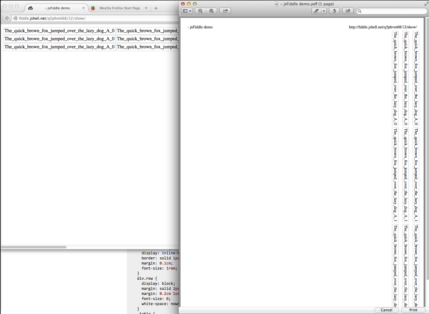
Printing html tables, preventing rows from spanning multiple pages
Adding
td, th {
  width: 10000px;
}
inside @media print { } did the trick to make the example code work.
Now the printed columns are properly aligned again, and each row stays on a single page, never spanning two pages.
Works in current versions of Webkit (Safari), FF and Chrome (all tested on macOS only).
Caveat:
Unfortunately, the above is not fool proof. It only works in this example because the cells in each row have the same width.
Once those widths are random, an over-reaching pixel width like 10000px is messing up the columns again.
The only solution I found around this is to provide actual widths that are to be used. Since this is for printing, and since I know that I want to print to a specific paper format (e.g. DIN A4 or US Letter), I can specify the column width precisely with certainty.
So, while this solution is not a good one for a web page view in a browser on-screen, where the total width can vary, it's a good solution for printing, as long as the target print size can be predicted.
Here is the complete html code, setting the column widths to 4cm, 2cm and 3cm:
<!DOCTYPE html><html><head><meta charset="utf-8"><style type="text/css">
th, td { border: 1px solid #aaa; }
@media print {
  table, tr, td, th {
    page-break-inside: avoid;
  }
  tr {
    display: block;
    page-break-before: auto;
  }
  td:nth-child(1), th:nth-child(1) {
    width: 4cm;
  }
  td:nth-child(2), th:nth-child(2) {
    width: 2cm;
  }
  td:nth-child(3), th:nth-child(3) {
    width: 3cm;
  }
}
</style></head>
<body>
<table>
  <tr><th>A</th><th>B</th><th>C</th></tr>
  <tr><td>more text<br>1<br>2<br>3<br>4<br>5<br></td><td>more text</td><td>more text</td></tr>
  <tr><td>1 adasd<br>2<br>3<br>4<br>5<br>6<br></td><td>x</td><td>x</td></tr>
  <tr><td>1<br>2<br>3<br>4<br>5<br>6<br></td><td>x</td><td>x</td></tr>
  <tr><td>1<br>2<br>3<br>4<br>5<br>6<br></td><td>x</td><td>x</td></tr>
  <tr><td>1asd<br>2<br>3<br>4<br>5<br>6<br></td><td>x</td><td>x</td></tr>
  <tr><td>1<br>2<br>3<br>4<br>5<br>6<br></td><td>x</td><td>x</td></tr>
  <tr><td>1<br>2<br>3<br>4<br>5<br>6<br></td><td>xsdsdfsf</td><td>x</td></tr>
  <tr><td>1<br>2<br>3<br>4<br>5<br>6<br></td><td>x</td><td>x</td></tr>
  <tr><td>1<br>2 asda asdas<br>3<br>4<br>5<br>6<br></td><td>xasdada</td><td>x</td></tr>
  <tr><td>1<br>2<br>3<br>4 asdasd <br>5<br>6<br></td><td>x</td><td>x</td></tr>
</table>
</body></html>
How to deal with page breaks when printing a large HTML table
<!DOCTYPE HTML>
<html>
<head>
<meta http-equiv="Content-Type" content="text/html; charset=UTF-8">
<title>Test</title>
<style type="text/css">
    table { page-break-inside:auto }
    tr    { page-break-inside:avoid; page-break-after:auto }
    thead { display:table-header-group }
    tfoot { display:table-footer-group }
</style>
</head>
<body>
    <table>
        <thead>
            <tr><th>heading</th></tr>
        </thead>
        <tfoot>
            <tr><td>notes</td></tr>
        </tfoot>
        <tbody>
        <tr>
            <td>x</td>
        </tr>
        <tr>
            <td>x</td>
        </tr>
        <!-- 500 more rows -->
        <tr>
            <td>x</td>
        </tr>
    </tbody>
    </table>
</body>
</html>
Related Topics
Turn Off Chrome/Safari Spell Checking by HTML/Css
Do Http Post Methods Send Data as a Querystring
Why Does Vw Include the Scrollbar as Part of the Viewport
White Space Showing Up on Right Side of Page When Background Image Should Extend Full Length of Page
Create a Slanted Edge to a Div
How to Vertically Center a <Span> Inside a Div
Is It Bad to Use Uppercase Letters for HTML Tags
How to Change the Color of Font Awesome's Cog Icon
How to Set a Stroke-Width:1 on Only Certain Sides of Svg Shapes
Chrome Rendering Issue. Fixed Position Anchor with Ul in Body
How to Remove "Invisible Space" from HTML
Img Tag Displays Wrong Orientation
Flex Item Should Align Left, Not Center, When It Wraps
How to Make a Transparent Canvas in HTML5
How to Set Style to Title Tag in Header
How to Prevent Line Break at Hyphens in All Browsers