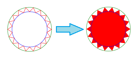
Creating a 'New' spiky label with 24 or above point burst
Canvas Approach
You can also achieve this using Canvas. The commands for drawing on Canvas are pretty much the same as in SVG. The approach, on a very high level, would be to find points on two circles (one with radius as x and another with a slightly smaller radius) and then connect them together to form a path. When the path is filled, it gives the appearance of a n-point burst.
In the below diagram, the green circle is the bigger circle with radius as x and the blue circle is the smaller inner circle. By plotting points on the circles and connecting them (with lineTo commands), we get the path which is in red. When this path is filled we get the burst appearance. (Note: The inner and outer circles are only for illustration and are not drawn in the actual diagram).
Calculation Logic
- The X and Y coordinates of each points on the circle can be calculated using the below formula:
- x = (Radius of circle * Cos(Angle in Radians)) + x coordinate of center
- y = (Radius of circle * Sin(Angle in Radians)) + y coordinate of center
- The angle at which the points are plotted on the circle are determined using the below logic:
- As used in both your and Persijn's answers, the angle is calculated as (360/no. of bursts). 360 is used because it is the total angle within a circle.
- Angle of the points on the inner circle should be half way between point1 and point2 on the larger circle and hence a delta is added to it. The delta is half of (360/no. of bursts)
- Angle in Radians = Angle in Degrees * π / 180
window.onload = function() {  var canvas = document.getElementById('canvas');  var ctx = canvas.getContext('2d');  var defaultBurst = 18;  var defaultContent = "New";
  function paint(numBurst, text) {    if (!numBurst) numBurst = defaultBurst;    if (!text) text = defaultContent;    ctx.clearRect(0, 0, canvas.width, canvas.height);    ctx.fillStyle = 'crimson';    var angleInRad = Math.PI * (360 / numBurst) / 180;    var deltaAngleInRad = angleInRad / 2;    ctx.beginPath();    ctx.moveTo(75, 150);    for (i = 0; i <= numBurst; i++) {      x1 = 75 * Math.cos(angleInRad * i) + 150;      y1 = 75 * Math.sin(angleInRad * i) + 150;      x2 = 60 * Math.cos((angleInRad * i) + deltaAngleInRad) + 150;      y2 = 60 * Math.sin((angleInRad * i) + deltaAngleInRad) + 150;      ctx.lineTo(x1, y1);      ctx.lineTo(x2, y2);    }    ctx.closePath();    /* Add shadow only for shape */    ctx.shadowOffsetX = -5;    ctx.shadowOffsetY = 5;    ctx.shadowBlur = 5;    ctx.shadowColor = "rgba(0, 0, 0, 0.5)";    ctx.fill();    ctx.font = "32px Arial";    ctx.textAlign = "center";    ctx.fillStyle = "gold";    /* Nullify shadow for text */    ctx.shadowOffsetX = 0;    ctx.shadowOffsetY = 0;    ctx.fillText(text, 150, 160, 120);  }  paint();  var slider = document.getElementById('burst');  var textInput = document.getElementById('content');  slider.addEventListener('change', function() {    paint(this.value, textInput.value);  });
  textInput.addEventListener('blur', function() {    paint(slider.value, this.value);  });}
/* For demo only */
.controls { float: right; padding: 5px; margin: 50px 20px; line-height: 25px; border: 1px solid; box-shadow: 1px 1px 0px #222;}label,input { display: inline-block; vertical-align: middle; text-align: left;}h3 { padding: 10px; text-align: center;}label { width: 100px;}input[type='range'],input[type='text'] { width: 100px;}body { font-family: Calibri; background-image: radial-gradient(circle, #3F9CBA 0%, #153346 100%);}<canvas id='canvas' height='300px' width='300px'></canvas><div class='controls'> <h3>Controls</h3>
<label for="burst">Change Burst:</label> <input id="burst" class="slider" type="range" value="18" min="12" max="36" step='2' title="Adjust slider to increase or decrease burst" /> <br/> <label for="content">Text Content:</label> <input type="text" id="content" maxlength="5" /></div>Replicate an animation around a circle
Using CSS:
Doing what you are looking for using a single element with pure CSS is going to be really tough (if not impossible). We can do it by using as many elements as the no. of spokes that are required. Position the spokes absolutely at a certain location and rotate by the required angles. Origin should be fixed at the bottom of the element so that they all converge into one point.
The animation itself can be achieved by using linear-gradient and animating their position.
.firework {  position: absolute;  top: 100px;  left: 100px;  border-radius: 30%;  height: 64px;  width: 2px;  background: linear-gradient(to top, red, red);  background-repeat: no-repeat;  background-size: 100% 64px;  background-position: 0px -64px;  transform-origin: bottom;  animation: firework-0 1s 1;}.firework:nth-child(2){  transform: rotate(36deg)}.firework:nth-child(3){  transform: rotate(72deg)}.firework:nth-child(4){  transform: rotate(108deg)}.firework:nth-child(5){  transform: rotate(144deg)}.firework:nth-child(6){  transform: rotate(180deg)}.firework:nth-child(7){  transform: rotate(216deg)}.firework:nth-child(8){  transform: rotate(252deg)}.firework:nth-child(9){  transform: rotate(288deg)}.firework:nth-child(10){  transform: rotate(324deg)}
@keyframes firework-0 {  0% {    background-position: 0px 64px;  }  50% {    background-position: 0px 0px;  }  100% {    background-position: 0px -64px;  }}
<div class="firework"></div><div class="firework"></div><div class="firework"></div><div class="firework"></div><div class="firework"></div><div class="firework"></div><div class="firework"></div><div class="firework"></div><div class="firework"></div><div class="firework"></div>Is it possible to position items around the circle?
Using CSS:
One pure CSS way to create this shape would be to use CSS skew transforms. Since you need click events on the parts, it is better to use separate elements instead of using pseudo-elements.
.outer { position: relative; height: 200px; width: 200px; border-radius: 50%; border: 2px solid; overflow: hidden;}.inner { position: absolute; height: 50%; width: 50%; top: calc(25% - 2px); left: calc(25% - 2px); border-radius: 50%; background: yellowgreen; border: 2px solid;}.part { position: absolute; height: 100%; width: 100%;}.part:nth-child(2) { top: -50%; left: calc(-50% - 2px); transform: skewY(-30deg); transform-origin: right bottom; background: red; border: 2px solid; }.part:nth-child(3) { top: -50%; right: calc(-50% - 2px); transform: skewY(30deg); transform-origin: left bottom; background: green; border: 2px solid;}.part:nth-child(1) { top: 0%; left: 0%; width: 100%; background: yellow;}.part:hover { background: chocolate;}.part:nth-child(1) p{ position: absolute; top: 85%; left: 50%; transform: translateX(-50%) translateY(-100%);}.part:nth-child(2) p{ position: absolute; top: 50%; left: 55%; transform: skewY(30deg);}.part:nth-child(3) p{ position: absolute; top: 50%; left: 30%; transform: skewY(-30deg);}<div class='outer'> <div class='part'><p>Text</p></div> <div class='part'><p>Text</p></div> <div class='part'><p>Text</p></div> <div class='inner'></div></div>SVG custom circles shape
You will need multiple elements to this SVG.
- Two for the center circle
- Four for the outer circle
First, you need 4 areas for the 4 sections in the outside circle. This can be done like so:
<svg width="50%" viewbox="0 0 100 100"> <path d="M50,50 L0,50 A50,50 0 0,1 50,0" fill="red"></path> <path d="M50,50 L100,50 A50,50 0 0,1 0,50" fill="blue"></path> <path d="M50,50 L100,50 A50,50 0 0,1 50,100" fill="green"></path> <path d="M50,50 L50,0 A50,50 0 0,1 100,50" fill="yellow"></path></svg>Zig zag border for a circle?
I would consider using SVG with some rotation and use them as backgrounds.
Here is an attempt that can give you an idea about how it can be done. Basically, the SVG is the same and we simply repeat and rotate until we get the full shape. The main trick is to find the correct values:
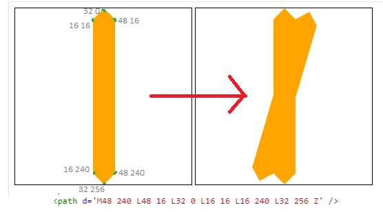
Here is the final code:
.zigzag {   width:256px;   height:256px;   background:    url("data:image/svg+xml;utf8,<svg xmlns='http://www.w3.org/2000/svg' viewBox='-97 0 256 256' fill='orange' width='256'> <path d='M48 240 L48 16 L32 0 L16 16 L16 240 L32 256 Z' /></svg>"),    url("data:image/svg+xml;utf8,<svg xmlns='http://www.w3.org/2000/svg' viewBox='-97 0 256 256' fill='orange' width='256' style='transform:rotate(16.36deg);'> <path  d='M48 240 L48 16 L32 0 L16 16 L16 240 L32 256 Z' /></svg>"),    url("data:image/svg+xml;utf8,<svg xmlns='http://www.w3.org/2000/svg' viewBox='-97 0 256 256' fill='orange' width='256' style='transform:rotate(32.73deg);'> <path  d='M48 240 L48 16 L32 0 L16 16 L16 240 L32 256 Z' /></svg>"),    url("data:image/svg+xml;utf8,<svg xmlns='http://www.w3.org/2000/svg' viewBox='-97 0 256 256' fill='orange' width='256' style='transform:rotate(49.09deg);'> <path  d='M48 240 L48 16 L32 0 L16 16 L16 240 L32 256 Z' /></svg>"),    url("data:image/svg+xml;utf8,<svg xmlns='http://www.w3.org/2000/svg' viewBox='-97 0 256 256' fill='orange' width='256' style='transform:rotate(65.45deg);'> <path  d='M48 240 L48 16 L32 0 L16 16 L16 240 L32 256 Z' /></svg>"),    url("data:image/svg+xml;utf8,<svg xmlns='http://www.w3.org/2000/svg' viewBox='-97 0 256 256' fill='orange' width='256' style='transform:rotate(81.81deg);'> <path  d='M48 240 L48 16 L32 0 L16 16 L16 240 L32 256 Z' /></svg>"),    url("data:image/svg+xml;utf8,<svg xmlns='http://www.w3.org/2000/svg' viewBox='-97 0 256 256' fill='orange' width='256' style='transform:rotate(98.18deg);'> <path  d='M48 240 L48 16 L32 0 L16 16 L16 240 L32 256 Z' /></svg>"),    url("data:image/svg+xml;utf8,<svg xmlns='http://www.w3.org/2000/svg' viewBox='-97 0 256 256' fill='orange' width='256' style='transform:rotate(114.54deg);'> <path  d='M48 240 L48 16 L32 0 L16 16 L16 240 L32 256 Z' /></svg>"),    url("data:image/svg+xml;utf8,<svg xmlns='http://www.w3.org/2000/svg' viewBox='-97 0 256 256' fill='orange' width='256' style='transform:rotate(130.90deg);'> <path  d='M48 240 L48 16 L32 0 L16 16 L16 240 L32 256 Z' /></svg>"),    url("data:image/svg+xml;utf8,<svg xmlns='http://www.w3.org/2000/svg' viewBox='-97 0 256 256' fill='orange' width='256' style='transform:rotate(147.27deg);'> <path  d='M48 240 L48 16 L32 0 L16 16 L16 240 L32 256 Z' /></svg>"),    url("data:image/svg+xml;utf8,<svg xmlns='http://www.w3.org/2000/svg' viewBox='-97 0 256 256' fill='orange' width='256' style='transform:rotate(164.2deg);'> <path  d='M48 240 L48 16 L32 0 L16 16 L16 240 L32 256 Z' /></svg>");    background-size:100% 100%;        font-size:28px;    line-height:256px;    color:#fff;    text-align:center;}
body { background:pink;}
<div class="zigzag">zig zag circle</div>Circle loading animation
Here's my effort. The conical gradient is an embedded bitmap image extracted by calculating the maximum value of each pixel in the animated GIF posted by the OP. A semi-opaque black windmill pattern is superimposed on top of that and animated, and a blur filter gets rid of the JPEG artefacts.
(Edit: Added a reflective highlight to make it look a bit more 3D)
<svg xmlns="http://www.w3.org/2000/svg" xmlns:xlink="http://www.w3.org/1999/xlink" width="121" height="121" viewBox="0 0 121 121"> <defs> <clipPath id="circ"> <circle r="60" cx="60.5" cy="60.5"/> </clipPath> <linearGradient id="shine" x1="0%" y1="0%" x2="0%" y2="100%"> <stop offset="0%" style="stop-color:#fff;stop-opacity:0.6" /> <stop offset="10%" style="stop-color:#fff;stop-opacity:0.3" /> <stop offset="20%" style="stop-color:#fff;stop-opacity:0.1" /> <stop offset="40%" style="stop-color:#fff;stop-opacity:0" /> </linearGradient> <filter id="blur"> <feGaussianBlur in="SourceGraphic" stdDeviation="2"/> </filter> </defs> <image width="121" height="121" filter="url(#blur)" xlink:href="data:image/jpeg;base64, /9j/4AAQSkZJRgABAQEASABIAAD/2wBDACAWGBwYFCAcGhwkIiAmMFA0MCwsMGJGSjpQdGZ6eHJm cG6AkLicgIiuim5woNqirr7EztDOfJri8uDI8LjKzsb/2wBDASIkJDAqMF40NF7GhHCExsbGxsbG xsbGxsbGxsbGxsbGxsbGxsbGxsbGxsbGxsbGxsbGxsbGxsbGxsbGxsbGxsb/wgARCAB5AHkDASEA AhEBAxEB/8QAGQAAAwEBAQAAAAAAAAAAAAAAAAECBAMF/8QAGAEAAwEBAAAAAAAAAAAAAAAAAAEC AwT/2gAMAwEAAhADEAAAAfQAXAM9O7YlzoXdLQ5QAIMSL6gA0DS50G6UyRYUyi2NBQhoHMMNzzM2 VX0BgwKQqSHJDWvTk/McagAMC0TcBUoA9LM8x49ACBjNJlawIlgl0kh8/SIAAekwbYgJiSEUc3WA AIdRBrgAhggLOfsAGxVc5xFc6WiBgN08O0AdKbqM551lKuBUjpV1OXWNN0oqohQ84V5pUr3aac8u fQ3FOpmnMKXEzWSVLX322WVXD59aamnMEkTNZzehre+ogzLn0p5lEyJzMvN6emmXQAuSIrlunmKX E9OhdHswAAAJzQ+tcbnnqtFdSAAD/8QAIBAAAgICAwADAQAAAAAAAAAAAQIAEQMwEBIgIjFAIf/a AAgBAQABBQLlsoE+TQIJ1EoTqIUE+SxcoPt3LQLWhluJkKnxkfsR/NRFzG/U8ZWoLsaYXsRj2fah 6vcG4zv+ipX4CPwH30jCm2qLapkW92NaHDLWxFvyVrUFv2U0BdJ+oODwPrz/AP/EABwRAQACAgMB AAAAAAAAAAAAAAEAEAIgETAxIf/aAAgBAwEBPwGvN/Nzox87Hod2O+T8nO+Ud2NkPKYxvHyYNNMa Ji8OjGB9sbYwNOegp0//xAAfEQABBAMAAwEAAAAAAAAAAAABAAIRIBAwMQMSIUH/2gAIAQIBAT8B pKI0BOEaD9Gk0CGX9oEMkTRugOheylTUoFTcUPajAT9DhIsz7l4irRAyRKc0jLGfpq/mPH2n/8QA HhAAAQQBBQAAAAAAAAAAAAAAEQEgITAQAAJAUHD/2gAIAQEABj8CzFEvCVDc0JYFyPADceljUvni /wD/xAAdEAADAAIDAQEAAAAAAAAAAAAAAREQMSAhQTBh/9oACAEBAAE/Ic9R2Y3vcR6iHh+A2+Hi 6LrdR1PR8m0lWNfEVtvFLilwnTpnggTTVXBnhCpClKUpSlKKUd4+evbYkRSlKUpSlKUSq+nRvaxY ZSlKUpSlKUpSC/GTlSlKUpSlLi5VypRvnOcKn0QhBInWCEJyhMQglhBomJiFFREIQgkLDGhomZiJ JI2sQSIImGhog0Qh3DbzbVrMEuDRCYrr1waqjHa6FzYxz96EoouXp0O1oLgzt6R69vlPZrl7zv/a AAwDAQACAAMAAAAQCZ9GgAVrOID+MKOo0R0OMKN+ec1rZcb1FaGkEgox777+BDUwvvfOejgbCEVt p82ChkNz+AVXCzANstqAAEMAAP/EABoRAAMBAQEBAAAAAAAAAAAAAAABERAgITH/2gAIAQMBAT8Q Eq4eeENso1wlHa1j9Jj4SVrGXUokiEHh4iExjansPgb0pS8SwvLPQkZSixjwvurR6g+C8UeEHh8S RTAYx7W1ZDHhCS1OMVDGJc/XT//EABsRAQEBAQEBAQEAAAAAAAAAAAEAERAhMSBh/9oACAECAQE/ EOHlsItTT9kstHnGIiODw4/eERZEMU6PAs4PrpyO+S3mz1vlttvdiWwXtvNtlzINvNlllDDDt5my ywyhvmGOyy2wwwwYcBZbYYYa7u/ktsMfjCGMz7w98s/0D9/J/8QAIxABAAICAgICAgMAAAAAAAAA AQARECExQSBRMGGhsXGBkf/aAAgBAQABPxDCgWxl/q4naJ0QW2rDhCfVnIGK21QfaF0xz/bgiWeL pKCIXTuzfbRYZLyX7mygIbujDSWOVotlzdeX3KUc/EAKA8y1W3DBssxuGW2eX4AL4dpnCbP68Khw NHixgcD4sUjkpn3zhfcvwBJDDgcV4K6rkl/UVS5cuXLhDpgtwMuEduFeFSmWl1yKOZUqVKm5WKlS sCCbXiB6Sh4jLgrwrJULQ6E6IFFZVisKw/mjdRdmQgjsglQalmFiokfqrtn1zQkAvwAwiomBwGGk 1BgSymPWb/iBAhgBKlYGGEiCWv5gUUZJgsY7e36ylagQIEqJEggqXoV+8IgoPFBKYS229RtpD7jH hIYYg5SFtM/cMbbeoFFHwc04MnGHKcXl/9k=" clip-path="url(#circ)" /> <g transform="translate(60.5,60.5)"> <path d="M0 0A56 56 0 0 0 0 56 56 56 0 0 0 32.916 45.305 56 56 0 0 1 0 0 56 56 0 0 0 53.259 17.305 56 56 0 0 0 53.259-17.305 56 56 0 0 1 0 0 56 56 0 0 0 32.916-45.305 56 56 0 0 0 0-56 56 56 0 0 1 0 0 56 56 0 0 0 -32.916-45.305 56 56 0 0 0-53.259-17.305 56 56 0 0 1 0 0 56 56 0 0 0 -53.259 17.305 56 56 0 0 0-32.916 45.305 56 56 0 0 1 0 0Z" stroke="none" fill="#000" opacity="0.25" transform="rotate(0)"> <animateTransform attributeName="transform" type="rotate" from="0" to="72" begin="0s" dur="0.6s" repeatCount="indefinite" /> </path> <circle r="59" stroke="#000" stroke-width="2" fill="none" opacity="0.25" /> <circle r="55" fill="url(#shine)" stroke="none" /> </g></svg>Calculating the position of points in a circle
A point at angle theta on the circle whose centre is (x0,y0) and whose radius is r is (x0 + r cos theta, y0 + r sin theta). Now choose theta values evenly spaced between 0 and 2pi.
Creating a Snowflake shape that contains text in shape
Play with this demo
This is actually a quite interesting question, and coming up with an answer was not easy.
The question asks to make a shape(in this case a snowflake), that would scale to fit the text inside of it. My first advice is to use an image, not try and create the shape with CSS. Images are much easier to make scale, and can have more detail then a CSS shape.
So, lets show how we can accomplish this.
First of all, since you want the element to scale to fit the font, we need to make the element display:inline-block. This will make it only be as wide as it's content, unlike block which would make it as wide as it's parent, and still be able to set the height(which you cannot do with inline).
Next, we need to make the element with a height the same as the width. Luckily, there is a trick in CSS that allows you to do just that. The padding of an element is calculated based on it's width, so if you set the padding-bottom(or padding-top) to 100%, it will have the same width as height.(See this excellent SO answer for further info).
After this, it is just a matter of centering the text inside the snowflake, which may take a little playing with the values to fit your font-family.
If you want the jsfiddle with code:
JSFiddle Demo
Full-Screen JSFiddle Demo
Tested in Chrome, FireFox, IE, and Safari. Minor adjustments may be needed for certain font-family's
.snowflake{ display:inline-block; background:url("http://i.imgur.com/4M9MH1Q.png") scroll no-repeat center/contain; }/*This is for setting the height the same as the width, a 1:1 ratio. more info http://www.mademyday.de/css-height-equals-width-with-pure-css.html#outer_wrap */ .snowflake:after{ content: ""; display: block; padding-top: 100%; } .snowflake span{ display:inline-block; -webkit-transform: translateY(110%); -ms-transform: translateY(110%); transform: translateY(110%); width:100%; text-align:center; padding-top:20%; }/*This part is ugly, but it is required to work in chrome or IE, you may have to change the char for different font types*/ .snowflake span:before, .snowflake span:after{ content:"aaa"; visibility:hidden; opacity:0; } Font-size 12pt: <div class="snowflake" style="font-size:12pt;"> <span>It's Snowing!</span> </div> Font-size 24pt: <div class="snowflake" style="font-size:24pt;"> <span>It's Snowing!</span> </div> Font-size 48pt: <div class="snowflake" style="font-size:48pt;"> <span>It's Snowing!</span> </div>Related Topics
How to Set Style to Title Tag in Header
How to Style Individual Parts of an Input Placeholder
How Does Selenium Click on Elements That Are 50% on Screen and 50% Not on Screen
What Replaces Cellpadding, Cellspacing, Valign, and Align in HTML5 Tables
Contenteditable=False Inside Contenteditable=True Block Is Still Editable in IE8
How to Curve the Div from Bottom with Image Background
Most Common Way of Writing a HTML Table with Vertical Headers
Css: Workaround to Backdrop-Filter
How to Change the Color of Font Awesome's Cog Icon
Pick Images of Root Folder from Sub-Folder
Fill Remaining Vertical Space - Only CSS
With a Browser, How to Know Which Decimal Separator Does the Operating System Use
CSS Only Animate Draw Circle with Border-Radius and Transparent Background
Height Calculation by Browsers:Containing Blocks and Children
How to Make a Textarea 100% Width Without Overflowing When Padding Is Present in CSS