CSS Responsive Center Div
I wanted to do the same thing 2 years ago, there's the solution:
Because you want it responsive, you may use the @media function in CSS3. Like this:
@media (max-width: 480px) {
    #div {
        top: 50%; /* IMPORTANT */
        left: 50%; /* IMPORTANT */
        display: block;
        position: absolute;
        background: url(images/background.png) no-repeat center center;
        width: 750px;
        height: 417px;

        margin-top: -208.5px; /* HALF OF THE HEIGHT */
        margin-left: -375px; /* HALF OF THE WIDTH */
    }
}
The max-width you use is the maximum width of the device screen. You just copy it and change the width, height, margin-left and margin-top for the image. Also, you should change the background tag!
It will center the image on the page.
You can see an exemple at: Créations MicroWeb - Carrières. The image is totally centered even if you change the window side.
You can add overflow: hidden; on the body to make the page unscrollable when the resolution is too low. Like I did.
EDIT: JSFiddle
Center DIV & responsive
I don't intend to post something very original (my answer was second), but here is flex version, instead of grid.
Simply saying, grid is intended to use for aligning large areas of layout, whereas flex is typically better when you need to align some small things, like 3 buttons in a header. But, you still could use flex for creating overall layout, without grid. For example, Chrome inner bookmarks manager created this way.
Also, when talking about flex and CSS-grid, you should note that CSS-grid is very new animal in the world of CSS, and if you think about compatibility with older browsers, flex will be better; compare browser support for Flexbox and CSS-grid.
Test
<div id="boxes">
    <div class="box">1</div>
    <div class="box">2</div>
    <div class="box">3</div>
</div>

<style>
#boxes {
    width:100%;
    display: flex;
}

#boxes .box {
    height: 90px;
    margin: 20px;
    width: 90px;
    line-height: 90px;
    text-align: center;
    border: 1px solid Black;
}
</style>
Aligning a responsive div center
Give the div with the id of logo a width and set its margin-left and margin-right css properties to auto.. also setting a max-width to 100% will ensure the responsive behaviour..
#logo{
  width: 100%;
  max-width: 300px; /* Original width of the logo image */
  margin-left: auto;
  margin-right: auto;
  text-align: center;
  float: left;
}
and i hope you have already done this but..
#logo img{
   max-width: 100%;
   height: auto;
}
UPDATE:
Modify your markup like so
<div id="container-top">
    <div id="logo">
        <a href="http://dev.jzm.co.nz/mytime/"><img src="http://dev.jzm.co.nz/mytime/image/data/logo-black-web.png" title="My Time Candles" alt="My Time Candles"></a>
    </div>
<!-- search -->
    <div id="search" class="visible">
        <div class="button-search">Search</div>
        <input type="text" name="filter_name" value="Search ... " onclick="this.value = '';" onkeydown="this.style.color = '#000000';">
    </div>
<!--/search-->
</div>

#container-top{
    position: relative;
}

#search{
    top: 15%;
    right: 0;
}
But then you'll have to use media queries to adjust your #search css as layout changes..
Also i have made some CSS changes above (before update section)..
CSS: Responsive way to center a fluid div (without px width) while limiting the maximum width?
Centering both horizontally and vertically
Actually, having the height and width in percents makes centering it even easier. You just offset the left and top by half of the area not occupied by the div.
So if you height is 40%, 100% - 40% = 60%. So you want 30% above and below. Then top: 30% does the trick.
See the example here: http://dabblet.com/gist/5957545
Centering only horizontally
Use inline-block. The other answer here will not work for IE 8 and below, however. You must use a CSS hack or conditional styles for that. Here is the hack version:
See the example here: http://dabblet.com/gist/5957591
.inlineblock {
    display: inline-block;
    zoom: 1;
    display*: inline; /* ie hack */
}
EDIT
By using media queries you can combine two techniques to achive the effect you want. The only complication is height. You use a nested div to switch between % width and
http://dabblet.com/gist/5957676
@media (max-width: 1000px) {
    .center{}
    .center-inner{left:25%;top:25%;position:absolute;width:50%;height:300px;background:#f0f;text-align:center;max-width:500px;max-height:500px;}
}
@media (min-width: 1000px) {
    .center{left:50%;top:25%;position:absolute;}
    .center-inner{width:500px;height:100%;margin-left:-250px;height:300px;background:#f0f;text-align:center;max-width:500px;max-height:500px;}
}
How do I responsively center text inside of a div
After researching for long time for this issue, I found an generic solution which solves this kind of requeriments. I am proud of it, simple and elegant :)
.center-element{
    position: absolute;
    top: 50%;
    left: 50%;
    transform: translate(-50%, -50%);
}
Hoping it helps, any doubt let me know. Cheers mate :)
How to center a div within a div but keep it responsive and have it stay in the center
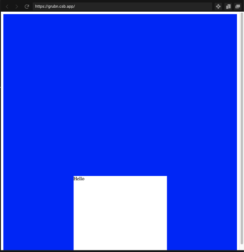
Since you are using absolute positioning, set the bottom to 0, left to 50%, then translate it left by 50% of the width.
style={{
  position: "absolute",
  backgroundColor: "white",
  zIndex: 1,
  height: "250px",
  width: "40%",
  bottom: 0,                     // <-- 0px from bottom of screen
  left: '50%',                   // <-- 50% of parent div width from left
  transform: 'translateX(-50%)', // <-- translate left 50% of child width
}}
Related Topics
CSS: Before and: First-Child Combined
Why Clear: Right Doesn't Work as Intended
How to Give Outer Glow to an Object in a Transparent Png Using CSS3
Webpack 4: Mini-CSS-Extract-Plugin + Sass-Loader + Splitchunks
How to Apply CSS to a MAC Chrome Select Box
Difference Between Box and Grid in Material-Ui
Phantomjs Doesn't Render Footers with a Custom Styles
How to Hide One Column from Grid in Bootstrap Mobile Version
Gulp SASS - How to Properly Name The Output CSS
CSS Inverted Triangle Image Overlay
Foundation 5 and Page Printing
Bootstrap 5 Form-Group, Form-Row, Form-Inline Not Working
What Font Format Should I Use for My Site