CSS Inverted Triangle image overlay
Here's a twist on the triangles-from-borders concept.
- Basic: http://jsfiddle.net/nhqKb/
- More Detailed: http://jsfiddle.net/nhqKb/3/
HTML
<div id="container">
    <div id="one"></div>
    <div id="two"></div>
</div>
CSS
#container{
    height: 300px;
    background-color: red;
    position: relative;
}

#one {
    position: absolute;
    width: 100px;
    left: 0;
    bottom: 0;
    border-bottom: 20px solid green;
    border-right: 20px solid transparent;
}

#two {
    position: absolute;
    left: 120px;
    bottom: 0;
    right: 0;
    border-bottom: 20px solid green;
    border-left: 20px solid transparent;
}
An alternative: I've done something similar with CSS transforms (specifically, skew). See CSS (3) & HTML Cut edge.
CSS negative triangle with inverted rounded corner
Yes, it is possible to achieve this effect by using two pseudo-elements. We need to position one of the pseudo-elements with respect to the left of the container while other is positioned with respect to right of the container. Then by adding a transform: skew() on them in opposite directions and assigning a border-radius to the required sides we can get the required output.
div { position: relative; height: 50px; width: 100%; padding-top: 50px; background: blue; background-clip: content-box; /* make sure blue background doesn't appear behind triangle */ overflow: hidden; color: white;}div:before,div:after { position: absolute; content: ''; top: 0; width: calc(50% + 10px); /* don't change */ height: 50px; /* must be equal to padding-top */ background: blue;}div:before { left: 0; transform: skew(45deg); transform-origin: right bottom; border-top-right-radius: 12px;}div:after { right: 0; transform: skew(-45deg); transform-origin: left bottom; border-top-left-radius: 12px;}<div class='shape'>This is a shape.</div>Transparent arrow/triangle indented over an image
There are several approaches to make a transparent arrow over an image with CSS. The two I will describe involve pseudo elements to minimize markup and have the same output. You can also see an SVG approach at the end of this answer :

The transparent effect on the black part arround the arrow is made with rgba() colors that allow transparency. But you can use opacity on the pseudo elements if you prefer.
1. SkewX()
You can use the CSS3 skewX() property on two pseudo elements to make the transparent arrow. The main asset of this approach is that the transparent arrow can be responsive but it also allows you to put a border on the black shape and around the traingle.
The responsiveness of the shape is made with the padding-bottom property to maintain it's aspect ratio (this technique is described here).
DEMO
.wrap { position: relative; overflow: hidden; width: 70%; margin: 0 auto;}.wrap img { width: 100%; height: auto; display: block;}.arrow { position: absolute; bottom: 0; width: 100%; padding-bottom: 3%; background-color: rgba(0, 0, 0, 0.8);}.arrow:before,.arrow:after { content: ''; position: absolute; bottom: 100%; width: 50%; padding-bottom: inherit; background-color: inherit;}.arrow:before { right: 50%; -ms-transform-origin: 100% 100%; -webkit-transform-origin: 100% 100%; transform-origin: 100% 100%; -ms-transform: skewX(45deg); -webkit-transform: skewX(45deg); transform: skewX(45deg);}.arrow:after { left: 50%; -ms-transform-origin: 0 100%; -webkit-transform-origin: 0 100%; transform-origin: 0 100%; -ms-transform: skewX(-45deg); -webkit-transform: skewX(-45deg); transform: skewX(-45deg);}<div class="wrap"> <img src="https://farm8.staticflickr.com/7187/6895047173_d4b1a0d798.jpg" /> <div class="arrow"></div></div>How do CSS triangles work?
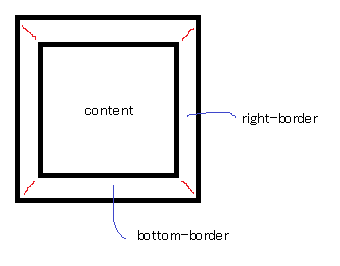
CSS Triangles: A Tragedy in Five Acts
As alex said, borders of equal width butt up against each other at 45 degree angles:
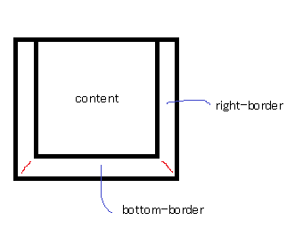
When you have no top border, it looks like this:
Then you give it a width of 0...
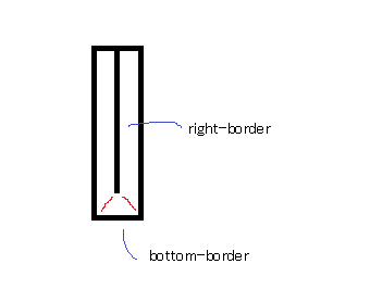
...and a height of 0...
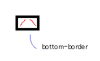
...and finally, you make the two side borders transparent:
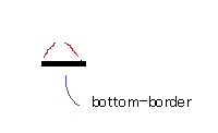
That results in a triangle.
CSS Triangles in React Native
It is still possible to draw triangles in React Native using the CSS trick.
I wrote a class to encapsulate this: https://github.com/Jpoliachik/react-native-triangle
If you'd like to write it yourself, I used this tool: http://apps.eky.hk/css-triangle-generator/ to generate the triangle I wanted and modify the styles to React Native syntax.
For example, an Isosceles triangle 90x90 pointing up in CSS reads:
width: 0;
height: 0;
border-style: solid;
border-width: 0 45px 90px 45px;
border-color: transparent transparent #007bff transparent;
But in React Native the styles would be:
triangle: {
     width: 0,
     height: 0,
     backgroundColor: 'transparent',
     borderStyle: 'solid',
     borderTopWidth: 0,
     borderRightWidth: 45,
     borderBottomWidth: 90,
     borderLeftWidth: 45,
     borderTopColor: 'transparent',
     borderRightColor: 'transparent',
     borderBottomColor: 'red',
     borderLeftColor: 'transparent',
   },
Triangle with one rounded corner
I know this is a little hacky, but I don't think there is an easy way to do this with a single class.
All I've done is rotated a box 45 degrees with border-radius:10px and then contained it in another div with width set to the desired width of your arrow and overflow:hidden so that everything that spills over is invisible.
.arrow-left {  position: absolute;  width: 100px;  height: 100px;  left: 20px;  background: black;  -webkit-transform: rotate(45deg);  transform: rotate(45deg);  border-radius: 10px;}
.cover {  position: absolute;  height: 100px;  width: 40px;  overflow: hidden;}
<div class="cover"> <div class="arrow-left"></div></div>Related Topics
Class Names Concatenated or Separated by a Space
How to Get My Page Headers to Resize Using Responsive Layout
Resizing Buttons in Twitter-Bootstrap
How to Use > or < (Greater Than and Less Than ) Symbols in Media Queries
Webpack 4: Mini-CSS-Extract-Plugin + Sass-Loader + Splitchunks
Ems to Pixel Conversion - Why 62.5% and Not 6.25%
Find All CSS Styles Used on Website
Twitter Bootstrap - Position Issue with Row-Fluid
Make Some Gradient Move Endlessly in a Progress Bar Like in Windows 7
How to Get a Custom Scroll in Firefox and Ie
Difference Between Firefox and Chrome Padding
How to Have a Border-Bottom on All Except The Last Item
Creating Custom Blocks in Rstudio's Bookdown
How to Use Nth-Child in CSS to Select All Elements After The 3Rd One
Browser-Specific Prefixes with a CSS Transition on Transform