Make some gradient move endlessly in a progress bar like in Windows 7
Using this CSS you can let a gradient move endlessly (based on the link in Michael's comment):
.bar {
background: -webkit-linear-gradient(left , #0193CD 30%, #66D4E5 80%, #0193CD 100%) repeat;
-webkit-background-size: 50% 100%;
-webkit-animation-name: moving-gradient;
-webkit-animation-duration: 1s;
-webkit-animation-iteration-count: infinite;
-webkit-animation-timing-function: linear;
}
@-webkit-keyframes moving-gradient {
0% {
background-position: left bottom;
}
100% {
background-position: right bottom;
}
}
Demo: http://jsfiddle.net/jhogervorst/X78qN/2/
This only works in WebKit-based browsers (e.g., Safari and Chrome). To make it work in other browsers as well, see Michael's link and copy some more CSS.
Edit: I had to make it perfect. See the new demo for an almost-perfect Windows progress bar in CSS3 :)
Moving Gradient Bar in CSS
The html part is quiet easy, all you need is two different divs.
HTML:
<body>
    <div class="background">
        <div class="movement"></div>
    </div>
</body>
CSS:
.movement
{
    background: -webkit-linear-gradient(left, rgba(255, 255, 255, 0) 0%, rgba(0,255,0,0.7) 25%, white 50%, rgba(0,255,0,0.7) 75%, rgba(255, 255, 255, 0) 100%);
    background: -o-linear-gradient(right,  rgba(255, 255, 255, 0) 0%, rgba(0,255,0,0.7) 25%, white 50%, rgba(0,255,0,0.7) 75%, rgba(255, 255, 255, 0) 100%);
    background: -moz-linear-gradient(right, rgba(255, 255, 255, 0) 0%, rgba(0,255,0,0.7) 25%, white 50%, rgba(0,255,0,0.7) 75%, rgba(255, 255, 255, 0) 100%);
    background: linear-gradient(to right, rgba(255, 255, 255, 0) 0%, rgba(0,255,0,0.7) 25%, white 50%, rgba(0,255,0,0.7) 75%, rgba(255, 255, 255, 0) 100%);
    width: 400px;
    height: 5px;
    position: relative;
    -webkit-animation: gradient 6s linear infinite;
    animation: gradient 6s linear infinite;
}
.background
{
    width: 1000px;
    overflow: hidden;
    height: 5px;
    background-color: #070;
}
@-webkit-keyframes gradient
{
    0%   {left: -400px;}
    100% {left: 1000px;}
}
@keyframes gradient
{
    0%   {left: -400px;}
    100% {left: 1000px;}
}
The background div is obviously for the background, size, color that's it.
The second div is the gradient div with your second color. It is colored with a gradient.
The animation causes the div to move over the background.
That's it! Try out here: http://jsfiddle.net/fgeLnbkm/2/
If you want to customize it, it's quiet handy, most of the things are easy to change, except from the gradient of the movement div.
Animating linear-gradient to create a loading bar
You don't need a gradient for this, just a pseudo-element, positioning & a transform.
.bar { width: 50%; height: 10px; background: lightgrey; margin: 2em auto; position: relative; overflow: hidden;}.bar::after { content: ''; position: absolute; height: 100%; width: 30%; background: red; animation: progress 2s infinite linear;}@-webkit-keyframes progress { 0% { left: 0; transform: translateX(-100%); } 100% { left: 100%; transform: translateX(0%); }}<div class="bar"></div>How can I style the ProgressBar component in JavaFX
I have marked this answer as community wiki.
If you have ideas for JavaFX ProgressBar styling outside of the original initial styling queries, please edit this post to add your styling ideas (or to link to them).
set the color of the progress bar itself
Answered in:
- JavaFX ProgressBar: how to change bar color?
The answer demonstrates
- Dynamic styling of the progress bar, so that the bar's color changes depending upon the amount of progress made.
- Static styling of the progress bar, which just sets the bar's color forever to a defined color.
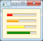
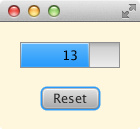
JavaFX 7 (caspian) on a Windows PC:
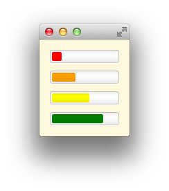
JavaFX 8 (modena) on a Mac:
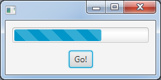
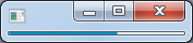
Sometimes people like barbershop pole style gradients, like the bootstrap striped style:
- ProgressBar Animated Javafx
set the background color of the progress bar (not the same as setting the background color)
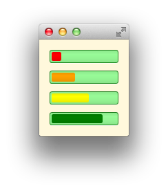
Define an appropriate css style for the progress bar's "track":
.progress-bar > .track {
  -fx-text-box-border: forestgreen;
  -fx-control-inner-background: palegreen;
}
add a custom text node on top of the progress bar (to show the different states)
Answered in:
- Draw a String onto a ProgressBar, like JProgressBar?
how to change the height of a progress bar:
Answered in:
- How to get narrow progres bar in JavaFX?
Sample CSS:
.progress-bar .bar {
    -fx-padding: 1px;
    -fx-background-insets: 0;
}
José Pereda gives a nice comprehensive solution for narrow progress bars in his answer to:
- How to get a small ProgressBar in JavaFX
I am looking for the css class names and the css commands
The place to look is in the default JavaFX style sheet.
- modena.css for Java 8.
- caspian.css for Java 7.
The ProgressBar style definitions for caspian (Java 7) are:
.progress-bar {
    -fx-skin: "com.sun.javafx.scene.control.skin.ProgressBarSkin";
    -fx-background-color:
        -fx-box-border,
        linear-gradient(to bottom, derive(-fx-color,30%) 5%, derive(-fx-color,-17%));
    -fx-background-insets: 0, 1;
    -fx-indeterminate-bar-length: 60;
    -fx-indeterminate-bar-escape: true;
    -fx-indeterminate-bar-flip: true;
    -fx-indeterminate-bar-animation-time: 2;
}

.progress-bar .bar {
    -fx-background-color:
        -fx-box-border,
        linear-gradient(to bottom, derive(-fx-accent,95%), derive(-fx-accent,10%)),
        linear-gradient(to bottom, derive(-fx-accent,38%), -fx-accent);
    -fx-background-insets: 0, 1, 2;
    -fx-padding: 0.416667em; /* 5 */
}

.progress-bar:indeterminate .bar {
    -fx-background-color: linear-gradient(to left, transparent, -fx-accent);
}

.progress-bar .track {
     -fx-background-color:
        -fx-box-border,
        linear-gradient(to bottom, derive(-fx-color,-15%), derive(-fx-color,2.2%) 20%, derive(-fx-color,60%));
    -fx-background-insets:  0, 1;
}

.progress-bar:disabled {
    -fx-opacity: -fx-disabled-opacity;
}
The progress bar style definitions for modena (Java 8) are:
.progress-bar {
    -fx-indeterminate-bar-length: 60;
    -fx-indeterminate-bar-escape: true;
    -fx-indeterminate-bar-flip: true;
    -fx-indeterminate-bar-animation-time: 2;
}
.progress-bar > .bar {
    -fx-background-color: linear-gradient(to bottom, derive(-fx-accent, -7%), derive(-fx-accent, 0%), derive(-fx-accent, -3%), derive(-fx-accent, -9%) );
    -fx-background-insets: 3 3 4 3;
    -fx-background-radius: 2;
    -fx-padding: 0.75em;
}
.progress-bar:indeterminate > .bar {
    -fx-background-color: linear-gradient(to left, transparent, -fx-accent);
}
.progress-bar > .track {
      -fx-background-color:
          -fx-shadow-highlight-color,
          linear-gradient(to bottom, derive(-fx-text-box-border, -10%), -fx-text-box-border),
          linear-gradient(to bottom,
            derive(-fx-control-inner-background, -7%),
            derive(-fx-control-inner-background, 0%),
            derive(-fx-control-inner-background, -3%),
            derive(-fx-control-inner-background, -9%)
          );
    -fx-background-insets: 0, 0 0 1 0, 1 1 2 1;
    -fx-background-radius: 4, 3, 2; /* 10, 9, 8 */
}
The JavaFX CSS reference guide contains general information on the use of CSS in JavaFX (which differs somewhat from the use of CSS in HTML).
How to create a Circular Style ProgressBar
You have a couple of options - the first is to template the ProgressBar control. This turns out to be a little tricky. I wrote a blog post which describes how to use an attached ViewModel to achieve the required effect.
The other alternative is to create your own control from scratch. You could do the following:
- Create a new user control
- Add new Value, Maximum and Minimum dependency properties to it.
- Handle the Value, Maximum and Minimum property change events in your user control to compute an Angle property.
- Construct two 'pie pieces' in code behind (see this post) and add them to the UI.
Related Topics
How to Get The Cursor to Change to The Hand When Hovering a <Button> Tag
Override Bootstrap Container Width
Textarea - Disable Resize on X or Y
How to Break Long Words in a Table Td
How to Select a Div with Class "A" But Not with Class "B"
Margin: Auto Not Working in Ie
Bootstrap 4: How to Have a Full Width Navbar with The Content in a Container (Like The So Navbar)
Update Source File When CSS Is Changed Through Chrome Developer Tools
CSS3 Flexbox Full-Height App and Overflow
Resizing Buttons in Twitter-Bootstrap
Image Paths in CSS to Support Cdn
CSS3 Transition Fadein with Display:None
How to Float a Twitter Bootstrap Navbar Item Right with Either Class=Pull-Right or Float:Right
How to Override Scoped Styles in Vue Components