Set width according to height
There are two techiques I am aware of to keep the aspect ratio of an element according to it's height :
When height is relative to the viewport :
You can use vh units :
div { width: 75vh; height: 75vh; background:darkorange;}<div></div>Resize div width relative to its height to keep aspect ratio
Since the width of the box should be changed relative to its height, you could use vh viewport relative length as the value of the width property.
From the Spec:
The viewport-percentage lengths are relative to the size of the
initial containing block. When theheightorwidthof the initial
containing block is changed, they are scaled accordingly.vh unit
Equal to1%of theheightof the initial containing block.
Here you go:
.center {
    position: absolute;
    left: 50%;
    width: 133.33vh; /* 100 * 4/3 ratio */
    height: 100%;
    margin-left: -66.66vh; /* width / 2 */
    z-index: 100;
}
WORKING DEMO.
It's worth noting that vh, vw viewport-percentage lengths are supported in IE9+.
Browser compatibility
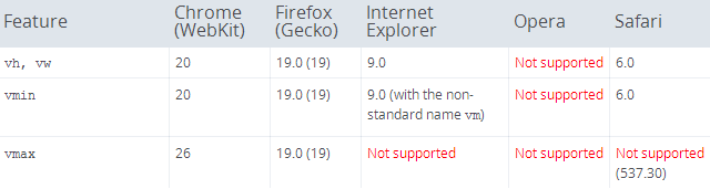
Credits: Mozilla Developer Network
CSS: Keeping a div's height relative to its width
Is this what you are after? I'm not using -webkit-calc() at all. I've inserted a 1px by 6px image into a outer div which has position: fixed applied to it, and set the image to have a width of 100% and position: relative. Then I have added an inner div which is absolutely positioned to be as high and wide as its ancestor.
Now you can change the width of the outer div, and the images' width: 100% setting will ensure that both the outer and the inner div's are guaranteed to always have a height equal to 1/6th of their width (or at least as close to exactly equal as it can get, the heights will be rounded off to the closest whole number of pixels). Any content could go inside the inner div.
HTML
<div>
  <div></div>
  <img src="https://dl.dropboxusercontent.com/u/6928212/sixbyone.png" />
</div>
CSS
html, body {
  margin: 0px;
  padding: 0px;
}
div {
  position: fixed;
  width: 100%;
}
div > div {
  position: absolute;
  top: 0px;
  right: 0px;
  bottom: 0px;
  left: 0px;
}
img {
  width: 100%;
  display: block;
  position: relative;
}
Here's a jsFiddle showing the requested behaviour.
Height equal to dynamic width (CSS fluid layout)
Using jQuery you can achieve this by doing
var cw = $('.child').width();
$('.child').css({'height':cw+'px'});
Check working example at http://jsfiddle.net/n6DAu/1/
Set child width relative to its parents height in pure css
Just assign your parent's height property value to a css variable and then use calc() to assign your child element's width to a value that is 10% of your parent's height.
Check and run the Code Snippet below for a practical example of what I have described above:
.parent {
   position: relative;
   --parentHeight: 300px;
   height: var(--parentHeight);
   width: 600px;
   background-color: red;
 }
 .parent .resized {
   height: 100px;
 }

 .child {
   position: absolute;
   height: 20%;
   width: calc(var(--parentHeight) / 10);
   background-color: green;
 }
<div class="parent">
<div class="child"></div>
</div>Width 100% relative to height
In this case
.box {
  width: 30vw;
  height: auto;
}
an element with class box will have width 30vw and its height will depend on the form of the element and its children. For example, if an img element is given class box it will have 30vw width and its height will be the right size to preserve its aspect ratio which I think is what is meant in the question by present us with good dimensions.
In the second case
.box {
  height: 30vh;
  width: auto;
}
if an img element is given class box then its height will be 30vh and its width will be set so that it maintains its aspect ratio. It will not take the width of the parent as the question supposes and in fact will do as the question wants and have a width calculated in relation to the specified height.
In the case of a div given class box and some text contained in it the height will be as specified and the text, if not further styled, will take up the width of the parent element.
Sizing width of an element as a percentage of its height or vice versa in a fluid design?
I came across this problem last year and found an obscure solution after some tedious researching. Unfortunately it involves wrapper DIVs. The structure is simple - you have a parent DIV which contains the contents container and another DIV that sets the proportions. You set the margin-top of the 'proportion' DIV as percent of the width of the parent... Example:
#parent {
    position: relative;
}
.proportions {
    margin-top: 75%; /* makes parent height to 75% of it's width (4:3)  */
}
.container { /* contents container with 100% width and height of #parent */
    position: absolute;
    top: 0px;
    left: 0px;
    bottom: 0px;
    right: 0px;
}
http://jsfiddle.net/twpTU/
Related Topics
What Are The Best Practices for Writing Maintainable CSS
How-To Create Rounded Corners on Table Head Only
Responsive CSS - Target 1024 X 768 Screen Size Only
Ie8's Rendering of Transparent Pngs Is Fubared on My Site
How to Restrict Character Limit by Line or # of Characters with CSS
How to Specify The Use of Text or Titling Figures in CSS
How to Vertically Center Align Background Image with Text
CSS Inverted Triangle Image Overlay
How to Make a Div Visible on Top of an HTML5 Fullscreen Video
Google Map V3 Initializing with Horizontal Gray Line W/ Foundation in Chrome