What is the difference between Box and Grid in Material-UI?
In short:
Box is a more powerful, convenient, and potential replacement for div. You can change it to any HTML elements (e.g. span), but most of the time you will use it as div replacement.
Grid is the syntactic sugar of Grid Layout.
What is different between Container vs Grid container in Material-UI?
I visited the documentation of material UI, here's what I found while inspecting these:
Container
When you use <Container> in your code, following styles will be applied to your <Container> component.
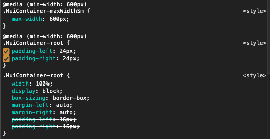
As you can see in above screenshot, there are two important properties present,
display: blockmax-width: 600px(In the media queries, so it varies depending on the viewport width)
Grid
When you use in your code with attribute container, following styles will be applied,
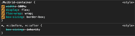
As you can see above, it utilizes the flexbox layout for holding the columns, which can be useful for holding the flex-items (i.e. columns). Also it has its max-width set depending on the type of spacing you are specifying.
After inspecting these differences, in my opinion, <Container> are used for outer wrapper which holds the all the components in it, whereas the <Grid container> can be used to create column layout (12-columns), which is not really possible in case of <Container>.
Box vs Stack in MUI
Box: The Box component serves as a wrapper component for most of the CSS utility needs.
The Box component packages all the style functions that are exposed in @mui/system.
Stack: Stack is like a flex container. The Stack component manages layout of immediate children along the vertical or horizontal axis with optional spacing and/or dividers between each child.
Usage of Stack:
Stack is concerned with one-dimensional layouts, while Grid handles two-dimensional layouts. The default direction is column which stacks children vertically.
By default, Stack arranges items vertically in a column. However, the direction prop can be used to position items horizontally in a row as well.
Use the divider prop to insert an element between each child. This works particularly well with the Divider component.
You can switch the direction or spacing values based on the active breakpoint.
Ref: https://mui.com/components/stack/
React MUI: How to create a flex-box like grid using the Grid component
CSS
display: "grid",
gridTemplateColumns: "repeat(auto-fill, 220px)", //the width of the card
justifyContent: "center",
gridGap: "20px",
Body
<Box className={classes.List}> //css
    {Cards.map(c => (
        <Grid item xs key={c._id} >
            <Card id={c._id} title={c.title} description={c.description} />
        </Grid>
    ))}
</Box>
What is the MUI Box component for?
EDIT: This was written in the MUI v4 days. In MUI v5, all MUI components allow you to define CSS styles via the sx prop, not just Box; but Box also accepts styling props at top-level, as well as within sx.
The other answers don't really explain the motivation for using Box.
Box renders a <div> you can apply CSS styles to directly via React props, for the sake of convenience, since alternatives like separate CSS files, CSS-in-JS, or inline styles can be more typing and hassle to use.
For example, consider this component that uses JSS:
import * as React from 'react'

import { makeStyles } from '@material-ui/styles'

const useStyles = makeStyles(theme => ({
  root: {
    display: 'flex',
    flexDirection: 'column',
    alignItems: 'center',
    padding: theme.spacing(1),
  }
}))

const Example = ({children, ...props}) => {
  const classes = useStyles(props);

  return (
    <div className={classes.root}>
      {children}
    </div>
  )
}
It's much shorter to do this with Box by passing the props you want to it:
import * as React from 'react'

import Box from '@material-ui/core/Box'

const Example = ({children}) => (
  <Box display="flex" flexDirection="column" alignItems="stretch" padding={1}>
    {children}
  </Box>
)
Notice also how padding={1} is a shorthand for theme.spacing(1). Box provides various conveniences for working with Material-UI themes like this.
In larger files it can be more of a hassle to jump back and forth from the rendered elements to the styles than if the styles are right there on the element.
Cases where you wouldn't want to use Box (MUI v4):
- You want the enclosing component to be able to override styles by passing
classes(makeStylesenables this.<Example classNames={{ root: 'alert' }} />would work in themakeStylesexample, but not theBoxexample.) - You need to use nontrivial selectors (example JSS selectors:
$root > li > a,$root .third-party-class-name)
What is the difference between Material-UI DataGrid and Material-UI Table?
Quoted from Material UI Docs
The
Tablecomponent has a close mapping to the native
elements.The
DataGridcomponent is designed for use-cases that are focused
around handling a large amounts of tabular data. While it comes with a
more rigid structure, in exchange, you gain more powerful features.
mui Grid in Box - horizontal and vertical spacing
Remove the flexGrow: 1 from the <Grid> conatiner
<Grid
  container
  rowSpacing={2}
  columnSpacing={2}
  justifyContent='flex-start'
  alignItems='flex-start'
  // --- remove this flexGrow --- //
  sx={{ flexGrow: 1, overflowY: 'scroll' }}
>
  {list_label.map((label) => (
    <Grid item key={label}>
      <Paper sx={{ height: 120, width: 150, backgroundColor: 'red'}}>
        {label}
      </Paper>
    </Grid>
  ))}
</Grid>
Related Topics
How to Get The Cursor to Change to The Hand When Hovering a <Button> Tag
How to Make Custom Scrollbars Show in All Browsers
How to Add Vertical Spacing Between Block Elements, But Not Top and Bottom
CSS3 Transforms and Transitions (Webkit)
Putting a Border Around Floating Elements
How to Make Leaflet Map Height Variable
How to Apply a CSS Rule to All Descendants of an Elements
Including CSS with '<Link>' or '@Import' - Which Is Better
CSS3 Flexbox Full-Height App and Overflow
Angular: Updating Scope on Hover
Sorting CSS Properties into an Arbitrary Order
Mattooltipclass Not Applying CSS
CSS Stylesheets at Top or Bottom? or How to Solve Blank Page Issue
Calculating Square-Roots with CSS