Angular Material Overriding Default Style of SnackBar Component
To do this properly, you need to set the View Encapsulation to None on your component:
@Component({
    templateUrl: './my.component.html' ,
    styleUrls: ['./my.component.css'],
    encapsulation: ViewEncapsulation.None,
})
Then in your component css you can just do this:
.mat-snack-bar-container {
   max-width: 800px;
}
From the official docs:
View Encapsulation = None means that Angular does no view
encapsulation. Angular adds the CSS to the global styles. The scoping
rules, isolations, and protections discussed earlier don't apply. This
is essentially the same as pasting the component's styles into the
HTML.
How do I manipulate the look of a mat-snack-bar template using CSS in Angular Material 7
you can do that quite simply by using CSS.
All you gotta do is add to the CSS file in which you define the class (for example blue-snackbar) the following:
.blue-snackbar {
  background: #2196F3;
  position: absolute;
  top: 0;
  left: 0;
  right: 0;
  max-width: 100% !important;
  width: 100%;
}
I'll go over what it does:
  position: absolute;
  top: 0;
  left: 0;
  right: 0;
Those lines make sure the snackbar is on the top (hence "top: 0") and stretches to the entire available space ("position: absolute" allows this game of placement)
  max-width: 100% !important;
  width: 100%;
Max width allows the div to take the entire width of the page, and width instructs it to.
The "!important" instruction is used to bypass any conflicting CSS from other styles.
Override verticalPosition property in Mat-Snack-Bar component
There's a reason for only having the options top and bottom for MatSnackBarVerticalPosition, as can be seen in the Angular Material API. They are following Material Design, which suggests to only place it at the top or bottom of a page.
But there's a trick to accomplish what you want, although it might be a bit hacky, and that is to make use of display: grid on the overlay pane.
.cdk-global-overlay-wrapper {
  display: grid !important;
  place-items: center !important;
}
The !important is needed to override default CSS styling to get the result you want.
See this StackBlitz example for the outcome.
Override Angular Material style in Angular component
As @Dylan pointed out, you have to use /deep/ to alter the CSS within the child compoenets. Here is the answer I was looking for:
:host /deep/ md-input-container .mat-input-wrapper
MatSnackBar open does not pick the style from styles.css
In Angular, component level styles only apply to that components html. ::ng-deep is used when you also want those styles to apply to children of the component. Since you are declaring the style globally there is no need to use ::ng-deep, .warning should suffice.
See the Angular docs
Angular 5 and material - How to change the background color from SnackBar component
You have to use the panelClass option (since v6) to apply classes on a snackbar like this:
this.snackBar.open(message, action, {
  duration: 2000,
  panelClass: ['blue-snackbar']
});
CSS (in global styles.scss):
.blue-snackbar {
  background: #2196F3;
}
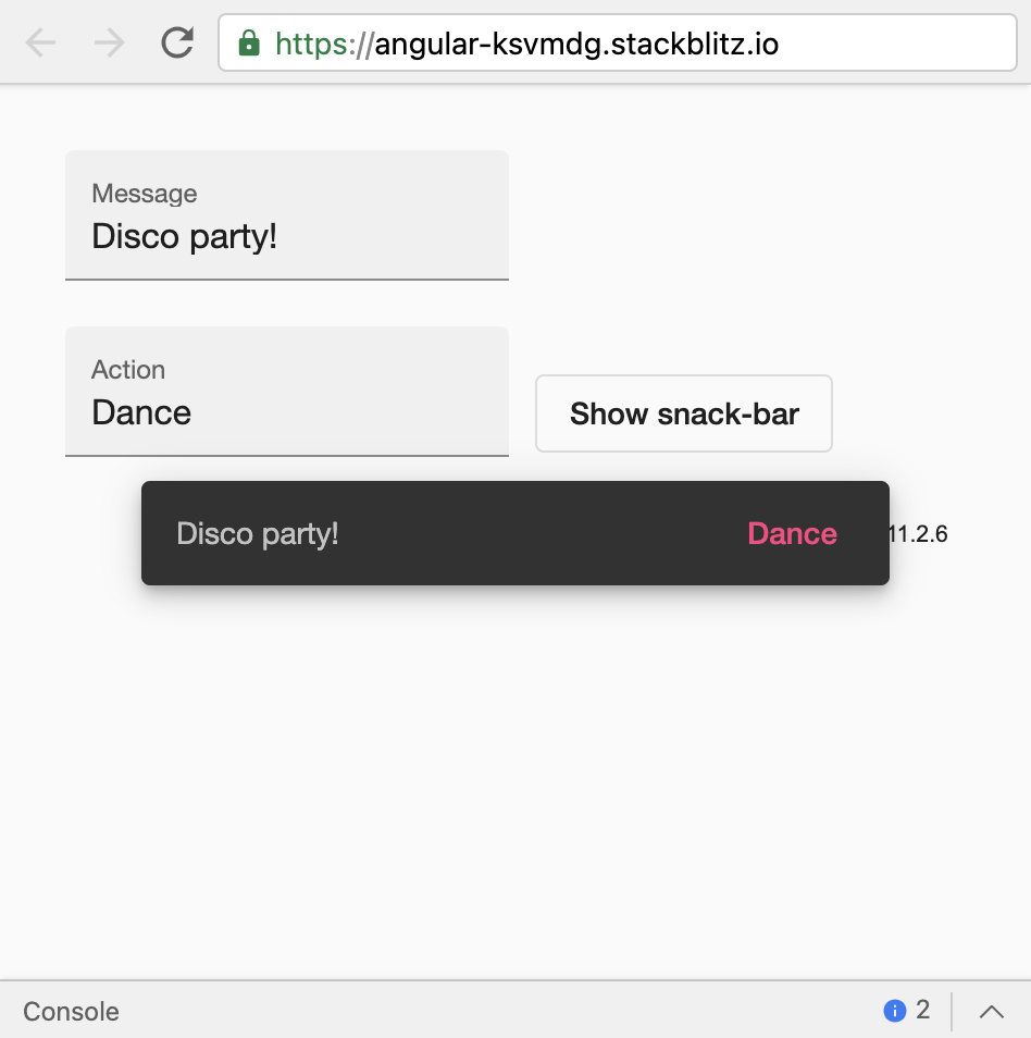
See the Stackblitz example
Angular 2/4 How to style angular material design snackbar
md-snackbar provides a service to provide custom config. One the properties of config is extraClasses that allows to add CSS classes to the snack bar container (doc).
extraClasses can be used with ::ng-deep to override the default CSS classes. Here's an example:
component.ts:
Requires following import in the component:
import {MdSnackBar, MdSnackBarConfig} from '@angular/material';
(providing custom configuration)
openSnackBar(message: string, action?: string) {
  let config = new MdSnackBarConfig();
  config.extraClasses = ['custom-class'];
  this.snackBar.open(message, action ? 'Action Label' : undefined, config);
}
component.css:
::ng-deep snack-bar-container.custom-class {
  background: yellow;
}

::ng-deep .custom-class .mat-simple-snackbar {
  color: green;
}
Here's a Plunker demo if you would like to try.
NOV 2018 UPDATE: Angular 6+
The syntax has changed a bit, with the md- prefix being replaced mat- and extraClasses was replaced with panelClass. The function is overall the same though:
const config = new MatSnackBarConfig();
config.panelClass = ['custom-class'];
...
and the imports too:
import { MatSnackBar, MatSnackBarConfig } from '@angular/material';
MatSnackBar panelClass doesnt read styling class
EDIT:
It seems to work if you prefix your class with the following ::ng-deep snack-bar-container (see this comment). So your component SCSS file should look like this:
::ng-deep snack-bar-container.alert-red{
  padding: 20px;
  background-color: red;
  color: white;
}
WORKAROUND: See post here, it seems that you need to put the style in your applications styles.scss file and not in your components SCSS file.
Check this stackblitz, the style works in the styles.scss, but not when you comment it out and leave it in the app.component.scss. Not sure if this is a bug or intended behaviour.
Related Topics
CSS: Possible to "Push" Webkit Scrollbars into Content
What's The Difference Between Line-Height:1.5 and Line-Height:150% in CSS
Changes Made to (Static) CSS File Not Reflecting in Django Development Server
How to Get The CSS Counter Value of The Parent
How to Specify The Use of Text or Titling Figures in CSS
Disabling Font Ligatures CSS (Letter Combining)
Best Practice to Manage All Asset Caching (Images, CSS, Js, Everything)
Ie8's Rendering of Transparent Pngs Is Fubared on My Site
Textfield CSS Styling Using Javafx
Browser-Specific Prefixes with a CSS Transition on Transform
Bootstrap 4: How to Have a Full Width Navbar with The Content in a Container (Like The So Navbar)
How to Make a Div Visible on Top of an HTML5 Fullscreen Video