What's the difference between line-height:1.5 and line-height:150% in css?
Short version: line-height: 150% is static, line-height: 1.5 is dynamic. The effect is more evident on inheriting elements. An example:
HTML
<div style="font-size: 12px">
    <span style="font-size: 24px">test</span>
</div>
This CSS
div { line-height: 150%; } /* Computed line-height: 18px (150% * 12px) */
span { }                   /* Computed line-height: 18px (inherited directly) */
As opposed to this:
div { line-height: 1.5 }   /* Computed line-height: 18px (1.5 * 12px) */
span { }                   /* Computed line-height: 36px (1.5 * 24px) */
You may read more at the CSS2 specs page
CSS Line-Height Guide
Maybe these references are more like what you're looking for. I haven't found a definitive rule, but at least here are some things to consider.
This one suggests that it depends on your choice of font-family:
http://www.webteacher.ws/2009/09/30/improve-readability-with-line-height/
This one suggests that it depends on the width of the lines:
http://kingdesk.com/articles/optimal-line-height/
This reference essentially agrees with both of those:
http://www.wpdesigner.com/2007/06/21/web-typography-line-spacing/
The main rules seem to be (1) wider lines of text require greater line-heights, and (2) greater line-height is required based on font if the height of lower-case letters is a high percentage of the height of upper-case letters.
The best approach is probably just to eyeball it, and try to avoid impenetrable walls of text.
Why does unitless line-height behave differently from percentage or em in this example?
Based on clues in the proposed answers, I think the rendering behavior seen in these examples is counterintuitive, but correct, and mandated by the interaction of several rules in the spec, and the overall CSS box model.
CSS calculates the leading L needed for a box by the formula
line-height= L + AD, where AD is "the distance from the top to
the
bottom"
of the font. Then "half the leading is added above A and the other
half below D." So text that hasfont-size:16pxandline-height:24pxwill have 4px of leading above and below. Text
thatfont-size:8pxandline-height:24pxwill have 8px of leading
above and below.By default, however, "user agent must align the glyphs ... by their
relevant
baselines.".
This starts to explain what's happening here. Whenline-heightis
specified by percentage or em, a computed value is inherited by the
child (here, thesmallerspan). Meaning, thesmallerspan gets
the sameline-heightas the parent block. But because of the L +
AD formula, the text of that span has more leading on the top and
bottom, and thus the baseline sits higher in its box. The browser
pushes down thesmallerspan vertically to match the baselines.But then the browser has a new problem — how to deal with the line
spacing in the enclosing block, which has been disrupted by this
baseline-adjusting process. The spec resolves this too: theline-heightof a block-level element "specifies the minimal
height of line boxes within the
element".
Meaning, CSS makes no promise that you'll get your exactline-height, just that you'll get at least that amount. So the
browser pushes the lines apart in the enclosing block so that the
realigned child box will fit.
The reason this is counterinitutive is that it's the opposite of how most word processors and page-layout programs work. In these programs, a smaller stretch of text within a paragraph is aligned by its baseline (like CSS) but line height is enforced as a distance between baselines, not as a box surrounding the smaller text. But that's not a bug — CSS is designed around a box model. So in the end, we could say that this spacing behavior is a consequence of that model.
That still leaves us to explain the behavior in the example with the unitless line-height:
First, note that when no
line-heightis specified, the browser
will apply a unitless line-height by default. This is required by
the
spec:
the initial value ofline-heightisnormal, which is defined to
have "the same meaning as <number>", and the spec recommends a
value "between 1.0 and 1.2". And that's consistent with what we see
in the examples above, where the paragraphs withline-height: 1.5
have the same behavior as the paragraphs with no line-height setting
(i.e., they are impliedly gettingline-height: normal)As others have pointed out, when the paragraph has
line-height: 1.5, the calculated line-height of the paragraph is
not inherited by thesmallerspan. Rather, thesmallerspan
calculates its own line height based on its own font size. When the
paragraph hasline-height: 1.5; font-size: 14px, then its
calculated line height is 14px * 1.5 = 21px. And if thesmaller
span only has the propertyfont-size: 50%, then its font size is
14px * 50% = 7px, and its line height is 7px * 1.5 = 10.5px (which
will generally be rounded to a whole pixel). But overall, thesmallerbox is half the size of the surrounding text.As before, the browser will vertically align the
smallerspan to
the adjacent baseline. But this time, because the box aroundsmalleris shorter than the surrounding text, this realignment
doesn't have any side effects in the enclosing block. It already
fits, so there's no need to spread the lines of the parent paragraph, as
there was before.
Both cases represent a consistent implementation of the spec. That's good news, because it means we can predict the line-spacing behavior.
That brings us back to the original reason for this question. While I now understand that the CSS box model requires this behavior, as a practicing typographer, this is rarely the behavior I want. What I want is for the lines within a paragraph to have consistent & exact line spacing, even if some spans of text within that paragraph are smaller.
Unfortunately, it seems there's no way to directly enforce exact line spacing in CSS as one can in a word processor or page-layout program. Again, this is because of the CSS box model: it doesn't use a baseline-to-baseline line-spacing model, and line-height is specified to be a minimum measurement, not maximum.
But we can at least say that unitless line-height values produce the best approximation of exact line spacing in CSS. Fussy typographers like myself should feel comfortable using them, because unitless values are endorsed by the spec, and they produce consistent results across browsers. They are not a hack, nor are they deprecated.
The caveat is that they're still only an approximation. Unitless line-height values don't change the underlying CSS box model, nor the CSS box-positioning rules. So it's possible that in some edge cases, they won't have the intended result. But eternal vigilance is the price of good typography. Be careful out there.
Line-height without units
line-height@ Mozilla Developer Network has a very good explanation (and examples) which is a easier to understand compared to the line-heightCSS specification.
line-height can have the value specified in one of the following ways
line-height: normal | <number> | <length> | <percentage>
In your case, you are using a <number> which is described as:
The used value is this unitless
<number>multiplied by the element's font size. The computed value is the same as the specified<number>. In most cases this is the preferred way to set line-height with no unexpected results in case of inheritance.
What are pros and cons to add line-height to body { }?
It just depends. If you put it in the body then you get to be lazy and not worry about ever doing it again, but your going to lose control because everything on the page will have the line-height set to 1.5. Whereas if you declared it in each tag, you gain lots of control, but will have to do more work.
Personally I would go for the tag-by-tag solution, but I'm a control freak, so...
Drawbacks to line-height without unit?
In most cases, it's actually better to use unitless line-height - see
- http://meyerweb.com/eric/thoughts/2006/02/08/unitless-line-heights/
- https://developer.mozilla.org/en/CSS/line-height - see the notes where they show an example
Of course, there are exceptions. The first one that comes to mind is when you have a block element with a known height and with one line of text in it and you want to center that line of text vertically - I find that the easiest way to do that is to use a line-height that's equal to the height of the block element.
[Just in case, for anybody who doesn't know what's the deal with unitless line-height.]
Suppose you have an element with font-size: 14px. It doesn't matter where it was set, whether it's inherited or not, if you set it yourself or it came from the user agent stylesheet. The element has font-size: 14px.
Now, if you set, let's say line-height: 1.5 for the same element, this will be translated into pixels as 1.5 * 14px = 21px. So your computed line-height will be 21px.
FireFox 3 line-height
The computed value of line-height: normal varies between platforms, browsers (and different versions of the same browser, as you state), fonts, and even different sizes of the same font (see Eric Meyer's article).
Setting a unitless value such as...
body {line-height: 1.2;}
...should work to normalize the spacing between browsers. If this is not working, can you provide a more-detailed description of your stylesheet?
It's hard (impossible?) to get "pixel-perfect" results, but in order to get results that are as predictable as possible, I try to use a line height that produces a nice round value when multiplied by the font-size. We can't know the user agent's default font size, but 16 pixels is somewhat common.
body
{
    font-size: 100%;
    line-height: 1.5;
}
If the user agent's starting font size is indeed 16 pixels then the line height of 1.5 comes out to a nice, even 24 pixels. Users can and do change the default font size or the page zoom, though, and different browsers have different methods of scaling the page. Nevertheless, I think I've had reasonable success for a majority of the users. If I can't make the line height come out exactly, then I shoot for a little above the integer rather than a little below, because some browsers seem to truncate values rather than round them.
Also, note that if you use a percentage for the line height, it behaves differently when the value is inherited.
body
{
    font-size: 100%;
    line-height: 150%;
}

p
{
    font-size: 75%;
}
Starting from a base font size of 16 pixels, the line height will be 24 pixels. Within a <p> element the font size becomes 12 pixels, but the line height does not become 18 pixels, rather it remains 24 pixels. This is the difference between line-height: 1.5 and line-height: 150%. When body {line-height: 1.5;} is used, the line height for <p> is 18 pixels.
Why is height in em units sometimes greater than appropriate count of text lines multiplied by their line height?
Kudos to Pete, who came up with the idea of why that was happening.
As we found out, Webkit-based browsers handle pixel fractions in line-height a bit differently, compared to other browsers (e.g., Firefox).
The resulting line-height in the question was 17px * 1.5 = 25.5px, and, as a result, each line of text occupied 25px, namely, Math.floor was implemented instead of any other theoretically possible option (Math.ceil or distributing 25px and 26px between odd and even lines, or whatever).
Hence, 6 lines occupied height equal to 25px * 6, 150px. On the other hand, the height of the floating element was defined to be 25.5px * 6, or simply 153px.
So, mathematically, we saw an occurrence of a common situation, when the sum of the floor-ed elements in a collection would be less or equal than the floor-ed sum of those elements, or:
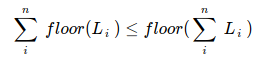 , where L is a height of a line.
That's why an acceptable solution is to take into the account the Webkit's way of handling pixel fractions, the flooring. That would look uniformly (unless a bigger error accumulates) across the other browsers, even if they apply ceil-ing in this context.
Line-Height does not match the font-size
1em is equal to 1 times the number of pixels in a font size. So if your font-size is 60px, 1em = 60px. If it is 14px, 1em = 14px, and so on. Setting the line-height to 1em makes it equal to 1 times the number of pixels.
There may be some confusion because the default line-height set by the user agent stylesheet is usually somewhere around 1.5em, so a 12px font-size would result in an 18px line-height.
em unit
Equal to the computed value of the ‘font-size’ property of the
element on which it is used
Source: http://www.w3.org/TR/css3-values/#font-relative-lengths
See also: http://www.w3.org/TR/CSS21/syndata.html#length-units
Based on this, your original example is exactly what I would expect to see. For reference, here is what I see in Chrome:

Your first line is 60px tall, but the computed value (W3's term) of the second is 14px (dictated by the class applied to it). Both have a line-height of 1em. Thus, the line-heights are 60px and 14px respectively. Since that is the same as the font sizes, the two lines touch (this can vary from font to font).
If you are seeing overlapping behavior, that's a different problem.
To change the behavior, you can use a different line-height, padding, margin, etc. As a side note, rem units may be more intuitive though support is lacking in older browsers.
For an overview of CSS units, see: http://css-tricks.com/css-font-size/
Fonts not aligned with edges of box
Updated Question/Problem

With regards to the updated question, see: http://www.w3.org/TR/css3-fonts/#propdef-font-size which states that:
Note that certain glyphs may bleed outside their EM box.
This happened in varying degrees with different fonts that I tried (some bleed both X/Y, some in one direction, some not at all).
I'm not sure there is any way to change this behavior, especially since each browser may use a different algorithm for anti aliasing which can slightly alter the edge of the character.
I think line-box-contain: glyph may be relevant, but I only see it mentioned in an editor's draft and I'm sure browser support is absent/inconsistent.
http://dev.w3.org/csswg/css3-linebox/#line-box-contain
Related Topics
Change The Colors of The Sphinx Read The Docs Theme
CSS Table-Like Alignment Using No Tables? (CSS Relativelayout)
What Does The & Mean in an SCSS Selector
Svg Data Image as CSS Background
Full Viewport Height Scaling Div Just CSS No Js... Possible
Can't Apply Width and Height to -Webkit-Scrollbar Using CSS
CSS: Possible to "Push" Webkit Scrollbars into Content
How to Install Bootstrap in Laravel 8
Changes Made to (Static) CSS File Not Reflecting in Django Development Server
Is Browser Prefix Still Required for Linear-Gradient
How to Specify The Use of Text or Titling Figures in CSS
CSS Filter Grayscale: I Want It Black
Color "Transparent" Not Working
How to Set Svg Width and Svg Height by Percent
How to Float a Twitter Bootstrap Navbar Item Right with Either Class=Pull-Right or Float:Right