Flexbox curved corners
You just need to add overflow:hidden; to the parent element with the border-radius property.
Explanation :
The issue is that the flexbox items are overflowing the parent element and therefore, the border radius doesn't apply on the items.
To prevent them from overflowing their parent, you need to add overflow:hidden; to the parent .wrap in the following example :
.wrap {
  display: flex;
  border-radius: 10px;
  overflow: hidden;
}

.item {
  flex: 1;
  height: 100px;
  background: teal;
  margin-right: 5px;
}

.item:last-child {
  margin-right: 0;
}
<div class="wrap">
<div class="item"></div>
<div class="item"></div>
<div class="item"></div>
<div class="item"></div>
<div class="item"></div>
<div class="item"></div>
</div>Perfectly rouded border-radius for flexbox items
Don't assign 50% to border-radius, it'll calculate exactly from the percentage of both width and height(in this situation, 40px/80px). If the width and height are not equal, it will end up an ellipse shape.
Just use an arbitrary big number instead.
You don't need to calculate exactly what the number it is, just make it bigger than the width or height could be(In this example, 500px is more than enough for 160px height, but don't be too crazy about it):
div {
  width: 80px;
  height: 160px;
  display: inline-block;
  margin-right: 10px;
}

.fifty-percent {
  border-radius: 0 0 50% 50%;
  background-color: salmon;
}

.big-number {
  border-radius: 0 0 500px 500px;
  background-color: steelblue;
}
<div class="fifty-percent">50%</div>
<div class="big-number">500px</div>flex container ruining a border-radius, How to fix this?
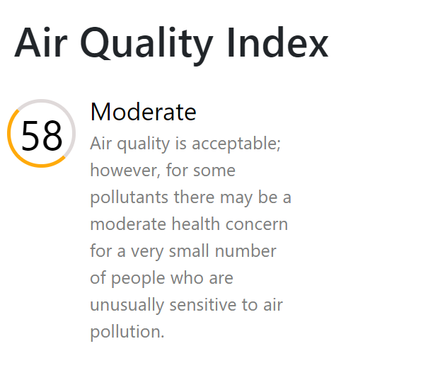
I would start by giving the circle a fixed height and width. Then giving it a border-radius of 50%. and that would solve the first problem ( to make it into a perfect circle).
The second problem centering the text. Give the span a display: flex then use align-items: center; and justify-content: center; and you are good to go.
.index {
    margin: 5px 0 0 5px;
    color: black;
    height: 50px;
    width: 50px;
    position: relative;
    align-items: center;
    justify-content: center;
    display: flex;
    font-size: xx-large;
    border: 3px solid rgb(223, 217, 217);
    border-left-color: rgb(255, 170, 11);
    border-bottom-color: rgb(255, 170, 11);
    /* padding: 15px; */
    border-radius: 50%;
}
Using CSS border-radius (rounded corners), how can we prevent the rounded corners from disappearing if the image is scaled down (max width/height)?
just add border radius in anchor tag too
<a style="border-radius:20%" > img </a>
How to make inverted rounded corners and bend content to follow curved container
You should post also complete code, it is not always enough with CSS. (Enlico already commented this to you).
Anyway, a posible solution would be this, moving the elements in a vertical amount to make them rotate:
.container {
    width: 100%;
    position: relative;
    top: 200px;
}

.element {
    position: absolute;
    background-color: tomato;
    left: 50%;
    transform: translateY(-400px) rotate(var(--angle)) translateY(400px) rotate(calc(-1 * var(--angle)));
}

.element:nth-child(1) {
    --angle: 50deg;
}

.element:nth-child(2) {
    --angle: 30deg;
}

.element:nth-child(3) {
    --angle: 10deg;
}

.element:nth-child(4) {
    --angle: -10deg;
}

.element:nth-child(5) {
    --angle: -30deg;
}

.element:nth-child(6) {
    --angle: -50deg;
}
<div class="container">
<div class="element">item 1</div>
<div class="element">item 2</div>
<div class="element">item 3</div>
<div class="element">item 4</div>
<div class="element">item 5</div>
<div class="element">item 6</div>
</div>Border radius issue with div
Your issue is overflow: scroll;. Remove overflow: ?; property from .stage-area. With border-radius overflow: scroll; will not work together it should be hidden or inherit. Below the snippet.
.stage-area {
  width: 50%;
  background: #ffffff;
  box-shadow: 0px 24px 34px rgba(0, 0, 0, 0.25);
  border-radius: 80px;
  -webkit-border-radius: 80px;
  -moz-border-radius: 80px;

  display: flex;
  flex-direction: column;
  align-items: center;
  max-height: 60%;
  /*overflow: scroll;*/
}

.stage-area {  width: 50%;  background: #ffffff;  box-shadow: 0px 24px 34px rgba(0, 0, 0, 0.25);  border-radius: 80px;  -webkit-border-radius: 80px;  -moz-border-radius: 80px;
  display: flex;  flex-direction: column;  align-items: center;  max-height: 60%;  /*overflow: scroll;*/}
body {  height: 100%;  margin: 0px;  background-color: #ffce31;}
.brand-icon {  padding: 0 10% 0 10%;}
.outer-yellow-area {  display: flex;  flex-direction: column;  align-items: center;  width: 100%;  height: 100%;}
<div className="outer-yellow-area"> <img className="brand-icon" src={brandIcon} alt="logo" /> <div class="stage-area"> Center stage <div>below stage</div> <div>below stage</div> <div>below stage</div> <div>below stage</div> <div>below stage</div> <div>below stage</div> <div>below stage</div> </div> </div>Related Topics
Why Won't Opera (11.00) Display Custom (@Font-Face) Fonts
Site 5X Faster via Mod_Rewrite, But CSS Images Are Broken
Center Two Divs in The Middle of a Wrapper
Using Cors Headers with CSS Background-Image
Input[Type='Text'] CSS Selector Does Not Apply to Default-Type Text Inputs
Target The 2Nd Instance of a CSS Class
Including a Font in Angular.Js (.Ttf)
Responsive Design: Why Does Height Zero & Padding-Bottom Work for Making a Div Responsively Sized
What Does The 'P-N' and Its Variants Represent in Bootstrap V4
Twitter Bootstrap - Nav Bar Issues in Internet Explorer
How to Use CSS? (Not *Learn* But Really *Use*)
Heroku Does Not Serve Background Image, Localhost Does
Overriding Bootstrap Table-Striped CSS
CSS 2.1 Spec: 8.3.1 Collapsing Margins: Cannot Properly Interpret Special Case: Clarification Sought