flex-grow isn't rendering correctly in Internet Explorer 11 (IE11)
The primary problem is that IE11 is riddled with flexbox-related bugs (flexbugs).
The specific problem is that flex-grow isn't strong enough to get flex items to wrap in IE11.
You have this rule in your code: flex: 1 100%. It uses a shorthand property that breaks down to:
flex-grow: 1flex-shrink: 1(by default)flex-basis: 100%
Because you've set flex-basis to 100%, and the container is set to wrap, that should be enough to get subsequent items to wrap.
Since flex-basis: 100% consumes all space in the row, there's no space remaining for other items. So they must wrap. Chrome gets this.
However, IE11, for whatever reason, sees subsequent items set to flex: 1 0% and says this:
Okay,
flex-growis set to1, but there's no free space on the line. So there's no space to distribute. Andflex-basisis set to0. This item must bewidth: 0. No need to wrap anything.
To workaround this logic, while maintaining cross-browser compatibility, add some width to items that must wrap. Try flex-basis: 1px instead of flex-basis: 0.
#nav {
  flex: 1 1px;
  background-color: green;
}

#notepad {
  flex: 1 1px;
  background-color: yellow;
}
revised demo
Flexbox not working in Internet Explorer 11
According to Flexbugs:
In IE 10-11,
min-heightdeclarations on flex containers work to size the containers themselves, but their flex item children do not seem to know the size of their parents. They act as if no height has been set at all.
Here are a couple of workarounds:
1. Always fill the viewport + scrollable <aside> and <section>:
html {
  height: 100%;
}

body {
  display: flex;
  flex-direction: column;
  height: 100%;
  margin: 0;
}

header,
footer {
  background: #7092bf;
}

main {
  min-height: 0; /* added 2021*/
  flex: 1;
  display: flex;
}

aside, section {
  overflow: auto;
}

aside {
  flex: 0 0 150px;
  background: #3e48cc;
}

section {
  flex: 1;
  background: #9ad9ea;
}
<header>
<p>header</p>
</header>
<main>
<aside>
<p>aside</p>
</aside>
<section>
<p>content</p>
<p>content</p>
<p>content</p>
<p>content</p>
<p>content</p>
<p>content</p>
<p>content</p>
<p>content</p>
<p>content</p>
<p>content</p>
</section>
</main>
<footer>
<p>footer</p>
</footer>Flex-grow in IE11 doesn't vertically stretch
Seems IE11 has an issue with only having min-height.
Try adding a base height.
.p{
  display: flex;
  min-height:100%;
  height: 100%;
}
body,html { background-color: red; min-height: 100%; height: 100%; padding: 0; margin: 0;}.p { display: flex; min-height: 100%; height: 100%;}.c1 { flex: 1; background-color: gray;}<div class="p"> <div class="c1"> asdasd </div></div>display: flex not working on Internet Explorer
Internet Explorer doesn't fully support Flexbox due to:
Partial support is due to large amount of bugs present (see known
issues).
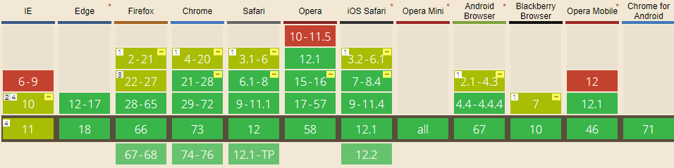
Screenshot and infos taken from caniuse.com
Notes
Internet Explorer before 10 doesn't support Flexbox, while IE 11 only supports the 2012 syntax.
Known issues
- IE 11 requires a unit to be added to the third argument, the flex-basis property see MSFT documentation.
- In IE10 and IE11, containers with
display: flexandflex-direction: columnwill not properly calculate their flexed childrens' sizes if the container hasmin-heightbut no explicitheightproperty. See bug. - In IE10 the default value for
flexis0 0 autorather than0 1 autoas defined in the latest spec. - IE 11 does not vertically align items correctly when
min-heightis used. See bug.
Workarounds
Flexbugs is a community-curated list of Flexbox issues and cross-browser workarounds for them. Here's a list of all the bugs with a workaround available and the browsers that affect.
- Minimum content sizing of flex items not honored
- Column flex items set to
align-items: centeroverflow their container min-heighton a flex container won't apply to its flex itemsflexshorthand declarations with unitlessflex-basisvalues are ignored- Column
flexitems don't always preserve intrinsic aspect ratios - The default flex value has changed
flex-basisdoesn't account forbox-sizing: border-boxflex-basisdoesn't supportcalc()- Some HTML elements can't be flex containers
align-items: baselinedoesn't work with nested flex containers- Min and max size declarations are ignored when wrapping flex items
- Inline elements are not treated as flex-items
- Importance is ignored on flex-basis when using flex shorthand
- Shrink-to-fit containers with
flex-flow: column wrapdo not contain their items - Column flex items ignore
margin: autoon the cross axis flex-basiscannot be animated- Flex items are not correctly justified when
max-widthis used
Internet Explorer 11 flexbox issues
Simply adding 100% width to the body fixed my problem.
Flex-wrap does not wrap items in IE11
You could refer to this code sample. The image is original size at first and the left and right parts are of the same width. It works well in IE 11 :
.d1 {
  display: flex;
  flex-wrap: wrap;
  padding: 4%;
}

.image-container {
  align-items: center;
  display: flex;
  flex: 1;
  justify-content: center;
  min-width: 200px;
}

.d1 .text {
  flex: 1;
  padding: 2%;
}

/* adjustment */
img {
  width: 100%;
  height: auto;
  max-width: 300px;
}
<div class="d1">
<div class="image-container">
<img src="https://emilythompsonflowers.com/wp-content/uploads/2016/08/hippie-flower-300x300.jpg">
</div>
<div class="text">
Lorem ipsum dolor sit amet, consectetur adipisicing elit, sed do eiusmod tempor incididunt ut labore et dolore magna aliqua. Ut enim ad minim veniam, quis nostrud exercitation ullamco laboris nisi ut aliquip ex ea commodo consequat. Duis aute irure dolor
in reprehenderit in voluptate velit esse cillum dolore eu fugiat nulla pariatur. Excepteur sint occaecat cupidatat non proident, sunt in culpa qui officia deserunt mollit anim id est laborum.
</div>
</div>Related Topics
Generate Random Color with Pure CSS (No JavaScript)
CSS Background-Position Animate Right to Left
Font Awesome Animated Spinner Through Background
How to Make a Text Go onto The Next Line If It Overflows
CSS Variables with Background-Image Url
Styling: :-Webkit-Scrollbar-Track Not Working
Can Visual Studio 2013 Generate CSS Files from .Less Files
Responsive CSS - Target 1024 X 768 Screen Size Only
Twitter Bootstrap & Google Maps
Why Is Transition on 'Margin' and 'Padding' Laggy in Webkit Browsers
CSS Sprites with Dynamic Sizing
CSS 2.1 Spec: 8.3.1 Collapsing Margins: Cannot Properly Interpret Special Case: Clarification Sought
Why Can't an <Ul> (With Absolute Position) Inside a <Li> (With Relative Position) Auto Size
Rotating Glyphicons/Font Awesome in Bootstrap
Min-Width for Column in Bootstrap Grid System
How to Align Text to The Middle of an Element with CSS in Twitter Bootstrap