javafx 2 and css pseudo-classes: setting hover attributes in setStyle method
As you note in your question, as of JavaFX 2.2, the css pseudoclasses aren't exposed as part of the public API you can use for style manipulation inside Java code.
If you want to change style attributes from Java code without using a stylesheet, you need to set the styles based on events or changelisteners. There are a couple of options in the sample below.
import javafx.application.Application;
import javafx.beans.binding.*;
import javafx.beans.property.SimpleStringProperty;
import javafx.event.EventHandler;
import javafx.geometry.Pos;
import javafx.scene.*;
import javafx.scene.control.Button;
import javafx.scene.input.MouseEvent;
import javafx.scene.layout.*;
import javafx.stage.Stage;

/** Changing button styles on hover without a css stylesheet. */
public class ButtonBackgroundChanger extends Application {
  private static final String STANDARD_BUTTON_STYLE = "-fx-background-color: #DDFFA4;";
  private static final String HOVERED_BUTTON_STYLE  = "-fx-background-color: #9ACD32;";

  public static void main(String[] args) throws Exception { launch(args); }
  @Override public void start(final Stage stage) throws Exception {
    Button configure = new Button("Configure");
    changeBackgroundOnHoverUsingBinding(configure);
    Button update = new Button("Update");
    changeBackgroundOnHoverUsingEvents(update);

    VBox layout = new VBox(10);
    layout.setAlignment(Pos.CENTER);
    layout.setStyle("-fx-padding: 10;");
    layout.getChildren().addAll(configure, update);
    stage.setScene(new Scene(layout));
    stage.show();
  }

  private void changeBackgroundOnHoverUsingBinding(Node node) {
    node.styleProperty().bind(
      Bindings
        .when(node.hoverProperty())
          .then(
            new SimpleStringProperty(HOVERED_BUTTON_STYLE)
          )
          .otherwise(
            new SimpleStringProperty(STANDARD_BUTTON_STYLE)
          )
    );
  }

  public void changeBackgroundOnHoverUsingEvents(final Node node) {
    node.setStyle(STANDARD_BUTTON_STYLE);
    node.setOnMouseEntered(new EventHandler<MouseEvent>() {
      @Override public void handle(MouseEvent mouseEvent) {
        node.setStyle(HOVERED_BUTTON_STYLE);
      }
    });
    node.setOnMouseExited(new EventHandler<MouseEvent>() {
      @Override public void handle(MouseEvent mouseEvent) {
        node.setStyle(STANDARD_BUTTON_STYLE);
      }
    });
  }
}
I'd only really do it in code rather than a stylesheet if colors needed to be really dynamic making use of stylesheets with predefined colors and styles problematic, or if there was some other aversion to using css stylesheets.
In JavaFX 8 there is be a public API which allows you (if you want to) to manipulate Region background colors without use of CSS.
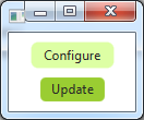
Sample program output (with the Update button hovered):
JavaFX hover only when not selected CSS
I have same problem, try this one :
.my-class-name:hover
{
    .fx-background-color: red;
}
.my-class-name:selected
{
    .fx-background-color: blue;
}
.my-class-name:selected:hover
{
    .fx-background-color: blue;
}
JavaFX .setStyle inline sub elements
For what I have, I like this solution better.
comboBox.setCellFactory(new Callback<ListView<String>, ListCell<String>>() {
    public ListCell<String> call(ListView<String> param) {
        return new ListCell<String>() {
            protected void updateItem(String item, boolean empty) {
                super.updateItem(item, empty);
                setText(item);
                setBackground(new Background(new BackgroundFill(Color.BLACK, CornerRadii.EMPTY, Insets.EMPTY)));
                setTextFill(Color.BLUE);
            }
        };
    }
});
Setting background color of listcell but keeping :hover :selected background colors
The quick solution will be
cell.setStyle("-fx-control-inner-background: red");
where -fx-control-inner-background is not a JavaFX CSS property, but a predefined color in caspian.css (for JavaFX 2).
However, the proper approach will be customizing the style through CSS file by overriding the related selectors of listview/listcell.
Additionally keep in mind, the background color of :odd rows of listview are derived ones from the above mentioned -fx-control-inner-background. And since the pseudo classes (:focused, :hover, :odd etc.) cannot be set through setStlyle(), you need to override it in CSS file, if you want it to be another color or no color definition at all.
Less CSS trickery for hover and multiple fonts on button with round edges
You can use setGraphic(Node node); method of Button class to set your custom labels on button. Here is an example,
Label header = new Label("A Prideful Header");
header.getStyleClass().addAll("header");

Label footer = new Label("a humble footer");
footer.getStyleClass().addAll("footer");

VBox box = new VBox();
box.getChildren().addAll(header,footer);

Button button = new Button();
button.setGraphic(box);
javafx - override root css attributes
In general, your best bet for figuring out CSS settings is to look at the source code for the default stylesheet.
For example, font colors are actually managed by automatically selecting from one of three fixed font colors, depending on the intensity of the background (so you don't end up with white text on a white background, for example):
/* One of these colors will be chosen based upon a ladder calculation
 * that uses the brightness of a background color.  Instead of using these
 * colors directly as -fx-text-fill values, the sections in this file should
 * use a derived color to match the background in use.  See also:
 *
 * -fx-text-base-color for text on top of -fx-base, -fx-color, and -fx-body-color
 * -fx-text-background-color for text on top of -fx-background
 * -fx-text-inner-color for text on top of -fx-control-inner-color
 * -fx-selection-bar-text for text on top of -fx-selection-bar
 */
-fx-dark-text-color: black;
-fx-mid-text-color: #333;
-fx-light-text-color: white;
So you can override these with something like
.root {
    -fx-dark-text-color: navy;
    -fx-mid-text-color: blue;
    -fx-light-text-color: lightskyblue;
}
in an external style sheet, and it will change the font color for the whole application. (If you're certain your backgrounds will never be a problem, you could make them all the same color, but I wouldn't recommend that.)
The properties set here are actually "looked-up colors". Since values of looked-up colors are inherited from the parent node, these values will apply to the entire scene graph.
If you want to do this from code, you can achieve the same with
root.setStyle(
    "-fx-dark-text-color:  navy ;"+
    "-fx-mid-text-color:   blue ;"+
    "-fx-light-text-color: lightskyblue ;");
javafx: change style dynamically on pane
The functionality you're looking for is already implemented with the hover pseudoclass. So you can just do
.myPane {
    /* do something */
}
.myPane:hover {
    /* do something else */
}
In general, though it's not necessary in this case, you can define arbitrary CSS pseudoclasses (which will work like selected and hover). To reproduce the hover functionality, for example, you can do:
PseudoClass moveOver = PseudoClass.getPseudoClass("mouse-over");
Pane myPane = new Pane();
myPane.getStyleClass().add("my-pane");
myPane.setOnMouseEntered(e -> myPane.pseudoClassStateChanged(mouseOver, true));
myPane.setOnMouseExited(e -> myPane.pseudoClassStateChanged(mouseOver, false));
and then you can use the following CSS:
.my-pane {
    -fx-background-color: white ;
}
.my-pane:mouse-over {
    -fx-background-color: yellow ;
}
Note the pseudoclass name in the CSS (:mouse-over) matches the string passed to the getPseudoClass method (PseudoClass.getPseudoClass("mouse-over")), and can be any string that is valid to use as a CSS identifier.
JavaFX TitledPane changed title background is reset on mouse entered
Setting inline CSS styling takes the priority over from the styles in css file. So applying the background through setStyle will do the trick.
button.setOnAction(event -> {
            final Node node = titledPane.lookup(".title");
            if (button.isSelected()) {
                node.setStyle("-fx-background-color:#00ff11;");
            } else {
                node.setStyle(null);
            }
        });
UPDATE:
However, a bit more details on the actual problem. To understand this, you need to first know how the background of .title is defined internally and how the hover styling is set.
Internally in Modena.css below are the styling for the background of .title:
.titled-pane > .title {
    -fx-background-color:
        linear-gradient(to bottom,
            derive(-fx-color,-15%) 95%,
            derive(-fx-color,-25%) 100%
        ),
        -fx-inner-border, -fx-body-color;
    -fx-background-insets: 0, 1, 2;
    -fx-background-radius: 3 3 0 0, 2 2 0 0, 1 1 0 0;
    -fx-padding: 0.3333em 0.75em 0.3333em 0.75em; /* 4 9 4 9 */
}

.titled-pane > .title:hover {
    -fx-color: -fx-hover-base;
}
If you notice the actual background is derived from -fx-color, -fx-inner-border & -fx-body-color. However -fx-inner-border & -fx-body-color are indeed again derived from -fx-color only.
-fx-inner-border: linear-gradient(to bottom,
                ladder(
                    -fx-color,
                    derive(-fx-color,30%) 0%,
                    derive(-fx-color,20%) 40%,
                    derive(-fx-color,25%) 60%,
                    derive(-fx-color,55%) 80%,
                    derive(-fx-color,55%) 90%,
                    derive(-fx-color,75%) 100%
                ),
                ladder(
                    -fx-color,
                    derive(-fx-color,20%) 0%,
                    derive(-fx-color,10%) 20%,
                    derive(-fx-color,5%) 40%,
                    derive(-fx-color,-2%) 60%,
                    derive(-fx-color,-5%) 100%
                ));

-fx-body-color: linear-gradient(to bottom,
            ladder(
                -fx-color,
                derive(-fx-color,8%) 75%,
                derive(-fx-color,10%) 80%
            ),
            derive(-fx-color,-8%));
In the :hover pseudo state, the -fx-color is changed to -fx-hover-base and the background is updated accordingly. There lies your problem. You are setting only the default background programatically. On mouse over the .title, it still picks the internally CSS file styling (as you have not defined your custom one for hover).
If we manage to update the -fx-color attribute, then it will take care of the corresponding css updates for different pseudo states.
A more correct approach for your requirement will be as below: this way you can still get the nice gradient features of title which are internally defined.
button.setOnAction(event -> {
            final Node node = titledPane.lookup(".title");
            if (button.isSelected()) {
                node.setStyle("-fx-color:#00ff11;");
            } else {
                node.setStyle(null);
            }
        });

// In css file
.titled-pane > .title {
    -fx-color: -primary-border-color;
    -fx-background-insets: 0;
    -fx-background-radius: 0 0 0 0;
    -fx-padding: 0.2em 0.2em 0.2em 0.2em;
}
UPDATE 2:
Please find below an example for TitledPane inside another TitledPane.
import javafx.application.Application;
import javafx.geometry.Insets;
import javafx.scene.Node;
import javafx.scene.Scene;
import javafx.scene.control.Button;
import javafx.scene.control.Label;
import javafx.scene.control.TitledPane;
import javafx.scene.control.ToggleButton;
import javafx.scene.layout.VBox;
import javafx.stage.Stage;

import java.util.Set;

public class TitledPaneApplication extends Application {

    public static void main(String[] args) {
        launch(args);
    }

    @Override
    public void start(Stage primaryStage) throws Exception {
        final VBox root = new VBox();
        root.setSpacing(10);

        final TitledPane titledPane = new TitledPane();
        titledPane.setText("Title");

        final String titleBackgroundValue = "#00ff11";
        final ToggleButton button = new ToggleButton("Change");
        button.setOnAction(event -> {
            final Set<Node> node = titledPane.lookupAll(".title");
            if (button.isSelected()) {
                node.forEach(n->n.setStyle("-fx-color:#00ff11;"));
            } else {
                node.forEach(n->n.setStyle(null));
            }
        });
        button.setSelected(false);

        VBox inner = new VBox();
        inner.setSpacing(10);
        inner.setPadding(new Insets(10));
        final TitledPane innerTP = new TitledPane();
        innerTP.setText("Inner Title");
        inner.getChildren().addAll(new Label("Inner"),innerTP);
        innerTP.setContent(new Button("Dummy Button"));

        titledPane.setContent(inner);

        root.getChildren().addAll(button,titledPane);
        final Scene scene = new Scene(root, 400, 400);
        scene.getStylesheets().add(getClass().getResource("light.css").toExternalForm());
        primaryStage.setScene(scene);
        primaryStage.setTitle("TestApplication");
        primaryStage.show();
    }
}
Related Topics
Stretch List Items <Li> to Fill The Width of <Ul>
Set The Same Value to Multiple Properties (CSS)
Lesscss Method with Ie Filter Alpha Opacity CSS
Regression Testing for Styling and Layout of Web Applications
Angular Material Overriding Default Style of Snackbar Component
Rotating Glyphicons/Font Awesome in Bootstrap
Gulp-Sass Fails to Compile SCSS File
Textfield CSS Styling Using Javafx
Fontawesome Instagram Icon - Colorized
Resizing Buttons in Twitter-Bootstrap
CSS - Centering a Page - Then Making The Page 100% Height
Getting Image to Stretch a Div
In Sass, What's The Difference Between The @Mixin and @Extend Directives
How to Make a Text Go onto The Next Line If It Overflows
Bootstrap 4: How to Have a Full Width Navbar with The Content in a Container (Like The So Navbar)