Zig zag border for a circle?
I would consider using SVG with some rotation and use them as backgrounds.
Here is an attempt that can give you an idea about how it can be done. Basically, the SVG is the same and we simply repeat and rotate until we get the full shape. The main trick is to find the correct values:
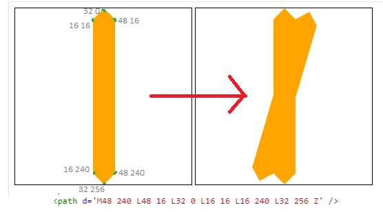
Here is the final code:
.zigzag {   width:256px;   height:256px;   background:    url("data:image/svg+xml;utf8,<svg xmlns='http://www.w3.org/2000/svg' viewBox='-97 0 256 256' fill='orange' width='256'> <path d='M48 240 L48 16 L32 0 L16 16 L16 240 L32 256 Z' /></svg>"),    url("data:image/svg+xml;utf8,<svg xmlns='http://www.w3.org/2000/svg' viewBox='-97 0 256 256' fill='orange' width='256' style='transform:rotate(16.36deg);'> <path  d='M48 240 L48 16 L32 0 L16 16 L16 240 L32 256 Z' /></svg>"),    url("data:image/svg+xml;utf8,<svg xmlns='http://www.w3.org/2000/svg' viewBox='-97 0 256 256' fill='orange' width='256' style='transform:rotate(32.73deg);'> <path  d='M48 240 L48 16 L32 0 L16 16 L16 240 L32 256 Z' /></svg>"),    url("data:image/svg+xml;utf8,<svg xmlns='http://www.w3.org/2000/svg' viewBox='-97 0 256 256' fill='orange' width='256' style='transform:rotate(49.09deg);'> <path  d='M48 240 L48 16 L32 0 L16 16 L16 240 L32 256 Z' /></svg>"),    url("data:image/svg+xml;utf8,<svg xmlns='http://www.w3.org/2000/svg' viewBox='-97 0 256 256' fill='orange' width='256' style='transform:rotate(65.45deg);'> <path  d='M48 240 L48 16 L32 0 L16 16 L16 240 L32 256 Z' /></svg>"),    url("data:image/svg+xml;utf8,<svg xmlns='http://www.w3.org/2000/svg' viewBox='-97 0 256 256' fill='orange' width='256' style='transform:rotate(81.81deg);'> <path  d='M48 240 L48 16 L32 0 L16 16 L16 240 L32 256 Z' /></svg>"),    url("data:image/svg+xml;utf8,<svg xmlns='http://www.w3.org/2000/svg' viewBox='-97 0 256 256' fill='orange' width='256' style='transform:rotate(98.18deg);'> <path  d='M48 240 L48 16 L32 0 L16 16 L16 240 L32 256 Z' /></svg>"),    url("data:image/svg+xml;utf8,<svg xmlns='http://www.w3.org/2000/svg' viewBox='-97 0 256 256' fill='orange' width='256' style='transform:rotate(114.54deg);'> <path  d='M48 240 L48 16 L32 0 L16 16 L16 240 L32 256 Z' /></svg>"),    url("data:image/svg+xml;utf8,<svg xmlns='http://www.w3.org/2000/svg' viewBox='-97 0 256 256' fill='orange' width='256' style='transform:rotate(130.90deg);'> <path  d='M48 240 L48 16 L32 0 L16 16 L16 240 L32 256 Z' /></svg>"),    url("data:image/svg+xml;utf8,<svg xmlns='http://www.w3.org/2000/svg' viewBox='-97 0 256 256' fill='orange' width='256' style='transform:rotate(147.27deg);'> <path  d='M48 240 L48 16 L32 0 L16 16 L16 240 L32 256 Z' /></svg>"),    url("data:image/svg+xml;utf8,<svg xmlns='http://www.w3.org/2000/svg' viewBox='-97 0 256 256' fill='orange' width='256' style='transform:rotate(164.2deg);'> <path  d='M48 240 L48 16 L32 0 L16 16 L16 240 L32 256 Z' /></svg>");    background-size:100% 100%;        font-size:28px;    line-height:256px;    color:#fff;    text-align:center;}
body { background:pink;}
<div class="zigzag">zig zag circle</div>How to add zigzag border to circular image view
Simple example using straight lines (curves are more complex, and I'd recommend creating a mask in a drawing program if that's what you need!).
This code assumes a UIImageView in a storyboard...
class DemoViewController: UIViewController {

    @IBOutlet weak var imageView: UIImageView!

    override func viewDidLoad() {
        super.viewDidLoad()
        setImageMask()
    }

    func setImageMask() {

        // Set the center and radius (pure circle rather than rectangle)
        let center = CGPoint(x: imageView.bounds.midX, y: imageView.bounds.midY)
        let radius = min(imageView.bounds.midX, imageView.bounds.midY)

        // Inset radius is the amount that the inner points are inset by
        let insetRadius: CGFloat = radius * 0.85

        // Calculate the segment arc sizes
        let numberOfPoints = 17
        let segmentArcSize = 360.0 / CGFloat(numberOfPoints)
        let arcMid = segmentArcSize / 2.0

        // Start at the top of the circle, but subtract half an arc so the outer point is at the top
        var angle = -90.0 - arcMid

        // Create the path
        let path = UIBezierPath()

        // Move to the inner starting point
        let startPoint = CGPoint(x: center.x + insetRadius * cos(angle.toRadians()) , y: center.y + insetRadius * sin(angle.toRadians()))
        path.move(to: startPoint)

        // Loop and draw the jagged points around the circlw
        for _ in 0 ..< numberOfPoints {

            // Outer point
            let midAngle = angle + arcMid
            let midPoint = CGPoint(x: center.x + radius * cos(midAngle.toRadians()), y: center.y + radius * sin(midAngle.toRadians()))
            path.addLine(to: midPoint)

            // Inner point
            let endAngle = angle + segmentArcSize
            let endPoint = CGPoint(x: center.x + insetRadius * cos(endAngle.toRadians()) , y: center.y + insetRadius * sin(endAngle.toRadians()))
            path.addLine(to: endPoint)
            angle += segmentArcSize
        }

        // End drawing
        path.close()

        // Mask the image view
        let mask = CAShapeLayer()
        mask.path = path.cgPath
        imageView.layer.mask = mask
    }

}

extension CGFloat {

    // Convert degrees to radians

    func toRadians() -> CGFloat {
        return self * CGFloat.pi / 180.0
    }
}
Wavy border css for a circle
Based on a previous answer where I created something similar zig-zag-border-for-a-circle you can do some adjustement to have this layout. Basically, I added stroke to the SVG element then I added a radial gradient to cover the non needed part. By the way it's a solution without transparency.
.zigzag {   width:256px;   height:256px;   background:    radial-gradient(#fff 60%,transparent 61%),    url("data:image/svg+xml;utf8,<svg xmlns='http://www.w3.org/2000/svg' viewBox='-97 -3 256 262' fill='white' width='256'> <path d='M48 240 L48 16 L32 0 L16 16 L16 240 L32 256 Z' stroke='red' stroke-width='3' /></svg>"),    url("data:image/svg+xml;utf8,<svg xmlns='http://www.w3.org/2000/svg' viewBox='-97 -3 256 262' fill='white' width='256' style='transform:rotate(16.36deg);'> <path  d='M48 240 L48 16 L32 0 L16 16 L16 240 L32 256 Z' stroke='red' stroke-width='3' /></svg>"),    url("data:image/svg+xml;utf8,<svg xmlns='http://www.w3.org/2000/svg' viewBox='-97 -3 256 262' fill='white' width='256' style='transform:rotate(32.73deg);'> <path  d='M48 240 L48 16 L32 0 L16 16 L16 240 L32 256 Z' stroke='red' stroke-width='3' /></svg>"),    url("data:image/svg+xml;utf8,<svg xmlns='http://www.w3.org/2000/svg' viewBox='-97 -3 256 262' fill='white' width='256' style='transform:rotate(49.09deg);'> <path  d='M48 240 L48 16 L32 0 L16 16 L16 240 L32 256 Z' stroke='red' stroke-width='3' /></svg>"),    url("data:image/svg+xml;utf8,<svg xmlns='http://www.w3.org/2000/svg' viewBox='-97 -3 256 262' fill='white' width='256' style='transform:rotate(65.45deg);'> <path  d='M48 240 L48 16 L32 0 L16 16 L16 240 L32 256 Z' stroke='red' stroke-width='3' /></svg>"),    url("data:image/svg+xml;utf8,<svg xmlns='http://www.w3.org/2000/svg' viewBox='-97 -3 256 262' fill='white' width='256' style='transform:rotate(81.81deg);'> <path  d='M48 240 L48 16 L32 0 L16 16 L16 240 L32 256 Z' stroke='red' stroke-width='3' /></svg>"),    url("data:image/svg+xml;utf8,<svg xmlns='http://www.w3.org/2000/svg' viewBox='-97 -3 256 262' fill='white' width='256' style='transform:rotate(98.18deg);'> <path  d='M48 240 L48 16 L32 0 L16 16 L16 240 L32 256 Z' stroke='red' stroke-width='3' /></svg>"),    url("data:image/svg+xml;utf8,<svg xmlns='http://www.w3.org/2000/svg' viewBox='-97 -3 256 262' fill='white' width='256' style='transform:rotate(114.54deg);'> <path  d='M48 240 L48 16 L32 0 L16 16 L16 240 L32 256 Z' stroke='red' stroke-width='3' /></svg>"),    url("data:image/svg+xml;utf8,<svg xmlns='http://www.w3.org/2000/svg' viewBox='-97 -3 256 262' fill='white' width='256' style='transform:rotate(130.90deg);'> <path  d='M48 240 L48 16 L32 0 L16 16 L16 240 L32 256 Z' stroke='red' stroke-width='3' /></svg>"),    url("data:image/svg+xml;utf8,<svg xmlns='http://www.w3.org/2000/svg' viewBox='-97 -3 256 262' fill='white' width='256' style='transform:rotate(147.27deg);'> <path  d='M48 240 L48 16 L32 0 L16 16 L16 240 L32 256 Z' stroke='red' stroke-width='3' /></svg>"),    url("data:image/svg+xml;utf8,<svg xmlns='http://www.w3.org/2000/svg' viewBox='-97 -3 256 262' fill='white' width='256' style='transform:rotate(164.2deg);'> <path  d='M48 240 L48 16 L32 0 L16 16 L16 240 L32 256 Z' stroke='red' stroke-width='3' /></svg>");    background-size:100% 100%;
    display:inline-block;}
<div class="zigzag"></div><div class="zigzag" style="width:100px;height:100px;"></div><div class="zigzag" style="width:50px;height:50px;"></div>How to make CSS zig-zag borders?
Here is solution. It's called zig-zag border.
http://jsfiddle.net/justinmc/QqnD3/
<div class="container">
    <h1>Content Here</h1>
</div>

.container {
    position: relative;
    padding: 8px 8px 32px 8px;
    background: #dddccf;
}

.container:after {
    background: linear-gradient(-45deg, #ffffff 16px, transparent 0), linear-gradient(45deg, #ffffff 16px, transparent 0);
    background-position: left-bottom;
    background-repeat: repeat-x;
    background-size: 32px 32px;
    content: " ";
    display: block;
    position: absolute;
    bottom: 0px;
    left: 0px;
    width: 100%;
    height: 32px;
}
credits
https://cocreate.localmotors.com/blog/post/zig-zag-borders-in-css/1205/
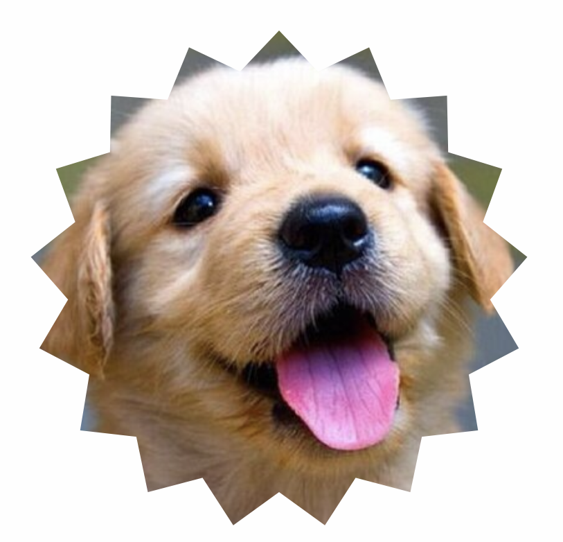
Creating a 'New' spiky label with 24 or above point burst
Canvas Approach
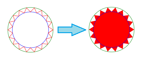
You can also achieve this using Canvas. The commands for drawing on Canvas are pretty much the same as in SVG. The approach, on a very high level, would be to find points on two circles (one with radius as x and another with a slightly smaller radius) and then connect them together to form a path. When the path is filled, it gives the appearance of a n-point burst.
In the below diagram, the green circle is the bigger circle with radius as x and the blue circle is the smaller inner circle. By plotting points on the circles and connecting them (with lineTo commands), we get the path which is in red. When this path is filled we get the burst appearance. (Note: The inner and outer circles are only for illustration and are not drawn in the actual diagram).
Calculation Logic
- The X and Y coordinates of each points on the circle can be calculated using the below formula:
- x = (Radius of circle * Cos(Angle in Radians)) + x coordinate of center
- y = (Radius of circle * Sin(Angle in Radians)) + y coordinate of center
- The angle at which the points are plotted on the circle are determined using the below logic:
- As used in both your and Persijn's answers, the angle is calculated as (360/no. of bursts). 360 is used because it is the total angle within a circle.
- Angle of the points on the inner circle should be half way between point1 and point2 on the larger circle and hence a delta is added to it. The delta is half of (360/no. of bursts)
- Angle in Radians = Angle in Degrees * π / 180
window.onload = function() {  var canvas = document.getElementById('canvas');  var ctx = canvas.getContext('2d');  var defaultBurst = 18;  var defaultContent = "New";
  function paint(numBurst, text) {    if (!numBurst) numBurst = defaultBurst;    if (!text) text = defaultContent;    ctx.clearRect(0, 0, canvas.width, canvas.height);    ctx.fillStyle = 'crimson';    var angleInRad = Math.PI * (360 / numBurst) / 180;    var deltaAngleInRad = angleInRad / 2;    ctx.beginPath();    ctx.moveTo(75, 150);    for (i = 0; i <= numBurst; i++) {      x1 = 75 * Math.cos(angleInRad * i) + 150;      y1 = 75 * Math.sin(angleInRad * i) + 150;      x2 = 60 * Math.cos((angleInRad * i) + deltaAngleInRad) + 150;      y2 = 60 * Math.sin((angleInRad * i) + deltaAngleInRad) + 150;      ctx.lineTo(x1, y1);      ctx.lineTo(x2, y2);    }    ctx.closePath();    /* Add shadow only for shape */    ctx.shadowOffsetX = -5;    ctx.shadowOffsetY = 5;    ctx.shadowBlur = 5;    ctx.shadowColor = "rgba(0, 0, 0, 0.5)";    ctx.fill();    ctx.font = "32px Arial";    ctx.textAlign = "center";    ctx.fillStyle = "gold";    /* Nullify shadow for text */    ctx.shadowOffsetX = 0;    ctx.shadowOffsetY = 0;    ctx.fillText(text, 150, 160, 120);  }  paint();  var slider = document.getElementById('burst');  var textInput = document.getElementById('content');  slider.addEventListener('change', function() {    paint(this.value, textInput.value);  });
  textInput.addEventListener('blur', function() {    paint(slider.value, this.value);  });}
/* For demo only */
.controls { float: right; padding: 5px; margin: 50px 20px; line-height: 25px; border: 1px solid; box-shadow: 1px 1px 0px #222;}label,input { display: inline-block; vertical-align: middle; text-align: left;}h3 { padding: 10px; text-align: center;}label { width: 100px;}input[type='range'],input[type='text'] { width: 100px;}body { font-family: Calibri; background-image: radial-gradient(circle, #3F9CBA 0%, #153346 100%);}<canvas id='canvas' height='300px' width='300px'></canvas><div class='controls'> <h3>Controls</h3>
<label for="burst">Change Burst:</label> <input id="burst" class="slider" type="range" value="18" min="12" max="36" step='2' title="Adjust slider to increase or decrease burst" /> <br/> <label for="content">Text Content:</label> <input type="text" id="content" maxlength="5" /></div>Responsive zig zag layout using css?
I have worked out an extremely complex hack (codepen). You really don't want this in production, though. It also only works for three “hops” (i. e. the stream of elements goes from left to right, bounces, goes back to left, bounces again and goes to eternal void, never to be seen again).
The hack works as follows: first, we calculate the position from left that we need to move our element to, for each possible “hop”. For the first hop, it's $i * 50px ($i being the 0-based index of element), for the second it's 100vw - ($i * 50px - 100vw) == 200vw - $i * 50px (100vw is window width; $i * 50px - 100vw is position of the element relative to the right screen border), and the third is $i * 50px - 200vw.
We now need to calculate max(min($first, $second), $third). Unfortunately, CSS calc() function doesn't allow that, so instead we place a special element before the figure:
.spacer {
  display: inline-block;
  max-width: 50px; /* first */
  min-width: 500px; /* third */
}

.spacer > span {
  display: inline-block;
  max-width: 300px; /* second */
  width: 10000px;
}
(You can play with this spacer thing in a separate codepen.)
Again, this is an extremely complex and slow solution, so you'd better stick with JavaScript for now (unless somebody invents some more clever CSS-only thing that would actually work).
Android bottom zig-zag shape
to draw a dashed line you can use a shape
<shape xmlns:android="http://schemas.android.com/apk/res/android"
 android:shape="line">

<stroke
   android:color="#FF00"
   android:dashWidth="5dp"
   android:dashGap="5dp" />
</shape>
if you want to combine more than one shape then you can use a layer-list and define a shape for every item
Related Topics
Default Web Page Width - 1024Px or 980Px
Linear Fade Out Div, Content and Border (Solid at Top to Transparent at Bottom)
Max-Height and Max-Width with CSS Only
How to Edit CSS in Chrome Like in Firebug for Firefox
Best Unit for Font-Sizes in CSS
What Does The 'P-N' and Its Variants Represent in Bootstrap V4
How to Remove Unused Styles from Twitter Bootstrap
How to Break Long Words in a Table Td
Using CSS Text-Overflow to Vary The Number of Lines of Text Within an Element of a Set Height
How to Add Image Background to Btn-Default Twitter-Bootstrap Button
Two Divs Inside Div. How to Auto-Fill The Space of Parent Div by Second Div
How to Override Scoped Styles in Vue Components
Rotating Glyphicons/Font Awesome in Bootstrap