Is there a working implementation of CSS3 Grid Layout for Webkit?
http://caniuse.com/css-grid
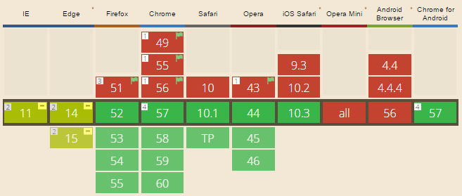
As of March 2017, quite a few browsers now support CSS Grid Layout:
old answer:
There's something in the works, here is the full issue tree for it's implementation:
https://bugs.webkit.org/showdependencytree.cgi?id=60731&hide_resolved=0
Here's some CSS from this file:
.gridWithFixed {
    display: -webkit-grid;
    -webkit-grid-columns: 7px 11px;
    -webkit-grid-rows: 17px 2px;
}
You can see the intent. Unfortunately, they've only got as far as parsing the CSS.
So, it looks like right now there's no working implementation of this for WebKit.
While Grid Layout has very poor support, Flexbox has decent support (apparently, including IE10). I suggest you use Flexbox instead.
Browser support for CSS Grid
Browser Support for CSS Grid
- Chrome - full support as of March 8, 2017 (version 57)
- Firefox - full support as of March 6, 2017 (version 52)
- Safari - full support as of March 26, 2017 (version 10.1)
- Edge - full support as of October 16, 2017 (version 16)
- IE11 - no support for current spec; supports obsolete version
- IE10 - no support for current spec; supports obsolete version
Here's the complete picture: http://caniuse.com/#search=grid (click on "Show all" for more details)
CSS Grid Layout not working in IE11 even with prefixes
IE11 uses an older version of the Grid specification.
The properties you are using don't exist in the older grid spec. Using prefixes makes no difference.
Here are three problems I see right off the bat.
repeat()
The repeat() function doesn't exist in the older spec, so it isn't supported by IE11.
You need to use the correct syntax, which is covered in another answer to this post, or declare all row and column lengths.
Instead of:
.grid {
  display: -ms-grid;
  display: grid;
  -ms-grid-columns: repeat( 4, 1fr );
      grid-template-columns: repeat( 4, 1fr );
  -ms-grid-rows: repeat( 4, 270px );
      grid-template-rows: repeat( 4, 270px );
  grid-gap: 30px;
}
Use:
.grid {
  display: -ms-grid;
  display: grid;
  -ms-grid-columns: 1fr 1fr 1fr 1fr;             /* adjusted */
      grid-template-columns:  repeat( 4, 1fr );
  -ms-grid-rows: 270px 270px 270px 270px;        /* adjusted */
      grid-template-rows: repeat( 4, 270px );
  grid-gap: 30px;
}
Older spec reference:
https://www.w3.org/TR/2011/WD-css3-grid-layout-20110407/#grid-repeating-columns-and-rows
span
The span keyword doesn't exist in the older spec, so it isn't supported by IE11. You'll have to use the equivalent properties for these browsers.
Instead of:
.grid .grid-item.height-2x {
  -ms-grid-row: span 2;
      grid-row: span 2;
}
.grid .grid-item.width-2x {
  -ms-grid-column: span 2;
      grid-column: span 2;
}
Use:
.grid .grid-item.height-2x {
  -ms-grid-row-span: 2;          /* adjusted */
      grid-row: span 2;
}
.grid .grid-item.width-2x {
  -ms-grid-column-span: 2;       /* adjusted */
      grid-column: span 2;
}
Older spec reference:
https://www.w3.org/TR/2011/WD-css3-grid-layout-20110407/#grid-row-span-and-grid-column-span
grid-gap
The grid-gap property, as well as its long-hand forms grid-column-gap and grid-row-gap, don't exist in the older spec, so they aren't supported by IE11. You'll have to find another way to separate the boxes. I haven't read the entire older spec, so there may be a method. Otherwise, try margins.
grid item auto placement
There was some discussion in the old spec about grid item auto placement, but the feature was never implemented in IE11. (Auto placement of grid items is now standard in current browsers).
So unless you specifically define the placement of grid items, they will stack in cell 1,1.
Use the -ms-grid-row and -ms-grid-column properties.
- CSS Grid auto placement in IE/EDGE
- CSS Grid not working in ie11 despite prefixes
- https://www.w3.org/TR/2011/WD-css3-grid-layout-20110407/#automatic-placement-of-grid-items
CSS grid/layout framework with focus on fixed elements and single page full screen layouts
Update 2 (This question seems to evolve!):
Criteria 1 - Switching between full page or inside modal should change the code as little as possible:
Because in this case the width/height of our body is always 100% of the window width/height, if you want your code to be easily adaptable to modals etc., you can always use position:absolute, as without any context this will be relative to the body.
Criteria 2 - The layout should support a multitude of ways to describe width and heights
Here's a JSFiddle that can do almost everything you mention. It uses both percentage and fixed pixel widths on the fixed elements. The first thing to note is that the only change I've had to do is add a box-sizing:border-box to each of our elements. Unlike flexbox, this has good support going back to IE8, and so shouldn't cause any issues. Adding this allows us to add padding to our elements without having to change widths to compensate.
Whilst the left sidebars have a width of 20%, they also have a minimum width of 100 pixels. To prevent the overlap with the main content to the right, we use some simple logic to establish the inverse:
Reaches Min At = Min-width / Width * 100
In our example, our left sidebar therefore reaches a min at 100/20*100 = 500px. Then we use an @media selector to change our main content's width when we reach this window size:
@media(max-width:500px) {
  #scrolling-content {
    left:100px;
  }
}
By changing the window size on the fiddle, you'll notice that our main content area changes colour when you reach the min-size. Now I admit, this might seem confusing, but again, by using a language such as Less you could easily set the width and min-widths as variables, and use a simple function to change your CSS. Now the reason I used the phrase "almost everything" is because this could get much more complex if you wanted to do a similar thing in a modal, but who knows, it could be possible!
A little thing to take away: If you're ever going to use JavaScript to pick up resize events, definitely consider the jQuery debounced resize plugin as you don't want to be doing calculations hundreds of times more than you need to! I'm leaving the extra content in this answer as most is still relevant and historically accurate to your developing question
Update: There's a lot of answers suggesting using Flexboxs, but I really don't think that's a great solution at the minute. Don't get me wrong, I'd love it if FlexBox's were a really viable solution, but at the minute Support for them is terrible, and if you're going to polyfill it for the majority of the web then, you might as well be using any other JavaScript solution, and I don't think JavaScript is the right tool to use for the entire presentation of your page.
I still don't see why your goals are hard to achieve using simple CSS positions. You don't need to use any JavaScript and. I'd argue that it is very manageable. If you're really struggling with maintaining your stylesheets, then why not use something like Sass/SCSS or Less, as you could then create variables, mixins, functions etc., and significantly reduce the number of changes you need to make.
That said, he's a really quick mockup of your solution, working using just pure CSS and HTML. All I'm using is 4 fixed divs, and a simple modification could be made so that the "scrolling content" is not fixed, but just uses margins to be positioned correctly. That would have the added bonus of not having to scroll within the div, but being able to do so against the body.
All the required CSS:
div { position:fixed; }
#top {
    top:0;
    left:0;
    right:0;
    height:40px;
}

#menu {
    top:40px;
    height:40px;
    left:0;
    width:200px;
}

#long-list {
    top:80px;
    left:0;
    width:200px;
    bottom:0;
    overflow-y:auto;
}
#scrolling-content {
    top:40px;
    bottom:0;
    right:0;
    left:200px;
    overflow-y:auto;
}
It's pretty easy to note the repetition of 40px and 200px as the height and width of the menus. With that in mind, you could simply use a dynamic language's variable and define them only once (Less example):
@leftwidth: 200px;

#scrolling-content {
    left:@leftwidth;
}
#menu, #longlist {
    width:@leftwidth;
}
Dispute #1: Frameworks aren't flexible or easy to edit
You mentioned that it's difficult to easily manipulate CSS frameworks, as relying on static content, they have to make decisions over the number of columns to use (in Bootstrap and many other cases they choose 12 as it's easily divisible by 1,2,3,4,6). However, in Bootstrap 2, it's very easy to customise the number of columns. Expect this feature to also exist when Bootstrap 3 RC2 comes out. There are also many resources which allow you to use Less with Bootstrap. That said, it would be fairly routine to create a Less-style flexible fluid-grid system, see demo (Disclaimer: I have no experience with Less, this article helped me with looping):
/* The total number of columns you wish to use */
@columns: 15;
/*
    We loop through and for each create class
   .dynamic-<index>-<columns>
*/
 .looping (@index) when (@index > 0) {
    (~".dynamic-@{index}-@{columns}") {
        width: percentage(@index/@columns);
    }
    .looping(@index - 1);
}
/* Stop and do nothing at 0 */
.looping (0) {}
/* Call our function */
.looping (@columns);
And then your HTML markup simply becomes:
<div class="cf rows">
    <div class="dynamic-4-15">4/15th width</div>
    <div class="dynamic-7-15">7/15th width</div>
</div>
Dispute #2: Percentage-based modals are difficult using CSS
In the comments you mentioned that you "would want the layout to be relative to the dialog width, not the browser window width". Well that's certainly possible too. In fact, it's really easy, and requires almost no change to our code:
#some-modal {
   position:fixed;
   top:10%;
   bottom:10%;
   left:10%;
   right:10%;
}
/* Before this was simply div, and it was fixed, now it's absolute */
#some-modal div {
   position:absolute;
   padding:10px;
}
Related Topics
Difference Between Ng-Class and Ng-Style
Using Cors Headers with CSS Background-Image
Media Queries - CSS Only for iPhone Landscape
Pace.Js "Hide Everything But Pace Until The Page Has Fully Loaded" Local Copy
Remove Less // Comments on Compile
Chrome Devtools Converts All Hex Colors to Rgb
Scss/Sass to CSS in Special Folder with PHPstorm 7 File Watcher
Bootstrap Amazon Style Search Bar
How to Make My <Input Type="Submit" /> an Image
CSS3 Transforms and Transitions (Webkit)
Full Viewport Height Scaling Div Just CSS No Js... Possible
PHP/HTML/CSS - If Firefox, If Chrome, If Safari
How to Hide One Column from Grid in Bootstrap Mobile Version
Set The Same Value to Multiple Properties (CSS)
Change The Colors of The Sphinx Read The Docs Theme