Rem-Based Layouts, Zooming on chrome is inconsistent, PX vs REM
That's because Chrome's behavior of setting a minimum font-size, so if you zoom-out, chrome will set the minimum font-size to 6px (12px for chinese and japanese version). So your div will have a minimum width as it depends on your base font-size (which can't be smaller then chrome's minimum).
See also:
Chrome will increase the font size when zooming out
[Edit] Additional Information:
Chromium Tickets & Discussions On this topic:
https://bugs.chromium.org/p/chromium/issues/detail?id=16875
https://bugs.chromium.org/p/chromium/issues/detail?id=36429
-webkit-text-size-adjust Support Dropped, so the viable solution for this behavior is not reliable anymore:
https://trac.webkit.org/changeset/145168/webkit
Should I use px or rem value units in my CSS?
TL;DR: use px.
The Facts
First, it's extremely important to know that per spec, the CSS
pxunit does not equal one physical display pixel. This has always been true – even in the 1996 CSS 1 spec.CSS defines the reference pixel, which measures the size of a pixel on a 96 dpi display. On a display that has a dpi substantially different than 96dpi (like Retina displays), the user agent rescales the
pxunit so that its size matches that of a reference pixel. In other words, this rescaling is exactly why 1 CSS pixel equals 2 physical Retina display pixels.That said, up until 2010 (and the mobile zoom situation notwithstanding), the
pxalmost always did equal one physical pixel, because all widely available displays were around 96dpi.Sizes specified in
ems are relative to the parent element. This leads to theem's "compounding problem" where nested elements get progressively larger or smaller. For example:body { font-size:20px; }
div { font-size:0.5em; }Gives us:
  <body> - 20px
      <div> - 10px
          <div> - 5px
              <div> - 2.5px
                  <div> - 1.25px
The CSS3
rem, which is always relative only to the roothtmlelement, is now supported on 99.67% of all browsers in use.
The Opinion
I think everyone agrees that it's good to design your pages to be accommodating to everyone, and to make consideration for the visually impaired. One such consideration (but not the only one!) is allowing users to make the text of your site bigger, so that it's easier to read.
In the beginning, the only way to provide users a way to scale text size was by using relative size units (such as ems). This is because the browser's font size menu simply changed the root font size. Thus, if you specified font sizes in px, they wouldn't scale when changing the browser's font size option.
Modern browsers (and even the not-so-modern IE7) all changed the default scaling method to simply zooming in on everything, including images and box sizes. Essentially, they make the reference pixel larger or smaller.
Yes, someone could still change their browser default stylesheet to tweak the default font size (the equivalent of the old-style font size option), but that's a very esoteric way of going about it and I'd wager nobody1 does it. (In Chrome, it's buried under the advanced settings, Web content, Font Sizes. In IE9, it's even more hidden. You have to press Alt, and go to View, Text Size.) It's much easier to just select the Zoom option in the browser's main menu (or use Ctrl++/-/mouse wheel).
1 - within statistical error, naturally
If we assume most users scale pages using the zoom option, I find relative units mostly irrelevant. It's much easier to develop your page when everything is specified in the same unit (images are all dealt with in pixels), and you don't have to worry about compounding. ("I was told there would be no math" – there's dealing with having to calculate what 1.5em actually works out to.)
One other potential problem of using only relative units for font sizes is that user-resized fonts may break assumptions your layout makes. For example, this might lead to text getting clipped or running too long. If you use absolute units, you don't have to worry about unexpected font sizes from breaking your layout.
So my answer is use pixel units. I use px for everything. Of course, your situation may vary, and if you must support IE6 (may the gods of the RFCs have mercy on you), you'll have to use ems anyway.
Chrome will increase the font size when zooming out
See, you used px for the first div and em for the second.
Chrome has a minimum font size and fonts smaller than it will be displayed as that font size only. (see your Chrome Settings)
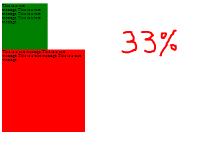
Now, using div with px, the box goes on and becomes even smaller on zooming at 33% (or 25% or 50%) but using em, the box remains the same size when the minimum font-size has been reached. see
em is useful on browsers which implement zooming by scaling the font size like Chrome. So if you size all your elements using em they scale accordingly.
em makes sure that the whole content is displayed as it is even if the size of div changes (on zooming). Hope you got your answer :)
EDIT
In IE10, there's no minimum font size in settings as in GC35. So the em px render like each other.
Why em instead of px?
The reason I asked this question was that I forgot how to use em's as it was a while I was hacking happily in CSS. People didn't notice that I kept the question general as I wasn't talking about sizing fonts per se. I was more interested in how to define styles on any given block element on the page.
As Henrik Paul and others pointed out em is proportional to the font-size used in the element. It's a common practice to define sizes on block elements in px, however, sizing up fonts in browsers usually breaks this design. Resizing fonts is commonly done with the shortcut keys Ctrl++ or Ctrl+-. So a good practice is to use em's instead.
Using px to define the width
Here is an illustrating example. Say we have a div-tag that we want to turn into a stylish date box, we may have HTML-code that looks like this:
<div class="date-box">
    <p class="month">July</p>
    <p class="day">4</p>
</div>
A simple implementation would defining the width of the date-box class in px:
* { margin: 0; padding: 0; }

p.month { font-size: 10pt; }

p.day { font-size: 24pt; font-weight: bold; }

div.date-box {
    background-color: #DD2222;
    font-family: Arial, sans-serif;
    color: white;
    width: 50px;
}
The problem
However, if we want to size the text up in our browser the design will break. The text will also bleed outside the box which is almost the same what happens with SO's design as flodin points out. This is because the box will remain the same size in width as it is locked to 50px.
Using em instead
A smarter way is to define the width in ems instead:
div.date-box {
    background-color: #DD2222;
    font-family: Arial, sans-serif;
    color: white;
    width: 2.5em;
}

* { margin: 0; padding: 0; font-size: 10pt; }

// Initial width of date-box = 10 pt x 2.5 em = 25 pt
// Will also work if you used px instead of pt
That way you have a fluid design on the date-box, i.e. the box will size up together with the text in proportion to the font-size defined for the date-box. In this example, the font-size is defined in * as 10pt and will size up 2.5 times to that font size. So when you're sizing the fonts in the browser, the box will have 2.5 times the size of that font-size.
How do I stop a CSS layout from distorting when zooming in/out?
As this question still gets constant views, I'll post the solution I use currently.
CSS Media Queries:
@media screen and (max-width: 320px) {

/*Write your css here*/

}

@media screen and (max-width: 800px) {

}
Check out:
CSS-Tricks + device sizes and Media Queries
Related Topics
React Routes - Different Styling on Body CSS Tag
How to Format CSS for 8.5X11 Inch Printed Pages
Angular: Updating Scope on Hover
How to Create 3X3 Grid Menu in React Native Without 3Rd Party Lib
How to Vertically Center Align Background Image with Text
Gooey CSS Effects with Contrast Parent
When to Use Gwt Ensureinjected()
White-Space: Nowrap; and Flexbox Did Not Work in Chrome
Left/Right Float Button Inside Div
Glyphicon Works Locally But Not on Heroku
How-To Create Rounded Corners on Table Head Only
How Does CSS Opacity Affect Accessibility
Slide Out Panel with Bootstrap
Why Clear: Right Doesn't Work as Intended
Bootstrap Container with Position:Absolute Loses Layout Inside