Weird behavior when rotating an element on hover
2021: The bug no more occur
It seems a browser bug (at least on Chrome) as it works fine if your try the code on Firefox.
Let refer to the the specification to explain this. Here is all the different cases of how interpolation between transform should work.
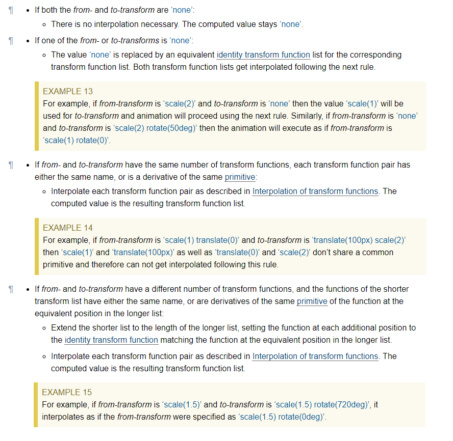
In our case, we will consider the last point where we don't have the same number of transform functions and the browser should handle this by adding the identity transform function from the missing list and in our case it should be rotate(0).
So technically a transition from translate(-50%) to translate(-50%) rotate(360deg) should be the same as a transition from translate(-50%) rotate(0) to translate(-50%) rotate(360deg).
Unless, I am missing something this is for sure a bug as in the case when rotate(360deg) is used alone, Chrome is handling this fine using the second point (when one value is none) which is almost the same as the last point.
Weird behavior of CSS (elements are rotated for 180%)
I believe the problem (at least why it's happening in Firefox 20.0) is that not all of your CSS3 transforms are the same. If you looks closely at your .back and .flipped styles, the value for transform (not any of the vendor-prefixed versions) is actually wrong. Where is should be rotateY(), it is instead solely rotate():
.flipped {
/*transform*/
-webkit-transform:rotateY(180deg);
   -moz-transform:rotateY(180deg);
    -ms-transform:rotateY(180deg);
     -o-transform:rotateY(180deg);
        transform:rotate(180deg); /* This seems wrong... */
}
To fix this, just add in the missing Y to that line for both class style definitions:
.flipped {
/*transform*/
-webkit-transform:rotateY(180deg);
   -moz-transform:rotateY(180deg);
    -ms-transform:rotateY(180deg);
     -o-transform:rotateY(180deg);
        transform:rotateY(180deg); /* Fixed! */
}

.back{
/*transform*/

-webkit-transform:rotateY(180deg);
   -moz-transform:rotateY(180deg);
    -ms-transform:rotateY(180deg);
     -o-transform:rotateY(180deg);
        transform:rotateY(180deg); /* Fixed! */
    z-index:3;
    position:absolute;
}
Here's an updated JSFiddle with the fix. It seems to correct the problem (at least in Firefox 20.0), and still works fine in Google Chrome (so it didn't break anything unexpectedly).
Hope this helps! Let me know if you have any questions.
Strange behaviour with simple HTML and CSS skewY
This seems to be a bug related to interpolation. Set a default rotation equal to 0deg to avoid this:
.background {
  background-color: #DEDEDE;
  width: 200px;
  height: 200px;
  position: relative;
}

.b {
  background-color: #DEDEDE;
  width: 100px;
  height: 100px;
}

.d {
  background-color: red;
  width: 200px;
  height: 2px;
  position: absolute;
  bottom: 99px;
  left: 0px;
}

.line1 {
  height: 200px;
  border-left: 5px solid black;
  position: absolute;
  left: 110px;
  top: 0px;
  transform-origin: -10px 100px;
  transition: transform 1s;
}

.background:hover>.line1 {
  transform: rotateY(180deg);
}

.line2 {
  width: 85px;
  border-top: 7px solid black;
  position: absolute;
  left: 115px;
  top: -17px;
  transform-origin: -15px 0px;
  transform: rotateY(0deg)  skewY(48.5deg);
  transition: transform 1s;
}

.background:hover>.line2 {
  transform: rotateY(180deg) skewY(48.5deg);
}

.line3 {
  width: 85px;
  border-bottom: 7px solid black;
  position: absolute;
  left: 115px;
  top: 210px;
  transform-origin: -15px;
  transform:rotateY(0deg) skewY(-48.5deg);
  transition: transform 1s;
}

.background:hover>.line3 {
  transform: rotateY(180deg) skewY(-48.5deg);
}
<!DOCTYPE html>
<head>
<title>DB</title>
<link href="style.css" rel="stylesheet" type="text/css">
</head>
<body>
<div class="background">
<div class="line1"></div>
<div class="d"></div>
<div class="line2"></div>
<div class="line3"></div>
</div>
</body>Hover not reliable in a relative hierarchy using CSS rotation
It looks like the row was overlapping the object at some points (not all, which is a bit confusing!).
Adding .row { pointer-events: none; }and .object { pointer-events: all; } fixes the problem:
.master {  perspective: 500px;  width: 200px;  height: 100px;}
.container {    transform: rotateX(50deg);    transform-style: preserve-3d;}
.row {  width: 200px;  background: darkgray;  padding: 20px;  pointer-events: none;}
.tile {  height: 150px;  width: 80px;  margin-left: 60px;  margin-right: 60px;  background: #505050;  position: relative;}
.object {  position: absolute;  height: 140px;  width: 70px;  margin: 5px;  background: orange;  pointer-events: all;}
.object:hover {  background: red;}
<div class="master"> <div class="container"> <div class="row"> <div class="tile"> <div class="object"/> </div> </div> </div></div>Issue with CSS3 rotation
After a few mugs of coffee, I finally managed to do it. What I did was to remove the pointer and the circle completely from the SVG element and remake them in a pure CSS:
.svg-pointer {
    width: 0;
    height: 0;
    border-style: solid;
    border-width: 0 45.5px 46px 45.5px;
    border-color: transparent transparent #4e4e4e transparent;
    position: absolute;
    top: 125px;
    left: 306px;
    transform-origin: 50% 227px;
}

.svg-circle {
    width: 379px;
    height: 379px;
    border-radius: 999px;
    background: #4e4e4e;
    position: absolute;
    top: 161px;
    left: 159px;
}
The rest is just a javascript transition manipulation. You can see the whole solution here:
http://jsfiddle.net/3c7zf4uq/7/
Also, I would like to point to this very helpful article which helped me a lot: http://demosthenes.info/blog/860/Animating-Elements-In-Arcs-Circles-and-Ellipses-With-CSS
I hope that it would help someone with similar problems :)
Rotate Image on hover fails
This way of styling doesn't detect hovers, hence use useState to set the hover state of the image (import it using import { useState } from "react";)
const [isHover, setIsHover] = useState(false);
Now, check if the Box is hovered or not, if hovered, set isHover to true, if not hovered, set it to false.
<Box
  style={styles.hoverRotate}
  onMouseEnter={() => setIsHover(true)}
  onMouseLeave={() => setIsHover(false)}
>
  {/* code */}
</Box>
Move your styles into the Rotate function. You are not assigning the key "hoverRotate img" to any of the styles hence it doesn't get applied. So change its name to something like image and add the hover code conditionally to it as shown below. The reason for moving styles into the Rotate function so that isHover stays in scope to get it's value.
const styles = {
  hoverRotate: {
    overflow: "hidden",
    margin: "8px",
    minWidth: "240px",
    maxWidth: "320px",
    width: "100%"
  },

  image: {
    transition: "all 0.3s",
    boxSizing: "border-box",
    maxWidth: "100%",
    transform: isHover && "scale(1.3) rotate(5deg)"
  }
};
Finally, set the image style to Image
<Image
  src="https://picsum.photos/id/669/600/800.jpg"
  style={styles.image}
/>
Checkout this sandbox: https://codesandbox.io/s/distracted-matan-c43ufb?file=/src/App.js:829-928
Edge browser: Jerking movement at the end of transition only when skew and translate are used together
Try to add the default values before the hover. There is probably an interpolation issue.
.button {  display: inline-block;  border: none;  background: transparent;  position: relative;  color: #212121;  font-size: 19px;  line-height: 1;  padding: 0;  margin: 30px;  text-decoration: none;  font-weight: 400;  cursor: pointer;  z-index: 2;  transition: .3s;  transition-timing-function: cubic-bezier(.82, .21, .27, .81);}
.button-bg {  position: absolute;  padding: 30px;  height: 50px;  border-radius: 0;  left: -30px;  right: -30px;  top: 50%;  transform: translateY(-50%) scaleY(1) scaleX(1) skewY(0deg);  z-index: -1;  transition: .4s;  transition-timing-function: cubic-bezier(.82, .21, .27, .81);  transform-origin: center;  border: 2px solid #212121;}
a.button:hover .button-bg {  transform: translateY(-50%) scaleY(2) scaleX(1.4) skewY(10deg);  transform-origin: center;  border: 2px solid transparent;  box-shadow: 0px 0px 20px 0px rgba(48, 48, 48, 0.6);}
<a class="button case-readmore" href="#"> Read Case <span class="button-bg"></span> </a>Related Topics
Sap.Ui.Table.Table: Visiblerowcountmode="Auto" Not Working with Vbox (Flexbox)
Positioning Context on Table-Cell Element in Firefox
How to Use Helvetica Neue Condensed Bold in CSS
Example of Selector Grouping and Contextual Selector on CSS
CSS Transform Causes Flicker in Safari, But Only When the Browser Is >= 2000Px Wide
Perfect 100% Width of Parent Container for a Bootstrap Input
What Are Good Resolution Values to Use with Media Queries
Bootstrap Fullscreen Layout with 100% Height
Styling Twitter's Bootstrap 3.X Buttons
Vue Cli 3 - Use Background Image in Style Tag
Compass: Generate Sprites, Plus Width/Height on Each Images in the Sprite
How to Select the Element Prior to a Last Child
Css: Auto Height on Containing Div, 100% Height on Background Div Inside Containing Div
Centering an Image in a Paragraph
What Does a Space Preceding :Nth-Child(N) Do
Set Line-Height as a Percentage Relative to the Parent Element