Perfect 100% width of parent container for a Bootstrap input?
Applying the input-block-level class works great for me, across various screen widths. It is defined by Bootstrap in mixins.less as follows:
// Block level inputs
.input-block-level {
  display: block;
  width: 100%;
  min-height: 28px;        // Make inputs at least the height of their button counterpart
  .box-sizing(border-box); // Makes inputs behave like true block-level elements
}
This is very similar to the style suggested by 'assembler' in his comment on issue #1058.
Make Bootstrap input group full width
According to bootstrap example you need to add input-group-btn element.
For Example.
<div class="input-group">
  <input type="text" class="form-control" aria-label="...">
  <div class="input-group-btn">
    <select class="form-control">
      <option selected="">seconds</option>
      <option>minutes</option>
      <option>hours</option>
      <option>days</option>
      <option>weeks</option>
    </select>
  </div>
</div>
Fiddle here
Bootstrap full-width text-input within inline-form
The bootstrap docs says about this:
Requires custom widths Inputs, selects, and textareas are 100% wide by
default in Bootstrap. To use the inline form, you'll have to set a
width on the form controls used within.
The default width of 100% as all form elements gets when they got the class form-control didn't apply if you use the form-inline class on your form.
You could take a look at the bootstrap.css (or .less, whatever you prefer) where you will find this part:
.form-inline {

  // Kick in the inline
  @media (min-width: @screen-sm-min) {
    // Inline-block all the things for "inline"
    .form-group {
      display: inline-block;
      margin-bottom: 0;
      vertical-align: middle;
    }

    // In navbar-form, allow folks to *not* use `.form-group`
    .form-control {
      display: inline-block;
      width: auto; // Prevent labels from stacking above inputs in `.form-group`
      vertical-align: middle;
    }
    // Input groups need that 100% width though
    .input-group > .form-control {
      width: 100%;
    }

    [...]
  }
}
Maybe you should take a look at input-groups, since I guess they have exactly the markup you want to use (working fiddle here):
<div class="row">
   <div class="col-lg-12">
    <div class="input-group input-group-lg">
      <input type="text" class="form-control input-lg" id="search-church" placeholder="Your location (City, State, ZIP)">
      <span class="input-group-btn">
        <button class="btn btn-default btn-lg" type="submit">Search</button>
      </span>
    </div>
  </div>
</div>
CSS Input with width: 100% goes outside parent's bound
According to the CSS basic box model, an element's width and height are applied to its content box. Padding falls outside of that content box and increases the element's overall size.
As a result, if you set an element with padding to 100% width, its padding will make it wider than 100% of its containing element. In your context, inputs become wider than their parent.
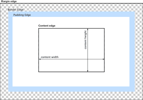
You can change the way the box model treats padding and width. Set the box-sizing CSS property to border-box to prevent padding from affecting an element's width or height:
border-box : The width and height properties include the padding and border, but not the margin... Note that padding and border will be inside of the box.
Note the browser compatibility of box-sizing (IE8+).
At the time of this edit, no prefixes are necessary.
Paul Irish and Chris Coyier recommend the "inherited" usage below:
html {
  box-sizing: border-box;
}
*, *:before, *:after {
  box-sizing: inherit;
}
For reference, see:
* { Box-sizing: Border-box } FTW
Inheriting box-sizing Probably Slightly Better Best-Practice.
Here's a demonstration in your specific context:
#mainContainer {
  line-height: 20px;
  font-family: "Helvetica Neue", Helvetica, Arial, sans-serif;
  background-color: rgba(0, 50, 94, 0.2);
  margin: 20px auto;
  display: table;
  -moz-border-radius: 15px;
  border-style: solid;
  border-color: rgb(40, 40, 40);
  border-radius: 2px 5px 2px 5px / 5px 2px 5px 2px;
  border-radius: 2px;
  border-radius: 2px 5px / 5px;
  box-shadow: 0 5px 10px 5px rgba(0, 0, 0, 0.2);
}
.loginForm {
  width: 320px;
  height: 250px;
  padding: 10px 15px 25px 15px;
  overflow: hidden;
}
.login-fields > .login-bottom input#login-button_normal {
  float: right;
  padding: 2px 25px;
  cursor: pointer;
  margin-left: 10px;
}
.login-fields > .login-bottom input#login-remember {
  float: left;
  margin-right: 3px;
}
.spacer {
  padding-bottom: 10px;
}
input[type=text],
input[type=password] {
  width: 100%;
  height: 30px;
  padding: 5px 10px;
  background-color: rgb(215, 215, 215);
  line-height: 20px;
  font-size: 12px;
  color: rgb(136, 136, 136);
  border-radius: 2px 2px 2px 2px;
  border: 1px solid rgb(114, 114, 114);
  box-shadow: 0 1px 0 rgba(24, 24, 24, 0.1);
  box-sizing: border-box;
}
input[type=text]:hover,
input[type=password]:hover,
label:hover ~ input[type=text],
label:hover ~ input[type=password] {
  background: rgb(242, 242, 242);
  !important;
}
input[type=submit]:hover {
  box-shadow: inset 0 1px 0 rgba(255, 255, 255, 0.3), inset 0 -10px 10px rgba(255, 255, 255, 0.1);
}
.login-top {
  height: auto;/*85px;*/
}
.login-bottom {
  padding: 35px 15px 0 0;
}
<div id="mainContainer">
<div id="login" class="loginForm">
<div class="login-top">
</div>
<form class="login-fields" onsubmit="alert('test'); return false;">
<div id="login-email" class="login-field">
<label for="email" style="-moz-user-select: none;-webkit-user-select: none;" onselectstart="return false;">E-mail address</label>
<span><input name="email" id="email" type="text" /></span>
</div>
<div class="spacer"></div>
<div id="login-password" class="login-field">
<label for="password" style="-moz-user-select: none;-webkit-user-select: none;" onselectstart="return false;">Password</label>
<span><input name="password" id="password" type="password" /></span>
</div>
<div class="login-bottom">
<input type="checkbox" name="remember" id="login-remember" />
<label for="login-remember" style="-moz-user-select: none;-webkit-user-select: none;" onselectstart="return false;">Remember my email</label>
<input type="submit" name="login-button" id="login-button_normal" style="cursor: pointer" value="Log in" />
</div>
</form>
</div>
</div>bootstrap 3 input-group 100% width
Adding width: 1% to the input element's sibling fixes this:
.clear { width: 1%; display: table-cell; }
See http://jsfiddle.net/Wexcode/B9LMN/2/
How to make input extend to width of column in Bootstrap 3?
As others have mentioned, you need to specify custom widths with inline forms. From the docs:
Inputs and selects have width: 100%; applied by default in Bootstrap. Within inline forms, we reset that to width: auto; so multiple controls can reside on the same line. Depending on your layout, additional custom widths may be required.
In your case, you need to specify width: 100% for both the input and the form-group:
<div class="form-group" style="width: 100%">
and
<input type="text" class="form-control" id="iR" placeholder="some mid long explanation" style="width: 100%" />
Working example in JSFiddle
Size of bootstrap input field
Its because of .form-control class ,which is bootstrap default class, you have to inherit this class.
for example:-
This is default
.form-control {
    background-color: #fff;
    background-image: none;
    border: 1px solid #ccc;
    border-radius: 4px;
    box-shadow: 0 1px 1px rgba(0, 0, 0, 0.075) inset;
    color: #555;
    display: block;
    font-size: 14px;
    height: 34px;
    line-height: 1.42857;
    padding: 6px 12px;
    width: 100%;
}
Use like this:-
<div class="wrap">
   <input name="test" type="text" class="form-control" placeholder="Type here" size="4" maxlength="4">
<div>

.wrap .form-control {
        background-color: #fff;
        background-image: none;
        border: 1px solid #ccc;
        border-radius: 4px;
        box-shadow: 0 1px 1px rgba(0, 0, 0, 0.075) inset;
        color: #555;
        display: block;
        font-size: 14px;
        height: 34px;
        line-height: 1.42857;
        padding: 6px 12px;
        /*width: 100%;*/ remove this
}
Hope i'll helps you.
Incorrectly calculates 100% width when parent width is an odd pixel value - Bootstrap (Chrome)
Firstly, you need to put your table inside your column of class col-xs-6 if you want it to take half the width of the row.
Then, remove padding and margin from the column otherwise it will be bigger than its children.
1251/2 = 625.5, (625.5-555.5)/2 = 35, it probably has a padding of 15 px and a margin of 20 px on each sides. Put both to 0 and you will have no problem.
Why are input fields wider than it's parent div?
Make sure you set the max-width of the input field to 100% and box-sizing to border-box to make sure padding and border fall within that 100%:
input {    max-width: 100%;    box-sizing: border-box;}
.parent {  width: 400px;  background-color: yellow;}
.left {  display: inline-block;  width: 50%;  background-color: red}
.right {  display: inline-block;  width: 30%;  background-color: blue}
<div class="parent"> <div class="left">This is text</div> <div class="right"><input type="text"></div> <div class="left">This is text</div> <div class="right">text</div></div>Related Topics
How to Use CSS Custom Properties in Values for the Content Property
Apply Ellipsis When Label Text Is Overflow
Different CSS Stylesheet for Routes
How to Use @Media (Prefers-Color-Scheme) in Responsive Email in Gmail
How to Provide CSS Properties for Different Browsers Like Mozilla and Chrome
Small Space Between Box Shadow and Div When Alpha Set
Responsive Two Gradient Diagonal Button
Why Is the Descender "Created" When Baseline Is Set to Vertical-Align
Less Inheritance Fails with "Undefined Class"
Font and Line Spacing in Different Browsers
IE8 Doesn't Zoom Content When Applying a CSS Zoom Value to a Div