Responsive two gradient diagonal button
You can keep one gradient inside the button then consider clip-path on the pseudo element to create a triangle shape and apply the second gradient:
.btn {  background-image: linear-gradient(to right, yellow,blue);  display: inline-block;  font-size: 1.6rem;  text-decoration: none;  padding: 2.6rem 1rem;  color: #fff;  text-transform: uppercase;  position: relative;  z-index: 0;}
.btn:after {  content: '';  position:absolute;  left: 0;  right: 0;  bottom: 0;  top: 0;  background-image: linear-gradient(to left, yellow,blue);  -webkit-clip-path:polygon(0 0,100% 0,100% 100%);  clip-path:polygon(0 0,100% 0,100% 100%);  z-index: -1;}
<a href="" class="btn">Button</a><a href="" class="btn">Another Button</a>CSS3 gradient diagonal how to apply?
I found this, works great. http://www.colorzilla.com/gradient-editor/
I got some code which you can use as a template.
background: #1e5799; /* Old browsers */

background: -moz-linear-gradient(-45deg,  #1e5799 0%, #2989d8 50%, #207cca 63%, #7db9e8 100%); /* FF3.6+ */

background: -webkit-gradient(linear, left top, right bottom, color-stop(0%,#1e5799), color-stop(50%,#2989d8), color-stop(63%,#207cca), color-stop(100%,#7db9e8)); /* Chrome,Safari4+ */

background: -webkit-linear-gradient(-45deg,  #1e5799 0%,#2989d8 50%,#207cca 63%,#7db9e8 100%); /* Chrome10+,Safari5.1+ */

background: -o-linear-gradient(-45deg,  #1e5799 0%,#2989d8 50%,#207cca 63%,#7db9e8 100%); /* Opera 11.10+ */

background: -ms-linear-gradient(-45deg,  #1e5799 0%,#2989d8 50%,#207cca 63%,#7db9e8 100%); /* IE10+ */

background: linear-gradient(135deg,  #1e5799 0%,#2989d8 50%,#207cca 63%,#7db9e8 100%); /* W3C */

filter: progid:DXImageTransform.Microsoft.gradient( startColorstr='#1e5799', endColorstr='#7db9e8',GradientType=1 ); /* IE6-9 fallback on horizontal gradient */
How to create a responsive linear-gradient while keeping the angle unchanged?
If the height is fixed you can set the background size to be a square with dimension equal to height (42px in your case) and center it like below:
.Product__widths__button {  background: #FFFFFF;  border: 1px solid #333333;  color: #333333;  display: block;  font-size: 16px;  line-height: 42px;  height: 42px;  text-align: center;  padding-left: 20px;  padding-right: 20px;}
.Product__widths__button.disabled {  color: #D1D1D1;  background:     linear-gradient(to top left,       /*the center is 42px*cos(45deg) = 29.7px, we remove/add pixel around*/      transparent 28px,#D1D1D1,transparent 31px)       center/42px 100% /*background-position/background-size  (100% is your height)*/      no-repeat;  border-color: #D1D1D1;}
<a id="width_1_1" class="Product__widths__button disabled"><span>W</span> (Wide)</a>creating a responsive diagonal line in element
You can do this in multiple ways.
1) background image
1.1) SVG
You can create an svg direct as inline code and use it for drawing the line. Using this you can achiev nice effects like shadow, gradient, dotted line, ... and much more. It is also posible to use a svg inside the css background-image element.
jsfiddle
<svg style='width: 100%; height: 100%;'>
    <line x1="0" y1="100%" x2="100%" y2="0"
        style="stroke:rgb(0,0,0);stroke-width:1"/>
</svg>
1.2) fix image (png, jpg, ...)
You can also use a simple image as background image on full div.
jsfiddle
2) create linear background gradient
jsfiddle
.testDiv {
  width: 300px;
  height: 300px;
  background:linear-gradient(to bottom right, transparent calc(50% - 1px),  black calc(50% - 1px), black 50%, transparent 50%);
}
How does this works?
- you define a gradient from top left to bottom right
- the color is transparent until 50% - 1 px and again transparent from 50% to end
(read more here)
3) rotated inner div (only on square divs)
jsfiddle
when resizing the testDiv, the line should stay a diagonal.
.testDiv{
  width: 600px;
  height: 600px;
  background-color: gray;
}

.lineDiv {
  position: relative;
  top: 29%;
  left: 29%;
  width: 142%;
  height: 142%;
  border-left: solid thin blue;
  transform: rotate(45deg);
}
How does this works?
- the outer div has a size (may be dynamic too)
- the inner div has position relative and width and height are set to 142%
- top and left are set to 29% (28.7)
-> 142 = sqrt(100^2 + 100^2) (see phytagoras)
Two-tone background split by diagonal line using css
Here are the examples in action: http://jsbin.com/iqemot/1/edit
You can change the placement of the diagonal line with the border pixels. With this approach you would have to position content over the background setup however.
#container {  height: 100px;  width: 100px;  overflow: hidden;  background-image: url(http://www.webdesign.org/img_articles/14881/site-background-pattern-07.jpg);}
#triangle-topleft {  width: 0;  height: 0;  border-top: 100px solid gray;  border-right: 100px solid transparent;}
<div id="container"> <div id="triangle-topleft"></div></div>Rectangle Diagonal Gradient Brush between two points
Hope this helps.
I have edited lineseries template using BlurBitmapEffect and I have added one more polyline with same Points so that we can achieve BlurBitmapEffect.
for eg.
  <Grid>
    <Polyline Points="0 1 1 0" Stroke="#9FBD5F" StrokeThickness="200" Stretch="Fill">
        <Polyline.BitmapEffect>
            <BlurBitmapEffect Radius="100"  KernelType="Box" />
        </Polyline.BitmapEffect>
    </Polyline>
    <Polyline Points="0 1 1 0" Stroke="#2DB14D" StrokeThickness="5" Stretch="Fill"/>
</Grid>
xaml
<Window x:Class="WpfApplication8.Window1"
    xmlns="http://schemas.microsoft.com/winfx/2006/xaml/presentation"
    xmlns:x="http://schemas.microsoft.com/winfx/2006/xaml"
    xmlns:chartingToolkit="clr-namespace:System.Windows.Controls.DataVisualization.Charting;assembly=System.Windows.Controls.DataVisualization.Toolkit"
    xmlns:visualizationToolkit="clr-namespace:System.Windows.Controls.DataVisualization;assembly=System.Windows.Controls.DataVisualization.Toolkit"
    xmlns:Primitives="clr-namespace:System.Windows.Controls.DataVisualization.Charting.Primitives;assembly=System.Windows.Controls.DataVisualization.Toolkit"
    Title="Window1" Height="500" Width="500">
<Window.Resources>
    <Style x:Key="LineSeriesStyle1" TargetType="{x:Type chartingToolkit:LineSeries}">
        <Setter Property="IsTabStop" Value="False"/>
        <Setter Property="Template">
            <Setter.Value>
                <ControlTemplate TargetType="{x:Type chartingToolkit:LineSeries}">
                    <Canvas x:Name="PlotArea">

                        <!--You can use linergradient or visulbrush to give color to polyline -->

                        <!--or you can use additional polylines to achieve  this affect-->
                        <Polyline Fill="Transparent"  StrokeThickness="200" Points="{TemplateBinding Points}">
                            <Polyline.Stroke>
                                <SolidColorBrush Color="#9FBD5F"></SolidColorBrush>
                            </Polyline.Stroke>
                            <Polyline.BitmapEffect>
                                <BlurBitmapEffect Radius="100"  KernelType="Box" />
                            </Polyline.BitmapEffect>
                        </Polyline>
                        <Polyline x:Name="polynine" Points="{TemplateBinding Points}" StrokeThickness="5"   Stroke="#2DB14D"/>
                    </Canvas>
                </ControlTemplate>
            </Setter.Value>
        </Setter>
    </Style>
</Window.Resources>

<chartingToolkit:Chart x:Name="mcChart" >
    <chartingToolkit:LineSeries DependentValuePath="Value"  IsSelectionEnabled="True" IndependentValuePath="Key" ItemsSource="{Binding}" Style="{StaticResource LineSeriesStyle1}"/>
</chartingToolkit:Chart>
c#
public Window1()
    {
        InitializeComponent();
        LoadColumnChartData();
    }
    private void LoadColumnChartData()
    {
        ((LineSeries)mcChart.Series[0]).ItemsSource =
        new KeyValuePair<string, int>[]{
        new KeyValuePair<string,int>("Project Manager", 13),
        new KeyValuePair<string,int>("CEO", 23),};

    }
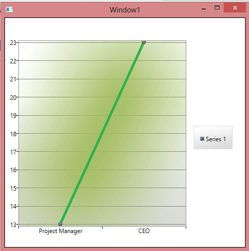
Result
Update add this in lineseries template.
                <Polyline Fill="Transparent"  StrokeThickness="200" Points="{TemplateBinding Points}">
                            <Polyline.Stroke>
                                <SolidColorBrush Color="#9FBD5F"></SolidColorBrush>
                            </Polyline.Stroke>
                            <Polyline.Effect>
                                <BlurEffect Radius="100"  KernelType="Box" />
                            </Polyline.Effect>
                        </Polyline>
How to draw a perfect diagonal with linear-gradient
You can use a to [side] [side] linear gradient which is transparent except for the thickness of the diagonal like in the below snippet.
(Border is added only for demo and is not actually required for the gradient to work.)
div { display: block; width: 100px; height: 100px; border: 1px solid; margin: 10px;}.border-2px { background: linear-gradient(to bottom left, transparent calc(50% - 2px), red calc(50% - 1px), red calc(50% + 1px), transparent calc(50% + 2px)) no-repeat 0px 0px / 100px 100px;}.border-1px { background: linear-gradient(to bottom left, transparent calc(50% - 1px), red 50%, transparent calc(50% + 1px)) no-repeat 0px 0px / 100px 100px;}.border-1px.small { height: 10px; width: 10px; background: linear-gradient(to bottom left, transparent calc(50% - .5px), red 50%, transparent calc(50% + .5px)) no-repeat 0px 0px / 10px 10px;}.border-1px.small-2 { height: 10px; width: 10px; background: linear-gradient(to bottom left, transparent calc(50% - 1px), #EEE calc(50% - .5px), red 50%, #EEE calc(50% + .5px), transparent calc(50% + 1px)) no-repeat 0px 0px / 10px 10px;}.border-1px.small-3 { background: linear-gradient(to bottom left, transparent calc(50% - .5px), red 50%, transparent calc(50% + .5px)) no-repeat 0px 0px / 10px 10px;}.border-1px.small-4 { background: linear-gradient(to bottom left, transparent calc(50% - 1px), #EEE calc(50% - .5px), red 50%, #EEE calc(50% + .5px), transparent calc(50% + 1px)) no-repeat 0px 0px / 10px 10px;}<div class='border-2px'></div><div class='border-1px'></div><div class='border-1px small'></div><div class='border-1px small-2'></div><div class='border-1px small-3'></div><div class='border-1px small-4'></div>Related Topics
React: How to Make an Input Only as Wide as the Amount of Text Provided
What Does a Space Preceding :Nth-Child(N) Do
Is It Posible to Make an Input Checkbox a Bootstrap Glyphicon
Position Floated Elements Directly Under Each Other
Draw an Arrow Inside Table Cell Using CSS
How to Use Commas in a CSS Variable Fallback
Lesscss Stops Processing Styles
How to Layer Box-Shadows Using Z-Index
Safari Page-Break-Inside:Avoid Not Working
Style Type="Text/Css" ... What Else Is There
How to Get Multiple Borders with Rounded Corners? CSS
Why Bootstrap 3 Navbar Dropdown Doesn't Work in IE8
What's the Difference Between Padding and Margin
Sass: Set Variable at Compile Time
Vue Cli 3 - Use Background Image in Style Tag