Styling Twitter's Bootstrap 3.x Buttons
Add extra colors to your less files and recompile. Also see Twitter Bootstrap Customization Best Practices.
update
As mentioned by @ow3n since v3.0.3 use:
.btn-custom {
  .button-variant(@btn-default-color; @btn-default-bg; @btn-default-border);
}
Note in the above @btn-default-color sets the font color,@btn-default-bg the background color and @btn-default-border the color of the border. Colors for states like active, hover and disabled are calculated based on of these parameters.
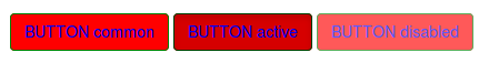
For example:
.btn-custom {
  .button-variant(blue; red; green);
}
will result in:
For who want to use the CSS direct, replace the colors in this code:
.btn-custom {
  color: #0000ff;
  background-color: #ff0000;
  border-color: #008000;
}
.btn-custom:hover,
.btn-custom:focus,
.btn-custom:active,
.btn-custom.active,
.open .dropdown-toggle.btn-custom {
  color: #0000ff;
  background-color: #d60000;
  border-color: #004300;
}
.btn-custom:active,
.btn-custom.active,
.open .dropdown-toggle.btn-custom {
  background-image: none;
}
.btn-custom.disabled,
.btn-custom[disabled],
fieldset[disabled] .btn-custom,
.btn-custom.disabled:hover,
.btn-custom[disabled]:hover,
fieldset[disabled] .btn-custom:hover,
.btn-custom.disabled:focus,
.btn-custom[disabled]:focus,
fieldset[disabled] .btn-custom:focus,
.btn-custom.disabled:active,
.btn-custom[disabled]:active,
fieldset[disabled] .btn-custom:active,
.btn-custom.disabled.active,
.btn-custom[disabled].active,
fieldset[disabled] .btn-custom.active {
  background-color: #ff0000;
  border-color: #008000;
}
.btn-custom .badge {
  color: #ff0000;
  background-color: #0000ff;
}
end update
To generate a custom button:
.btn-custom {
    .btn-pseudo-states(@yourColor, @yourColorDarker);
 }
The above will generate the following css:
.btn-custom {
  background-color: #1dcc00;
  border-color: #1dcc00;
}
.btn-custom:hover,
.btn-custom:focus,
.btn-custom:active,
.btn-custom.active {
  background-color: #19b300;
  border-color: #169900;
}
.btn-custom.disabled:hover,
.btn-custom.disabled:focus,
.btn-custom.disabled:active,
.btn-custom.disabled.active,
.btn-custom[disabled]:hover,
.btn-custom[disabled]:focus,
.btn-custom[disabled]:active,
.btn-custom[disabled].active,
fieldset[disabled] .btn-custom:hover,
fieldset[disabled] .btn-custom:focus,
fieldset[disabled] .btn-custom:active,
fieldset[disabled] .btn-custom.active {
  background-color: #1dcc00;
  border-color: #1dcc00;
}
In the above #1dcc00 will be your custom color and #19b300 your darker color. In stead of the less solution you also can add this css direct to your html files (after the bootstrap css).
Or get your css code direct from Twitter's Bootstrap 3 Button Generator
Styling twitter bootstrap buttons
Basically, the buttons in Twitter Bootstrap are controlled in CSS by ".btn{}". What you have to do is go to the CSS file and find where it says "btn" and change the color settings. However, it's not as simple as just doing that since you also have to change what color the button changes into when you highlight it, etc. To do THAT, you have to look for other tags in CSS like ".btn:hover{}", etc.
Changing it requires changing of the CSS. Here is a quick link to that file:
https://github.com/twbs/bootstrap/blob/master/dist/css/bootstrap.css
Style of Twitter's Bootstrap 3 navbar
Just like buttons and panel a navbar will have two classes (see: https://github.com/twbs/bootstrap/issues/10332). The first class (.navbar) will set the structure. The second class will set the styling. By default there will be two classes for styling: .navbar-default and .navbar-inverse. To change the style of your navbar you have to change the styles of these styling classes. The best way to do this is using Less and recompile Bootstrap.
Using Less
The variables for .navbar-default and .navbar-inverse are set in variables.less and used by navbar.less. To define a custom navbar style you could modify the variable for .navbar-default or .navbar-inverse and reuse this classes. If you don't want to change the original code. Create an customnavbar.less file (don't forget ti import this in bootstrap.less) and copy the .navbar-default part from navbar.less to this file. Rename and set the variables. B.e. see here: Change twitter bootstrap 3.0 navbar class background color in less to set the background to blue.
Using CSS
Define your css just like .navbar-default. To change the style. B.e. for <nav class"navbar navbar-custom"> and set background to blue;
.navbar-custom { background-color: #0000FF;}
For more styles and easy styling see: http://twitterbootstrap3navbars.w3masters.nl/
How to center buttons in Twitter Bootstrap 3?
Wrap the Button in div with "text-center" class.
Just change this:
<!-- wrong -->
<div class="col-md-4 center-block">
    <button id="singlebutton" name="singlebutton" class="btn btn-primary center-block">Next Step!</button>
</div>
To this:
<!-- correct -->
<div class="col-md-4 text-center">
    <button id="singlebutton" name="singlebutton" class="btn btn-primary">Next Step!</button>
</div>
Edit
As of BootstrapV4, center-block was dropped #19102 in favor of m-*-auto
All buttons hover styling in Twitter Bootstrap
The solution I found is not very elegant (you need to modify bootstrap file) but it works.
You need to go to mixins/_buttons.scss file and then change:
background-color: darken($background, 10%);
into
background-color: lighten($background, 10%);
It should do the job for all buttons.
Why are buttons loosing their 3d style when I change my Twitter.Bootstrap version from 2.3 to 3.0?
You'll find an asset called bootstrap-theme{.min}.css, which contains optically improved styles:
<link href="../../dist/css/bootstrap-theme.min.css" rel="stylesheet">
Check out the new template theme on getbootstrap.
Twitter bootstrap highlight buttons on hover
The default button have a gradient from @btnBackground (top) to (@btnBackgroundHighlight) and set the hover color to @btnBackgroundHighlight. Switch the colors won't help cause a light hover will always have the gradient from dark to light and visa versa.
Solution 1:
Generate a button on: http://twitterbootstrapbuttons.w3masters.nl/ choose the first light variant. Switch the gradient color of the code by hand. Don't forget to hover overlay to in your css by adding: background-position: 0 15px;
Solution 2:
Generate your code with less by adding:
.buttonBackgroundReverse(@startColor, @endColor, @textColor: #fff, @textShadow: 0 -1px 0 rgba(0,0,0,.25)) {
  // gradientBar will set the background to a pleasing blend of these, to support IE<=9
  .gradientBar(@startColor, @endColor, @textColor, @textShadow);
  *background-color: @endColor; /* Darken IE7 buttons by default so they stand out more given they won't have borders */
  .reset-filter();

  // in these cases the gradient won't cover the background, so we override
  &:hover, &:focus, &:active, &.active, &.disabled, &[disabled] {
    color: @textColor;
    background-color: @startColor;
    *background-color: darken(@startColor, 5%);
  }
  &:hover, &:focus {background-position: 0 15px;}

  // IE 7 + 8 can't handle box-shadow to show active, so we darken a bit ourselves
  &:active,
  &.active {
    background-color: darken(@startColor, 10%) e("\9");
  }
}

@darkcolor: #46a546;
@lightcolor : lighten(#46a546, 30%);
.btn-light
{
.buttonBackgroundReverse(@lightcolor,@darkcolor);
}
Use @darkcolor to set your button color also change the percentage of @lightcolor to your needs. See http://bootply.com/65731 for an example.
Styling Rails button link helpers with Twitter Bootstrap
You just need :class => "foo" to set the class of the button, instead of :html => { :class => "foo" }. So it should look like this:
<%= button_to('Sign Up', new_user_registration_path, :class => 'btn btn-large btn-primary') %>
This will generate your large primary button.
Change background color of button in Twitter Bootstrap using CSS
You need to overwrite the css codes:
.next a {
    background-color: #ecf0f1 !important;
    color: #2d525d !important;
}
Edit: The color and background-color styles are for "a" element inside the li.
Related Topics
How to Span to the Last Column in an Implicit Grid
Rotate Text in Bootstrap in Different Col Sizes
How to Stop Mobile Safari from Setting Fixed Positions to Absolute on Input Focus
How to Select Every Other Group of Three in CSS
How to Allow Flex-Items to Grow While Keeping the Same Size
Box-Shadow Only on Left and Right
React: How to Make an Input Only as Wide as the Amount of Text Provided
Set the Width of Children to Fill the Parent
CSS Opacity Affecting Sibling Image Opacity
Position Floated Elements Directly Under Each Other
Draw an Arrow Inside Table Cell Using CSS
CSS - Increasing Size of Holder or What Ever Its Called
When I Float the Div to the Right the Screen Messes Up...I'Ve Tried Clear and Some Other Options
Make Element Scroll Without Fixed Position Setting
Sass --Watch with Automatic Minify
Box-Shadow Not Shown on Safari Mobile on iOS 7 (In Landscape)