The meaning and benefits of flex: 1
The CSS border, padding and margin properties are all shorthand properties. This means they consolidate multiple properties into one.
The CSS flex property is no different. It's simply a shorthand way to consolidate:
flex-growflex-shrinkflex-basis
So, use the flex property for the same reason you would use any other CSS shorthand property:
- to minimize your code
- reset/change default values
In terms of function, there's nothing unique about the flex property. Anything that the flex property can do, can also be done using a combination of the longhand properties.
For example:
flex: 2 1 250px
is exactly the same as:
flex-grow: 2flex-shrink: 1flex-basis: 250px
The flexbox spec then takes "shorthanding" a step further, defining an even shorter shorthand:
flex: <positive-number>Equivalent to
flex: <positive-number> 1 0.Makes the flex item flexible and sets the flex basis to zero.
http://www.w3.org/TR/css-flexbox-1/#flex-common
Here's a list of commonly used flex shorthand rules:
- https://www.w3.org/TR/css-flexbox-1/#flex-common
The spec also makes this recommendation:
Authors are encouraged to control flexibility using the
flexshorthand rather than with its longhand properties directly, as the shorthand correctly resets any unspecified components to accommodate common uses.http://www.w3.org/TR/css-flexbox-1/#flex-components
Here's a related post with more info:
- Understanding the flex property
Understanding the flex property
First take a look at this rule in your code:
.wrapper > * {
  padding: 10px;
  flex: 1 100%;
}
The selector above is targeting all five flex items:
headerarticleasideasidefooter
The flex component breaks down to this:
flex-grow: 1flex-shrink: 1(by default)flex-basis: 100%
You wrote:
Why, in this example, is the
.mainelement (blue) dividing space only with.aside-1(yellow) and.aside-2(pink), and not with all elements?
This is why:
- The container is set to
flex-flow: row wrap, meaning flex items are allowed to wrap. - As noted above, all flex items are set to
flex-basis: 100%(i.e.width: 100%), meaning there can only be one flex item per row, except... flex-basis: 100%only gets applied to theheaderandfooterbecause...it is being overridden by other rules later in the cascade sequence1:
.main { flex: 3 0px; }

.aside { flex: 1 auto; }
However, I've noticed that with a
nowrapwrapper the smallest item is.main.
Yes, because, as mentioned above, it has flex-basis: 0 and flex-shrink: 1.
In
.mainwe sayflex: 3 0px, which I think says, this element will be 3x bigger than the other four elements and will occupy 3/(3+1+1+1+1).
Not quite. flex-grow: 3 means that the element will consume 3x the amount of free space than other flex items with flex-grow: 1. It doesn't necessarily mean it will be 3x the size. More details here: flex-grow not sizing flex items as expected
1 It may appear that specificity should win over the cascade, and all items should get flex-basis: 100%:
.wrap > * { flex-basis: 100%; }vs.main { flex: 3 0px; }.wrap > * { flex-basis: 100%; }vsaside { flex: 1 auto; }
Except that the universal selector (*) has zero specificity. So in this case, all selectors have equal specificity and source order matters.
Why does the flex shorthand property behave differently?
When using flex:1 it is the shorthand for flex: 1 1 0 (in IE - is flex:1 1 0px) and not flex: 1 1 auto
Here is why:
Basic Values of flex
flex:
<positive-number>Equivalent to
flex: <positive-number> 1 0. Makes the flex item flexible and sets the flex basis to zero, resulting in an item that
receives the specified proportion of the free space in the flex
container. If all items in the flex container use this pattern, their
sizes will be proportional to the specified flex factor.
What are the main advantages of using flex style in CSS?
I had hardly seen any site using flex for responsiveness.
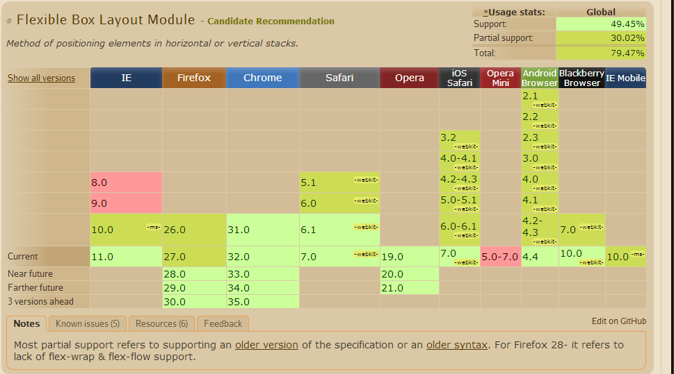
Source from CanIUse
CSS Flexible Boxes Layout specification is at the Candidate
Recommendation stage, not all browsers have implemented it. WebKit
implementation must be prefixed with -webkit; Internet Explorer
implements an old version of the spec, prefixed; Opera 12.10
implements the latest version of the spec, unprefixed. See the
compatibility table on each property for an up-to-date compatibility
status.
Flex Box
The new flexbox layout mode is poised to redefine how we do layouts in CSS. Unfortunately the specification has changed a lot recently, so it's implemented differently in different browsers. There are a lot of out-of-date flexbox resources around.
Flexbox Has Many Exciting Features, As It
- can be laid out in any flow direction (leftwards, rightwards, downwards, or even upwards!)
- can have display order reversed or rearranged at the style layer (i.e., visual order can be independent of source and speech order)
- can be laid out linearly along a single (main) axis or wrapped into multiple lines along a secondary (cross) axis
- can “flex” their sizes to respond to the available space
- can be aligned with respect to their container or each other
- can be dynamically collapsed or uncollapsed along the main axis while preserving the container’s cross size.
The Problem With The Old Box Model
Consider the following code for use with a three column layout.
.col {
    width: 33.33%;
    padding: 0 5%;
}
That won’t actually give you columns that are 33.33% wide, it will create columns that are 43.33% wide. This will break the 3 column layout because the combined width of the columns exceed 100%. In other words, the padding is added to the already existing width. So it’s padding + width.
If you need to create a 3 column layout you typically use float (or inline-block), and then figure out the necessary widths, paddings and margins so they fit inside the parent container. It’s an unecessary amount of work that it’d be nice to avoid, even if it has become second nature by now.
I found a good tutorial for the current status of the implementation of Flexbox here.
Known Issues from CanIUse
- Firefox does not support specifying widths in percentages. See bug.
- IE10 and IE11 default values for
flexare0 0 auto(see here) rather than0 1 auto, as per the draft spec, as of September 2013. - Firefox does not support flex-wrap, align-content properties. See bug
- In IE10 and IE11, containers with
display: flexandflex-direction: columnwill not properly calculate their flexed childrens' sizes if the container hasmin-heightbut no explicitheightproperty. See bug. - In Chrome and Safari, the height of (non flex) children are not recognized in percentages. However Firefox and IE recognize and scale the children based on percentage heights.
References
Editor's Draft
Dive into Flexbox
Flexbox Tutorial 2013 (Updated 2013)
Guide to flexbox
What are the differences between flex-basis and width?
Consider flex-direction
The first thing that comes to mind when reading your question is that flex-basis doesn't always apply to width.
When flex-direction is row, flex-basis controls width.
But when flex-direction is column, flex-basis controls height.
Key Differences
Here are some important differences between flex-basis and width / height:
flex-basisapplies only to flex items. Flex containers (that aren't also flex items) will ignoreflex-basisbut can usewidthandheight.flex-basisworks only on the main axis. For example, if you're inflex-direction: column, thewidthproperty would be needed for sizing flex items horizontally.flex-basishas no effect on absolutely-positioned flex items.widthandheightproperties would be necessary. Absolutely-positioned flex items do not participate in flex layout.By using the
flexproperty, three properties –flex-grow,flex-shrinkandflex-basis– can be neatly combined into one declaration. Usingwidth, the same rule would require multiple lines of code.
Browser Behavior
In terms of how they are rendered, there should be no difference between flex-basis and width, unless flex-basis is auto or content.
From the spec:
7.2.3. The
flex-basispropertyFor all values other than
autoandcontent,flex-basisis resolved the same way aswidthin horizontal writing modes.
But the impact of auto or content may be minimal or nothing at all. More from the spec:
autoWhen specified on a flex item, the
autokeyword retrieves the value
of the main size property as the usedflex-basis. If that value is
itselfauto, then the used value iscontent.
contentIndicates automatic sizing, based on the flex item’s content.
Note: This value was not present in the initial release of Flexible
Box Layout, and thus some older implementations will not support it.
The equivalent effect can be achieved by usingautotogether with a
main size (widthorheight) ofauto.
So, according to the spec, flex-basis and width resolve identically, unless flex-basis is auto or content. In such cases, flex-basis may use content width (which, presumably, the width property would use, as well).
The flex-shrink factor
It's important to remember the initial settings of a flex container. Some of these settings include:
flex-direction: row- flex items will align horizontallyjustify-content: flex-start- flex items will stack at the start of the line on the main axisalign-items: stretch- flex items will expand to cover the cross-size of the containerflex-wrap: nowrap- flex items are forced to stay in a single lineflex-shrink: 1- a flex item is allowed to shrink
Note the last setting.
Because flex items are allowed to shrink by default (which prevents them from overflowing the container), the specified flex-basis / width / height may be overridden.
For example, flex-basis: 100px or width: 100px, coupled with flex-shrink: 1, will not necessarily be 100px.
To render the specified width – and keep it fixed – you will need to disable shrinking:
div {
   width: 100px;
   flex-shrink: 0;
}
OR
div {
  flex-basis: 100px;
  flex-shrink: 0;
}
OR, as recommended by the spec:
flex: 0 0 100px; /* don't grow, don't shrink, stay fixed at 100px */
7.2. Components of
FlexibilityAuthors are encouraged to control flexibility using the
flexshorthand
rather than with its longhand properties directly, as the shorthand
correctly resets any unspecified components to accommodate common
uses.
Browser Bugs
Some browsers have trouble sizing flex items in nested flex containers.
flex-basis ignored in a nested flex container. width works.
When using flex-basis, the container ignores the sizing of its children, and the children overflow the container. But with the width property, the container respects the sizing of its children and expands accordingly.
References:
- Chrome does not expand flex parent according to children's content
- Flex item overflowing when using flex-basis
- Difference between width and flex-basis
- Flex-basis is being ignored when sizing nested flex containers.
- flex-basis:100px does something different from width:100px+flex-basis:auto
Examples:
- https://jsfiddle.net/t419zhra/ (source: @Dremora)
- https://codepen.io/anon/pen/NVxaoy (source @Daniel)
- https://jsfiddle.net/voc9grx6/ (source: Chromium Bugs)
- https://jsfiddle.net/qjpat9zk/ (source: Chromium Bugs)
flex items using flex-basis and white-space: nowrap overflow inline-flex container. width works.
It seems that a flex container set to inline-flex doesn't recognize flex-basis on a child when rendering a sibling with white-space: nowrap (although it could just be an item with undefined width). The container doesn't expand to accommodate the items.
But when the width property is used instead of flex-basis, the container respects the sizing of its children and expands accordingly. This is not a problem in IE11 and Edge.
References:
- inline flex container width not growing
- Inline flex container (display: inline-flex) is expanding the full width of parent container
Example:
- https://jsfiddle.net/p18h0jxt/1/ (from first post above)
flex-basis (and flex-grow) not working on table element
References:
- Why does flex-box work with a div, but not a table?
- Why doesn't flex-grow: 1 work for a table in Safari? (and Edge)
flex-basis fails in Chrome and Firefox when the grandparent container is a shrink-to-fit element. The set-up works fine in Edge.
- Absolutely positioned container not expanding width to fit flexbox content
Like in the example presented in the link above, involving position: absolute, the use of float and inline-block, will also render the same flawed output (jsfiddle demo).
Bugs affecting IE 10 and 11:
flexshorthand declarations with unitlessflex-basisvalues are ignoredflex-basisdoesn't account forbox-sizing: border-boxflex-basisdoesn't supportcalc()- Importance is ignored on
flex-basiswhen usingflexshorthand
What is a usecase where you use flex-order in CSS?
flex-order is used to give order to the Childs under flex container.
    <div class="box">
        <div><a href="#">1</a></div>
        <div><a href="#">2</a></div>
        <div><a href="#">3</a></div>
        <div><a href="#">4</a></div>
        <div><a href="#">5</a></div>
    </div>
CSS
        .box {
          display: flex;
          flex-direction: row;
        }
        .box :nth-child(1) { order: 2; }
        .box :nth-child(2) { order: 3; }
        .box :nth-child(3) { order: 1; }
        .box :nth-child(4) { order: 3; }
        .box :nth-child(5) { order: 1; }
This code will arrange the child in specified order under a row!
i.e., 1st child will have at 2nd position
2nd child will be at 3rd position
Note:- Indexing will be from 0.
Using display:flex on almost everything
Flexbox comes to improve existing layouts. Float is still the only option to do what it does, there's no flexbox alternative for it. You can see flexbox as "improved tables". It shares many concepts with them (but it isn't a complete alternative)
display:flex can't even replace block, because a display:flex is actually a block itself; flex affects its children not the way it is laid out itself
same as a display:inline-block element. it is laid out like an inline element, but its contents are laid out as they were in a display:block element
you can have display:flex on almost everything, except on text blocks, like paragraphs and headings, or any other text string. they should be contained in a block element, otherwise browsers will do it for you: http://jsfiddle.net/56fHY/
what you can also see from this example, is that even if <b> is display:inline, since its container is display:flex, it is forced to be display:block
you also still need float: as I already said
you also may need inline-flex: a typical use case are elements such as widgets that should work both when placed in a display:block paragraph and when used in a display:flex container
you still need also display:table or <table>s because flexbox can't cover all their features. for example in order to make grids with flexbox you have to specify dimensions (via width/height/flex-basis) while with tables dimensions are calculated implicitly (eg the width of the cells in a column are equal to the larger cell in the column); you can for example simulate colspan but not rowspan) http://jsfiddle.net/xDLvg/
and of course you still need display:inline elements, for bold and other text-level styling
hope this helps
Why use Flex instead of HTML/AJAX/PHP frameworks?
You should ask yourself why you need to use flex. Are you developing a game? A 3D graphics application on the web? Something that actually cannot be achieved with HTML?
If not, there is no reason of using flex instead of HTML. HTML is an open and standard specification, you don't need plugins, your application will run on any platform with a browser supporting html, and it will be faster and less resource-consuming. Don't fall in the error of developing in flash/flex something that can be done perfectly with HTML/AJAX. I saw some developers creating applications with flex or silverlight that consisted in just a series of forms, and it was a ridicolous waste of time and resources.
So the only way to convince your clients to use flex should be finding something you actually can't do with HTML.. and having in account that HTML5 is almost here and hardware-accelerated HTML5 browsers will be launched at the end of this year.., it will be difficult to convince people to get tied to flash/flex! :)
How to get the content of the bottom element of a flexbox to be 100% height its container
Flex has a quirk where you need to set the height to 0.
Change the #bottom rule's height property to this height: 0;
For the inside to work I changed it to "position: absolute" and as well added a position:relative to the bottom
Update
If you don't want to use absolute position, you can set these 2 css rules like this:
(Note though, that this propagates the original issue if a new inner div is used like the first one)
#bottom {
  position: relative;
  background-color: blue;
  flex: 1 0 auto;
  height: 0;
  display: flex;
}
#inside {
  background-color: green;
  flex: 1 0 auto;
}
Sample using "position: absolute"
* { box-sizing: border-box;}html, body { margin: 0; width: 100%; height: 100%; color: white;}#outer { display: flex; flex-flow: column; height: 100%;}#top { background-color: red;}#bottom { position: relative; background-color: blue; flex: 1 0 auto; height: 0;}#inside { background-color: green; position: absolute; left: 0; top: 0; right: 0; bottom: 0;}<div id="outer"> <div id="top">top</div> <div id="bottom"> <div id="inside">inside (would not scroll if working)</div> </div></div>Related Topics
Stop Animation from Replaying When Parent Switches from Display:None to Block
Position: Sticky (Firefox) on a <Table> Element
Css-Moving Text from Left to Right
How to Use Commas in a CSS Variable Fallback
Apply Ellipsis When Label Text Is Overflow
Zoom Out Shiny App at Default in Browser
Different CSS Stylesheet for Routes
How to Make a Button Stretch Across the Width of a Column
Why Bootstrap 3 Navbar Dropdown Doesn't Work in IE8
How to Get Attribute Value Using Selenium and CSS
How to Make Numbers in an Ordered List Bold