Dot leaders with text that may wrap
With this HTML:
<div class="leader">
  <span>Peter Piper picked a peck of pickled peppers. A peck of pickled peppers Peter Piper picked. If Peter Piper picked a peck of pickled peppers, Where's the peck of pickled peppers Peter Piper picked?</span>
  <span>The peck of pickled peppers Peter Piper picked is gone.</span>
</div>
<div class="leader">
  <span>Really?</span>
  <span>Really.</span>
</div>
and this CSS:
.leader {
  position: relative;
  overflow: hidden;
  z-index: 0;
}
.leader > span {
  background-color: white;
}
.leader > span:first-child:after, .leader > span:last-child:before {
  position: absolute;
  background-color: white;
  z-index: -1;
  content: "................................................................"
    "................................................................"
    "................................................................"
    "................................................................"
    "................................................................"
    "................................................................"
    "................................................................"
    "................................................................";
  letter-spacing: 0.25em;
  cursor: default;
}
.leader > span:last-child {
  float: right;
  background-color: white;
  text-align: right;
}
.leader > span:last-child:before {
  left: 0;
}
You should have good results.
You can play around with it on CodePen if you like.
Dot leaders with picture background
It's easy to do with some simple javascript and css, here's a fiddle: jsfiddle
The key is to set the width of the div that holds the dots to the width of the column minus the width of the food name minus the width of the price, and to make sure there are more than enough dots to cover the distance, and to set overflow: hidden for the dot div.
$(".menu-row").each(function(index, element) {
    var menuRowWidth = $(element).width();
    var foodItemWidth = $(element).children('.food-item').width();
    var priceWidth = $(element).children('.price').width();
    var $dotFiller = $(element).children('.dot-filler');
    var dotFillerWidth = menuRowWidth - foodItemWidth - priceWidth;
    $dotFiller.width(dotFillerWidth + "px");
});
Then float the item and dot div left, the price right, all within a set width column. It's also important that overflow: hidden is set for the dots, because when we set the width of that div in javascript we want all extra dots to just be cut off. The CSS:
.food-item {
  float: left
}

.dot-filler {
  overflow: hidden;
  width: 0;
  float: left;
}

.price {
  float: right;
}

.menu-row {
  width: 400px;
}
Then structure your html as follows:
<div class="menu-row">
  <div class="food-item">Steak</div>
  <div class="dot-filler">............................................................................................</div>
  <div class="price">$18.00</div>
</div>

<div class="menu-row">
  <div class="food-item">Hamburger</div>
  <div class="dot-filler">............................................................................................</div>
  <div class="price">$8.00</div>
</div>
How can I use CSS dot leaders for a three column list?
The second idea (http://jsfiddle.net/coma/wrwwn/2/) is better because the dots won't overlap between columns.
HTML
<div class="dotted">
    <div>
        <div>
            <span>item</span>
         </div>
        <div>
            <span>price 1</span>
         </div>
        <div>
            <span>price2</span>
         </div>
     </div>
    <div>
        <div>
            <span>item2</span>
         </div>
        <div>
            <span>price 1</span>
         </div>
        <div>
            <span>price2</span>
         </div>
     </div>
</div>
CSS
div.dotted > div:after {
    content: "";
    display: block;
    clear: both;
}

div.dotted > div > div {
    position: relative;
    float: left;
    width: 33.333333%;
}

div.dotted > div > div:before {
    content: "";
    display: block;
    position: absolute;
    top: 50%;
    right: 0;
    bottom: 0;
    left: 0;
    border-top: 1px dotted #000;
    z-index: -1;
}

div.dotted > div > div:last-child:before {
    display: none;
}

div.dotted > div > div > span {
    padding: 0 5px;
    display: inline-block;
    background-color: #fff;
}
http://jsfiddle.net/coma/wrwwn/
Prices aligned to the right
div.dotted > div {
    position: relative;
}

div.dotted > div:before {
    content: "";
    display: block;
    position: absolute;
    top: 50%;
    right: 0;
    bottom: 0;
    left: 0;
    border-top: 1px dotted #000;
    z-index: -1;
}

div.dotted > div:after {
    content: "";
    display: block;
    clear: both;
}

div.dotted > div > div {
    float: left;
    width: 33.333333%;
}

div.dotted > div > div + div {
    text-align: right;
}

div.dotted > div > div > span {
    padding: 0 5px;
    display: inline-block;
    background-color: #fff;
}
http://jsfiddle.net/coma/wrwwn/2/
Using a fixed background
div.dotted > div > div > span,
html {
    background: #F4EAEC url(http://colourlovers.com.s3.amazonaws.com/images/patterns/3949/3949452.png?1382901481) 0 0 fixed;
}
http://jsfiddle.net/coma/wrwwn/4/
Complex
html {
    background: #F4EAEC url(http://colourlovers.com.s3.amazonaws.com/images/patterns/3949/3949452.png?1382901481) 0 0 fixed;
}

div.dotted div {
    height: 2em;
}

div.dotted > div div {
    float: left;
    width: 50%;
    position: relative;
    overflow: hidden;
}

div.dotted span {
    display: block;
    position: absolute;
    padding: 0 5px;
}

div.dotted span:after {
    content: "";
    display: block;
    position: absolute;
    top: 50%;
    width: 1000px;
    border-top: 1px dotted #000;
}

div.item span {
    left: 0;
}

div.item span:after {
    left: 100%;
}

div.prices span {
    right: 0;
}

div.prices span:after {
    right: 100%;
}
http://jsfiddle.net/coma/wrwwn/6/
CSS responsive multiline list with dashed lines (name - - - price)
Something from the top of my mind:
(Honestly I don't know for any other better and responsive solution):
jsBin demo (so you can resize and play with)
- Place 2
span(as table-cell) inside aLIset astable - Trick the last span to
width: 1%; - Add the desired dashes or dots or even a background-image to the first
span's:afterpseudo element
body{background:orange;} /* No other backgrounds are used */
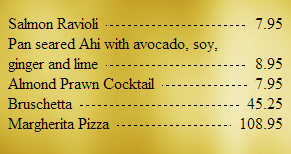
ul.leaders { padding: 0;}ul.leaders li { display: table;}ul.leaders li span { display: table-cell;}ul.leaders li span:first-child { /* TITLE */ position: relative; overflow: hidden; /* Don't go underneath the price */}ul.leaders li span:first-child:after { /* DASHES */ content: ""; position: absolute; bottom: 0.5em; /* Set as you want */ margin-left: 0.5em; /* Keep same for the next span's left padding */ width: 100%; border-bottom: 1px dashed #000;}ul.leaders li span + span { /* PRICE */ text-align: right; width: 1%; /* Trick it */ vertical-align: bottom; /* Keep Price text bottom-aligned */ padding-left: 0.5em; /* white-space: nowrap; /* Uncomment if needed */}<ul class=leaders> <li> <span>Salmon Ravioli</span> <span>7.95</span> </li> <li> <span>Pan seared Ahi with avocado, soy, ginger and lime</span> <span>8.95</span> </li> <li> <span>Almond Prawn Cocktail</span> <span>7.95</span> </li> <li> <span>Bruschetta</span> <span>45.25</span> </li> <li> <span>Margherita Pizza</span> <span>108.95</span> </li></ul>Placing a fluid-width pseudo-element between two floated elements
OK after more research, I discovered that what I'm looking for is called a dot leader. While the W3C Working Draft has a section on them here, they don't seem to be well-implemented yet. I found another approach on SO here. Using that answer, I revised my code as follows:
HTML:
  <header>
    <h1>Title</h1>
    <span>Category</span>
  </header>
CSS:
header {
    overflow: hidden;
}
h1 {
    float: left;
    padding: 0 .4em 0 0;
    margin: 0;
}
span {
    float: right;
    padding: 0 0 0 .4em;
    margin: 0;
}
/* Dot Leader */
header:after {
    content: "";
    display: block;
    overflow: hidden;
    height: 1em;
    border-bottom: 1px dotted;
}
Here's a JSFiddle with the result: http://jsfiddle.net/dx48R/
Creating an interactive map with CSS
I was interested in this too and found this example (USA) MAP if you look into the source code there is area for each state that look like <area onmouseover="show(this)" onmouseout="hide()" onclick="fform.tg.checked=false;togl()" shape="poly" coords="179,33,174,66,230,67,225,35,179,33,179,33" href="us-nd.html">. You can read more about and tags in W3C link. I think its the only way how to do this without flash or something... But it cant be done without a little JS. To get the coords, I would asume you just open your image in some editor that shows coords(gimp or something) and manually find them out...
Related Topics
How to Vertically Centralize a Bootstrap V4 Modal with CSS
Specifying Different Font-Sizes for Different Font-Families
Firefox Animation Not Starting on Toggle Display Style
Add a Rule to an Element Only If It Has a Certain Child
Getting Div to Occupy Full Cell Height
How to Add CSS to Selected Row in Treegrid Gxt 3
Difference Between Id and Class
Scss Target Class Before :Hover
Center Vertically the Content of a Div
Resizing Google Map According to Browser Resizing
CSS Doesn't Work on Https Pages in Chrome and Ie
8-Digit Hex Is Not a Background-Color Value
CSS + Firefox: Hiding Scrollbar on Iframe with Scrolling=Yes
Bootstrap 3 Column Wraps in Portrait View Only
Differencebetween :Where() and :Is()
Use Images in CSS Files with Reactjs
Set Line-Height as a Percentage Relative to the Parent Element