Wave (or shape?) with border on CSS3
You could use svg instead of .panel(div) and float it to the right.
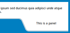
body { background: #007FC1;}.container { border-bottom: 4px solid #B4CAD8;}.container { background-color: #fff; z-index: -1;}.container > .text { padding: 0.5em;}.panel { position: relative; float: right; margin-top: -4px;}<div class="container"> <div class="text"> <p>Lorem ipsum dolor sit amet, consectetur adipisicing elit. Voluptates nam fuga eligendi ipsum sed ducimus quia adipisci unde atque enim quasi quidem perspiciatis totam soluta tempora hic voluptatem optio perferendis.</p> </div></div><svg class="panel" width="200" height="54"> <path d="M0,0 h7 q9,3 12.5,10 l13,30 q3.2,10 13,10 h157 v-50z" fill="white" /> <path transform="translate(0, -0.5)" d="M0,2 h7 q10,2 13,10 l13,30 q3,9 13,10 h157" fill="none" stroke="#B4CAD8" stroke-width="4" /> <text x="110.5" y="25" text-anchor="middle">This is a panel</text></svg>Wavy shape with css
I'm not sure it's your shape but it's close - you can play with the values:
https://jsfiddle.net/7fjSc/9/
#wave { position: relative; height: 70px; width: 600px; background: #e0efe3;}#wave:before { content: ""; display: block; position: absolute; border-radius: 100% 50%; width: 340px; height: 80px; background-color: white; right: -5px; top: 40px;}#wave:after { content: ""; display: block; position: absolute; border-radius: 100% 50%; width: 300px; height: 70px; background-color: #e0efe3; left: 0; top: 27px;}<div id="wave"></div>Wave border in CSS
It's relatively easy to draw a border like that with a couple of pseudo-elements.
First we draw the bottom of the wave:
.wave{ background: linear-gradient(to right, sandybrown, chocolate); height: 50px; position: relative;}.wave::before{ content: ""; position: absolute; left: 0; bottom: 0; right: 0; background-repeat: repeat; height: 10px; background-size: 20px 20px; background-image: radial-gradient(circle at 10px -5px, transparent 12px, maroon 13px);}<div class='wave'></div>Waves in CSS or SVG
I would suggest using an inline handcoded SVG. Your shapes are pretty simple an making the waves with the SVG <path> element is easy.
All you need to know about the SVG path on MDN. In the following example, I used two path elements with quadratic bezier curves to make the waves :
svg { background: url('https://farm9.staticflickr.com/8461/8048823381_0fbc2d8efb.jpg') no-repeat center center; background-size: cover; width: 100%; display: block;}<svg viewbox="0 0 100 25"> <path fill="#9EAFFD" opacity="0.5" d="M0 30 V15 Q30 3 60 15 V30z" /> <path fill="#9EAFFD" d="M0 30 V12 Q30 17 55 12 T100 11 V30z" /></svg>Css Shape Creation Curved Wave
Here is a final demo (archived) on the folded corners:
and the following code is how you can create them:
.note {
  position: relative;
  width: 30%;
  padding: 1em 1.5em;
  margin: 2em auto;
  color: #fff;
  background: #97C02F;
  overflow: hidden;
}

.note:before {
  content: "";
  position: absolute;
  top: 0;
  right: 0;
  border-width: 0 16px 16px 0;
  border-style: solid;
  border-color: #fff #fff #658E15 #658E15;
  background: #658E15;
  -webkit-box-shadow: 0 1px 1px rgba(0, 0, 0, 0.3), -1px 1px 1px rgba(0, 0, 0, 0.2);
  -moz-box-shadow: 0 1px 1px rgba(0, 0, 0, 0.3), -1px 1px 1px rgba(0, 0, 0, 0.2);
  box-shadow: 0 1px 1px rgba(0, 0, 0, 0.3), -1px 1px 1px rgba(0, 0, 0, 0.2);
  /* Firefox 3.0 damage limitation */
  display: block;
  width: 0;
}

.note.rounded {
  -moz-border-radius: 5px 0 5px 5px;
  border-radius: 5px 0 5px 5px;
}

.note.rounded:before {
  border-width: 8px;
  border-color: #fff #fff transparent transparent;
  -moz-border-radius: 0 0 0 5px;
  border-radius: 0 0 0 5px;
}
<div class="note"></div>Create wavy borders in CSS for top and bottom borders
Try using this:
.wave-top {  position: relative;  margin-top: 20px;}
.wave-top::before,.wave-top::after {  border-bottom: 5px solid rgba(237, 30, 30, 1);}
.wave-top::before {  content: "";  position: absolute;  left: 0;  right: 0;  bottom: 0;  height: 10px;  background-size: 20px 40px;  background-image: radial-gradient(circle at 10px -15px, transparent 20px, rgba(237, 30, 30, 1) 21px);}
.wave-top::after {  content: "";  position: absolute;  left: 0;  right: 0;  bottom: 0;  height: 15px;  background-size: 40px 40px;  background-image: radial-gradient(circle at 10px 26px, rgba(237, 30, 30, 1) 20px, transparent 21px);}
.wave-mid {  background-color: rgba(237, 30, 30, 1);  height: 50px;}
.wave-bottom {  position: relative;}
.wave-bottom::before,.wave-bottom::after {  border-top: 5px solid rgba(237, 30, 30, 1);}
.wave-bottom::before {  content: "";  position: absolute;  left: 0;  right: 0;  bottom: 0;  height: 10px;  background-size: 20px 40px;  background-image: radial-gradient(circle at 10px -15px, transparent 20px, #fff 21px);}
.wave-bottom::after {  content: "";  position: absolute;  left: 0;  right: 0;  bottom: 0;  height: 15px;  background-size: 40px 40px;  background-image: radial-gradient(circle at 10px 26px, #fff 20px, transparent 21px);}
<div class='wave-top'></div><div class="wave-mid"></div><div class="wave-bottom"></div>Related Topics
Centering Brand Logo in Bootstrap Navbar
Applying CSS Styles Only to Certain Elements
How to Style a Div to Be a Responsive Square
How to Apply Multiple Background Colors With Css3
When Setting a Font-Size in CSS, What Is the Real Height of the Letters
Make Child Visible Outside an Overflow:Hidden Parent
Add CSS Cursor Property When Using "Pointer-Events: None"
How to Make an Inline-Block Element Fill the Remainder of the Line
Sass Variable in CSS Calc() Function
What Are the Rules For CSS Media Query Overlap
Responsive CSS Triangle With Percents Width
How to Reset/Remove Chrome'S Input Highlighting/Focus Border
Specify an Svg as a Background Image and Also Style the Svg in Css