Cut Corners using CSS
If the parent element has a solid color background, you can use pseudo-elements to create the effect:
div {    height: 300px;    background: red;    position: relative;}
div:before { content: ''; position: absolute; top: 0; right: 0; border-top: 80px solid white; border-left: 80px solid red; width: 0;}<div></div>Box-Shadow over angled corner
It is normally impossible, because the slanted corner is a part of border of element that is not visible.
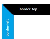
In image if the blue area changes to white you have a slanted corner black area, that is a part of border and in css we can not any think to change this.(change as you want).
You can cover the shadows by adding two little divs to the product div:
<div class="product-info-wrapper">
    <div class="coverShadow c1"></div>
    <div class="coverShadow c2"></div>
    ....
And CSS:
.coverShadow {
   position: absolute;
   z-index: 999;
   background-color: white;
   box-shadow: 0 0 14px white;
 }

 .coverShadow.c1 {
    width: 10px;
    height: 35px;
    background-color: white;
    bottom: 8px;
    right: -10px;
 }

 .coverShadow.c2 {
    width: 35px;
    height: 10px;
    bottom: 0px;
    right: 0;
 }
By changing the box shadow and width/height and right/bottom of covering divs it could be more smooth.
And thanks for the good idea for creating slanted corners.
div with slanted side and rounder corners
Note: I am adding a separate answer because though the answers that I linked in comment seem to give a solution, this one is a bit more complex due to the presence of border also along with the border-radius.
The shape can be created by using the following parts:
- One main container element which is positioned relatively.
- Two pseudo-elements which are roughly half the width of parent element. One element is skewed to produce the skewed left side whereas the other is not skewed.
- The skewed pseudo-element is positioned at the left while the normal element is positioned at the right of the container element.
- The skewed pseudo-element has only top, left and bottom borders. The right border is omitted as it would come right in the middle of the shape. For the pseudo-element that is not skewed, the left border is avoided for the same reason.
- Left border of the skewed pseudo-element is a bit more thicker than other borders because skew makes the border look thinner than it actually is.
I have also added a hover effect to the snippet to demonstrate the responsive nature of the shape.
.outer {  position: relative;  height: 75px;  width: 300px;  text-align: center;  line-height: 75px;  color: white;  text-transform: uppercase;}.outer:before,.outer:after {  position: absolute;  content: '';  top: 0px;  height: 100%;  width: 55%;  background: purple;  border: 2px solid white;  border-left-width: 3px;  z-index: -1;}.outer:before {  left: 0px;  border-radius: 20px;  border-right: none;  transform: skew(20deg);  transform-origin: top left;}.outer:after {  right: 0px;  border-top-right-radius: 20px;  border-bottom-right-radius: 20px;  border-left: none;}
/* Just for demo of responsive nature */
.outer{  transition: all 1s;}.outer:hover{  height: 100px;  width: 400px;  line-height: 100px;}body{  background: lightblue;}
<div class='outer'> Call me back</div>Slanted border using CSS
You can use half triangle with the pseudo element.
.container { padding: 20px; background-color: #F8F8F8; max-width: 200px;}.rectangle { width: 200px; height: 100px; background-color: #003781; position: relative;}.rectangle:after { content: ''; position: absolute; bottom: 0; right: 0; width: 0; height: 0; border-style: solid; border-width: 0 0 25px 25px; border-color: transparent transparent #F8F8F8 transparent;}<div class="container"> <div class="rectangle"></div></div>Creating a div rectangle with a slanted right side with curved corners
skew transformtion can help you here:
.box {
  padding: 10px 20px 10px 30px;
  border: 2px solid red;
  display: inline-block;
  border-right: 0;
  border-radius: 10px 0 0 10px;
  margin-right: 20px;
  position: relative;
  z-index:0;
}

.box::after {
  content: "";
  position: absolute;
  top: -2px;
  right: -10px;
  left: 50%;
  bottom: -2px;
  border: 2px solid red;
  border-left: 0;
  border-radius: 0 10px 10px 0;
  transform-origin: bottom;
  transform: skew(-20deg);
  z-index:-1;
}
<div class="box"> text </div>
<div class="box"> more text </div>Is it possible to draw a border with 1 angled corner?
Here is a solution with linear gradient:
.box { height:100px; width:200px; background:linear-gradient(to bottom,red 50%,transparent 0) 0 0/calc(100% - 20px) 2px no-repeat, linear-gradient(to bottom,transparent 50%,red 0) 0 100%/100% 2px no-repeat, linear-gradient(to right,red 50%,transparent 0) 0 0/2px 100% no-repeat, linear-gradient(to right,transparent 50%,red 0) 100% 20px/2px 100% no-repeat, linear-gradient(to top right,transparent 50%,red 50%,red calc(50% + 1px),transparent calc(50% + 2px)) 100% 0/20px 20px no-repeat;}<div class="box"></div>Is it possible to create an angled corner in CSS?
It's a little difficult keeping the border, but I managed to achieve a close effect using :before and :after elements with a parent container (:before and :after don't work on an img tag)
Add a border to the container
Add a before to block out a corner and offset by -1 to cover the border
Add an after that's slightly offset from the before to create the line inside the cut off
As you can see, the thickness of the 45deg line is a bit of an issue:
.cutCorner {    position:relative; background-color:blue;     border:1px solid silver; display: inline-block;}
.cutCorner img {    display:block;}
.cutCorner:before {    position:absolute; left:-1px; top:-1px; content:'';    border-top: 70px solid silver;    border-right: 70px solid transparent;}
.cutCorner:after {    position:absolute; left:-2px; top:-2px; content:'';    border-top: 70px solid white;    border-right: 70px solid transparent;}
<div class="cutCorner"> <img class="" src="https://www.google.co.uk/logos/doodles/2013/william-john-swainsons-224th-birthday-5655612935372800-hp.jpg" /></div>How to create a box with cut off corner and shadow? (Boxed Website design)
You where very close!
If you use a clip-path you can cut both the header and the main part of the box.
When you then set the drop-shadow filter on the main element you should get the desired style.
#main1 {  height:500px;  width:500px;  filter: drop-shadow(0px 0px 10px blue);}#wrap {  width:500px;  height:500px;  background: linear-gradient(135deg, transparent 70px,green 0);  clip-path: polygon(25% 0, 100% 0, 100% 100%, 0 100%, 0 25%);  position:absolute;}
header {  height:55px;  max-width:100%;  background-color:#eee;  position: relative;}
<div id ="main1"> <div id ="wrap"> <header> </header>
<main> </main> </div> </div>Related Topics
Css Text-Decoration Property Cannot Be Overridden by Child Element
How to Change the Height of an Image in CSS :Before/:After Pseudo-Elements
Difference Between :First-Child and :First-Of-Type
What Does the Forward Slash Mean in the CSS Font Shorthand
How to Set Border'S Thickness in Percentages
Content Url Does Not Display Image on Firefox Browser
:Not() Selector Not Behaving the Same Between Safari and Chrome/Firefox
Drop Shadow For Png Image in Css
Css Native Variables Not Working in Media Queries
What Has Bigger Priority: Opacity or Z-Index in Browsers
Style ≪Select≫ Element Based on Selected ≪Option≫
Css Transparent Curved Shape With Two Rounded Sides
How to Write a CSS Hack For Ie 11