CSS Input with width: 100% goes outside parent's bound
According to the CSS basic box model, an element's width and height are applied to its content box. Padding falls outside of that content box and increases the element's overall size.
As a result, if you set an element with padding to 100% width, its padding will make it wider than 100% of its containing element. In your context, inputs become wider than their parent.
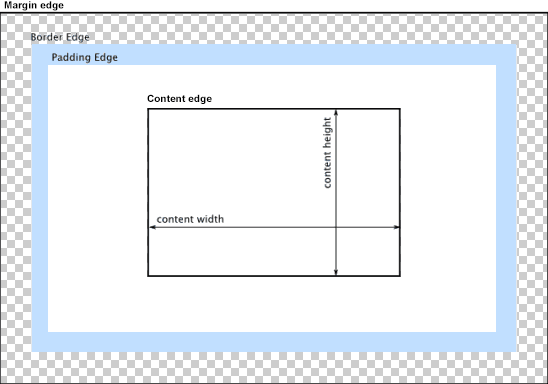
You can change the way the box model treats padding and width. Set the box-sizing CSS property to border-box to prevent padding from affecting an element's width or height:
border-box : The width and height properties include the padding and border, but not the margin... Note that padding and border will be inside of the box.
Note the browser compatibility of box-sizing (IE8+).
At the time of this edit, no prefixes are necessary.
Paul Irish and Chris Coyier recommend the "inherited" usage below:
html {
  box-sizing: border-box;
}
*, *:before, *:after {
  box-sizing: inherit;
}
For reference, see:
* { Box-sizing: Border-box } FTW
Inheriting box-sizing Probably Slightly Better Best-Practice.
Here's a demonstration in your specific context:
#mainContainer {
  line-height: 20px;
  font-family: "Helvetica Neue", Helvetica, Arial, sans-serif;
  background-color: rgba(0, 50, 94, 0.2);
  margin: 20px auto;
  display: table;
  -moz-border-radius: 15px;
  border-style: solid;
  border-color: rgb(40, 40, 40);
  border-radius: 2px 5px 2px 5px / 5px 2px 5px 2px;
  border-radius: 2px;
  border-radius: 2px 5px / 5px;
  box-shadow: 0 5px 10px 5px rgba(0, 0, 0, 0.2);
}
.loginForm {
  width: 320px;
  height: 250px;
  padding: 10px 15px 25px 15px;
  overflow: hidden;
}
.login-fields > .login-bottom input#login-button_normal {
  float: right;
  padding: 2px 25px;
  cursor: pointer;
  margin-left: 10px;
}
.login-fields > .login-bottom input#login-remember {
  float: left;
  margin-right: 3px;
}
.spacer {
  padding-bottom: 10px;
}
input[type=text],
input[type=password] {
  width: 100%;
  height: 30px;
  padding: 5px 10px;
  background-color: rgb(215, 215, 215);
  line-height: 20px;
  font-size: 12px;
  color: rgb(136, 136, 136);
  border-radius: 2px 2px 2px 2px;
  border: 1px solid rgb(114, 114, 114);
  box-shadow: 0 1px 0 rgba(24, 24, 24, 0.1);
  box-sizing: border-box;
}
input[type=text]:hover,
input[type=password]:hover,
label:hover ~ input[type=text],
label:hover ~ input[type=password] {
  background: rgb(242, 242, 242);
  !important;
}
input[type=submit]:hover {
  box-shadow: inset 0 1px 0 rgba(255, 255, 255, 0.3), inset 0 -10px 10px rgba(255, 255, 255, 0.1);
}
.login-top {
  height: auto;/*85px;*/
}
.login-bottom {
  padding: 35px 15px 0 0;
}
<div id="mainContainer">
<div id="login" class="loginForm">
<div class="login-top">
</div>
<form class="login-fields" onsubmit="alert('test'); return false;">
<div id="login-email" class="login-field">
<label for="email" style="-moz-user-select: none;-webkit-user-select: none;" onselectstart="return false;">E-mail address</label>
<span><input name="email" id="email" type="text" /></span>
</div>
<div class="spacer"></div>
<div id="login-password" class="login-field">
<label for="password" style="-moz-user-select: none;-webkit-user-select: none;" onselectstart="return false;">Password</label>
<span><input name="password" id="password" type="password" /></span>
</div>
<div class="login-bottom">
<input type="checkbox" name="remember" id="login-remember" />
<label for="login-remember" style="-moz-user-select: none;-webkit-user-select: none;" onselectstart="return false;">Remember my email</label>
<input type="submit" name="login-button" id="login-button_normal" style="cursor: pointer" value="Log in" />
</div>
</form>
</div>
</div>CSS input element width going outside container
That's because you set padding. It will sum the value of the element width with the padding set.
To avoid this behavior, is recommended to add the property box-sizing: border-box
Example:
#element{
    box-sizing: border-box;}
Or even better:
*{
    box-sizing: border-box;}
Width 100% goes outside the wrap
This is the default box-model behavior :
Width = width + padding-left + padding-right + border-left + border-right
Therefore, your width is 100% + 2*10px which is larger than the footer's width...
You can :
- Remove
width: 100%which will result on an implicit use ofwidth: auto(which is just fine because block elements automatically fill the width of their parent) - Use the
box-sizing: border-boxproperties
For deeper explanations, just take a look at this resource and this one!
Regards.
How to enforce input text to take 100% width of its parent
input {
  width: 100%;
  box-sizing: border-box;
}

.one {
  width: 200px;
  background-color: blue;
  height: 60px;
  float: left;
}

.two {
  background-color: red;
  height: 60px;
  width: auto;
}

.three {
  background-color: yellow;
  height: 60px;
  width: 150px;
  float: right;
}

.input-wrapper {
  background-color: green;
  position: relative;
  margin-left: 200px;
  margin-right: 150px;
}
Input type to have width of 100% and be inside parent div
The problem is with the input paddings. To fix it add box-sizing property to your input fields:
box-sizing: border-box;
I just tested it in your codepen, seems like the result you want.
Why Input box going out of the div box after giving padding to it with 100% width
This is how box model works. When you add 100% width it is applied to content. And an extra padding breaking the alignment. But you can change the box model to count the width from border.
Add Box Sizing to input fields
input {
  box-sizing: border-box;
}
Why does an Input width of 100% always overrun the containing div?
Form inputs are really hard to style. And it's especially hard to make the style look consistent across all browsers. One of the best ways I've found to style text inputs is to get rid of the border, outline, padding, and margin. Then wrap the input in a div with the border, outline, padding, and margin that you want.
I think I achieved what you want. Check out this forked jsFiddle: http://jsfiddle.net/aP2Ju/
Unable to extend my input bar with width 100% and align to center
to extend input box, change into or better yet ... if they're small in size and you want to make them centered, use .form-group div { margin:auto; }
to center the radio buttons, use display: flex also
working snippet below:
.form-group div {
  margin: auto;
  display: flex;
}
<meta name="viewport" content="width=device-width, initial-scale=1">
<link rel="stylesheet" href="https://maxcdn.bootstrapcdn.com/bootstrap/4.5.0/css/bootstrap.min.css">
<script src="https://ajax.googleapis.com/ajax/libs/jquery/3.5.1/jquery.min.js"></script>
<script src="https://cdnjs.cloudflare.com/ajax/libs/popper.js/1.16.0/umd/popper.min.js"></script>
<script src="https://maxcdn.bootstrapcdn.com/bootstrap/4.5.0/js/bootstrap.min.js"></script>
<form class="form-horizontal" method="POST" action="save-user">
<input type="hidden" name="id" value="${user.id }" />
<div class="form-group">
<label class="control-label col-md-3">Username</label>
<div class="col-md-7">
<input type="text" class="form-control" name="username" value="${user.username }" />
</div>
</div>
<div class="form-group">
<label class="control-label col-md-3">First Name</label>
<div class="col-md-7">
<input type="text" class="form-control" name="firstname" value="${user.firstname }" />
</div>
</div>
<div class="form-group">
<label class="control-label col-md-3">Last Name</label>
<div class="col-md-7">
<input type="text" class="form-control" name="lastname" value="${user.lastname }" />
</div>
</div>
<div class="form-group">
<label class="control-label col-md-3">Age </label>
<div class="col-md-3">
<input type="text" class="form-control" name="age" value="${user.age }" />
</div>
</div>
<div class="form-group">
<label class="control-label col-md-12">Gender </label>
<div class="col-12">
<div class="form-check form-check-inline">
<input class="form-check-input" type="radio" name="gender" id="male" value="Male">
<label class="form-check-label" for="Male">Male</label>
</div>
<div class="form-check form-check-inline">
<input class="form-check-input" type="radio" name="gender" id="Female" value="Female">
<label class="form-check-label" for="Female">Female</label>
</div>
</div>
</div>
<div class="form-group">
<label class="control-label col-md-3">Password</label>
<div class="col-md-7">
<input type="password" class="form-control" name="password" value="${user.password }" />
</div>
</div>
<div class="form-group ">
<input type="submit" class="btn btn-primary" value="Register" />
</div>
</form>
</div>
</c:when>Related Topics
Transition Background-Color Via Slide Animation
Bootstrap: How to Stack Divs of Different Heights
How to Have Css3 Animation to Loop Forever
How to Apply Multiple Background Colors With Css3
Offsetting Columns Is Not Working (Bootstrap V4.0.0-Beta)
Css Skew Element and Get Inner Rounded Border Top
Why the CSS Calc() Function Is Not Working
Meaning of Numbers in "Col-Md-4"," Col-Xs-1", "Col-Lg-2" in Bootstrap
Downloading a Google Font and Setting Up an Offline Site That Uses It
Styling Google Maps Infowindow
Css: Styled a Checkbox to Look Like a Button, Is There a Hover
Why Does CSS Float Not Change the Width of the Following Div