Calc of max, or max of calc in CSS
min(), max(), and clamp() are finally available!
Support starts in Firefox 75, Chrome 79, and Safari 11.1 (clamp is available in Safari 13.1).
min() and max() take any number of arguments.
clamp() has syntax clamp(MIN, VAL, MAX) and is equivalent to max(MIN, min(VAL, MAX)).
min() and max() may be nested. They can be used in calc() as well as outside of it, they also may contain math expressions, that means you can avoid calc() when using them.
Therefore the original example can be written as:
max-width: max(500px, 100% - 80px);
Use max-content in calc
Unfortunately you can't use the max-content keyword with calc()
My solution to your problem would be to use padding:
#myDiv {
  width: max-content;
  padding-inline: 2px;
  border-style: dashed;
}
<div id="myDiv">
<p>This is my text</p>
</div>Use max()/min() inside of CSS calc()
Yes, yes you can.
https://developer.mozilla.org/en-US/docs/Web/CSS/max()
You can (and often need to) combine
min()andmax()values, or usemax()within aclamp()orcalc()function.
If your current expression isn't working, I think it's because you need inner whitespace so the CSS tokenizer can separate the different components, as it's possible 100vh-max is being interpreted as a single token instead of as 100vh - max(...).
Try this:
.myclass{
  height: calc( 100vh - max( 40px, 7vmin ) );
}
(and I'm sure you'll agree it's easier to read with inner whitespace too).
What does CSS max-width and calc() really do here?
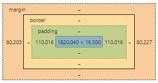
I assume you're getting the values from dev tools.padding is calculated using the parent's size, so 5% padding would actually be 2200 * 5% = 110.
Secondly, the element width doesn't include margins or padding, so 1820 would be the size of the element excluding the padding.
See fiddle
As you can see from the image below, with a parent width of ~2200px (I had to zoom out, so it's not exactly 2200), everything is sized correctly. Make sure there aren't any other rules that are modifying the element.
Use Calc with Max Height
You can use display:flex to accomplish that, as long as you don't have to support older browsers (< IE11, if I remember correctly).
#container { position: absolute; top: 0; left: 0; max-height: 100%; /* uncomment this static height to see it work */ /* height: 100%; */ width: 100px; overflow: hidden; display: flex; flex-direction: column;}#tip { background: #ff0; height:20px;}#top { background: #f00; height:20px;}#btm { background: #0f0; max-height: calc(100% - 40px); overflow-y: auto;}html, body { padding: 0; margin: 0; height:100%; width:100%;}<div id="container"> <div id="tip">Tip</div> <div id="top">Top</div> <div id="btm"> Btm<br> Btm<br> Btm<br> Btm<br> Btm<br> Btm<br> Btm<br> Btm<br> Btm<br> Btm<br> Btm<br> Btm<br> Btm<br> Btm<br> Btm<br> Btm<br> Btm<br> Btm<br> Btm<br> Btm<br> Btm<br> Btm<br> Btm<br> Btm<br> Btm<br> Btm<br> Btm<br> Btm<br> Btm<br> Btm<br> Btm<br> Btm<br> Btm<br> Btm<br> Btm<br> Btm<br> Btm<br> Btm<br> Btm<br> Btm<br> Btm<br> Btm<br> Btm<br> Btm<br> Btm<br> </div></div>What does max-height: calc(( 100vh - 80px ) , 560px) do?
Your rule
body {
  max-height: calc((100vh - 80px), 560px);
}
as it stands, is invalid CSS because there is no comma-separation of two or more values allowed in the calc argument (invalid number error).
As with regard to your other question, the space surrounding the operator is necessary to differentiate between a signed number/expression and the subtraction operation:
The
+and-operators must be surrounded by whitespace. For instance,
calc(50% -8px)will be parsed as a percentage followed by a negative length — an invalid expression — whilecalc(50% - 8px)is a percentage followed by a subtraction operator and a length. Likewise,calc(8px + -50%)is treated as a length followed by an addition operator and a negative percentage.The
*and/operators do not require whitespace, but adding it for consistency is both allowed and recommended.
https://developer.mozilla.org/en-US/docs/Web/CSS/calc#Syntax
Keep Element In Middle Of Excess Space With CSS calc() Function
Because the arrow is absolutely positioned, it makes it a lot more complicated to position it relative to the main element. Instead, you can achieve the same effect (if i'm understand what you're looking for correctly!) using a wrapping container and Flexbox (or default CSS to vertically and horizontally center the child elements, I just prefer flex).
What I did was wrap the main element and the arrow in a div, labeled with a class of container. This way, we can position the main and svg relative to each other while still maintaining the flow of the application.
Display flex automatically aligns child elements in a row, which puts the svg and main elements next to each other. Adding align-items and justify-content center ensures that everything remains vertically and horizontally centered. I removed the margin: 0 auto; from main and the absolute positioning from the svg since it's no longer necessary.
Pen with changes, or see below: https://codepen.io/xenvi/pen/OJMGweV
body {
  margin: 0;
  height: 100vh;
}

 .container {
   display: flex;
 }

main {
  position: relative;
  width: 80%;
  padding: 6rem 0;
  background: red;
  height: 100vh;
  max-width: 1220px;
}

.down-arrow {
  width: 1rem;
  height: 1rem;
  bottom: 25vh;
}

.arrow-container, .end-container {
  display: flex;
  align-items: center;
  justify-content: center;
  flex-grow: 1;
}
<div class="container">
<div class="arrow-container">
<svg class="down-arrow" aria-hidden="true" viewBox="0 0 410.95 355.89">
<polygon fill="#000" points="205.47 354.89 410.08 0.5 0.87 0.5 205.47 354.89" /></svg>
</div>
<main>
<div class="row"></div>
</main>
<div class="end-container"></div>
</div>Related Topics
Difference Between :First-Child and :First-Of-Type
How to Increase the Gap Between Text and Underlining in Css
Transition of Background-Color
Style Disabled Button With Css
How to Set Border'S Thickness in Percentages
Font Awesome 5 - Why Aren't Icons Like Bitcoin, Facebook, Twitter Showing
My Position: Sticky Element Isn't Sticky When Using Flexbox
Why Did Bootstrap 3 Switch to Box-Sizing: Border-Box
How to Reference One CSS Rule Within Another
Css3 Animation Not Working in Safari
Sass Variable in CSS Calc() Function