Twitter bootstrap 3 form-horizontal and multiple input columns on single line
To align easily things in bootstrap 3, You should use the Grid System.
Here is a fiddle close to your needs :
<body>
<form class="form-horizontal">
    <div class="row">
       <div class="form-group">
        <label class="col-sm-2">Quarter</label>
        <div class="col-sm-10"><input type="text" class="form-control" /></div>
        </div>
   </div>
    <div class="row">
        <div class="form-group">
        <label class="col-sm-2">Address</label>
        <div class="col-sm-5"><input type="text" class="form-control" /></div>
        </div>
        <div class="form-group">
        <label class="col-sm-2">Addr. №</label>
        <div class="col-sm-3"><input type="text" class="form-control" /></div>
        </div>
    </div>
    <div class="row">
         <div class="form-group">
        <label class="col-sm-2">Block name/Number</label>
        <div class="col-sm-1"><input type="text" class="form-control" /></div>
        </div>
        <div class="form-group">
        <label class="col-sm-1">Entrance</label>
        <div class="col-sm-1"><input type="text" class="form-control" /></div>
         </div>
         <div class="form-group">
        <label class="col-sm-1">Floor</label>
        <div class="col-sm-1"><input type="text" class="form-control" /></div>
         </div>
         <div class="form-group">
        <label class="col-sm-2">Apartament</label>
        <div class="col-sm-3"><input type="text" class="form-control" /></div>
        </div>
    </div>
</form>
</body>
The alignment depends on the width of the screen so be sure to tune it properly to your needs. Then you can style the inputs themselves.
Horizontal form with 3 columns that stack when resized
Thanks to jme11 to getting me on the right track. I think I have figured this out - the following layout is exactly the look and behaviour that I need. Hopefully this will help someone else out in the future.
         <form class="form-horizontal">
                    <div class="form-body">
                        <div class="row">
                            <div class="col-md-12">
                                <div class="col-md-4">
                                    <div class="row">
                                        <div class="form-group">
                                            <label class="control-label col-md-3">Col A Input 1</label>
                                            <div class="col-md-9">
                                                <div class="form-control-static">Col A Input 1</div>
                                            </div>
                                        </div>
                                    </div>
                                    <div class="row">
                                        <div class="form-group">
                                            <label class="control-label col-md-3">Col A Input 2</label>
                                            <div class="col-md-9">
                                                <div class="form-control-static">Col A Input 2</div>
                                            </div>

                                        </div>
                                    </div>
                                    <div class="row">
                                        <div class="form-group">
                                            <label class="control-label col-md-3">Col A Input 3</label>
                                            <div class="col-md-8">
                                                <div class="form-control-static">Col A Input 3</div>
                                            </div>
                                        </div>
                                    </div>

                                </div>
                                <div class="col-md-4">
                                    <div class="row">
                                        <div class="form-group">
                                            <label class="control-label col-md-3">Col B Input 1</label>
                                            <div class="col-md-9">
                                                <div class="form-control-static">Col B Input 1</div>
                                            </div>

                                        </div>
                                    </div>
                                    <div class="row">
                                        <div class="form-group">
                                            <label class="control-label col-md-3">Col B Input 2</label>
                                            <div class="col-md-9">
                                                <div class="form-control-static">Col B Input 2</div>
                                            </div>
                                        </div>
                                    </div>
                                    <div class="row">
                                        <div class="form-group">
                                            <label class="control-label col-md-3">Col B Input 3</label>
                                            <div class="col-md-9">
                                                <div class="form-control-static">Col B Input 3</div>
                                            </div>
                                        </div>
                                    </div>
                                </div>
                                <div class="col-md-4">
                                    <div class="row">
                                        <div class="form-group">
                                            <label class="control-label col-md-3">Col C Input 1</label>
                                            <div class="col-md-9">
                                                <div class="form-control-static">Col C Input 1</div>
                                            </div>
                                        </div>
                                    </div>
                                    <div class="row">
                                        <div class="form-group">
                                            <label class="control-label col-md-3">Col C Input 2</label>
                                            <div class="col-md-9">
                                                <div class="form-control-static">Col C Input 2</div>
                                            </div>
                                        </div>
                                    </div>
                                    <div class="row">
                                        <div class="form-group">
                                            <label class="control-label col-md-3">Col C Input 3</label>
                                            <div class="col-md-9">
                                                <div class="form-control-static">Col C Input 3</div>
                                            </div>
                                        </div>
                                    </div>

                                </div>
                            </div>
                        </div>
                    </div>
                </form>
Plunkr example (Make the preview pane larger to see the columns unstacked)
Bootstrap 3 form 2 columns
Okay, it's not so diffucult to solve this issue, my solution would be putting each form-group in separate rows and if you want them to be inline, you can just keep them in the same row. That's something like table.
Now try this :
<form class="form-horizontal container" role="form" name="event" ng-controller="eventFormController">
    <div class="row">
        <div class="form-group col-md-6">
            <label for="selectBusinesses" class="col-sm-3 col-md-3 col-lg-2 control-label">Businesses</label>
            <div class="col-sm-5 col-md-4 col-lg-3">
                <select id="selectBusinesses" class="form-control" ng-model="event.business" name="businesses"  ng-options=""></select>
            </div>
            <div class="col-sm-4 col-md-4 col-lg-3">
                <button type="button" class="btn btn-primary"><span class="glyphicon glyphicon-plus"></span></button>
                <button type="button" class="btn btn-danger"><span class="glyphicon glyphicon-minus"></span></button>
            </div>
        </div>
    </div>
    <div class="row">
        <div class="form-group col-md-6">
            <label for="selectEventType" class="col-sm-3 col-md-3 col-lg-2  control-label">Event Type</label>
            <div class="col-sm-9 col-md-6 col-lg-5">
                <select id="selectEventType" class="form-control" ng-model="event.eventType" name="eventType" ng-options=""></select>
            </div>
        </div>
    </div>
    <div class="row">
        <div class="form-group">
            <label for="status" class="col-sm-3 col-md-3 col-lg-2control-label">Status</label>
            <div class="col-sm-9 col-md-6 col-lg-5">
                {{event.status}}
            </div>
        </div>
    </div>
    <div class="row">
        <div class="form-group col-md-6">
            <label for="inputTopic" class="col-sm-3 col-md-3 col-lg-2 control-label">Topic</label>
            <div class="col-sm-9 col-md-6 col-lg-5">
                <input type="text" class="form-control" id="inputTopic" ng-model="event.topic" name="topic" ng-maxlength="100" />
            </div>
        </div>
    </div>
    <div class="row">
        <div class="form-group col-md-6">
            <label for="inputStartTime" class="col-sm-3 col-md-3 col-lg-2 control-label">Start Time</label>
            <div class="col-sm-9 col-md-6 col-lg-5">
                <timepicker ng-model="event.startTime" hour-step="hStep" minute-step="mStep" show-meridian="ismeridian"></timepicker>
            </div>
        </div>
        <div class="form-group col-md-6">
            <label for="inputEndTime" class="col-sm-3 col-md-3 col-lg-2 control-label">End Time</label>
            <div class="col-sm-9 col-md-6 col-lg-5">
                <timepicker ng-model="event.endTime" hour-step="hStep" minute-step="mStep" show-meridian="ismeridian"></timepicker>
            </div>
        </div>
    </div>
</form>
Twitter Bootstrap 3 inline and horizontal form
Just because the docs suggest you should use the form controls does not mean you have to. You can just use the built-in grid system to achieve the layout. See http://bootply.com/82900 for a working example. Code below:
<script src="https://cdnjs.cloudflare.com/ajax/libs/jquery/3.3.1/jquery.min.js"></script>
<!-- Latest compiled and minified CSS -->
<link rel="stylesheet" href="https://maxcdn.bootstrapcdn.com/bootstrap/3.3.7/css/bootstrap.min.css" integrity="sha384-BVYiiSIFeK1dGmJRAkycuHAHRg32OmUcww7on3RYdg4Va+PmSTsz/K68vbdEjh4u" crossorigin="anonymous">

<!-- Optional theme -->
<link rel="stylesheet" href="https://maxcdn.bootstrapcdn.com/bootstrap/3.3.7/css/bootstrap-theme.min.css" integrity="sha384-rHyoN1iRsVXV4nD0JutlnGaslCJuC7uwjduW9SVrLvRYooPp2bWYgmgJQIXwl/Sp" crossorigin="anonymous">

<!-- Latest compiled and minified JavaScript -->
<script src="https://maxcdn.bootstrapcdn.com/bootstrap/3.3.7/js/bootstrap.min.js" integrity="sha384-Tc5IQib027qvyjSMfHjOMaLkfuWVxZxUPnCJA7l2mCWNIpG9mGCD8wGNIcPD7Txa" crossorigin="anonymous"></script>

<div class="container">
  <form role="form">
    <div class="row">
      <label class="col-xs-4" for="inputEmail1">Email</label>
      <div class="col-xs-8">
        <input type="email" class="form-control" id="inputEmail1" placeholder="Email">
      </div>
    </div>
    <div class="row">
      <label class="col-xs-4" for="inputPassword1">Password</label>
      <div class="col-xs-8">
        <input type="password" class="form-control" id="inputPassword1" placeholder="Password">
      </div>
    </div>
    <div class="row">
      <label class="col-xs-12" for="TextArea">Text Area</label>
    </div>
    <div class="row">
      <div class="col-xs-12">
        <textarea class="form-control" id="TextArea"></textarea>
      </div>
    </div>
    <div class="row">
      <div class="col-xs-12">
        <button type="submit" class="btn btn-default">Sign in</button>
      </div>
    </div>
  </form>
</div>
Twitter Bootstrap 3 Inline Form with labels
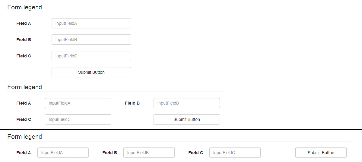
Option #1 : fixed columns
You can use a structure mixing col-xs-12, col-sm-6 and col-lg-3 to get 1, 2 or 4 columns. Inside your form-group, remember to fix label/input sizes with col-xs-4 and col-xs-8 :
<div class="container">
  <form class="form form-inline" role="form">

    <legend>Form legend</legend>

    <div class="form-group col-xs-12 col-sm-6 col-lg-3">
      <label for="InputFieldA" class="col-xs-4">Field A</label>
      <div class="col-xs-8">
        <input type="text" class="form-control" id="InputFieldA" placeholder="InputFieldA">
      </div>
    </div>

    <div class="form-group col-xs-12 col-sm-6 col-lg-3">
      <label for="InputFieldB" class="col-xs-4">Field B</label>
      <div class="col-xs-8">
        <input type="text" class="form-control" id="InputFieldB" placeholder="InputFieldB">
      </div>
    </div>

    <div class="form-group col-xs-12 col-sm-6 col-lg-3">
      <label for="InputFieldC" class="col-xs-4">Field C</label>
      <div class="col-xs-8">
        <input type="text" class="form-control" id="InputFieldC" placeholder="InputFieldC">
      </div>
    </div>

    <div class="form-group col-xs-12 col-sm-6 col-lg-3">
    <button type="submit" class="btn btn-default col-xs-8 col-xs-offset-4">Submit Button</button>
    </div>

  </form>
</div>
You still need a few CSS :
// get a larger input, and align it with submit button
.form-inline .form-group > div.col-xs-8 {
    padding-left: 0;
    padding-right: 0;
}
// vertical align label
.form-inline label {
    line-height: 34px;
}
// force inline control to fit container width
// http://getbootstrap.com/css/#forms-inline
.form-inline .form-control {
    width: 100%;
}
// Reset margin-bottom for our multiline form
@media (min-width: 768px) {
  .form-inline .form-group {
    margin-bottom: 15px;
  }
}
You can add as many inputs as you want.
Bootply
Option #2 : fluid columns
To be able to not care of the number of fields per row, you can use this structure :
<div class="container">
  <form class="form form-inline form-multiline" role="form">

    <legend>Form legend</legend>

    <div class="form-group">
      <label for="InputFieldA">Field A</label>
      <input type="text" class="form-control" id="InputFieldA" placeholder="InputFieldA">
    </div>

    <div class="form-group">
      <label for="InputFieldB">Very Long Label For Field B</label>
      <input type="text" class="form-control" id="InputFieldB" placeholder="InputFieldB">
    </div>

    <div class="form-group">
      <label for="InputFieldC">F. C</label>
      <input type="text" class="form-control" id="InputFieldC" placeholder="InputFieldC">
    </div>

    <div class="form-group">
      <label for="InputFieldD">Very Long Label For Field D</label>
      <input type="text" class="form-control" id="InputFieldD" placeholder="InputFieldD">
    </div>

    <div class="form-group">
      <label for="InputFieldE">Very Long Label For Field E</label>
      <input type="text" class="form-control" id="InputFieldE" placeholder="InputFieldE">
    </div>

    <div class="form-group">
      <label for="InputFieldF">Field F</label>
      <input type="text" class="form-control" id="InputFieldF" placeholder="InputFieldF">
    </div>

    <div class="form-group">
      <button type="submit" class="btn btn-default">Submit Button</button>
    </div>

  </form>
</div>
And a few CSS lines to fix margins :
.form-multiline .form-group {
    margin-bottom: 15px;
    margin-right: 30px;
}
.form-multiline label,
.form-multiline .form-control {
    margin-right: 15px;
}

Bootply
Form inline inside a form horizontal in twitter bootstrap?
Don't nest <form> tags, that will not work. Just use Bootstrap classes.
Bootstrap 3
<form class="form-horizontal" role="form">
    <div class="form-group">
      <label for="inputType" class="col-md-2 control-label">Type</label>
      <div class="col-md-3">
          <input type="text" class="form-control" id="inputType" placeholder="Type">
      </div>
    </div>
    <div class="form-group">
        <span class="col-md-2 control-label">Metadata</span>
        <div class="col-md-6">
            <div class="form-group row">
                <label for="inputKey" class="col-md-1 control-label">Key</label>
                <div class="col-md-2">
                    <input type="text" class="form-control" id="inputKey" placeholder="Key">
                </div>
                <label for="inputValue" class="col-md-1 control-label">Value</label>
                <div class="col-md-2">
                    <input type="text" class="form-control" id="inputValue" placeholder="Value">
                </div>
            </div>
        </div>
    </div>
</form>
You can achieve that behaviour in many ways, that's just an example. Test it on this bootply
Bootstrap 2
<form class="form-horizontal">
    <div class="control-group">
        <label class="control-label" for="inputType">Type</label>
        <div class="controls">
            <input type="text" id="inputType" placeholder="Type">
        </div>
    </div>
    <div class="control-group">
        <span class="control-label">Metadata</span>
        <div class="controls form-inline">
            <label for="inputKey">Key</label>
            <input type="text" class="input-small" placeholder="Key" id="inputKey">
            <label for="inputValue">Value</label>
            <input type="password" class="input-small" placeholder="Value" id="inputValue">
        </div>
    </div>
</form>
Note that I'm using .form-inline to get the propper styling inside a .controls.
You can test it on this jsfiddle
Multiple inputs on single line Bootstrap 3
Try like this,
<!DOCTYPE html>
<html>
  <head>
    <title>Bootstrap 101 Template</title>
    <meta name="viewport" content="width=device-width, initial-scale=1.0">
    <link href="//netdna.bootstrapcdn.com/bootstrap/3.0.0/css/bootstrap.min.css" rel="stylesheet" media="screen">
    <style>
        label {
         font-weight: normal;
        }
       .jumbotron {
         line-height: 1.143;
        }
       label.col-lg-1 {
         width: 0;
       }
    </style>
  </head>
  <body>
    <div class="container jumbotron">
    <h1><span class="text-center">Mywebsite.</span></h1>

    <h2><span class="text-center">Find things close to you</span></h2>

    <form class="form-horizontal" role="form">
      <div class="form-group">
        <label for="inputCity" class="col-lg-2 control-label">Ineed</label>
        <div class="col-lg-3">
          <select class="form-control">
                <option>
                  Bakery
                </option>

                <option>
                  Supermarket
                </option>

                <option>
                  Etc
                </option>
              </select>
        </div>
        <label for="inputType" class="col-lg-1 control-label">In</label>
        <div class="col-lg-3">
          <input type="text" class="form-control" id="inputCity" placeholder="City">
        </div>
        <button type="submit" class="btn btn-success">Go</button>
      </div>
    </form>
  </div>

    <script src="//code.jquery.com/jquery.js"></script>
    <script src="//netdna.bootstrapcdn.com/bootstrap/3.0.0/js/bootstrap.min.js"></script>
  </body>
</html>
Screen-shot
Multi column forms with fieldsets
There are a couple of things that need to be adjusted in your layout:
You are nesting
colelements withinform-groupelements. This should be the other way around (theform-groupshould be within thecol-sm-xxelement).You should always use a
rowdiv for each new "row" in your design. In your case, you would need at least 5 rows (Username, Password and co, Title/First/Last name, email, Language). Otherwise, your problematic.col-sm-12is still on the same row with the above 3.col-sm-4resulting in a total of columns greater than 12, and causing the overlap problem.
Here is a fixed demo.
And an excerpt of what the problematic section HTML should become:
<fieldset>
    <legend>Personal Information</legend>
    <div class='row'>
        <div class='col-sm-4'>
            <div class='form-group'>
                <label for="user_title">Title</label>
                <input class="form-control" id="user_title" name="user[title]" size="30" type="text" />
            </div>
        </div>
        <div class='col-sm-4'>
            <div class='form-group'>
                <label for="user_firstname">First name</label>
                <input class="form-control" id="user_firstname" name="user[firstname]" required="true" size="30" type="text" />
            </div>
        </div>
        <div class='col-sm-4'>
            <div class='form-group'>
                <label for="user_lastname">Last name</label>
                <input class="form-control" id="user_lastname" name="user[lastname]" required="true" size="30" type="text" />
            </div>
        </div>
    </div>
    <div class='row'>
        <div class='col-sm-12'>
            <div class='form-group'>

                <label for="user_email">Email</label>
                <input class="form-control required email" id="user_email" name="user[email]" required="true" size="30" type="text" />
            </div>
        </div>
    </div>
</fieldset>
Related Topics
Succinct Way of Specifying Two or More Values for an Attribute in CSS Selector
Mobile Menu Open & Close Buttons Display in Chrome But Not Safari
How to Scale Text Size Compared to Container
Visited Links Color Not Changing in Ie 8
Styling an Input Button Using "Sliding Doors"
Watermark Background Images in Div
Rotating Animation Doesn't Work with Chrome
How to Simplify These CSS Selectors
A Styled Ordered List Whose Nested List Should Have Numbers with Letters Using CSS Counter Property
Cannot Get CSS to Work in Itextsharp (5.4.3) When Making Pdf
Attr as Property in CSS Selector
Issue with Embedded Svg Images in Dark Mode
How to Target All Divs of The Same Class Except for Hovered Over Div
CSS Background Image Not Appearing in Safari