bootstrap 4 row height
Use the sizing utility classes...
h-50= height 50%h-100= height 100%
http://www.codeply.com/go/Y3nG0io2uE
 <div class="container">
        <div class="row">
            <div class="col-md-8 col-lg-6 B">
                <div class="card card-inverse card-primary">
                    <img src="http://lorempicsum.com/rio/800/500/4" class="img-fluid" alt="Responsive image">
                </div>
            </div>
            <div class="col-md-4 col-lg-3 G">
                <div class="row h-100">
                    <div class="col-md-6 col-lg-6 B h-50 pb-3">
                        <div class="card card-inverse card-success h-100">

                        </div>
                    </div>
                    <div class="col-md-6 col-lg-6 B h-50 pb-3">
                        <div class="card card-inverse bg-success h-100">

                        </div>
                    </div>
                    <div class="col-md-12 h-50">
                        <div class="card card-inverse bg-danger h-100">

                        </div>
                    </div>
                </div>
            </div>
        </div>
    </div>
Or, for an unknown number of child columns, use flexbox and the cols will fill height. See the d-flex flex-column on the row, and h-100 on the child cols.
<div class="container">
    <div class="row">
        <div class="col-md-8 col-lg-6 B">
            <div class="card card-inverse card-primary">
                <img src="http://lorempicsum.com/rio/800/500/4" class="img-fluid" alt="Responsive image">
            </div>
        </div>
        <div class="col-md-4 col-lg-3 G ">
            <div class="row d-flex flex-column h-100">
                <div class="col-md-6 col-lg-6 B h-100">
                    <div class="card bg-success h-100">

                    </div>
                </div>
                <div class="col-md-6 col-lg-6 B h-100">
                    <div class="card bg-success h-100">

                    </div>
                </div>
                <div class="col-md-12 h-100">
                    <div class="card bg-danger h-100">

                    </div>
                </div>
            </div>
        </div>
    </div>
</div>
https://www.codeply.com/go/tgzFAH8vaW
Change height of rows in Bootstrap
Firstly, you have to set html and body to 100% height.
Then you can use predefined bootstrap classes, like h-50 or h-75 to fill the container as you desire - that is no such class like h-80, as you can check here.
However, if you want specific heights you can simply create custom classes, like so:
.h-80 {
    height: 80%;
}

.h-20 {
    height: 20%;
}
Bootstrap 4 row fill remaining height
Use the Bootstrap 4.1 flex-grow-1 class...
https://codeply.com/go/Iyjsd8djnz
html,body{height:100%;}

.bg-purple {
  background: rgb(48,0,50);
}
.bg-gray {
  background: rgb(74,74,74);
}
.bg-blue {
  background: rgb(50,101,196);
}
.bg-red {
  background: rgb(196,50,53);
}
<link rel="stylesheet" href="https://stackpath.bootstrapcdn.com/bootstrap/4.3.1/css/bootstrap.min.css" integrity="sha384-ggOyR0iXCbMQv3Xipma34MD+dH/1fQ784/j6cY/iJTQUOhcWr7x9JvoRxT2MZw1T" crossorigin="anonymous">
<div class="container-fluid h-100">
<div class="row justify-content-center h-100">
<div class="col-4 bg-red">
<div class="h-100 d-flex flex-column">
<div class="row justify-content-center bg-purple">
<div class="text-white">
<div style="height:150px">ROW 1 - fixed height</div>
</div>
</div>
<div class="row justify-content-center bg-blue flex-grow-1">
<div class="text-white">ROW 2 - grow remaining height</div>
</div>
</div>
</div>
<div class="col-8 bg-gray"></div>
</div>
</div>Make row occupy full height in Bootstrap 4
You should use flex-grow:1; as explained in the other answer: Bootstrap 4: How to make the row stretch remaining height?
The problem is that body should be height:100%; not min-height...
<main class="container-fluid d-flex h-100 flex-column">
  <div class="row">
      <div class="col-sm-6">
          Hello,
      </div>
      <div class="col-sm-6">
          World!
      </div>
  </div>
  <div class="row flex-grow-1" id="second-row">
      <div class="col-sm-8 portlet-container portlet-dropzone">
          <textarea></textarea>
      </div>
      <div class="col-sm-4 portlet-container portlet-dropzone">
          <textarea></textarea>
      </div>
  </div>
</main>
https://www.codeply.com/go/tpecZ31njp
How to customize the height of a bootstrap row
specify viewport as height. viewport is the part of the website that is visible to the browser window
<div class="row" style="background-color: aliceblue; height: 90vh;"> </div>

<div class="row" style="background-color: red; height: 10vh;"> </div>
In bootstrap 4 how to get a row or column to expand to full height within the parent container?
- Use
min-vh-100andflex-columnon the parent row - Use
flex-grow-1to fill the height
<div class="container-fluid">
    <div class="row">
        <div class="col-3"> [ thumbnail image goes here ]</div>
        <div class="col-9">
            <div class="row flex-column min-vh-100">
                <div class="col-12">Tags: tag1, tag2, tag3</div>
                <div class="col-12 flex-fill">Article title</div>
                <div class="col-12">Article excerpt</div>
            </div>
        </div>
    </div>
</div>
EDIT
Based on the comments, to grow in height of the adjacent column instead of viewport height...
   <div class="row">
        <div class="col-3 bg-warning">
            [img]
        </div>
        <div class="col-9">
            <div class="row flex-column h-100">
                <div class="col flex-grow-0">Tags: tag1, tag2, tag3</div>
                <div class="col flex-fill bg-success">Article title</div>
                <div class="col flex-grow-0">Article excerpt</div>
            </div>
        </div>
   </div>
Demo
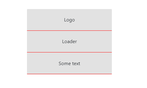
Bootstrap 4 : Each row fill the same amount of height
You can certainly hard code the heights, but since you ask if there is any cleaner way to do it, my opinion is to use flexbox with column flow direction, and let flexbox children grow by setting their flex-grow to 1.
This way doesn't require you to hard code the height for each row, and allows you to have as many rows as you "want".
<div class="rectangle-chargement d-flex flex-column">
    <div class="rectangle-chargement-row flex-grow-1">
        Logo
    </div>
    <div class="rectangle-chargement-row flex-grow-1">
        Loader
    </div>
    <div class="rectangle-chargement-row flex-grow-1">
        Some text
    </div>
</div>

demo: https://jsfiddle.net/davidliang2008/sngkbLcq/32/
If you want to "centralize" the content in each row, you can mark each row as flexbox as well, and set its justify-content and align-items to center.
<div class="rectangle-chargement d-flex flex-column">
    <div class="rectangle-chargement-row flex-grow-1
        d-flex justify-content-center align-items-center">
        Logo
    </div>
    <div class="rectangle-chargement-row flex-grow-1
        d-flex justify-content-center align-items-center">
        Loader
    </div>
    <div class="rectangle-chargement-row flex-grow-1
        d-flex justify-content-center align-items-center">
        Some text
    </div>
</div>
demo: https://jsfiddle.net/davidliang2008/sngkbLcq/36/
Related Topics
Difference Between CSS Fit-Content and Max-Content
Li:Before{ Content: "■"; } How to Encode This Special Character as a Bullit in an Email Stationery
<Hr> Inside Container with Display Flex Become Corrupted
Does The Order of Styles Matter
Strategies for Handling Multiple Screen Resolutions and Aspect Ratios in Web Development
How to CSS Style Angularjs Directive
Overlay a Background-Image with an Rgba Color, with a CSS3 Transition
How to Override Left:0 Using CSS or Jquery
Specifing Width of a Flexbox Flex Item: Width or Basis
With Webpack, How to Generate CSS Only, Excluding The Output.Js
Change Text-Align Responsively (With Bootstrap 3)
Using Gulp to Compile SASS and Minify Vendor CSS
How to Output Compressed CSS from Compass
Google Font Not Showing in Firefox
Possible to Set Hex Color Opacity Independently