Different between landscape and portrait Media Query
The queries are quite different; note the trailing and (orientation : landscape) and and (orientation : portrait) in both media queries.
Here's a fiddle that demonstrates these queries by applying a different background color when viewed in landscape or portrait mode.
https://jsfiddle.net/dem49e87/2/show/
Make sure to open it on your phone and check it out in both portrait and landscape mode.
Are all desktop/laptop monitor's orientation similar to landscape orientation on devices like the iPad?
Are all Desktop/laptop Monitor's orientation similar to Landscape orientation on devices like iPad?
No they are not. The orientation is based on the width and height of the window.
Landscape Mode is when the window width is larger than window height.
Portrait Mode is when the window height is larger than window width.
You can see this using your example: http://jsfiddle.net/tw16/EaHhU/
Adjust the width of the results window to match the above scenarios and you will see the colour change.
Desktop Browser Support: Firefox 3.5+, Google Chrome 5+, Opera 10.6+, Safari 4+
Mobile Browser Support: Android 2+, iOS4, Mobile Firefox.
media-query for iPad Air: at 1536px, how to differentiate from PCs?
Ok,
it turns out that iPad viewport is fixed at 1024px so if I target 1025px as non-mobile resolution, everything is fine!
CSS media query to target iPad and iPad only?
Finally found a solution from : Detect different device platforms using CSS
<link rel="stylesheet" media="all and (device-width: 768px) and (device-height: 1024px) and (orientation:portrait)" href="ipad-portrait.css" />
<link rel="stylesheet" media="all and (device-width: 768px) and (device-height: 1024px) and (orientation:landscape)" href="ipad-landscape.css" />
To reduce HTTP call, this can also be used inside you existing common CSS file:
@media all and (device-width: 768px) and (device-height: 1024px) and (orientation:portrait) {
  .ipad-portrait { color: red; } /* your css rules for ipad portrait */
}
@media all and (device-width: 1024px) and (device-height: 768px) and (orientation:landscape) {
  .ipad-landscape { color: blue; } /* your css rules for ipad landscape */
}
Other references:
- https://developer.apple.com/library/content/documentation/AppleApplications/Reference/SafariCSSRef/Articles/OtherStandardCSS3Features.html
Differentiating portrait and landscape versions in media queries
We have to add orientation: portrait and orientation: landscape to your media screen.
iPad Landscape and Portrait
/* iPad Portrait */
@media only screen
  and (min-device-width: 768px)
  and (max-device-width: 1024px)
  and (orientation: portrait)
  and (-webkit-min-device-pixel-ratio: 1) {

/* ur CSS */
}

/* iPad Landscape */
@media only screen
  and (min-device-width: 768px)
  and (max-device-width: 1024px)
  and (orientation: landscape)
  and (-webkit-min-device-pixel-ratio: 1) {

}
For latest iPads use pixel ratio:2 (Retina display) .
-webkit-min-device-pixel-ratio: 2
Similarly for iPhone's, for iPhone's you have to set media for 4 different screens , < iPhone 4S , iPhone 5S and iPhone 6 and 6 plus versions.
media query to target narrow desktop and not mobile
I just realized that I'm using Modernizr anyway. So I think the best solution for me would be to use Modernizr to detect touch devices. Like so:
1) First check touch events
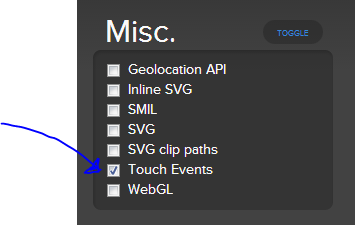
2) Click the generate button
Just to demonstrate this, I copied the generated javascript into a jsbin
Now right-click and inspect the html element. Modernizr adds the class 'no-touch' on desktop and the class 'touch' for phones and tablets (touch devices)
So now I can use code like this:
@media (max-width: 1024px) {
   .no-touch {
      div {
         color: green;
      }
   }
}
iPad only media queries for safari in landscape
What you are looking for cannot be achieved with media queries alone, you must use Javascript to find an Ipad Safari user agent:
function isiPad() {
  return (
    (navigator.userAgent.toLowerCase().indexOf(/iPad/i) > -1)
  );
}
Using this Javascript, you can detect if the device is an Ipad, and apply a class on the body - using Jquery in the following example:
if (isIpad) {
  $('body').addClass('isIpad');
}
Afterwards, write your media queries as suggested above:
@media only screen
and (min-device-width : 768px)
and (max-device-width : 1024px)
and (orientation : landscape) {
   .isiPad .myclass {
    /*styles*/
  }
}
Although I can see why an iPad differentiation is needed, I can't understand why a Safari differentiation is - so, a user would visit the same webpage/webapp with Safari and see something different compared to Chrome or Opera or a different browser? :/ UX-wise doesn't sound right.
Related Topics
How to Use The Display:Inline with Text-Align: Right
Fixed Position Not Working in Safari 7
Use CSS to Alternate Ul Bullet Point Styles
Image Shifting/Jumping After CSS Transition Effect with Scale Transform in Firefox
How to Add Some Pixels to The Current Height of Div
Ipad Mini Specfic CSS Media Queries
How to Make Entire Div Change Color on Hover Using CSS
How to Make Input Buttons Look Exactly The Same in All Browsers
CSS: Text-Align-Last Doesnt Work in Chrome
Vertical Align Inside CSS Grid
Right-Align The Contents of a Facebook Like-Button Iframe
R Shiny: Color Fileinput Button and Progress Bar
Linear-Gradient Using CSS3 Pie in Ie9 Not Working, Ie8 Does