How to vertically align objects in CSS when working with CSS grids?
Good question - I managed to work around the issue with a wrapper, and using display: table
https://jsfiddle.net/8vjvnznk/
.wrapper {  display: grid;  grid-template-columns: 100px 100px 300px;  grid-template-rows: 200px 200px;  grid-gap: 10px;  background-color: #fff;  color: #444;  align-content: space-evenly;}
.workaround{  border: 1px solid green;  margin: 0;  padding: 0;  height: 100%;  width: 100%;  display: table;  }h1{  font-size: 1em;  border: 1px solid yellow;  display: table-cell;  vertical-align: middle;}
#boxc{ background: red;}
.box {  background-color: #444;  color: #fff;  border-radius: 5px;  padding: 20px;  font-size: 100%;}
<div class="wrapper"> <div class="box a">A</div> <div class="box b">B</div> <div class="box c" id="boxc"> <div class="workaround"> <h1> The heading in question! </h1> </div> </div> <div class="box d">D</div> <div class="box e">E</div> <div class="box f">F</div></div>Centering in CSS Grid
This answer has two main sections:
- Understanding how alignment works in CSS Grid.
- Six methods for centering in CSS Grid.
If you're only interested in the solutions, skip the first section.
The Structure and Scope of Grid layout
To fully understand how centering works in a grid container, it's important to first understand the structure and scope of grid layout.
The HTML structure of a grid container has three levels:
- the container
- the item
- the content
Each of these levels is independent from the others, in terms of applying grid properties.
The scope of a grid container is limited to a parent-child relationship.
This means that a grid container is always the parent and a grid item is always the child. Grid properties work only within this relationship.
Descendants of a grid container beyond the children are not part of grid layout and will not accept grid properties. (At least not until the subgrid feature has been implemented, which will allow descendants of grid items to respect the lines of the primary container.)
Here's an example of the structure and scope concepts described above.
Imagine a tic-tac-toe-like grid.
article {
  display: inline-grid;
  grid-template-rows: 100px 100px 100px;
  grid-template-columns: 100px 100px 100px;
  grid-gap: 3px;
}
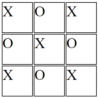
You want the X's and O's centered in each cell.
So you apply the centering at the container level:
article {
  display: inline-grid;
  grid-template-rows: 100px 100px 100px;
  grid-template-columns: 100px 100px 100px;
  grid-gap: 3px;
  justify-items: center;
}
But because of the structure and scope of grid layout, justify-items on the container centers the grid items, not the content (at least not directly).
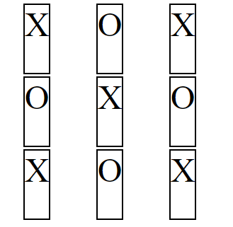
article {  display: inline-grid;  grid-template-rows: 100px 100px 100px;  grid-template-columns: 100px 100px 100px;  grid-gap: 3px;  justify-items: center;}
section {    border: 2px solid black;    font-size: 3em;}
<article> <section>X</section> <section>O</section> <section>X</section> <section>O</section> <section>X</section> <section>O</section> <section>X</section> <section>O</section> <section>X</section></article>Vertical align inside CSS grid
For the Flexbox solution, you have to add display:flex and align-items: center to .two, so the CSS becomes like this:
.two {
    border-style: solid;
    border-color: yellow;
    grid-column: 1 / 3;
    grid-row: 2 / 4;
    display: flex;
    align-items: center;
}
Then add flex: 1 to .vertical:
.vertical {
    flex: 1
}
Here is the full code:
.wrapper {  display: grid;  border-style: solid;  border-color: red;  grid-template-columns: repeat(2, 1fr);  grid-template-rows: repeat(4, 1fr);  grid-gap: 10px;  /* width: 100vw; not needed */  height: 100vh;}
.one {  border-style: solid;  border-color: blue;  grid-column: 1 / 3;  grid-row: 1 / 2;}
.two {  border-style: solid;  border-color: yellow;  grid-column: 1 / 3;  grid-row: 2 / 4;  display: flex;  align-items: center;}
.vertical {  flex: 1;}
.three {  border-style: solid;  border-color: violet;  grid-column: 1;  grid-row: 4 / 5;}
.four {  border-style: solid;  border-color: aqua;  grid-column: 2;  grid-row: 4 / 5;}
progress {  width: 100%;  background-color: #f3f3f3;  border: 0;  height: 2em;}
<div class="wrapper"> <div class="one">One</div> <div class="two"> <div class="vertical"> <progress max="100" value="80"> <div class="progress-bar"> <span style="width: 80%;">Progress: 80%</span> </div> </progress> </div> </div> <div class="three"> Three</div> <div class="four">Four</div></div>Vertically align content within CSS Grid
If you just want them vertically centered you can add display:flex; and align-items: center; to the box class:
body {  margin: 40px;}
.wrapper {  display: grid;  grid-gap: 10px;  grid-template-columns: [col] 100px [col] 100px [col] 100px;  grid-template-rows: [row] auto [row] auto [row];  background-color: #fff;  color: #444;}
.box {  background-color: #444;  color: #fff;  padding: 20px;  font-size: 150%;  display: flex;  align-items: center;}
.a {  grid-column: col / span 2;  grid-row: row 1 / 3;}
.b {  grid-column: col 3 / span 1;  grid-row: row;}
.c {  grid-column: col 3 / span 1;  grid-row: row 2;}
.d {  grid-column: col / span 1;  grid-row: row 3;}
.e {  grid-column: col 2 / span 1;  grid-row: row 3;}
.f {  grid-column: col 3 / span 1;  grid-row: row 3;}
<div class="wrapper"> <div class="box a">A</div> <div class="box b">B</div> <div class="box c">C</div> <div class="box d">D</div> <div class="box e">E</div> <div class="box f">F</div></div>How do I center text vertically and horizontally inside CSS grid items?
flex and grid works wonderfully together. Just apply your flex-positioning properties on the item you want.
.container {
  display: grid;
  grid-template-columns: 1fr 1fr;
  grid-template-rows: 1fr 1fr;
  grid-gap: 20px;
  align-items: center;
  justify-content: center;
}

.container div {
  display: flex;
  align-items: center;
  justify-content: center;
  background-color: gray;
  height: 100px;
}
<div class="container">
<div>Box 1</div>
<div>Box 2</div>
<div>Box 3</div>
<div>Box 4</div>
</div>Vertically center text in a grid layout with grid and items 100% height
Put flex on the boxes, just like in an answer on the post you linked.
https://css-tricks.com/snippets/css/a-guide-to-flexbox
section {
  height: 400px;
}

#boxes {
  background-color: green;
  display: grid;
  grid-template-columns: repeat(3, 1fr);
  grid-template-rows: repeat(3, 1fr);
  gap: 6px;
  height: 100%;
  min-height: 10em;
  min-width: 12em;
}

#boxes>div {
  background-color: #8ca0ff;
  text-align: center;
  border: 1px solid red;
  height: 100%;
  display: flex;
  flex-direction: column;
  justify-content: center;
}
<section>
<div id="boxes">
<div id="00">I'm not</div>
<div id="01">vertically</div>
<div id="02">centered.</div>
<div id="10">I</div>
<div id="11">am not</div>
<div id="12">either!</div>
<div id="20">Was CSS designed</div>
<div id="21">by a psychopath?</div>
<div id="22">Seems like it!</div>
</div>
</section>Related Topics
Change Background Image of Li on an A:Hover
CSS Start Repeating Background from Defined Position
Modal Dialog in Shiny: Can Adjust Width But Not Height
How to Loop a CSS Animation with Multiple Keyframe Definitions
Does Pattern Lab "Not Mix Well" with Angular
How Specify Two CSS Classes: from Property and Conditional Class
CSS Color Rendering Different in Safari
How to Use Pure CSS Selector to Select Hidden Element
Negative Margins in CSS: Good Tutorial and Tricks Site
How to Position a Background Image Relative to The Centre of an Element
Difficulty in Understanding CSS-Styling in Mjml
Sass Syntax Highlighting in Visual Studio
How to Change CSS of Columns - Reacttable
CSS Transition - Two Directions
How to Use CSS to Justify Text with Hyphenating Words at The End of a Line