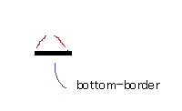
CSS Triangle + After Implementation
Changing the triangle to position: absolute; and adding position: relative; to the .box fixes it. It seems to be inheriting the height of the box.
CSS triangle :before element
You need to specify the content property.
For positioning, add position:relative to the parent, and then absolutely position the arrow -15px to the left.
jsFiddle example
.d {
    position:relative;
}

.d:before {
    content:"\A";
    border-style: solid;
    border-width: 10px 15px 10px 0;
    border-color: transparent #dd4397 transparent transparent;
    position: absolute;
    left: -15px;
}
How do CSS triangles work?
CSS Triangles: A Tragedy in Five Acts
As alex said, borders of equal width butt up against each other at 45 degree angles:
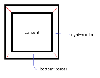
When you have no top border, it looks like this:
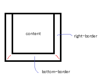
Then you give it a width of 0...
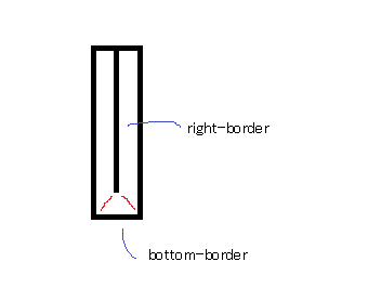
...and a height of 0...
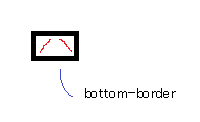
...and finally, you make the two side borders transparent:
That results in a triangle.
Drawing a triangle over a div in CSS
You can achieve that triangle with a pseudo element ::after, some positioning and transforming:
li { position: relative; display: block; background: #04a4a9; padding: 1em; overflow: hidden;}li a { color: white; text-decoration: none;}li::after { content: ''; position: absolute; width: 15px; height: 15px; background: white; right: -8px; top: 50%; transform: translate(0, -50%) rotate(45deg);}<section class="sidebar"> <ul class="sidebar-menu"> <li class="active"> <a href="/home"> <i class="fa fa-users active-fa"></i> <span class="menu-title">MY USERS</span> </a> </li> </ul></section>Creating a triangle with only CSS
I believe you are looking for triangles with borders and a transparent cut in between (which none of the existing answers seem to address) and so here is an example. It's absolutely possible to achieve with but takes a lot of hacking around.
Using CSS Transforms:
The below snippet uses pseudo-elements and transforms to produce the triangles effect. The output is responsive but the usage of skew transforms mean that if the container's shape becomes a rectangle then the skew angles would need modification and more tweaking of the positioning attributes etc.
.container { position: relative; overflow: hidden; height: 200px; width: 200px;}.div-1,.div-2 { position: absolute; top: 0px; left: 0px; height: 100%; width: 100%; overflow: hidden;}.div-1 { top: calc(-100% - 5px); transform: skewY(45deg); transform-origin: left top; border-bottom: 2px solid;}.div-1:after { position: absolute; content: ''; height: calc(100% - 2px); width: calc(100% - 2px); top: calc(100% + 7px); left: 0px; transform: skewY(-45deg); transform-origin: left top; border: 1px solid;}.div-2 { top: 5px; transform: skewY(45deg); transform-origin: left bottom; border-top: 1px solid;}.div-2:after { position: absolute; content: ''; height: calc(100% - 7px); width: calc(100% - 7px); top: 0px; left: 0px; transform: skewY(-45deg); transform-origin: left bottom; border: 1px solid;}* { box-sizing: border-box;}
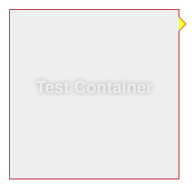
/* just for demo */.container{ transition: all 1s;}.container:hover{ width: 400px; height: 400px;}body{ background: radial-gradient(circle at center, aliceblue, mediumslateblue); min-height: 100vh;}<script src="https://cdnjs.cloudflare.com/ajax/libs/prefixfree/1.0.7/prefixfree.min.js"></script><div class='container'> <div class='div-1'></div> <div class='div-2'></div></div>Draw triangle in corner of div
You can use position: absolute on triangle element and set top and right properties to 0.
.container {  position: absolute;  top: 5%;  left: 5%;  width: 60%;  height: 30%;  background: black;  color: white;  border-radius: 12px;  overflow: hidden;}
.triangle {  width: 0;  height: 0;  border-style: solid;  border-width: 0 30px 30px 0;  border-color: transparent #608A32 transparent transparent;  right: 0;  top: 0;  position: absolute;}
<div class="container"> <div class="triangle"></div></div>CSS triangle custom border color
You actually have to fake it with two triangles....
.container {
    margin: 15px 30px;
    width: 200px;
    background: #fff;
    border: 1px solid #a00;
    position: relative;
    min-height: 200px;
    padding: 20px;
    text-align: center;
    color: #fff;
    font: bold 1.5em/180px Helvetica, sans-serif;
    text-shadow: 0 0 1px #000;
}

.container:after,
.container:before {
    content: '';
    display: block;
    position: absolute;
    left: 100%;
    width: 0;
    height: 0;
    border-style: solid;
}

.container:after {
    top: 10px;
    border-color: transparent transparent transparent #fdd;
    border-width: 10px;
}

.container:before {
    top: 9px;
    border-color: transparent transparent transparent #a00;
    border-width: 11px;
}
Updated Fiddle here
Pure CSS triangle with semi-transparent border. Possible?
This still needs some work, but here's the general idea:
Use a pseudo-element, rotate it 45deg and apply the styling to that:
.arrow {
    bottom: -25px;
    left: 30px;
    width: 40px;
    height: 40px;
    position: absolute;
    overflow: hidden;
}
.arrow:after {
    content: ' ';
    display: block;
    background: red;
    width: 20px;
    height: 20px;
    transform: rotate(45deg);
    position: absolute;
    top: -19px;
    left: 3px;
    background: #999;
    border: 5px solid rgba(0, 0, 0, 0.2);
    background-clip: padding-box;
}
Here's the fiddle: http://jsfiddle.net/yZ3vB/
The problem with this is that the borders overlap, making it darker by the edges.
This could probably be remedied by adding another element though.
Update: Yes! Here you go: http://jsfiddle.net/sJFTT/
Update 2: You don't even need that additional element. You can use the pseudo element from the main box:
.ui-overlay-content:after {
    content: ' ';
    border-width: 13px;
    border-color: #999 transparent transparent;
    border-style: solid;
    bottom: -10px;
    left: 30px;
    width: 0;
    height: 0;
    position: absolute;
}
Here's the fiddle: http://jsfiddle.net/6v9nV/
Update 3: Actually, you can do all this with just a single element and no transform, by using both pseudo-elements - the before and the after:
.speech-bubble {
    background: #999;
    background: linear-gradient(top, #444 0%,#999 100%);
    background-clip: padding-box;
    border: 5px solid rgba(0, 0, 0, 0.2);
    padding: 20px;
    width: 200px;
    height: 100px;
    position: relative;
}
.speech-bubble:before{
    content: ' ';
    border-color: rgba(0, 0, 0, 0.2) transparent transparent;
    border-style: solid;
    border-width: 17px;
    position: absolute;
    bottom: -39px;
    left: 16px;
}
.speech-bubble:after{
    content: ' ';
    border-color: #999 transparent transparent;
    border-style: solid;
    border-width: 13px;
    position: absolute;
    bottom: -26px;
    left: 20px;
}
Here's the fiddle: http://jsfiddle.net/95vvr/
P.S. Don't forget the vendor prefixes in production!
CSS triangle how to remove white space on the right
Add following css.
.triangle {
    display: inline-block;
}
Or you can use float property.
.triangle {
    float: left;
}
CSS triangle for image tag
You can't use pseudo elements with the image tag check here
You will have to wrap your image with for example a div element and set the pseudo elements on that element.
Related Topics
How to Alternate The Number of Children Between Odd and Even Rows
Strange Border-Width Behavior in Chrome - Floating Point Border-Width
How to Add Multiple Classes to Markdown Using Jekyll
Rails: Precompiled Assets Missing Node Modules
How to Change Focus Glow of Textarea in Bootstrap 3
How Specify Two CSS Classes: from Property and Conditional Class
CSS Transition Fade in Only for Element
Making a Row of Divs All Be The Same Height Using CSS
How to Use CSS Rotate() in Th Table Tags
Is The CSS3 Transform Translate Percentage Values Relative to Its Width And/Or Height
How to Completely Hide Lines of Text That Are Half Cut Off
CSS3 Box-Shadow for Overlapping-Like Divs