Colour of progress bar in fileInput -- Shiny
Here is a sample app where I have made the color of progress bar green using css.
ui <- fluidPage(

    tags$head(tags$style(".progress-bar{background-color:#3c763d;}")),

    fileInput(inputId = "fileInp", label = "Input file:",multiple = FALSE,
               accept = c(
                 "text/csv",
                 "text/comma-separated-values,text/plain",
                 ".csv"))

  )

  server <- function(input, output){

  }

  shinyApp(ui=ui, server=server)
Using the above code you get something like this: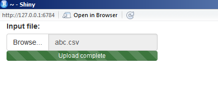
Hope it helps!
change fileinput progress bar color to gradient in R shiny
To set a gradient in CSS, the property is background-image, not background-color. You also have to set the background-size to auto, otherwise it is set to 40px 40px and the progress bar is striped. Here is the CSS:
  tags$head(
    tags$style(
      ".progress-bar {
          background-image: linear-gradient(to right, red , yellow) !important;
          background-size: auto !important;
      }")
  )
Set individual color of multiple progress bars in Shiny
Nice try, you are close, but as you mentioned, this does require some advanced CSS knowledge. Here is how:
:nth-of-type() selector
library(shiny)

ui <- fluidPage(
    tags$head(tags$style(
        '
        .myfiles .col-sm-4:nth-of-type(1) .progress-bar {background-color:#3c763d;}
        .myfiles .col-sm-4:nth-of-type(2) .progress-bar {background-color:#bf37a4;}
        .myfiles .col-sm-4:nth-of-type(3) .progress-bar {background-color:#cfa646;}
        '
    )),
    fluidRow(
        class = "myfiles",
        column(4, fileInput("dataUpload_1","Label 1",width = "400px")),
        column(4, fileInput("dataUpload_2","Label 2",width = "400px")),
        column(4, fileInput("dataUpload_3","Label 3",width = "400px"))
    )
)

server <- function(input, output){}

shinyApp(ui=ui, server=server)

Shiny customise fileInput
One can define a custom input function, that takes the regular one and cuts away the pieces you don't want.
library(shiny)

fileInputOnlyButton <- function(..., label="") {
  temp <- fileInput(..., label=label)
  # Cut away the label
  temp$children[[1]] <- NULL
  # Cut away the input field (after label is cut, this is position 1 now)
  temp$children[[1]]$children[[2]] <- NULL
  # Remove input group classes (makes button flat on one side)
  temp$children[[1]]$attribs$class <- NULL
  temp$children[[1]]$children[[1]]$attribs$class <- NULL
  temp
}

ui <- shinyUI(fluidPage(
  # Set width to fit the upload progress bar to button size.
  fileInputOnlyButton("file", buttonLabel="Browse", width=72)
))

server <- shinyServer(function(input, output) {})

shinyApp(ui, server)
Why does shinyFeedback overwrite custom CSS?
We can use shinyjs to change the color dynamically:
library(shiny)
library(shinyjs)
library(shinyFeedback)

ui <- fluidPage(
  useShinyFeedback(),
  useShinyjs(),
  fileInput(
    inputId = "upload",
    label = "Upload file:",
    accept = ".csv"
  ),
  # tags$style(".progress-bar {
  #            background-color: blue;
  #            }"),
  verbatimTextOutput("text")
)

server <- function(input, output, session) {

  data_in <- reactive({
    req(input$upload)
    ext <- tools::file_ext(input$upload$name)

    if (ext == "csv") {
      hideFeedback("upload")
      runjs('document.querySelector("#upload_progress > div").style.setProperty("background-color", "green", "important");')
      read.delim(
        input$upload$datapath,
        sep = ";"
      )
    } else {
      showFeedbackWarning(
        inputId = "upload",
        color = "red"
      )
    }
  })

  output$text <- renderPrint({
    class(data_in())
  })
}

shinyApp(ui, server)
Adjust size of Shiny progress bar and center it
I wrote a progress bar function in the package shinyWidgets, you can put it in a modal, but it's tricky to use with shiny::showModal, so you can create your own modal manually like the below. It's more code to write but it works fine.
library("shiny")
library("shinyWidgets")

ui <- fluidPage(
  actionButton(inputId = "go", label = "Launch long calculation"), #, onclick = "$('#my-modal').modal().focus();"

  # You can open the modal server-side, you have to put this in the ui :
  tags$script("Shiny.addCustomMessageHandler('launch-modal', function(d) {$('#' + d).modal().focus();})"),
  tags$script("Shiny.addCustomMessageHandler('remove-modal', function(d) {$('#' + d).modal('hide');})"),

  # Code for creating a modal
  tags$div(
    id = "my-modal",
    class="modal fade", tabindex="-1", `data-backdrop`="static", `data-keyboard`="false",
    tags$div(
      class="modal-dialog",
      tags$div(
        class = "modal-content",
        tags$div(class="modal-header", tags$h4(class="modal-title", "Calculation in progress")),
        tags$div(
          class="modal-body",
          shinyWidgets::progressBar(id = "pb", value = 0, display_pct = TRUE)
        ),
        tags$div(class="modal-footer", tags$button(type="button", class="btn btn-default", `data-dismiss`="modal", "Dismiss"))
      )
    )
  )
)

server <- function(input, output, session) {

  value <- reactiveVal(0)

  observeEvent(input$go, {
    shinyWidgets::updateProgressBar(session = session, id = "pb", value = 0) # reinitialize to 0 if you run the calculation several times
    session$sendCustomMessage(type = 'launch-modal', "my-modal") # launch the modal
    # run calculation
    for (i in 1:10) {
      Sys.sleep(0.5)
      newValue <- value() + 1
      value(newValue)
      shinyWidgets::updateProgressBar(session = session, id = "pb", value = 100/10*i)
    }
    Sys.sleep(0.5)
    # session$sendCustomMessage(type = 'remove-modal', "my-modal") # hide the modal programmatically
  })

}

shinyApp(ui = ui, server = server)
Related Topics
Jqgrid Style Issue with Twitter Bootstrap
Editing Angular Material's Table Cell Padding
Modal Dialog in Shiny: Can Adjust Width But Not Height
Override Vuetify 2.0 SASS Variable $Heading-Font-Family
How to Inherit Only One Element of CSS Shorthand
Align Material Icon Vertically
Remove Border from All Primefaces P:Panelgrid Components
How to Style Django Validation Errors with Bootstrap
How to Hide or Show Content with CSS Depending on Screen Size
What Is The Biggest Usable Number for Use in Calc() in CSS
Google Chrome: Diagonal CSS Line-Through
Make CSS of Gradient from Image Style
In CSS Use "Display:None" on The Element, But Keep Its ":After"