Angular 6 - How to apply external css stylesheet (leaflet) at component level?
Ok, here's what worked (thanks @Palsri, I read once more the blog post and the Angular styling guidelines and tried the following, which worked):
In a separate css file, import the leaflet css:
// map.component.css
@import url("../assets/lib/leaflet/leaflet.css");

.mapstyle {
    width: 100%;
    height:100%;
};
Then in the component, reference this css instead of the leaflet css as follows:
@Component({
    templateUrl: "./map.component.html",
    selector: "app-map",
    styleUrls: ["./map.component.css"],
    encapsulation: ViewEncapsulation.None
})
Here's the code in the html template:
<div id="map" class="mapstyle"></div>
One more thing: for the height % to work, you need to define the parents size, which I currently did in the index.html as follows:
<style>
html, body {
    min-height: 100% !important;
    height:     100%;
    padding: 0px 0px 0px 0px;
    margin:  0px 0px 0px 0px;
}
</style>
Load external CSS into component
See also https://angular.io/docs/ts/latest/guide/component-styles.html
View encapsulation
To allow external styles to affect the content of components you can change view encapsulation (that's what prevents styles to "bleed into" components).
@Component({
    selector: 'some-component',
    template: '<div></div>',
    styleUrls: [
        'http://example.com/external.css',
        'app/local.css'
    ],
    encapsulation: ViewEncapsulation.None,
})
export class SomeComponent {}
View encapsulation fulfills a purpose. The better way is to add styles directly to the component they should affect. ViewEncapsulation is set per component and may come handy in some situations.
"shadow piercing"
You can also use shadow piercing CSS combinator ::ng-deep (>>> and /deep/ are deprecated) to build selectors that cross component boundaries like
:host ::ng-deep .ng-invalid {
  border-bottom: solid 3px red;
}
- update
::slottedis now supported by all new browsers and can be used with `ViewEncapsulation.ShadowDom
https://developer.mozilla.org/en-US/docs/Web/CSS/::slotted
which styles all tags with a class ng-invalid in the current component or any descendant with a red underline no matter if encapsulation is None or Emulated. It depends on browser support whether /deep/ works with Native (as far as I know this is not supported by any browser anymore).
Note
The shadow piercing CSS combinators are similar to the ones from the shadow DOM spec where they are deprecated since quite a while.
With the default ViewEncapsulation.Emulated Angulars own /deep/ and ::shadow implementation are used and they will work even when Chrome removes native support.
With ViewEncapsulation.Native Angular uses Chromes shadow DOM CSS combinators (only Chrome supported them at all anyway AFAIK). If Chrome finally removes them, then they won't work in Angular as well (again ViewEncapsulation.Native only).
Global styles
Styles added globally (index.html) don't consider component boundaries. Such styles are not rewritten by Angular2 and ViewEncapsulation.Emulated doesn't apply to them. Only if ViewEncapsulation.Native is set and the browser has native shadow DOM support, then global styles can't bleed in.
See also this related issue https://github.com/angular/angular/issues/5390
Cannot load css from assets in component
Absolute path in styleUrls is not trivial, as documented here.
You can still use relative path though : ../../../etc.
Going with @import in your scss is another solution indeed, and you can just use:
@import 'src/assets/css/sidebar-nav.min.css';
angular style not applied on components (despite the use of host selectors)
About the width issue your facing in the test component, assuming you want the whole element to span to a width of 350px, you should define its display property to block:
:host {
  background: blue;
  display: block;
}
Custom elements does not have a default display property and your browser can't guess what your means are.
About applying the .test style on your component, the app-component styles are encapsulated using the _nghost-c0 and _ng-content-c0 attributes and therefor not being applied on test.component. If you want to apply the .test on other components you can either write the CSS RULE on the global styles.css file which is applied globally:
//styles.css
.test {
  background-color: red;
  width: 350px;
}
or use the viewEncapsulation property on your @component decorator like this:
//app.component.ts
import { Component, ViewEncapsulation } from '@angular/core';

@Component({
  selector: 'app-root',
  templateUrl: './app.component.html',
  styleUrls: ['./app.component.css'],
  encapsulation: ViewEncapsulation.None
})
and then you can leave the CSS RULE on the app.component file
//app.component.css
.test {
  background-color: red;
  width: 350px;
}
but now the styles in that file are not encapsulated and will penetrate other components.
Angular unable to locate stylesheet warning
Edit:
This warning is caused by new update in polyfills.
Solution is:
Remove all bootstrap cdn links from index.html
Install bootstrap >
npm install bootstrapNext, go the angular.json file and add the paths of Bootstrap CSS and JavaScript files to the styles and scripts arrays under the build target as follows:
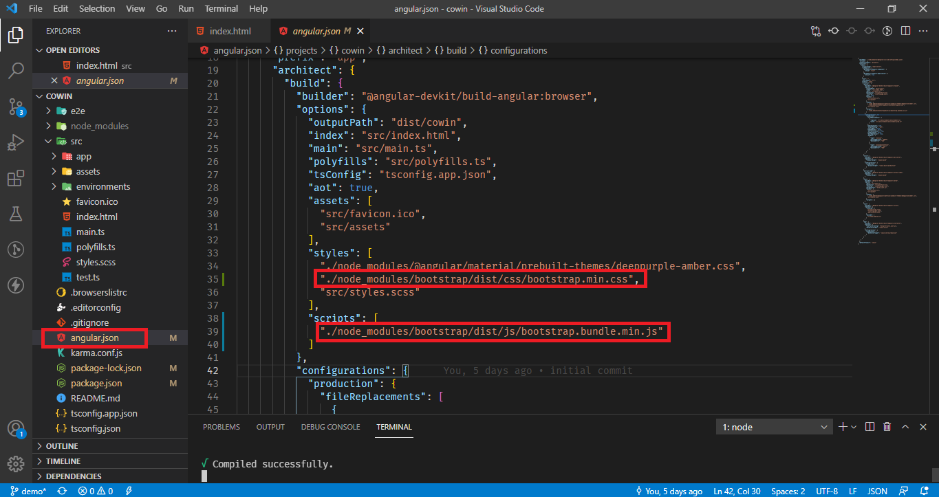
ng serve --openagain.
Result
This solution worked for me.
Related Topics
Advanced Custom Syntax Coloring for Aptana Studio 3 (.Less)
How to Draw Triangle with Transparent Background with Border
Override Vuetify 2.0 SASS Variable $Heading-Font-Family
How to Prevent a Flex Item Height to Overflow Due to It's Content
How to Have a Progress Bar Move from Right to Left Based on a Negative Value in Twitter Bootstrap
How to Style a Svg Using CSS in Javafx Fxml
Using CSS Clip with Percentage
Currentcolor Inheritance for Svg Url
Load Different CSS Rule Depending on The Browser in an Angular 4 Component
Media Query to Differentiate Desktop from iPad in Landscape Mode
Options to Solve Browser Compatibility Issues
Empty Div with Red Border Is Visible as a Red Line - How to Hide It Only with CSS
How to Change The Scrollbar to Custom Design? (Avoid Using The Default Browser Look)
Use Multiple Ids for Divs in CSS
How to Implement a CSS-Only Fallback for Background-Size