How can I emulate prefers-color-scheme media query in Chrome?
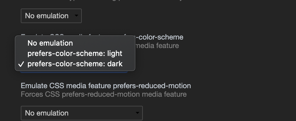
Since Chrome version 79 you can toggle between prefers-color-scheme: dark and prefers-color-scheme: light from the Rendering panel
- Open Developer tools (otherwise the key combination below opens the print dialog)
- Open the Command Control: Ctrl+Shift+P or Command+Shift+P (Mac)
- Type "Show rendering"
- Set the Emulate CSS media feature prefers-color-scheme to the value you want to debug
How to override css prefers-color-scheme setting
I have determined an appropriate solution, it is as follows:
CSS will use variables and themes:
// root/default variables
:root {
    --font-color: #000;
    --link-color:#1C75B9;
    --link-white-color:#fff;
    --bg-color: rgb(243,243,243);
}
//dark theme
[data-theme="dark"] {
    --font-color: #c1bfbd;
    --link-color:#0a86da;
    --link-white-color:#c1bfbd;
    --bg-color: #333;
}
The variables are then called where necessary, for example:
//the redundancy is for backwards compatibility with browsers that do not support CSS variables.
body
{
    color:#000;
    color:var(--font-color);
    background:rgb(243,243,243);
    background:var(--bg-color);
}
JavaScript is used to identify which theme the user has set, or if they have over-ridden their OS theme, as well as to toggle between the two, this is included in the header prior to the output of the html <body>...</body>:
//determines if the user has a set theme
function detectColorScheme(){
    var theme="light";    //default to light

    //local storage is used to override OS theme settings
    if(localStorage.getItem("theme")){
        if(localStorage.getItem("theme") == "dark"){
            var theme = "dark";
        }
    } else if(!window.matchMedia) {
        //matchMedia method not supported
        return false;
    } else if(window.matchMedia("(prefers-color-scheme: dark)").matches) {
        //OS theme setting detected as dark
        var theme = "dark";
    }

    //dark theme preferred, set document with a `data-theme` attribute
    if (theme=="dark") {
         document.documentElement.setAttribute("data-theme", "dark");
    }
}
detectColorScheme();
This javascript is used to toggle between the settings, it does not need to be included in the header of the page, but can be included wherever
//identify the toggle switch HTML element
const toggleSwitch = document.querySelector('#theme-switch input[type="checkbox"]');

//function that changes the theme, and sets a localStorage variable to track the theme between page loads
function switchTheme(e) {
    if (e.target.checked) {
        localStorage.setItem('theme', 'dark');
        document.documentElement.setAttribute('data-theme', 'dark');
        toggleSwitch.checked = true;
    } else {
        localStorage.setItem('theme', 'light');
        document.documentElement.setAttribute('data-theme', 'light');
        toggleSwitch.checked = false;
    }
}

//listener for changing themes
toggleSwitch.addEventListener('change', switchTheme, false);

//pre-check the dark-theme checkbox if dark-theme is set
if (document.documentElement.getAttribute("data-theme") == "dark"){
    toggleSwitch.checked = true;
}
finally, the HTML checkbox to toggle between themes:
<label id="theme-switch" class="theme-switch" for="checkbox_theme">
    <input type="checkbox" id="checkbox_theme">
</label>
Through the use of CSS variables and JavaScript, we can automatically determine the users theme, apply it, and allow the user to over-ride it as well. [As of the current time of writing this (2019/06/10), only Firefox and Safari support the automatic theme detection]
prefers-color-scheme default styles vs light
Yes, light color scheme is default on most devices and browsers. Also adding @media with light color scheme won't change anything since there are no other color schemes than light and dark.
Define dark mode for both a class and a media query, without repeat CSS custom properties declarations, and allow users to switch between color modes
Let's analyze it.
We definitely cannot put the dark mode styles only inside the media query, since there will be no way to apply it via in-site choice. So we want the styles to be under a certain class (dark) with no media query (so that the class can be toggled via JS), but the media query should somehow pull the same styles even without that class, and without repeating the styles. We probably also want a light class to override the media query if the user chooses to.
The perfect solution here would be the abandoned @apply at-rule which could allow reusing of a bunch of styles under a single variable. But this was, well, abandoned.
The standard proposal for reusing a bunch of styles is using mixins on a CSS preprocessor (so it's not repeated on the project's source code but it's repeated on the compiled CSS). If all properties are applied to the <body> element or a few elements then I believe that's the way to go. However you asked for a solution without preprocessors.
The other way would be to use the media query in the JS rather than in the CSS itself, and toggle the class accordingly. This method would handle even complicated themes with properties applied to many elements, but it may have a "Flash of unstyled content" until the JS takes effect. Anyway you already brought that up and asked for a solution that keeps the media query in the CSS itself.
You also asked to not use repeated CSS variables. Now, I'm not sure it would be possible without repeating anything, but pheraps we can reduce the repeatation to two "toggle" variables, regardless of the number of affected properties.
var root = document.documentElement,
  theme = window.getComputedStyle(root)
  .getPropertyValue('--light') === ' ' ? 'dark' : 'light';

document.getElementById('toggle-theme')
  .addEventListener('click', toggleTheme);

function toggleTheme() {
  root.classList.remove(theme);
  theme = (theme === 'dark') ? 'light' : 'dark';
  root.classList.add(theme);
}
/*
"initial"ized variables are like undefined variables and will resolve to
their fallback value.
Whitespaced variables (the space is required) will serve as an empty value
in chaining.
*/
@media (prefers-color-scheme: dark) {
:root {
--light: ;
--dark: initial;
}
}
@media (prefers-color-scheme: light) {
:root {
--dark: ;
--light: initial;
}
}
:root.dark {
--light: ;
--dark: initial;
}
:root.light {
--dark: ;
--light: initial;
}
#content {
background-color: var(--dark, darkblue) var(--light, lightblue);
color: var(--dark, white) var(--light, black);
border: 5px solid var(--dark, blue) var(--light, yellow);
}<div id="content">
Hello, world!
<button id="toggle-theme">Toggle theme</button>
</div>Related Topics
How to Create Inline Pseudo Styles
How to Add Multiple CSS Gradient as a Multiple Background
Using a Custom (Ttf) Font in CSS
Css: Transform: Translate(-50%, -50%) Makes Texts Blurry
Bootstrap Drop Down Cutting Off
Why Are Certain CSS Properties Not Applied to A:Visited
Why Shouldn't I Use Position:Absolute for Positioning Everything
Differencebetween Background-Size: Cover; and Background-Size: 100%;
CSS List Item Width/Height Does Not Work
How to Match 3D Perspective of Real Photo and Object in CSS3 3D Transforms
Rounded Side, Not Rounded Corners
Importance of CSS Stylesheet Hierarchy
Difference Between "-Webkit-Text-Fill-Color" and "Color"
Table Border Color in CSS with Border Collapse
Css: Background Image Does Not Fill When Scrolling