My border-radius not working in all four corners
The padding here is causing an issue (div class="head"). If padding-top is 0 the corners are rounded better. As the padding increases, that 1 corner gets squared-off more.
#generic_table .generic_content .generic_head .generic_head_content .head {
    padding-top: 15px;
    position: relative;
}
How to add rounded corners to a single side in HTML-CSS
Try like following snippet, for more info take a look here:
.button {
  border: 1px solid #00bfff;
  border-bottom-right-radius: 30%;
  border-top-right-radius: 30%;
  padding: 20px;
  background: #00bfff;
}
<button type="button" class="button">Button</button>How can I get CSS rounded corners without rounding the border line?
.inner {  background:red;  border-radius:5px;  width:100px;  height:100px;}
.wrapper {  display:inline-block;  border-bottom:1px solid #000;}
<div class="wrapper"> <div class="inner"></div> </div>Avoid elliptical shape in CSS border-radius
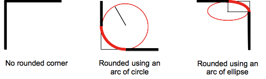
(source: mozilla.org)
Formally, the syntax for the border-radius property accepts 2 values for each corner: a horizontal radius and a vertical radius (separated by a slash). The following line would create an elliptical border-radius similar to the third image above.
border-radius: 10px / 5px;
Usually, we only specify one value. In this case, that value gets used as both the vertical and horizontal radii. The following line would create a circular border-radius similar to the second image above.
border-radius: 10px;
Using Percentages
The Mozilla Developer's Network defines the possible value types for this property as follows:
<length>
Denotes the size of the circle radius or the semi-major and semi-minor axes of the ellipsis. It can be expressed in any unit allowed by the CSS data types. Negative values are invalid.<percentage>
Denotes the size of the circle radius, or the semi-major and semi-minor axes of the ellipsis, using percentage values. Percentages for the horizontal axis refer to the width of the box, percentages for the vertical axis refer to the height of the box. Negative values are invalid.
Using a single value to create a circular radius is fine when we're using absolute length units like pixels or ems, but gets more complicated when we're using percentages. Since the single-value usage of this property is synonymous with using the same value twice, the following two lines are equivalent; however, these would not necessarily create a circular border-radius.
border-radius: 50%;
border-radius: 50%/50%;
These lines say to "create an ellipse or circle whose vertical radius is equal to 50% of the element's height and whose horizontal radius is equal to 50% of the element's width, and use that as the border-radius.". If the element is 200 pixels wide and 100 pixels tall, this results in an ellipse rather than a circle.
Solution
If you want a circular border-radius, the easiest thing to do is to use absolute measurement units (like pixels or ems or anything besides percentage), but sometimes that doesn't fit your use case and you want to use percentages. If you know the aspect-ratio of the containing element, you still can! In the example below, since my element is twice as wide as it is tall, I've scaled the horizontal radius in half.
#rect {
  width: 200px;
  height: 100px;
  background: #000;
  border-radius: 25%/50%;
}
<div id="rect"></div>rounded corner for bottom border using css
Here you go. You need to add a div and give it a border-bottom. I have changed the HTML and CSS below. You can increase the div's height and width as you like
.footer_line {
  white-space: nowrap;
  margin-top: 12px;
  font-weight: bold;
  padding-bottom: 1px;
  font-size: 36px;
  width: 150px;
  border-radius: 4px !important;
}

.news_let {
  margin-left: 0px !important;
  font-weight: bold !important;
  letter-spacing: 1px !important;
  color: white !important;
  font-size: 21px !important;
  border-bottom: 4px solid #2782dd !important;
  border-radius:4px;
}
<div class="col-md-6">
<h3 class="footer_line">News Letter
<div class="news_let"></div>
</h3><br/>
</div>Related Topics
How to Customize the HTML5 Input Range Type Looks Using CSS
Where Do CSS and JavaScript Files Go in a Maven Web App Project
How to Create Multi Columns from a Single Unordered List
Chrome:How to Turn Off User Agent Stylesheet Settings
Image Moves on Hover When Changing Filter in Chrome
CSS Different Font Sizes on Different Families
Minmax Fails (Invalid Property Value)
Horizontally Scrollable List of Cards in Bootstrap
How to Declare Dependent Style Names with Uibinder
How to Rotate Text Left 90 Degree and Cell Size Is Adjusted According to Text in HTML
Issue When Centering Vertically with Flexbox When Heights Are Unknown
Run CSS3 Animation Only Once (At Page Loading)
CSS Transition Between Left -> Right and Top -> Bottom Positions
Is There Any Clean CSS Method to Make Each Letter in a Word a Different Color