How to match 3D perspective of real photo and object in CSS3 3D transforms
If you can use 3-d transforms (such as rotateZ), then you can also provide matrix3d which you can compute from desired point correspondences.
Here's a fiddle: https://jsfiddle.net/szym/03s5mwjv/
I'm using numeric.js to solve a set of 4 linear equations to find the perspective transform matrix that transforms src onto dst. This is essentially the same math as in getPerspectiveTransform in OpenCV.
The computed 2-d perspective transform is a 3x3 matrix using homogeneous coordinates. The CSS matrix3d is a 4x4 matrix using homogeneous coordinates, so we need to add an identity row/column for the z axis. Furthermore, matrix3d is specified in column-major order.
Once you get the matrix3d you can just paste it into your stylesheet. But keep in mind that the matrix is computed assuming (0, 0) as origin, so you also need to set transformOrigin: 0 0.
// Computes the matrix3d that maps src points to dst.function computeTransform(src, dst) {  // src and dst should have length 4 each  var count = 4;  var a = []; // (2*count) x 8 matrix  var b = []; // (2*count) vector
  for (var i = 0; i < 2 * count; ++i) {    a.push([0, 0, 0, 0, 0, 0, 0, 0]);    b.push(0);  }
  for (var i = 0; i < count; ++i) {    var j = i + count;    a[i][0] = a[j][3] = src[i][0];    a[i][1] = a[j][4] = src[i][1];    a[i][2] = a[j][5] = 1;    a[i][3] = a[i][4] = a[i][5] =      a[j][0] = a[j][1] = a[j][2] = 0;    a[i][6] = -src[i][0] * dst[i][0];    a[i][7] = -src[i][1] * dst[i][0];    a[j][6] = -src[i][0] * dst[i][1];    a[j][7] = -src[i][1] * dst[i][1];    b[i] = dst[i][0];    b[j] = dst[i][1];  }
  var x = numeric.solve(a, b);  // matrix3d is homogeneous coords in column major!  // the z coordinate is unused  var m = [    x[0], x[3],   0, x[6],    x[1], x[4],   0, x[7],       0,    0,   1,    0,    x[2], x[5],   0,    1  ];  var transform = "matrix3d(";  for (var i = 0; i < m.length - 1; ++i) {    transform += m[i] + ", ";  }  transform += m[15] + ")";  return transform;}
// Collect the four corners by user clicking in the cornersvar dst = [];document.getElementById('frame').addEventListener('mousedown', function(evt) {  // Make sure the coordinates are within the target element.  var box = evt.target.getBoundingClientRect();  var point = [evt.clientX - box.left, evt.clientY - box.top];  dst.push(point);
  if (dst.length == 4) {    // Once we have all corners, compute the transform.    var img = document.getElementById('img');    var w = img.width,        h = img.height;    var transform = computeTransform(      [        [0, 0],        [w, 0],        [w, h],        [0, h]      ],      dst    );    document.getElementById('photo').style.visibility = 'visible';    document.getElementById('transform').style.transformOrigin = '0 0';    document.getElementById('transform').style.transform = transform;    document.getElementById('result').innerHTML = transform;  }});
.container { position: relative; width: 50%;} #frame,#photo { position: absolute; top: 0; left: 0; right: 0; bottom: 0;} #photo { visibility: hidden;} #frame img,#photo img { width: 100%} #photo { opacity: 0.7;}<script src="https://cdnjs.cloudflare.com/ajax/libs/numeric/1.2.6/numeric.min.js"></script> <p id="result">Click the desired top-left, top-right, bottom-right, bottom-left corners <div class="container"> <div id="frame"> <img src="http://cdn.idesigned.cz/img/cc08acc7b9b08ab53bf935d720210f13.png" /> </div>
<div id="photo"> <div id="transform"> <img id="img" src="http://placehold.it/350x150" /> </div> </div>
</div>How to use css perspective to match a div to visually fit inside a svg laptop screen?
Change below CSS
.container {
/*   perspective: 500px; */
}

.screenContents {
 transform: perspective(3651px) rotateY(-30deg) rotateX(18deg) rotate(3deg);
 --scale: 37;
 width: calc(16px * var(--scale));
 height: calc(10px * var(--scale));
}
Generating CSS 3D Mockups
This Mathematics question has the doorway:
https://math.stackexchange.com/questions/296794/finding-the-transform-matrix-from-4-projected-points-with-javascript
It leads to these nice live examples:
- https://franklinta.com/2014/09/08/computing-css-matrix3d-transforms/
- https://tympanus.net/codrops/2014/11/21/perspective-mockup-slideshow/
Here's the pen from the article ported from CoffeeScript to this answer in plain JavaScript:
// Original was CoffeeScript at https://codepen.io/fta/pen/ifnqH?editors=0010.
// This is ported back to plain JavaScript. It could be cleaned up!
{
  const $ = jQuery;

  function getTransform (from, to) {
    console.assert(from.length === to.length && to.length === 4);

    const A = []; // 8x8
    for (let i = 0; i < 4; i++) {
      A.push([from[i].x, from[i].y, 1, 0, 0, 0, -from[i].x * to[i].x, -from[i].y * to[i].x]);
      A.push([0, 0, 0, from[i].x, from[i].y, 1, -from[i].x * to[i].y, -from[i].y * to[i].y]);
    }

    const b = []; // 8x1
    for (let i = 0; i < 4; i++) {
      b.push(to[i].x);
      b.push(to[i].y);
    }

    // Solve A * h = b for h
    const h = numeric.solve(A, b);
    const H = [[h[0], h[1], 0, h[2]], [h[3], h[4], 0, h[5]], [0, 0, 1, 0], [h[6], h[7], 0, 1]];

// Sanity check that H actually maps `from` to `to`
    for (let i = 0; i < 4; i++) {
      const lhs = numeric.dot(H, [from[i].x, from[i].y, 0, 1]);
      const k_i = lhs[3];
      const rhs = numeric.dot(k_i, [to[i].x, to[i].y, 0, 1]);
      console.assert(numeric.norm2(numeric.sub(lhs, rhs)) < 1e-9, "Not equal:", lhs, rhs);
    }

    return H;
  };

   function applyTransform(element, originalPos, targetPos, callback) {
    // All offsets were calculated relative to the document
    // Make them relative to (0, 0) of the element instead
    const from = (function() {
      const results = [];
      for (let k = 0, len = originalPos.length; k < len; k++) {
        const p = originalPos[k];
        results.push({
          x: p[0] - originalPos[0][0],
          y: p[1] - originalPos[0][1]
        });
      }
      return results;
    })();

    const to = (function() {
      const results = [];
      for (let k = 0, len = targetPos.length; k < len; k++) {
        const p = targetPos[k];
        results.push({
          x: p[0] - originalPos[0][0],
          y: p[1] - originalPos[0][1]
        });
      }
      return results;
    })();

    // Solve for the transform
    const H = getTransform(from, to);

    // Apply the matrix3d as H transposed because matrix3d is column major order
    // Also need use toFixed because css doesn't allow scientific notation
    $(element).css({
      'transform': `matrix3d(${((function() {
        const results = [];
        for (let i = 0; i < 4; i++) {
          results.push((function() {
            const results1 = [];
            for (let j = 0; j < 4; j++) {
              results1.push(H[j][i].toFixed(20));
            }
            return results1;
          })());
        }
        return results;
      })()).join(',')})`,
      'transform-origin': '0 0'
    });

    return typeof callback === "function" ? callback(element, H) : void 0;
  };

  function makeTransformable(selector, callback) {
    return $(selector).each(function(i, element) {
      $(element).css('transform', '');

      // Add four dots to corners of `element` as control points
      const controlPoints = (function() {
        const ref = ['left top', 'left bottom', 'right top', 'right bottom'];
        const results = [];
        for (let k = 0, len = ref.length; k < len; k++) {
          const position = ref[k];
          results.push($('<div>').css({
            border: '10px solid black',
            borderRadius: '10px',
            cursor: 'move',
            position: 'absolute',
            zIndex: 100000
          }).appendTo('body').position({
            at: position,
            of: element,
            collision: 'none'
          }));
        }
        return results;
      })();

      // Record the original positions of the dots
      const originalPos = (function() {
        const results = [];
        for (let k = 0, len = controlPoints.length; k < len; k++) {
          const p = controlPoints[k];
          results.push([p.offset().left, p.offset().top]);
        }
        return results;
      })();

      // Transform `element` to match the new positions of the dots whenever dragged
      $(controlPoints).draggable({
        start: () => {
          return $(element).css('pointer-events', 'none'); // makes dragging around iframes easier
        },
        drag: () => {
          return applyTransform(element, originalPos, (function() {
            const results = [];
            for (let k = 0, len = controlPoints.length; k < len; k++) {
              const p = controlPoints[k];
              results.push([p.offset().left, p.offset().top]);
            }
            return results;
          })(), callback);
        },
        stop: () => {
          applyTransform(element, originalPos, (function() {
            const results = [];
            for (let k = 0, len = controlPoints.length; k < len; k++) {
              const p = controlPoints[k];
              results.push([p.offset().left, p.offset().top]);
            }
            return results;
          })(), callback);

          return $(element).css('pointer-events', 'auto');
        }
      });

      return element;
    });
  };

  makeTransformable('.box', function(element, H) {
    console.log($(element).css('transform'));
    return $(element).html($('<table>').append($('<tr>').html($('<td>').text('matrix3d('))).append((function() {
      const results = [];
      for (let i = 0; i < 4; i++) {
        results.push($('<tr>').append((function() {
          const results1 = [];
          for (let j = 0; j < 4; j++) {
            results1.push($('<td>').text(H[j][i] + ((i === j && j === 3) ? '' : ',')));
          }
          return results1;
        })()));
      }
      return results;
    })()).append($('<tr>').html($('<td>').text(')'))));
  });

}
.box {
margin: 20px;
padding: 10px;
height: 150px;
width: 500px;
border: 1px solid black;
}<div class="box">
Drag the points to transform the box!
</div>
<script src="https://cdnjs.cloudflare.com/ajax/libs/jquery/2.1.3/jquery.min.js"></script>
<script src="https://ajax.googleapis.com/ajax/libs/jqueryui/1.11.2/jquery-ui.min.js"></script>
<script src="https://cdnjs.cloudflare.com/ajax/libs/numeric/1.2.6/numeric.min.js"></script>
<script src="https://cdnjs.cloudflare.com/ajax/libs/jqueryui-touch-punch/0.2.3/jquery.ui.touch-punch.min.js"></script>Image Manipulation - add image with corners in exact positions
Quadrilateral transform
One way to go about this is to use Quadrilateral transforms. They are different than 3D transforms and would allow you to draw to a canvas in case you want to export the result.
The example shown here is simplified and uses basic sub-divison and "cheats" on the rendering itself - that is, it draws in a small square instead of the shape of the sub-divided cell but because of the small size and the overlap we can get away with it in many non-extreme cases.
The proper way would be to split the shape into two triangles, then scan pixel wise in the destination bitmap, map the point from destination triangle to source triangle. If the position value was fractional you would use that to determine pixel interpolation (f.ex. bi-linear 2x2 or bi-cubic 4x4).
I do not intend to cover all this in this answer as it would quickly become out of scope for the SO format, but the method would probably be suitable in this case unless you need to animate it (it is not performant enough for that if you want high resolution).
Method
Lets start with an initial quadrilateral shape:
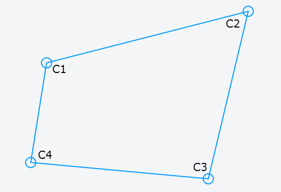
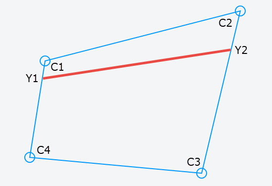
The first step is to interpolate the Y-positions on each bar C1-C4 and C2-C3. We're gonna need current position as well as next position. We'll use linear interpolation ("lerp") for this using a normalized value for t:
y1current = lerp( C1, C4, y / height)
y2current = lerp( C2, C3, y / height)

y1next = lerp(C1, C4, (y + step) / height)
y2next = lerp(C2, C3, (y + step) / height)
This gives us a new line between and along the outer vertical bars.
Next we need the X positions on that line, both current and next. This will give us four positions we will fill with current pixel, either as-is or interpolate it (not shown here):
p1 = lerp(y1current, y2current, x / width)
p2 = lerp(y1current, y2current, (x + step) / width)
p3 = lerp(y1next, y2next, (x + step) / width)
p4 = lerp(y1next, y2next, x / width)
x and y will be the position in the source image using integer values.

We can use this setup inside a loop that will iterate over each pixel in the source bitmap.
Demo
The demo can be found at the bottom of the answer. Move the circular handles around to transform and play with the step value to see its impact on performance and result.
The demo will have moire and other artifacts, but as mentioned earlier that would be a topic for another day.
Snapshot from demo:

Alternative methods
You can also use WebGL or Three.js to setup a 3D environment and render to canvas. Here is a link to the latter solution:
- Three.js
and an example of how to use texture mapped surface:
- Three.js texturing (instead of defining a cube, just define one place/face).
Using this approach will enable you to export the result to a canvas or an image as well, but for performance a GPU is required on the client.
If you don't need to export or manipulate the result I would suggest to use simple CSS 3D transform as shown in the other answers.
/* Quadrilateral Transform - (c) Ken Nilsen, CC3.0-Attr */var img = new Image();  img.onload = go;img.src = "https://i.imgur.com/EWoZkZm.jpg";
function go() {  var me = this,      stepEl = document.querySelector("input"),      stepTxt = document.querySelector("span"),      c = document.querySelector("canvas"),      ctx = c.getContext("2d"),      corners = [        {x: 100, y: 20},           // ul        {x: 520, y: 20},           // ur        {x: 520, y: 380},          // br        {x: 100, y: 380}           // bl      ],      radius = 10, cPoint, timer,  // for mouse handling      step = 4;                    // resolution
  update();
  // render image to quad using current settings  function render() {      var p1, p2, p3, p4, y1c, y2c, y1n, y2n,        w = img.width - 1,         // -1 to give room for the "next" points        h = img.height - 1;
    ctx.clearRect(0, 0, c.width, c.height);
    for(y = 0; y < h; y += step) {      for(x = 0; x < w; x += step) {        y1c = lerp(corners[0], corners[3],  y / h);        y2c = lerp(corners[1], corners[2],  y / h);        y1n = lerp(corners[0], corners[3], (y + step) / h);        y2n = lerp(corners[1], corners[2], (y + step) / h);
        // corners of the new sub-divided cell p1 (ul) -> p2 (ur) -> p3 (br) -> p4 (bl)        p1 = lerp(y1c, y2c,  x / w);        p2 = lerp(y1c, y2c, (x + step) / w);        p3 = lerp(y1n, y2n, (x + step) / w);        p4 = lerp(y1n, y2n,  x / w);
        ctx.drawImage(img, x, y, step, step,  p1.x, p1.y, // get most coverage for w/h:            Math.ceil(Math.max(step, Math.abs(p2.x - p1.x), Math.abs(p4.x - p3.x))) + 1,            Math.ceil(Math.max(step, Math.abs(p1.y - p4.y), Math.abs(p2.y - p3.y))) + 1)      }    }  }    function lerp(p1, p2, t) {    return {      x: p1.x + (p2.x - p1.x) * t,       y: p1.y + (p2.y - p1.y) * t}  }
  /* Stuff for demo: -----------------*/  function drawCorners() {    ctx.strokeStyle = "#09f";     ctx.lineWidth = 2;    ctx.beginPath();    // border    for(var i = 0, p; p = corners[i++];) ctx[i ? "lineTo" : "moveTo"](p.x, p.y);    ctx.closePath();    // circular handles    for(i = 0; p = corners[i++];) {      ctx.moveTo(p.x + radius, p.y);       ctx.arc(p.x, p.y, radius, 0, 6.28);    }    ctx.stroke()  }   function getXY(e) {    var r = c.getBoundingClientRect();    return {x: e.clientX - r.left, y: e.clientY - r.top}  }   function inCircle(p, pos) {    var dx = pos.x - p.x,        dy = pos.y - p.y;    return dx*dx + dy*dy <= radius * radius  }
  // handle mouse  c.onmousedown = function(e) {    var pos = getXY(e);    for(var i = 0, p; p = corners[i++];) {if (inCircle(p, pos)) {cPoint = p; break}}  }  window.onmousemove = function(e) {    if (cPoint) {      var pos = getXY(e);      cPoint.x = pos.x; cPoint.y = pos.y;      cancelAnimationFrame(timer);      timer = requestAnimationFrame(update.bind(me))    }  }  window.onmouseup = function() {cPoint = null}    stepEl.oninput = function() {    stepTxt.innerHTML = (step = Math.pow(2, +this.value));    update();  }    function update() {render(); drawCorners()}}
body {margin:20px;font:16px sans-serif}canvas {border:1px solid #000;margin-top:10px}<label>Step: <input type=range min=0 max=5 value=2></label><span>4</span><br><canvas width=620 height=400></canvas>Get actual pixel coordinates of div after CSS3 transform
After hours trying to calculate all the transformations and almost giving up desperately I came up with a simple yet genius little hack that makes it incredibly easy to get the corner points of the transformed <div />
I just added four handles inside the div that are positioned in the corners but invisible to see:
<div id="div">
  <div class="handle nw"></div>
  <div class="handle ne"></div>
  <div class="handle se"></div>
  <div class="handle sw"></div>
</div>
.handle {
    background: none;
    height: 0px;
    position: absolute;
    width: 0px;
}
.handle.nw {
    left: 0;
    top: 0;
}
.handle.ne {
    right: 0;
    top: 0;
}
.handle.se {
    right: 0;
    bottom: 0;
}
.handle.sw {
    left: 0;
    bottom: 0;
}
Now with jQuery (or pure js) it's a piece of cake to retrieve the position:
$(".handle.se").offset()
Related Topics
How to Ensure That Text Is Inside Rounded Div
How to Add a Margin to a Table Row <Tr>
Css: Left, Center, & Right Align Text on Same Line
Is Vertical Text-Overflow Possible with CSS3
How to Find Out When I Can Safely Drop Vendor Prefixes for a CSS3 Property
CSS Loading Locally But Not in Heroku for a Rails App
Width and Height Doesn't Seem to Work on :Before Pseudo-Element
How to Define Specific CSS Rules for IE9 Alone
How to Have Different Colored Left and Top Borders in CSS with Straight Join
How to Target All <H> Tags with a Single Selector
Hex Colors: Numeric Representation for "Transparent"
Getting Columns to Wrap in CSS Grid
Bootstrap 4 - No Column Wrapping
How to Use Vh Minus Pixels in a CSS Calc()
How to Include the Background-Cover Value in the Shorthand Background Property