CSS - position: fixed acting like absolute in Firefox
Through the process of elimination I was able to determine that having the following in my body was causing all the problems with fixed divs in Firefox:
-o-backface-visibility: hidden;
-moz-backface-visibility: hidden;
-webkit-backface-visibility: hidden;
backface-visibility: hidden;
I had originally added this code to prevent flickering in certain CSS transitions throughout the site, but I guess I'll have to add it to each individual class now.
position: fixed works like position: absolute in Firefox when using CSS filter
Seems to work if you don't apply the filter to html and just apply it to the image. Or if you want to apply this to multiple items, wrap them in an element and apply the filter/positioning to the wrapper.
body {  min-height: 500vh;}
img {  -moz-filter: grayscale(100%);  filter: grayscale(100%);  position: fixed;  bottom: 0;  right: 0;}
<img src="https://www.google.com/images/srpr/logo3w.png">Absolute and Fixed Positioning bug on Firefox?
I opened your page in firefox's inspect and added this position: relative;:
#holder {
    height: 100%;
    width: 100%;
    position: relative;
}
It is working, but I didnt test back in chrome
css issue with position: fixed only in Firefox due to -moz-transform: scale(1);
Try moving the
-moz-transform: scale(1);
-moz-transform-origin: 0 0;
part from #conteneur to #conteneur > div.
So instead of:
#conteneur {
    width: 960px;
    position: relative;
    margin: auto;
    zoom: 100%;
    -moz-transform: scale(1);
    -moz-transform-origin: 0 0;
}
try
#conteneur {
    width: 960px;
    position: relative;
    margin: auto;
}

#conteneur > div {
    zoom: 100%;
    -moz-transform: scale(1);
    -moz-transform-origin: 0 0;
}
See this Fiddle for a 0.4 scale example: http://jsfiddle.net/XtsRH/2/
Update:
About the > (child) selector:
- W3.org selectors
- Stack Overflow question (CSS Child vs Descendant selectors)
* is simply the universal selector, that matches the name of any element type.
I've forked your fiddle (modify scale with jQuery): http://jsfiddle.net/AgCSx/ . The jQuery selector is changed from #conteneur to #conteneur > *
Position fixed not working is working like absolute
The issue here lies with your .content-container wrapper class, which has a CSS declaration of webkit-transform: translate3d(0,0,0). The transform declaration, as this answer illustrates, changes the positioning context from the viewport to the rotated element, which essentially means that your fixed element behaves as if it were absolutely positioned. Here's an example showing the difference between a fixed element inside a transformed div and a fixed element outside of that div.
.rotate { transform: rotate(30deg); background: blue; width: 300px; height: 300px; margin: 0 auto;}.fixed { position: fixed; background: red; padding: 10px; color: white; top: 50px;}<div class="rotate"> <div class="fixed"> I am fixed inside a rotated div.</div></div><div class="fixed"> I am fixed outside a rotated div.</div>CSS 'bottom' position not working in Firefox only
If I remove the -moz-transform: scale(1); on the .Normal class, it appears like it does in Chrome on FireFox:
.Normal {
    zoom: 1;
    /*-moz-transform: scale(1);*/
}
That line can be found in the file: http://box.endurehosting.com/css/style.css
Updated fiddle: http://jsfiddle.net/uw8f9/2326/
CSS absolute positioned button doesnt work in Firefox + fiddle
https://jsfiddle.net/7vz89t4d/2/
.img-element-del {
    position: relative; /* this is new */
    padding-bottom: 40px;
    display: inline-block;
}

.deletebtn {
    border-radius: 0;
    width: 155px;

  color: white;
  text-align: center;
  text-decoration: none;
  padding: 5px 0;

  position: absolute;
  bottom: 0;  /* this is new */
  left: 0;  /* this is new */
}
Short explanation:
If using position:absolute; do also set position:relative; to the parent. Then absolute is always from the parent.
This picture might help: 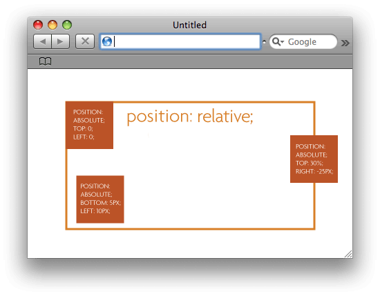
the picture is from css-tricks.com/absolute-positioning-inside-relative-positioning which explains it even a little further.
The above picture in code would look like:
.parent {  position: relative;  width: 400px;  height: 300px;  border: solid 3px CHOCOLATE;}
.absolute-one,.absolute-two,.absolute-three  {  position: absolute;  background-color: CHOCOLATE;  color: white;  padding: 10px;  width: 100px;  height: 100px;}
.absolute-one {  top: 0;  left: 0;}
.absolute-two {  bottom: 5px;  left: 10px;}
.absolute-three  {  top: 30%;  right: -25px;}
<div class="parent"> <div class="absolute-one"> top: 0; left: 0; </div> <div class="absolute-two"> bottom: 5px; left: 10px; </div> <div class="absolute-three"> top: 30%; right: -25px; </div></div>Related Topics
Can It Flexbox? Chat Window with Input at the Bottom, Chats Scrolling Up
Why Is My Android Device-Width 980Px
Internet Explorer Automatically Switches to Compatibility Mode (IE9 and Ie10)
Nested Column Flexbox Inside Row Flexbox with Wrapping
Adding CSS Stylesheet to Pages Based on Route in Opencart
Css: Set Color for Selected Row in a Table
Safari Rounding Down on Subpixel Calculations
Using an Data Uri Svg as a CSS Background Image
How to Scroll with Ionic and Have Fixed Content Above
Web Design for Smart Phone - Pixel Size
Css: How to Vertically and Horizontally Align an Image
How to Use CSS Attribute Selector for an Svg Element with Namespaced Attribute Href
Resize Unknown Number of Elements to Fill Width of Parent Container
Hide Overflow on Elements with Fixed Position