Resize unknown number of elements to fill width of parent container
Unfortunatly I think you'll have to use tables to do this. As <td>'s resize itslef to fit into the full width.
HTH
Make a list of an unknown number of items stretch to full width of container, responsive
Here's a flex solution:
#list{
  display: flex;
  flex-flow: wrap;
  justify-content: space-between;
  padding:20px 0 0 0;
  border-top: 4px solid black;
  width:30%;
  list-style-type:none;
}

.Container{
  width:40px;
  height:40px;
  background-color:red;
  margin: 1px;
}
This works for all rows except the last one:
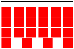
A fix is to add additional elements, with visibility hidden:
.hidden {
  visibility: hidden;
}

<li class="Container hidden"></li>
<li class="Container hidden"></li>
...
Since elements with visibility: hidden still take up screen space, the flex box will take them into account during layout:
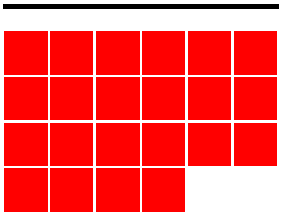
In this fiddle, the elements stay evenly spaced as you grow and shrink the viewport.
Multiple divs spread to fill width of container?
You're going to need to emulate table layout behavior, as in this answer.
This does NOT involve using actual <table> and children elements! This involves using certain values of the display property, namely table and table-cell, to emulate the layout behavior of tables. You don't want to use actual table markup for pure layout, as that is semantically incorrect and frowned upon. If your content is actual tabular data that belongs in a table, then it makes perfect sense to use an actual <table>. I'll present the non-table way here since that's likely what you want.
Your div.container element will need the display: table; property to make it behave like <table>. You'll also want the table-layout rule with the fixed value, to make all of your child elements evenly spaced. Your div.child elements will then need display: table-cell; to make them act like table cells. The browser will now automagically compute evenly-spaced layouts for your child elements. Note that you do not need/want a width rule on your child elements anymore, since the browser computes that. The container element will need a width of some kind, otherwise the table will simply collapse to be only as large as its content. Note that content can also overflow out of the child elements if the content width is more than the computed, evenly-spaced dimensions.
The final code is below, and here's a fiddle.
HTML:
<div class="container">
    <div class="child">AAAAA</div>
    <div class="child">BB</div>
    <div class="child">CCCCCCCCC</div>
    <div class="child">D</div>
    <div class="child">E</div>
    <div class="child">E</div>
    <div class="child">E</div>
</div>
CSS:
.container {
    width: 100%;
    border: 1px solid black;
    display: table;
    table-layout: fixed;
}
.child {
    border: 1px solid grey;
    display: table-cell;
}
Also, an unrelated note about display: inline-block;. It will render any and all whitespace between inline-block elements (you can see this as spacing between your child elements in your original fiddle). This is normal and following the spec, but is sometimes undesired. You can read about ways to get around it here.
Multiple div auto width to fill parent
you will have to add jquery to achieve this : DEMO
var containerW = $('.container').width();
var innerCount = $('.container .inner').length;

$('.inner').css({
    width: containerW / innerCount
});
Expand a div to fill the remaining width
The solution to this is actually very easy, but not at all obvious. You have to trigger something called a "block formatting context" (BFC), which interacts with floats in a specific way.
Just take that second div, remove the float, and give it overflow:hidden instead. Any overflow value other than visible makes the block it's set on become a BFC. BFCs don't allow descendant floats to escape them, nor do they allow sibling/ancestor floats to intrude into them. The net effect here is that the floated div will do its thing, then the second div will be an ordinary block, taking up all available width except that occupied by the float.
This should work across all current browsers, though you may have to trigger hasLayout in IE6 and 7. I can't recall.
Demos:
- Fixed Left: http://jsfiddle.net/A8zLY/5/
- Fixed Right: http://jsfiddle.net/A8zLY/2/
div {
  float: left;
}

.second {
  background: #ccc;
  float: none;
  overflow: hidden;
}
<div>Tree</div>
<div class="second">View</div>How to add in-line elements so they fill available horizontal space?
You can use the following solution using flexbox. You can add more elements on HTML without changing the CSS:
#container { display:flex; flex-direction:row; justify-content:space-evenly;}.item { border:1px dashed red; width:100%;}<div id="container"> <div class="item">1</div> <div class="item">2</div> <div class="item">3</div> <div class="item">4</div></div>
<div id="container"> <div class="item">1</div> <div class="item">2</div> <div class="item">3</div></div>
<div id="container"> <div class="item">1</div> <div class="item">2</div> <div class="item">3</div> <div class="item">4</div> <div class="item">5</div> <div class="item">6</div> <div class="item">7</div></div>DIV filling 100% of an unknown parent element
Personally, I would simply set it to fill the parent container (which can be a task in itself in CSS2).
This way, whomever is controlling the template can decide the eventual size of your div by influencing the parent container. If they want it to fill the container, they just leave is as-is - if they want to restrict it or position it in some way, they can place it in a block element and dictate the size/shape/positioning of the block.
How to center unknown number of fluid divs in a 100% width container?
Instead of floats use display:inline-block
JSfiddle with 6 divs
Jsfiddle with 5 divs
CSS
body, html {
    height: 100%;
}
body {
    margin: 0;
    padding: 0;
}
#container {
    width: 100%;
    height: 100%;
    background-color: #000000;
    text-align: center;
    font-size: 0;
}

#container div {
    width: 16.66%;
    display: inline-block;
    font-size:1rem
}
Stretch child div height to fill parent that has dynamic height
The solution is to use display: table-cell to bring those elements inline instead of using display: inline-block or float: left.
div#container { padding: 20px; background: #F1F1F1}.content { width: 150px; background: #ddd; padding: 10px; display: table-cell; vertical-align: top;}.text { font-family: 12px Tahoma, Geneva, sans-serif; color: #555;}<div id="container"> <div class="content"> <h1>Title 1</h1>
<div class="text">Sample Text. Sample Text. Sample Text. Sample Text. Sample Text. Sample Text. Sample Text. Sample Text. Sample Text. <br>Sample Text. Sample Text. Sample Text. <br>Sample Text. <br> </div> </div> <div class="content"> <h1>Title 2</h1>
<div class="text">Sample Text. Sample Text. Sample Text. Sample Text. Sample Text. Sample Text. Sample Text. Sample Text. Sample Text.</div> </div></div>How can I expand a child div to 100% screen width if the container div is smaller?
You can set the width based on the vw (viewport width). You can use that value too using the calc function, to calculate a left-margin for the div. This way you can position it inside the flow, but still sticking out on the left and right side of the centered fixed-width div.
Support is pretty good. vw is supported by all major browsers, including IE9+. The same goes for calc(). If you need to support IE8 or Opera Mini, you're out of luck with this method.
-edit-
As mentioned in the comments, when the content of the page is higher than the screen, this will result in a horizontal scrollbar. You can suppress that scrollbar using body {overflow-x: hidden;}. It would be nice though to solve it in a different way, but a solution using left and rightlike presented in Width:100% without scrollbars doesn't work in this situation.
-edit 2021-
Another work-around for the scrollbars, which may be acceptable or not depending on your situation:
By making the green div a little bit smaller, say 20px, you can keep a bit of space for the scrollbar. Half that reserved width can be added to the margin, to keep the wide div centered:
#wide-div {
  width: calc(100vw - 20px);
  margin-left: calc(-50vw + 50% + 10px);
div {
  min-height: 40px;
  box-sizing: border-box;
}
#container {
  position: relative;
}
#parent {
  width: 400px;
  border: 1px solid black;
  margin: 0 auto;
}

#something {
  border: 2px solid red;
}

#wide-div {
  width: calc(100vw - 20px);
  margin-left: calc(-50vw + 50% + 10px);
  border: 2px solid green;
}
<div id="container">
<div id="parent">
<div id="something">Red</div>
<div id="wide-div">Green
<br>Green
<br>Green
<br>Green
<br>Green
<br>Green
<br>Green
<br>Green
</div>
<div id="something-else">Other content, which is not behind Green as you can see.</div>
</div>
</div>Related Topics
Css: How to Attach an Arrow to a Div and Make It Overlap the Border
How to Figure Out Proper Min-Width and Max-Width Values for Responsive CSS
CSS Linear Gradient Transparency Misbehaving Only in Safari
How to Update and Include Twitter Bootstrap 3 on Webapp or Yo Angular
Css: How to Have to Divs Side by Side with Height 100%
How to Put Text in the Upper Right, or Lower Right Corner of a "Box" Using CSS
CSS Media Query Min-Width Not Working Correctly
Nested Flexbox with Scrolling Area
How to Set Fill and Stroke Colors and Opacity on Vml Paths Using CSS
Bootstrap 3 Nav-Bar Change Color Cause Showing a White Border or White Line
Fixed Persistent Header and Scroll to Focussed Input Fields
Print Stylesheet - Converting Inputs to Text
Best Practice for CSS Clear or Overflow
Evenly-Spaced Navigation Links That Take Up Entire Width of Ul in CSS3
CSS Background Sizing Polyfill
How to Center an Image That Is Wider Than the Browser Window (Not a Background Image)