Maintain Perfectly Circular Corners on Variable-Height Element
Just set the border-radius to something high, like 360px.
div {
    height:50px;
    width:500px;
    background:red;
    border-radius:360px;
}
Look at this jsFiddle example to see what I mean.
border-radius for circle left and right with unequal width and height and variable height
Set border-radius to a higher value:
border-radius: 9999px;
How to maintain border-radius shape as height changes
50px border radius is too big here. you can use 20px.
.card {  margin-bottom:20px;  background: yellow;  padding: 10px;  width: 80%;  border-radius: 20px;  position: relative;}.avatar {  background: red;  height: 50px;  width:50px;  border-radius:50%;  position: absolute;  top: -2px;  right: -2px; }
p { width: calc(100% - 20px);}
<div class="card"> <p>Lorem Ipsum is simply dummy text of the printing and typeset </p> <div class="avatar"></div></div><div class="card"> <p> Lorem Ipsum is simply dummy text of the printing and typesetting industry. Lorem Ipsum is simply dummy text of the printing and typesetting industry. </p> <div class="avatar"></div></div>
<div class="card"> <p> Lorem Ipsum is simply dummy text of the printing and typesetting industry. Lorem Ipsum is simply dummy text of the printing and typesetting industry. Lorem Ipsum is simply dummy text of the printing and typesetting industry. Lorem Ipsum is simply dummy text of the printing and typesetting industry. Lorem Ipsum is simply dummy text of the printing and typesetting industry. Lorem Ipsum is simply dummy text of the printing and typesetting industry. </p> <div class="avatar"></div></div>Avoid elliptical shape in CSS border-radius
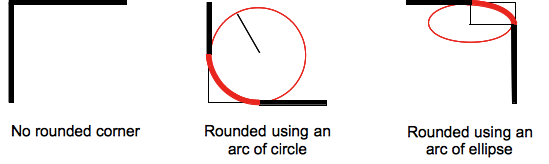
(source: mozilla.org)
Formally, the syntax for the border-radius property accepts 2 values for each corner: a horizontal radius and a vertical radius (separated by a slash). The following line would create an elliptical border-radius similar to the third image above.
border-radius: 10px / 5px;
Usually, we only specify one value. In this case, that value gets used as both the vertical and horizontal radii. The following line would create a circular border-radius similar to the second image above.
border-radius: 10px;
Using Percentages
The Mozilla Developer's Network defines the possible value types for this property as follows:
<length>
Denotes the size of the circle radius or the semi-major and semi-minor axes of the ellipsis. It can be expressed in any unit allowed by the CSS data types. Negative values are invalid.<percentage>
Denotes the size of the circle radius, or the semi-major and semi-minor axes of the ellipsis, using percentage values. Percentages for the horizontal axis refer to the width of the box, percentages for the vertical axis refer to the height of the box. Negative values are invalid.
Using a single value to create a circular radius is fine when we're using absolute length units like pixels or ems, but gets more complicated when we're using percentages. Since the single-value usage of this property is synonymous with using the same value twice, the following two lines are equivalent; however, these would not necessarily create a circular border-radius.
border-radius: 50%;
border-radius: 50%/50%;
These lines say to "create an ellipse or circle whose vertical radius is equal to 50% of the element's height and whose horizontal radius is equal to 50% of the element's width, and use that as the border-radius.". If the element is 200 pixels wide and 100 pixels tall, this results in an ellipse rather than a circle.
Solution
If you want a circular border-radius, the easiest thing to do is to use absolute measurement units (like pixels or ems or anything besides percentage), but sometimes that doesn't fit your use case and you want to use percentages. If you know the aspect-ratio of the containing element, you still can! In the example below, since my element is twice as wide as it is tall, I've scaled the horizontal radius in half.
#rect {
  width: 200px;
  height: 100px;
  background: #000;
  border-radius: 25%/50%;
}
<div id="rect"></div>Circular button that resizes with window size
There are two ways to achive this; with and without JavaScript.
The JavaScript method
Here's a simple demo: little link.
HTML:
<div class = "circle"></div>
CSS:
html, body {
    height: 100%;
}
.circle {
    border-radius: 1000px;
    background-color: rgb(0, 162, 232);
}
JavaScript (uses jQuery, but it isn't necessary):
function upd() {
    var h = $("body").height();
    $(".circle").height(h / 5);
    $(".circle").width(h / 5);
}
upd();
window.onresize = upd;
The non-JavaScript (CSS) method
For a CSS-only solution, you need to use the fact that all padding values are calculated relative to the element parent's width, not height (reference). Little demo: little link.
HTML:
<div class = "wrapper">
    <div class = "main">

    </div>
</div>
CSS:
html, body {
    height: 100%;
    width: 100%;
}
.wrapper {
    width: 20%;
    display: inline-block;
    position: relative;
}
.wrapper:after {
    padding-top: 100%; /*1:1 ratio*/
    display: block;
    content: '';
}
.main {
    position: absolute;
    top: 0; bottom: 0; right: 0; left: 0; /*fill parent*/
    border-radius: 1000px;
    background-color: rgb(0, 162, 232);
    /*I wanted it to look good :)*/
    font-family: 'Arial', Helvetica, Sans-Serif;
    color: white;
}
Make a perfect circle around a div of variable height
Clip-path can easily do this if you consider solid coloration.
Resize the element and the circle will follow:
.box {
  width: 200px;
  height: 200px;
  overflow: hidden;
  resize: both;
  background: blue;
  box-shadow: 0 0 0 200vmax red;
  clip-path: circle(71%);
  margin: 100px auto;
}
<div class="box"></div>Beveled corner on a rounded button
Using Box Shadow:
One approach would be to use box-shadow on a pseudo-element like in the below snippet. Here, one pseudo-element (.shape:before) is positioned in such a way that it is a bit above the top-right corner of the circle and then its box shadow is used to fill the parent (.container) with required background color. The badge is added via another pseudo-element on the .container element.
This has better browser support than the radial-gradient approach as it works in IE8+. Drawbacks would be that it can only support a solid background color for the main circle as shadows cannot be a gradient or an image. Also, it seems to require two elements (I am trying to reduce it and if successful will add it into answer).
.container {  position: relative;  height: 50px;  width: 50px;  border-radius: 50%;  margin: 25px;}.shape {  position: absolute;  height: 100%;  width: 100%;  top: 0px;  left: 0px;  border-radius: 50%;  overflow: hidden;}.shape:before {  position: absolute;  content: '';  height: 60%;  width: 60%;  top: -20%;  right: -20%;  border-radius: 50%;  box-shadow: 0px 0px 0px 50px rgb(0, 199, 158);}.container:after {  position: absolute;  content: '2';  height: 50%;  width: 50%;  right: -20%;  top: -20%;  background: rgb(255, 67, 0);  color: white;  line-height: 25px;  text-align: center;  border-radius: 50%;}
/* just for demo */
*, *:after, *:before {  transition: all 2s;}.container:hover {  height: 100px;  width: 100px;}.container:hover .shape:before {  box-shadow: 0px 0px 0px 100px rgb(0, 199, 158);  }.container:hover:after {  line-height: 50px;}body {  background-image: radial-gradient(circle, #3F9CBA 0%, #153346 100%);  min-height: 100vh;}
<div class='container'> <div class='shape'></div></div>Capsule shape using border-radius without a set width or height?
Applying a very large border radius seems to work on many browsers (IE9+, FF, Chrome) like this mod of David's fiddle http://jsfiddle.net/cthQW/1/
border-radius: 500px;
Create a perfect circle with CSS
In order to achieve a perfectly round shape you'll need to have perfect square to begin with. So, for instance, your button will need to have dimensions like width: 32px; height: 32px. To turn a square into a circle you'll have to apply a border radius of 50% e.g. border-radius: 50%.
Related Topics
How to Vertically Align Objects in CSS When Working with CSS Grids
Ie Doesn't Support Height=Auto for Images, What Should I Use
Select Element Based on Child Class
Make Flex Items Stretch Full Height and Vertically Center Their Content
Create a W3C Validated Anchor Link with Target="_Blank"
Ie CSS Bug: Table Border Showing Div with Visibility: Hidden, Position: Absolute
Grails 2.3 Changes CSS Font-Face Url to "Resource:/..."
CSS Background Sizing Polyfill
Is Position: Fixed Z-Index Relative to Its Parent's Z-Index
Angular Material 6 Grid List Align-Items and Justify-Content to Flex-Start
Media Query-Like Behaviour on Width of a Specific Div
CSS Content Attribute for Img Tag
Can an Abbr Tag's Title Be Styled
Keep Image Ratio Using Max-Width and Max-Height in Ie 11