Angular Material 6 grid list align-items and justify-content to flex-start
Put in styles.css:
DEMO
.mat-grid-tile .mat-figure {
   justify-content: flex-start !important ;
   align-items: flex-start !important;
}
text-align in md-grid-tile (Angular Material) doesn't work
You could simply put a span or div tag around your text inside md-grid-tile:
<md-grid-tile>
    <div class="text-inside-grid">{{ video.title }}</div>
</md-grid-tile>
and then style it:
.text-inside-grid {
  position: absolute;
  left: 5px;
}
How to disable flex from Angular mat-grid-list
Solution
Disable encapsulation
import { Component, OnInit , ViewEncapsulation } from '@angular/core';

@Component({
  selector: 'app-registration',
  templateUrl: './registration.component.html',
  styleUrls: ['./registration.component.css'],
  encapsulation: ViewEncapsulation.None //Add this line
})
And In component.css
.mat-grid-tile .mat-figure {
    top: 0;
    left: 0;
    right: 0;
    bottom: 0;
    position: absolute;
    display: block !important ;
    align-items: flex-start;
    justify-content: flex-start;
    height: 100%;
    padding: 0;
    margin: 0;
}
Angular Material 2 : How to style an md-grid-tile?
You can use ::ng-deep to override the default css of md-grid-tile.
css:
::ng-deep md-grid-tile.mat-grid-tile .mat-figure {
    align-items: initial;  /*vertical alignment*/
    justify-content: initial;  /*horizontal alignment*/
}
Plunker demo
FlexLayout Angular and align items in one line on start as well as on the end
Could be like this?
<mat-card fxLayout="row">
  <div fxLayout="row" fxLayoutAlign="start center" fxFlex="50"     fxLayoutGap="5px">
      <button mat-raised-button color="accent" (click)="newRows()">Add</button>
      <button [disabled]="selectedRow != undefined && selectedRow.isBevoorschotting" mat-raised-button color="accent"
        (click)="updateRows()">Update</button>
      <button mat-raised-button color="warn" (click)="deleteRows()" [disabled]='!isAdmin'>Delete</button>
      <button mat-raised-button color="accent" (click)="refresh(0)">Refresh</button>
  </div>
  <div fxLayout="row"  fxFlex fxLayoutAlign="end center">
      <mat-checkbox (change)="onclickMutatieVelden()" [(ngModel)]="toonMutatievelden">
        <p>Mutatie velden aan...</p>
      </mat-checkbox>
      <mat-checkbox (change)="onclickMaakInactief()" *ngIf="selectedRow" [(ngModel)]="!selectedRow.isActief">
        <p>Maak Inactief...</p>
      </mat-checkbox>
  </div>
</mat-card>
https://stackblitz.com/edit/flex-layout-angular-material-gxew4y?embed=1&file=app/app.component.html
Center aligned grid list in Angular Material
You can use CSS Flexbox.
Make your parent (i.e. md-grid-list) a flex container using display: flex & use justify-content: center to align its children (i.e. md-grid-tile) horizontally center. Like:
md-grid-list {
  display: flex;
  flex-wrap: wrap;
  justify-content: center;
}
I've used div's instead of regular md- type components for demonstration:
md-grid-listis equivalent to.listmd-grid-tileis equivalent to.tile
Have a look at the example snippet below (updated fiddle according to your requirements):
.list {  display: flex;  flex-wrap: wrap;  justify-content: center;}
.tile {  width: 100px;  height: 100px;  border: 1px solid #777;  margin: 10px;  display: flex;  align-items: center;  justify-content: center;  box-shadow: 0 0 3px rgba(0, 0, 0, 0.5);}
<div class="list"> <div class="tile"> <div class="compas-home-text">Grid Title</div> </div>
<div class="tile"> <div class="compas-home-text">Grid Title</div> </div>
<div class="tile"> <div class="compas-home-text">Grid Title</div> </div>
<div class="tile"> <div class="compas-home-text">Grid Title</div> </div>
<div class="tile"> <div class="compas-home-text">Grid Title</div> </div>
<div class="tile"> <div class="compas-home-text">Grid Title</div> </div></div>How to align correctly mat form field in my forms in Angular 11 material?
First, add this CSS snippet at your styles.css/styles.scss file.
.mat-grid-tile .mat-figure {
  justify-content: left !important;
}
Since you are using mat-grid-list you have to manually align the content to left.
Second, If you want every mat-form-field on a separate line. Then you have to add every mat-form-field separately inside separate mat-grid-tile. E.g:
<mat-grid-tile>
    <mat-form-field>
        <mat-label>Nom</mat-label>
        <input matInput formControlName="firstCtrl" placeholder="Nom voyageur" required>
        <mat-error>Le nom est obligatoire.</mat-error>
    </mat-form-field>
</mat-grid-tile>
Working demo at StackBlitz.
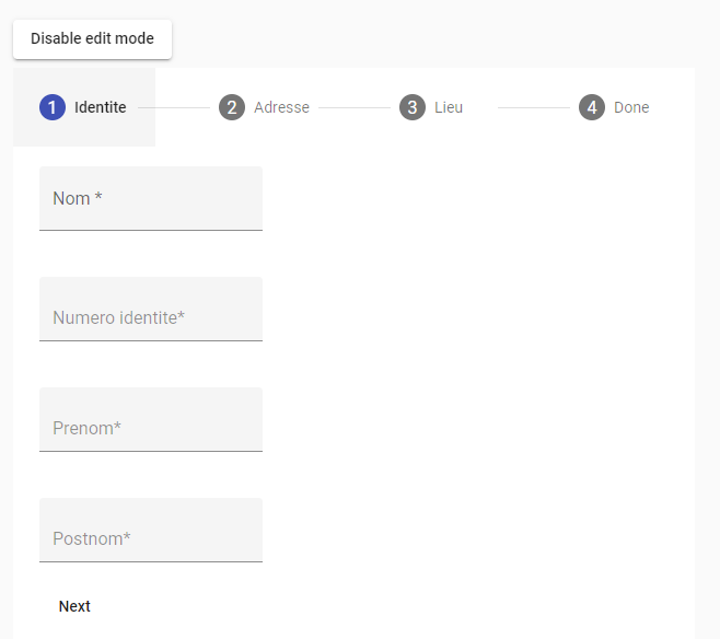
Final result:
Related Topics
Increment a Variable in Less CSS
Normalized CSS, Option in Jsfiddle, How to Add It to Document
How to Make a Angled Arrow Like This with Gradient and Transparent
Rails Images and Assets Not Being Loaded Properly
Sass: Change Color with @For Loop
What Is the Meaning of the "@Include" in .CSS Files
Line Height Default Value If Font Size Is 100%
CSS Grid Vertical Columns with Infinite Rows
Draw a Line That Doesn't Get Thicker When Image Stretches
Angular Mat-Select Text Color Doesn't Change
In the CSS Visual Formatting Model, What Does "The Flow of an Element" Mean
Content Scrolling on Mobile Page with Fixed Header/Footer
How to Import CSS File for into Component .Jsx File
How to Make Placeholder and Label Transitions
Css: How to Get Two Floating Divs Inside Another Div
How to Set Up a Dynamic Grid Based on Flex or Grid