safari rounding down on subpixel calculations
There isn't a whole lot you can do about how different browsers render subpixels, sadly. It'd be great if we could choose how the rounding should be handled through CSS, but nope.
Simply using pixels rather then percentages would solve the problem but that's obviously not what you want. I guess you could get around with static pixels if you change the values (possible to a percentage value) through media queries.
Whenever I find myself in a similar scenario I float the last child to the right. A few additional pixels between the last and second last elements don't usually hurt as much as a few additional pixels between the last element and its parent.
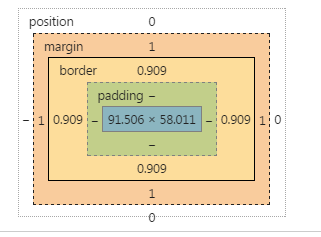
Sub-Pixels calculated and rendered differently among browsers
As you already know, the problem arises from a different approach to subpixel calculus between browsers
In Chrome, for instance, borders can have a fractional size, but margins are handled different (as integers).
I don't have documentation about it from the Chrome team, but it's what can be seen in dev tools:
AFAIK, there is not a way to change that.
Instead, you can transfer the use of the margin in the button to a border.
Since you need to get space for the 1px border of the input, do the same in the button, set a 1px border (instead of a margin), and set it transparent.
The remaining trick is to set the background-clip property to padding box, so that this transparency is not affected by the background
There is another bug in Chrome, the padding expressed in em is not reliable at this level of precision when the browser is zoomed. I changed this in the snippet.
Since we are using the border button to get the dimension ok, we can style the border using instead a inset shadow.
* {  margin: 0; padding: 0; box-sizing: border-box;}button, input, wrapper {  display: inline-block; border-radius: 3px;}
.wrapper {  position: relative;    width: 60%;  margin: 1em;  background-color: #ccc;}
input {  border: 1px solid red;  width: 100%;    background-color: limegreen;  line-height: 3em;/*  padding: 0.75em; */  padding: 10px;}
button {  position: absolute;  right: 0;  top: 0;  bottom: 0;  border: 1px solid transparent;  width: 7em;  margin: 0px;  background-clip: padding-box;  box-shadow:  inset 0px 0px 0px 2px  black;}
<div class="wrapper"> <input type="text"> <button>Test</button></div>Div doesn't fill container 100% of the way when shrunk
John Resig has a post about this issue that uses this exact case as its example.
http://ejohn.org/blog/sub-pixel-problems-in-css/
Take the following page for example. You have 4 floated divs, each
with a width of 25%, contained within a parent div of width 50px.
Here’s the question: How wide are each of the divs?The problem lies in the fact that each div should be, approximately,
12.5px wide and since technology isn’t at a level where we can start rendering at the sub-pixel level we tend to have to round off the
number. The problem then becomes: Which way do you round the number?
Up, down, or a mixture of the two? I think the results will surprise
you, as they did me.
There are also several Stack Overflow questions on the subject:
- safari rounding down on subpixel calculations
- percent (%) width rendered differently in different browser (firefox, safari, opera, chrome)
Subpixel issues with an animated sprite in odd zoom levels of Safari and FF
Instead of moving the background to the new frame, have a canvas tag re-draw the frame. The canvas tag handles sub-pixel interpretation independent of the browser and because of this you not only control the render (browser agnostic) but also solve the jitter issue as it's being re-drawn frame-by-frame into the canvas' dimensions in realtime.
Zooming is specifically tough because there's no reliable way to detect the zoom level from the browser using jQuery or plain-ole javascript.
Check out the demo here: http://jsfiddle.net/zhaocnus/Gr9TF/
*Credit goes to my coworker zhaocnus for the solution. I'm simply answering this question on his behalf.
// js spritemap animation
// constants
var COUNTER_MAX = 14,
    OFFSET = -200,
    FRAMERATE = 100;

// variables
var _counter = 0,
    _sprite = document.getElementById("sprite"),
    _canvas = document.getElementById("anim-canvas"),
    _ctx = _canvas.getContext("2d"),
    _img = null;

// functions
function play() {
    // update counter
    _counter++;
    if (_counter > COUNTER_MAX) {
        _counter = 0;
    }

    // show current frame
    _ctx.clearRect(0, 0, _canvas.width, _canvas.height);
    _ctx.drawImage(_img, _counter * OFFSET, 0);

    // next frame
    setTimeout(play, FRAMERATE);
}

function getStyle(oElm, strCssRule) {
    var strValue = '';
    if (document.defaultView && document.defaultView.getComputedStyle) {
        strValue = document.defaultView.getComputedStyle(oElm, null).getPropertyValue(strCssRule);
    } else if (oElm.currentStyle) {
        var strCssRule = strCssRule.replace(_styleRegExp, function (strMatch, p1) {
            return p1.toUpperCase();
        });
        strValue = oElm.currentStyle[strCssRule];
    }
    return String(strValue);
}

function initCanvas(callback) {
    var url = getStyle(_sprite, 'background-image');
        url = url.replace(/^url\(["']?/, '').replace(/["']?\)$/, '');
    _img = new Image();
    _img.onload = function(){
        _ctx.drawImage(_img, 0, 0);
        callback();
    };
    _img.src = url;
}

// start animation
initCanvas(play);
gap in percentage based layout
Its a problem with certain browsers trying to round subpixel (decimal) widths. The percentages are converted to pixels automatically.
If you go through and add up the calculated width in pixels of the elements in your jsfiddle they don't add up to the width of your container element.
Here is some more info
http://css-tricks.com/percentage-bugs-in-webkit/
and
How do I get around the IE CSS percentage rounding problem?
and
Hi,
I don't have exact details of what browsers do but I have noted the
following in the past.When dealing width Pixels:
Firefox will round 125.5px up to 126px and 125.4px will be rounded
down to 125px.Opera will treat 126.9px as 126px (but it will treat 126.999 as 127px
!!)IE ignores all the decimal points and treats 126.9999px as 126px.
When dealing with percentages.
Opera doesn't seem to take any notice at all of the decimal portion of
percentages. e.g 33.9% will only equate to exactly 33%. Therefore
for three floats of 33.333% in a 1000px width Opera will show a 10px
gap at the right edge.Mozilla seems to keep a running total of the decimal parts of
percentages used and will at the most only be 1 pixel out on the full
width.IE rounds each portion up or down individually and therefore for three
floats will possibly be 3 pixels too big thus causing a float drop.To stop the floats dropping in ie you can apply a negative right
margin to the last float that will soak up the extra space.
(margin-right:-3px).For opera there is no cure but perhaps to make the last element fit
the space required or to make the elements bigger than needed and
apply a larger right negative margin.This is the reason that most people simply use 33% because then they
know it will fit all browsers even if there is a slight gap which
depending on the situation may not be noticable. (e.g. the background
color of the element behind may hide it.)
Safari is not respecting decimals in CSS filter: blur()
Using a combination of scaling and font-size setting, Safari can be made to look as though it is blurring 'fractionally' - it seems happy scaling fractionally but not blurring fractionally.
This snippet sets font-size inversely proportional to the required blur, keeps the blur at 1px and then scales down by the fraction which is the required blur:
div {
  margin: 0;
}

.blur:nth-child(1) {
  --b: 1;
}

.blur:nth-child(2) {
  --b: 0.6;
}

.blur:nth-child(3) {
  --b: 0.1;
}

.blur:nth-child(4) {
  --b: 0.01;
}

.blur:nth-child(5) {
  --b: 0.001;
}

.blur {
  font-size: calc(1em / var(--b));
  line-height: calc(1.4em * var(--b));
  filter: blur(1px);
  width: calc(100% / var(--b));
  transform: scale(var(--b));
  transform-origin: 0 0;
}
<div>
<div class="blur">Hello 1px</div>
<div class="blur">Hello 0.6px</div>
<div class="blur">Hello 0.1px</div>
<div class="blur">Hello 0.01px</div>
<div class="blur">Hello 0.001px</div>
</div>Do different browsers render decimal percentage sizes differently?
Yes they do.
From my memory:
In Opera, you cannot set the decimal places of the percentage so, if you set 33.3% it uses only 33% (rather annoying) (edit:Opera may have improved on that in current version as it seems)
In Firefox, if you have percentages that add up to 100%, the pixels don't always add up to the 100% of the pixels
e.g. you have a outer div with three columns all with width: 33.33333%. If the outer div has width 100px, the columns will have 33 pixels and the sum is 99 pixels and not 100.
(edit: Firefox does better than I remember. Maybe they improved)
Old IE, I cannot remember IE9 seems to work fine. The bad one of course is IE7, which rounds up (as the IE6, but who cares?). IE8/9 seem to work ok
Chrome works fine
Safari: can't remember
edit
Her one can test for oneself
http://jsfiddle.net/fTpFw/
conclusion
After I played with my fiddle in different browsers I think they all have improved. The only bad implementations (from what I want to achieve) in modern browsers is Opera and Safari. IE7 is a stopper, too. If you don't have to deal with these buggers, you could go ahead and use the percentage widths.
Related Topics
CSS - Vertically Center an Image Within a Floated Div
Best Way to Structure a CSS Stylesheet
Display Twitter Bootstrap Btn-Group Inline with Text
Internet Explorer Creates Horizontal Scrollbar for Vertical Scrollbar's Width
In the CSS Visual Formatting Model, What Does "The Flow of an Element" Mean
Enable Support for CSS3 ::Outside Pseudoelement
How to Prevent HTML Elements from Overlapping or Sliding Under One Another
Css/Js Bundle in Single File in MVC When Publish with Release Option
How to Add Tooltip to Image on Hover with CSS
How to Change Height of Ui-Grid Row
How to Center One Image Over Another
Making a Column-Oriented Table in HTML