With SwiftUI, is there a way to constrain a view's size to another non-sibling view?
1.Getting the size
struct CellTwoView: View {

    var body: some View {
        Rectangle()
            .background(
                GeometryReader(content: { (proxy: GeometryProxy) in
                    Color.clear
                        .preference(key: MyPreferenceKey.self, value: MyPreferenceData(rect: proxy.size))
                })
        )
    }
}
Explanation - Here I have get the size of the view from using background View ( Color.clear ) , I used this trick unless getting the size from CellTwoView itself ; 'cause of SwiftUI-View size is determined by the view itself If they have size ( parent cannot change the size like in UIKit ). so if I use GeometryReader with CellTwoView itself , then the GeometryReader takes as much as size available in the parent of CellTwoView. - > reason -> GeometryReader depends on their parent size. (actually this is another topic and the main thing in SwiftUI)
Key ->
struct MyPreferenceKey: PreferenceKey {
            static var defaultValue: MyPreferenceData = MyPreferenceData(size: CGSize.zero)

        static func reduce(value: inout MyPreferenceData, nextValue: () -> MyPreferenceData) {
            value = nextValue()
        }

        typealias Value = MyPreferenceData
    }
Value (and how it is handle when preference change) ->
struct MyPreferenceData: Equatable {
    let size: CGSize
    //you can give any name to this variable as usual.
}
2. Applying the size to another view
struct ContentView: View {

    @State var widtheOfCellTwoView: CGFloat = .zero

    var body: some View {
        VStack {
            HStack {
                CellOneView()
                CellTwoView ()
                    .onPreferenceChange(MyPreferenceKey.self) { (prefereneValue) in
                        self.widtheOfCellTwoView = prefereneValue.size.width
                }
            }

            HStack {
                CellThreeView ()
                CellFourView ()
                    .frame(width: widtheOfCellTwoView)
            }
        }
    }
}
How to make view the size of another view in SwiftUI
I have written a detailed explanation about using GeometryReader, view preferences and anchor preferences. The code below uses those concepts. For further information on how they work, check this article I posted: https://swiftui-lab.com/communicating-with-the-view-tree-part-1/
The solution below, will properly animate the underline:
I struggled to make this work and I agree with you. Sometimes, you just need to be able to pass up or down the hierarchy, some framing information. In fact, the WWDC2019 session 237 (Building Custom Views with SwiftUI), explains that views communicate their sizing continuously. It basically says Parent proposes size to child, childen decide how they want to layout theirselves and communicate back to the parent. How they do that? I suspect the anchorPreference has something to do with it. However it is very obscure and not at all documented yet. The API is exposed, but grasping how those long function prototypes work... that's a hell I do not have time for right now.
I think Apple has left this undocumented to force us rethink the whole framework and forget about "old" UIKit habits and start thinking declaratively. However, there are still times when this is needed. Have you ever wonder how the background modifier works? I would love to see that implementation. It would explain a lot! I'm hoping Apple will document preferences in the near future. I have been experimenting with custom PreferenceKey and it looks interesting.
Now back to your specific need, I managed to work it out. There are two dimensions you need (the x position and width of the text). One I get it fair and square, the other seems a bit of a hack. Nevertheless, it works perfectly.
The x position of the text I solved it by creating a custom horizontal alignment. More information on that check session 237 (at minute 19:00). Although I recommend you watch the whole thing, it sheds a lot of light on how the layout process works.
The width, however, I'm not so proud of... ;-) It requires DispatchQueue to avoid updating the view while being displayed. UPDATE: I fixed it in the second implementation down below
First implementation
extension HorizontalAlignment {
private enum UnderlineLeading: AlignmentID {
static func defaultValue(in d: ViewDimensions) -> CGFloat {
return d[.leading]
}
}
static let underlineLeading = HorizontalAlignment(UnderlineLeading.self)
}
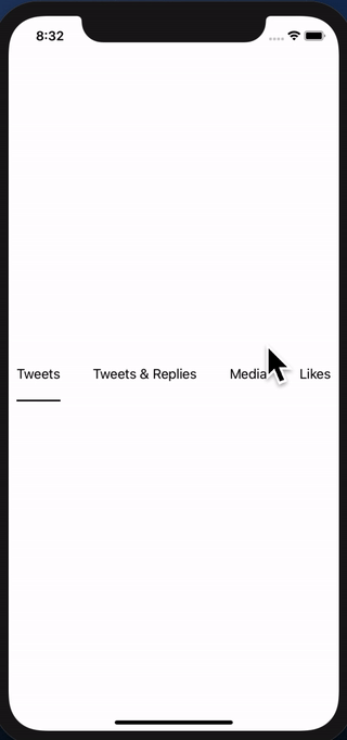
struct GridViewHeader : View {
@State private var activeIdx: Int = 0
@State private var w: [CGFloat] = [0, 0, 0, 0]
var body: some View {
return VStack(alignment: .underlineLeading) {
HStack {
Text("Tweets").modifier(MagicStuff(activeIdx: $activeIdx, widths: $w, idx: 0))
Spacer()
Text("Tweets & Replies").modifier(MagicStuff(activeIdx: $activeIdx, widths: $w, idx: 1))
Spacer()
Text("Media").modifier(MagicStuff(activeIdx: $activeIdx, widths: $w, idx: 2))
Spacer()
Text("Likes").modifier(MagicStuff(activeIdx: $activeIdx, widths: $w, idx: 3))
}
.frame(height: 50)
.padding(.horizontal, 10)
Rectangle()
.alignmentGuide(.underlineLeading) { d in d[.leading] }
.frame(width: w[activeIdx], height: 2)
.animation(.linear)
}
}
}
struct MagicStuff: ViewModifier {
@Binding var activeIdx: Int
@Binding var widths: [CGFloat]
let idx: Int
func body(content: Content) -> some View {
Group {
if activeIdx == idx {
content.alignmentGuide(.underlineLeading) { d in
DispatchQueue.main.async { self.widths[self.idx] = d.width }
return d[.leading]
}.onTapGesture { self.activeIdx = self.idx }
} else {
content.onTapGesture { self.activeIdx = self.idx }
}
}
}
}
Update: Better implementation without using DispatchQueue
My first solution works, but I was not too proud of the way the width is passed to the underline view.
I found a better way of achieving the same thing. It turns out, the background modifier is very powerful. It is much more than a modifier that can let you decorate the background of a view.
The basic steps are:
- Use
Text("text").background(TextGeometry()). TextGeometry is a custom view that has a parent with the same size as the text view. That is what .background() does. Very powerful. - In my implementation of TextGeometry I use GeometryReader, to get the geometry of the parent, which means, I get the geometry of the Text view, which means I now have the width.
- Now to pass the width back, I am using Preferences. There's zero documentation about them, but after a little experimentation, I think preferences are something like "view attributes" if you like. I created my custom PreferenceKey, called WidthPreferenceKey and I use it in TextGeometry to "attach" the width to the view, so it can be read higher in the hierarchy.
- Back in the ancestor, I use onPreferenceChange to detect changes in the width, and set the widths array accordingly.
It may all sound too complex, but the code illustrates it best. Here's the new implementation:
import SwiftUI

extension HorizontalAlignment {
    private enum UnderlineLeading: AlignmentID {
        static func defaultValue(in d: ViewDimensions) -> CGFloat {
            return d[.leading]
        }
    }

    static let underlineLeading = HorizontalAlignment(UnderlineLeading.self)
}

struct WidthPreferenceKey: PreferenceKey {
    static var defaultValue = CGFloat(0)

    static func reduce(value: inout CGFloat, nextValue: () -> CGFloat) {
        value = nextValue()
    }

    typealias Value = CGFloat
}

struct GridViewHeader : View {

    @State private var activeIdx: Int = 0
    @State private var w: [CGFloat] = [0, 0, 0, 0]

    var body: some View {
        return VStack(alignment: .underlineLeading) {
            HStack {
                Text("Tweets")
                    .modifier(MagicStuff(activeIdx: $activeIdx, idx: 0))
                    .background(TextGeometry())
                    .onPreferenceChange(WidthPreferenceKey.self, perform: { self.w[0] = $0 })

                Spacer()

                Text("Tweets & Replies")
                    .modifier(MagicStuff(activeIdx: $activeIdx, idx: 1))
                    .background(TextGeometry())
                    .onPreferenceChange(WidthPreferenceKey.self, perform: { self.w[1] = $0 })

                Spacer()

                Text("Media")
                    .modifier(MagicStuff(activeIdx: $activeIdx, idx: 2))
                    .background(TextGeometry())
                    .onPreferenceChange(WidthPreferenceKey.self, perform: { self.w[2] = $0 })

                Spacer()

                Text("Likes")
                    .modifier(MagicStuff(activeIdx: $activeIdx, idx: 3))
                    .background(TextGeometry())
                    .onPreferenceChange(WidthPreferenceKey.self, perform: { self.w[3] = $0 })

                }
                .frame(height: 50)
                .padding(.horizontal, 10)
            Rectangle()
                .alignmentGuide(.underlineLeading) { d in d[.leading]  }
                .frame(width: w[activeIdx],  height: 2)
                .animation(.linear)
        }
    }
}

struct TextGeometry: View {
    var body: some View {
        GeometryReader { geometry in
            return Rectangle().fill(Color.clear).preference(key: WidthPreferenceKey.self, value: geometry.size.width)
        }
    }
}

struct MagicStuff: ViewModifier {
    @Binding var activeIdx: Int
    let idx: Int

    func body(content: Content) -> some View {
        Group {
            if activeIdx == idx {
                content.alignmentGuide(.underlineLeading) { d in
                    return d[.leading]
                }.onTapGesture { self.activeIdx = self.idx }

            } else {
                content.onTapGesture { self.activeIdx = self.idx }
            }
        }
    }
}
How Do I get uniform view size when using Image and SFSymbols in SwiftUI?
If you want to normalize the sizes, you could use a PreferenceKey to measure the largest size and make sure that all of the other sizes expand to that:
struct ContentView: View {
    let symbols = [ "camera", "comb", "diamond", "checkmark.square"]
    @State private var itemSize = CGSize.zero

    var body: some View {
        HStack(spacing: 0) {
            ForEach(Array(symbols), id: \.self) { item in
                VStack {
                    Image(systemName: item).font(.largeTitle)
                }
                .padding()
                .background(GeometryReader {
                    Color.clear.preference(key: ItemSize.self,
                                           value: $0.frame(in: .local).size)
                })
                .frame(width: itemSize.width, height: itemSize.height)
                .border(.red)
            }.onPreferenceChange(ItemSize.self) {
                itemSize = $0
            }
        }
        .border(Color.black)
    }
}

struct ItemSize: PreferenceKey {
    static var defaultValue: CGSize { .zero }
    static func reduce(value: inout Value, nextValue: () -> Value) {
        let next = nextValue()
        value = CGSize(width: max(value.width,next.width),
                       height: max(value.height,next.height))
    }
}

Aligning the height of views in SwiftUI
Here is a demo of possible layout. Tested with Xcode 11.4 / iSO 13.4

Note: .border and .padding are added just for demo & better visibility. Important places are marked in comment. MultilineTextView is a simple representable of UITextView
struct DemoFixedToLabel: View {
    var body: some View {
        HStack {
            Text("Some Text").font(Font.system(.title))
                .padding()
                .border(Color.blue)
                .fixedSize()             // << here !!
            MultilineTextView(text: .constant("My desire is to restrict the height of the UITextView to match the height of the Text"))
                .border(Color.green)
        }
        .padding()
        .border(Color.red)
        .fixedSize(horizontal: false, vertical: true)    // << here !!
    }
}
Is there a short way to assign all the anchors of a view equals to another view's all anchors
You can use a frame instead of a constraint. Also, in code setting constraint and view inside the viewDidLayoutSubviewsit's not a good way. Also, use lazy.
Here is the possible solution.
class TestViewController: UIViewController {
    private lazy var container: UIView = {
        let aView = UIView()
        aView.translatesAutoresizingMaskIntoConstraints = false
        return aView
    }()


    private lazy var imageView: UIImageView = {
        let imageView = UIImageView(image: UIImage(named: "Red"))
        imageView.translatesAutoresizingMaskIntoConstraints = true
        imageView.contentMode = .scaleAspectFit
        return imageView
    }()

    private lazy var blurredEffectView: UIVisualEffectView = {
        let blurEffect = UIBlurEffect(style: .dark)
        let blurredEffectView = UIVisualEffectView(effect: blurEffect)
        blurredEffectView.translatesAutoresizingMaskIntoConstraints = false
        return blurredEffectView
    }()


    override func viewDidLoad() {
        super.viewDidLoad()
        view.backgroundColor = .white
        navigationController?.navigationBar.prefersLargeTitles = true
        setViews()
    }


    override func viewDidLayoutSubviews() {
        super.viewDidLayoutSubviews()
        self.imageView.frame = container.bounds
        self.blurredEffectView.frame = container.bounds
    }

    private func setViews() {
        view.addSubview(container)

        let g = view.safeAreaLayoutGuide
        NSLayoutConstraint.activate([
            container.topAnchor.constraint(equalTo: view.topAnchor),
            container.leadingAnchor.constraint(equalTo: g.leadingAnchor),
            container.trailingAnchor.constraint(equalTo: g.trailingAnchor),
            container.heightAnchor.constraint(equalTo: view.heightAnchor, multiplier: 0.42)])

        container.addSubview(imageView)
        container.addSubview(blurredEffectView)
    }
}
SwiftUI custom alignment pushes views wider than parent
One way to do it, is using Preferences (learn more here).
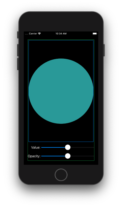
struct ContentView: View {
    @State private var num1: Double = 0.5
    @State private var num2: Double = 0.5
    @State private var sliderWidth: CGFloat = 0

    private let spacing: CGFloat = 5
    let blueGreen = Color(red: 0.2, green: 0.6, blue: 0.6)

    var body: some View {
        VStack {
            Circle().fill(blueGreen).border(Color.blue, width: 1.0).padding(4.0)

            VStack(alignment: .trailing) {
                HStack(spacing: self.spacing) {
                    Text("Value:")
                        .fixedSize()
                        .anchorPreference(key: MyPrefKey.self, value: .bounds, transform: { [$0] })

                    Slider(value: $num1, in: 0...1)
                        .frame(width: sliderWidth)
                }
                .frame(maxWidth: .infinity, alignment: .trailing)

                HStack(spacing: self.spacing) {
                    Text("Opacity:")
                        .fixedSize()
                        .anchorPreference(key: MyPrefKey.self, value: .bounds, transform: { [$0] })

                    Slider(value: $num2, in: 0...1)
                        .frame(width: sliderWidth)
                }
                .frame(maxWidth: .infinity, alignment: .trailing)

            }
            .backgroundPreferenceValue(MyPrefKey.self) { prefs -> GeometryReader<AnyView> in

               GeometryReader { proxy -> AnyView in
                    let vStackWidth = proxy.size.width

                    let maxAnchor = prefs.max {
                        return proxy[$0].size.width < proxy[$1].size.width

                    }

                    DispatchQueue.main.async {
                        if let a = maxAnchor {
                            self.sliderWidth = vStackWidth - (proxy[a].size.width + self.spacing)

                        }
                    }

                    return AnyView(EmptyView())

                }
            }

            Spacer()

        }.border(Color.green, width: 1.0).padding(20)
    }

}

struct MyPrefKey: PreferenceKey {
    typealias Value = [Anchor<CGRect>]

    static var defaultValue: [Anchor<CGRect>] = []

    static func reduce(value: inout [Anchor<CGRect>], nextValue: () -> [Anchor<CGRect>]) {
        value.append(contentsOf: nextValue())
    }
}
Get width of a view using in SwiftUI
The only way to get the dimensions of a View is by using a GeometryReader. The reader returns the dimensions of the container.
What is a geometry reader? the documentation says:
A container view that defines its content as a function of its own size and coordinate space. Apple Doc
So you could get the dimensions by doing this:
struct ContentView: View {

   @State var frame: CGSize = .zero

    var body: some View {
        HStack {
            GeometryReader { (geometry) in
                self.makeView(geometry)
            }
        }

    }

    func makeView(_ geometry: GeometryProxy) -> some View {
        print(geometry.size.width, geometry.size.height)

        DispatchQueue.main.async { self.frame = geometry.size }

        return Text("Test")
                .frame(width: geometry.size.width)
    }
}
The printed size is the dimension of the HStack that is the container of inner view.
You could potentially using another GeometryReader to get the inner dimension.
But remember, SwiftUI is a declarative framework. So you should avoid calculating dimensions for the view:
read this to more example:
- Make a VStack fill the width of the screen in SwiftUI
- How to make view the size of another view in SwiftUI
SwiftUI - How to align bottom edge to center of sibling
I found the solution:
Set the ZStacks alignment to
.bottom. Now the red view will be aligned to the green views bottom edge. Thanks to @Andrew. But this is not enough:Set the red views .alignmentGuide to the following:
->
.alignmentGuide(.bottom) { d in d[.bottom] / 2 }
Explanation: Now the green view's bottom edge will be aligned to 50% of the red view's height! Awesome!
Related Topics
How to Get Title from Wkinterfacebutton
How to Call a Method on a Uiview from Outside the Uiviewrepresentable in Swiftui
Why Does Realm Use Realmoptional<Int> Rather Than Int? for Optional Properties
Fail to Import Restkit with Cocoapods Dynamic Frameworks
How to Declare Exponent/Power Operator with New Precedencegroup in Swift 3
Swift. Combine. How to Call a Publisher Block More Than Once When Retry
Swift Programmatically Create Function for Button with a Closure
Parse.Com Pfgeopoint.Geopointforcurrentlocationinbackground Not Doing Anything
Swift Package Manager Unable to Compile Ncurses Installed Through Homebrew
Recursion Over a Swift Sliceable
How Does Appdelegate.Swift Replace Appdelegate.H and Appdelegate.M in Xcode 6.3
Update Nstouchbar on the Fly to Add/Remove Items Programmatically
Swiftui Behavior of .Frame(Height: Nil)
Navigationview Swiftui Shows Split View in iPad
Swiftui Pass Two Child Views to View
Cannot Call Value of Non-Function Type 'Ciimage'
Swift 3 Issue with Cvararg Being Passed Multiple Times
Googlesignin - Always Return "The User Canceled the Sign-In Flow." in iOS 11