SwiftUI behavior of .frame(height: nil)
What .frame(width: nil) does
Basically .frame will take the given values and return another view that is updated with the values you put.
If you omit one of the parameters or set it to nil, then it will take the respective width/height value of the previous view.
Test code:
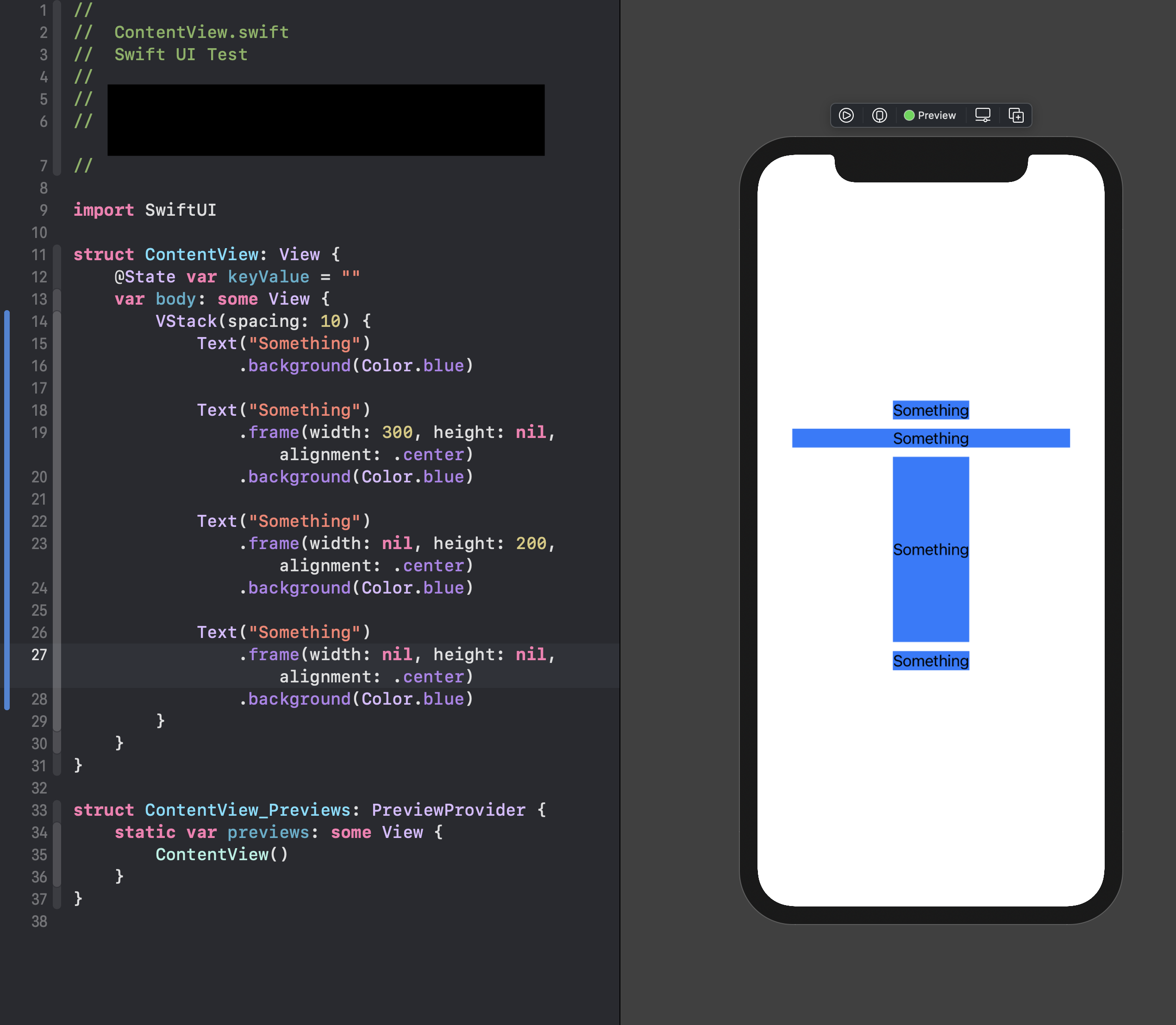
struct ContentView: View {
    @State var keyValue = ""
    var body: some View {
        VStack(spacing: 10) {
            Text("Something")
                .background(Color.blue)

            Text("Something")
                .frame(width: 300, height: nil, alignment: .center)
                .background(Color.blue)

            Text("Something")
                .frame(width: nil, height: 200, alignment: .center)
                .background(Color.blue)

            Text("Something")
                .frame(width: nil, height: nil, alignment: .center)
                .background(Color.blue)
        }
    }
}
Why .frame(width: .infinity) still runs
.infinity (Apple doc on .infinity) is of type Float, so there's no way for .frame not to except it, but it still can create problems. (Thus the thread issue)
Thanks to Mark Moeykens for the help in getting me to this answer!
Note: .frame(maxWidth: .infinity) instead of .frame(width: .infinity)
Issues setting height in SwiftUI View
ScrollView needs to know content size in-advance, that's why you observe issue with getting data from network, because in such case there is no initial content in scroll view and it is squeezed
Here is a solution, tested with replicated code on Xcode 11.4 / iOS 13.4
ScrollView(.horizontal, showsIndicators: false){
    HStack(spacing: 20){
        ForEach(someIterator) { someViewModel in
            CardView(myViewModel: someViewModel)
        }
    }.padding([.leading,.bottom,.trailing])
    .frame(height: 420)                      // << move inside !!
}
SwiftUI Frame Sizes For ZStacked Views, and Rotation
the .border on the single elements leads to the problem, as it adopts the size of the outer frame. Skip it and you're fine. In my opinion you also don't need the first Rectangle, comment it out and the result is the same.
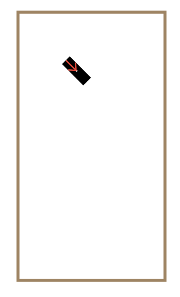
    var body: some View {
        ZStack {
            // you dont really need this Rect ...
            Rectangle() //draw the frame the arrow is rendered within
                .frame(width: 50, height: 18, alignment: .center)
                .rotationEffect(Angle(degrees: 45)) // here
               .position(x: origin.x, y: origin.y)

            Circle() //Just to show the target of the arrow in the frame
                .foregroundColor(.white)
                .frame(width: 3, height: 3, alignment: .center)
                .position(x: origin.x, y: origin.y)

            Image(systemName: "arrow.right")
                .resizable()
                .foregroundColor(.red)
                .frame(width: 25, height: 18)
                .frame(width: 50, alignment: .leading)
                .rotationEffect(Angle(degrees: 45)) // here
                .position(x: origin.x, y: origin.y)
        }
        .frame(width: 250, height: 450, alignment: .center)
        .border(.brown, width: 5)
    }
Alignment for GeometryReader and .frame
That's because GeometryReader doesn't center its children.
You have to manually position the Rectangle by adding either a .position modifier or a .offset.
.position will move the origin of the rectangle's frame relative to the parent's center.
.offset will not change the frame, but rather change the rendering (working like a CGAffineTransform with translation).
The following modifiers to your Rectangle will yield the same results visually (though different under the hood):
Rectangle()
    .fill(Color.yellow.opacity(0.6))
    .frame(width: max(geometry.size.width, 120), height: max(geometry.size.height, 120))
    .position(x: geometry.size.width / 2, y: geometry.size.height / 2)
or
let rectWidth = max(geometry.size.width, 120)
Rectangle()
    .fill(Color.yellow.opacity(0.6))
    .frame(width: rectWidth, height: max(geometry.size.height, 120))
    .offset(x: ((geometry.size.width - rectWidth) / 2), y: 0)
Note that your rectangle's frame exceeds the bounds of its parent. I'd suggest to avoid that because it will cause all sorts of difficulties laying out other UI elements on the screen.
You could build it the other way around (unless your practical goal is to just understand how GeometryReader works):
struct ExampleView: View {
    @State private var width: CGFloat = 50

    var body: some View {
        VStack {
            let minWidth: CGFloat = 120
            let subViewWidth: CGFloat = max(minWidth, width)
            SubView(desiredWidth: width)
                .frame(width: subViewWidth, height: 120)
                .background(.yellow.opacity(0.6))

            Text("Offered Width is \(Int(width))")
            Slider(value: $width, in: 0...200, step: 5)
        }
    }
}

struct SubView: View {
    let desiredWidth: CGFloat
    var body: some View {
        Rectangle()
            .fill(.clear)
            .border(Color.blue, width: 2)
            .frame(width: desiredWidth, height: nil)
    }
}
In this example the SubView has a yellow fill and a minimal frame width while the inner rectangle just takes whatever width is set on the slider. It also doesn't need a GeometryReader anymore. It looks and behaves the same but none of the views exceeds its parent's bounds anymore.
SwiftUI - view expand from the bottom of frame
You can't have them all in the same stacks. The easiest way to do this is to have your gray rectangle be your case view, and then overlay the others on top in VStacks with Spacers like this:
            // neutral background
            Rectangle()
                .fill(Color.gray)
                .frame(width: geom.size.width, height: geom.size.height * DISP_PCT)
                .overlay (
                    ZStack {
                        VStack {
                            Spacer()

                            // the first gauge value display
                            Rectangle()
                                .fill(Color.red)
                                .frame(width: geom.size.width, height: geom.size.height * DISP_PCT * redPct)
                        }
                        VStack {
                            Spacer()
                            // the second gauge value, on top of the first
                            Rectangle()
                                .fill(Color.blue)
                                .frame(width: geom.size.width, height: geom.size.height * DISP_PCT * bluePct)
                        }
                    }
                )
The overlay contains them, and the spacers push your rectangles down to the bottom of the stacks.
SwiftUI view won't expand to full height - iOS 15 Xcode 13 beta 5
I would use a LazyVGrid to handle this. The solution you are trying to use was really an iOS 13 workaround for making grids. LazyVGrid handles this elegantly.
struct IPKeyboardButtons: View {

    let columns = [
        GridItem(.flexible()),
        GridItem(.flexible()),
        GridItem(.flexible())
    ]

    var body: some View {
        LazyVGrid(columns: columns, alignment: .center, spacing: 20) {
            ForEach(KeyboardKey.allCases, id: \.self) { key in
                Button(action: {
                    print("Tapped: \(key)")
                }) {
                    key.view()
                }
            }
        }
        .padding(5)
        .padding()
        .background(Color.gray)
    }
}
I changed the enums view() function slightly to add some padding around the symbols(number or SF Font). Also, you can treat an SF Font like text. They are designed to be used right along with text and using text modifiers like .font:
enum KeyboardKey: String, CaseIterable {

    case one = "1"
    case two = "2"
    case three = "3"
    case four = "4"
    case five = "5"
    case six = "6"
    case seven = "7"
    case eight = "8"
    case nine = "9"
    case zero = "0"
    case dot = "."
    case backspace = "backspace"

    @ViewBuilder
    func view() -> some View {
        switch self {
        case .one, .two, .three, .four, .five, .six, .seven,
                .eight, .nine, .zero:
            Text(self.rawValue)
                .font(.title)
                .foregroundColor(Color.black)
                .padding() // optional, but this will increase the size of the button itself
                .frame(maxWidth: .infinity, maxHeight: .infinity)
                .background(Color.white)
                .cornerRadius(6)
                .shadow(color: Color.black.opacity(0.5), radius: 1, x: 0, y: 1)
        case .dot:
            Text(self.rawValue)
                .font(.title)
                .foregroundColor(Color.black)
                .padding() // optional, but this will increase the size of the button itself
                .frame(maxWidth: .infinity, maxHeight: .infinity)
                .background(Color.red)
                .cornerRadius(6)
        case .backspace:
            Image(systemName: "delete.left")
                .font(.title)
                .background(Color.green)
                .padding() // optional, but this will increase the size of the button itself
                .frame(maxWidth: .infinity, maxHeight: .infinity)
                .background(Color.red)
                .cornerRadius(6)
        }
    }
}
This is the view I put it in so it would behave in a real world test case. I would stay away from forcing frames in the preview as that will give artificial constraints and does not respect safe areas:
struct KeyboardView: View {

    @State var textBinding = ""

    var body: some View {
        VStack {
            TextField("TextField", text: $textBinding)
            Spacer()
            IPKeyboardButtons()
        }
    }
}
This code is much simpler and easier to maintain.
Related Topics
Update Nstouchbar on the Fly to Add/Remove Items Programmatically
How to Open to a Specific View Using Home Quick Actions
How to Pass Binding to Child View in the New Navigationstack.Navigationdestination
Swift 5, How to Execute Code After Fetching All Childadded from Firebase
Drag a Cgrect Using Uipangesturerecognizer
Shows the Alert When Uitextfield's Are Full or Empty Swift
Implementing Stringliteralconvertible on Nsurl
Does the Initializer of an 'Open' Class Need to Be Open as Well
Using "Codable" to Set Property Values Doesn't Work Through Inheritance
Filteredarrayusingpredicate Does Not Exist in Swift Array
Swift Alamofire Add Custom Header to All Requests
Swift: Search Bar Created at Auto Focus
Why Does My @Lazy Property Crash, But If I Make It Non Lazy It Works
How to Calculate the Energy Per Bin in a Dft
Coerced to Any' But Property Is of Type Uicolor
Find Out When Uikeyboard.Frame Intersects with Other Frame