Change background color of TextEditor in SwiftUI
iOS 16
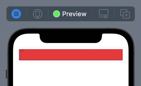
You should hide the default background to see your desired one:
TextEditor(text: .constant("Placeholder"))
    .scrollContentBackground(.hidden) // <- Hide it
    .background(Color.red) // To see this
iOS 15 and below
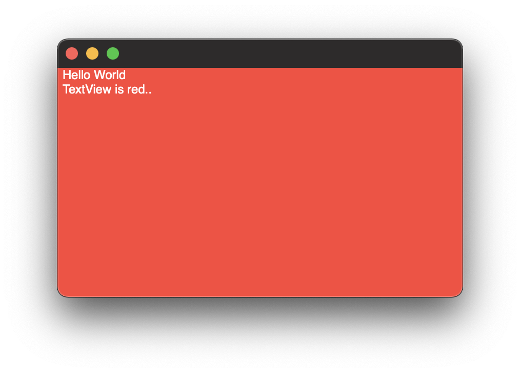
TextEditor is backed by UITextView. So you need to get rid of the UITextView's backgroundColor first and then you can set any View to the background.
struct ContentView: View {
    init() {
        UITextView.appearance().backgroundColor = .clear
    }

    var body: some View {
        List {
            TextEditor(text: .constant("Placeholder"))
                .background(Color.red)
        }
    }
}
Demo
You can find my simple trick for growing TextEditor here in this answer
Transparent Background for TextEditor in SwiftUI
Here is a possible work around for this. The extension sets all of your TextViews background to .clear and then you are able to change the background color with .background() modifier.
import SwiftUI

extension NSTextView {
    open override var frame: CGRect {
        didSet {
            backgroundColor = .clear //<<here clear
            drawsBackground = true
        }

    }
}

struct ContentView: View {

    @State var string: String = ""

    var body: some View {
        TextEditor(text: $string)
            .textFieldStyle(PlainTextFieldStyle())
            .background(Color.red) //<< here red
    }
}
Changing TextEditor background color in SwiftUI for macOS
I have just posted an answer for that issue on a similar question here
With the help of extension, you can clear the default background Color of the NSTextView class and then use .background modifier in SwiftUI like this
extension NSTextView {
    open override var frame: CGRect {
        didSet {
            backgroundColor = .clear //<<here clear
            drawsBackground = true
        }

    }
}

struct ContentView: View {

    @State var string: String = ""

    var body: some View {
        TextEditor(text: $string)
            .textFieldStyle(PlainTextFieldStyle())
            .background(Color.red) //<< here red
    }
}
Background color not change TextEditor view
We need to clear default background color via appearance
    init() {
        UITextView.appearance().backgroundColor = .clear
    }
and then background modifier works in any mode
    TextEditor(text: $mytext)
        .background(Color.orange)
Tested with Xcode 13.4 / iOS 15.5

Exiting SwiftUI TextEditor
you can use @FocusState and add a button that sets it to nil:
struct ContentView: View {

    @State var NotificationMessage = "Body"
    @State var NotificationTitle = "Title"

    @FocusState var focusValue: Int?

    var body: some View {
        VStack {
            Image("NotificationExample")
                .resizable()
                .cornerRadius(10)
                .padding()
                .frame(height: 100)

            TextEditor(text: $NotificationTitle)
                .focused($focusValue, equals: 1) // here
                .autocapitalization(.words)
                .background(RoundedRectangle(cornerRadius:6).stroke(Color.blue,lineWidth:2))
                .frame(height: 100)
                .padding()

            TextEditor(text: $NotificationMessage)
                .focused($focusValue, equals: 2) // here
                .autocapitalization(.words)
                .frame(height: 300)
                .background(RoundedRectangle(cornerRadius:6).stroke(Color.blue,lineWidth:2))
                .padding()

            Button("Done") { focusValue = nil } // and here

            Spacer(minLength: 0)
        }
    }
}
TextEditor added / SwiftUi
First , for changing TextEditor background color
I could not find a SwiftUI 100% solution for that (maybe apple will support this in future ) , so you need to change every UITextView.appearance().backgroundColor in the app
init() {
    UITextView.appearance().backgroundColor = UIColor.black
}
don't miss import UIKit
Then for corner radius , you need to use overlay modifier for a rounded corners
VStack {
   TextEditor(text: $inputText)
     .frame(height:geometry.size.height / 3, alignment: .center)
     .lineSpacing(10)
     .autocapitalization(.words)
     .disableAutocorrection(true)
     .padding()

}.overlay(
         RoundedRectangle(cornerRadius: 25)
           .stroke(Color.yellow, lineWidth: 5)
         )
.padding()
SwiftUI/macOS: DatePicker without background field
Here is a simplified demo of representable wrapper approach
Tested with Xcode 13.2 / macOS 12.1

struct DemoView: View {
    @State private var newDate: Date = Date()

    var body: some View {
        VStack {
            Text("Selected: \(newDate)")
            MyDatePicker(selection: $newDate)
        }
    }
}

struct MyDatePicker: NSViewRepresentable {
    @Binding var selection: Date

    func makeNSView(context: Context) -> NSDatePicker {
        let picker = NSDatePicker()
        picker.isBordered = false
        picker.datePickerStyle = .textField
        picker.action = #selector(Coordinator.onValueChange(_:))
        picker.target = context.coordinator
        return picker
    }

    func updateNSView(_ picker: NSDatePicker, context: Context) {
        picker.dateValue = selection
    }

    func makeCoordinator() -> Coordinator {
        Coordinator(owner: self)
    }

    class Coordinator: NSObject {
        private let owner: MyDatePicker
        init(owner: MyDatePicker) {
            self.owner = owner
        }

        @objc func onValueChange(_ sender: Any?) {
            if let picker = sender as? NSDatePicker {
                owner.selection = picker.dateValue
            }
        }
    }
}
SwiftUI TextEditor Divider doesn't change Y position based on text-line count?
It is doing exactly what you told it to do. But a background color on your TextEditor. You will see that it has a height of 200 + a spacing of 10 from the VStack.
I changed your code to make it obvious:
struct EditBio: View {
    @State var editProfileVM = ""

    var body: some View {
        VStack(spacing: 10) {
            TextEditor(text: $editProfileVM)
                .foregroundColor(.white)
                .padding(.top, 70)
                .padding([.leading, .trailing], 50)
                .frame(minWidth: 100, idealWidth: 200, maxWidth: 400, maxHeight: 200, alignment: .center)
                .background(Color.gray)
            Divider().frame(height: 1).background(.red)
            Spacer()
        }
    }
}
to produce this:
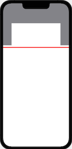
You can see the TextEditor naturally wants to be taller than 200, but that is limiting it. Therefore, the Spacer() is not going to cause the TextEditor to be any smaller.
The other problem that setting a fixed frame causes will be that your text will end up off screen at some point. I am presuming what you really want is a self sizing TextEditor that is no larger than it's contents.
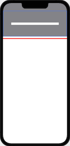
That can be simply done with the following code:
struct EditBio: View {
    @State var editProfileVM = ""
    var body: some View {
        VStack(spacing: 10) {
            SelfSizingTextEditor(text: $editProfileVM)
             // Frame removed for the image below.
            // .frame(minWidth: 100, idealWidth: 200, maxWidth: 400, maxHeight: 200, alignment: .center)
                .foregroundColor(.white)
                // made the .top padding to be .vertical
                .padding(.vertical, 70)
                .padding([.leading, .trailing], 50)
                .background(Color.gray)
            Divider().frame(height: 5).background(.red)
            Spacer()
        }
    }
}

struct SelfSizingTextEditor: View {

    @Binding var text: String
    @State var textEditorSize = CGSize.zero

    var body: some View {
        ZStack {
            Text(text)
                .foregroundColor(.clear)
                .copySize(to: $textEditorSize)
            TextEditor(text: $text)
                .frame(height: textEditorSize.height)
        }
    }
}

extension View {
    func readSize(onChange: @escaping (CGSize) -> Void) -> some View {
        background(
            GeometryReader { geometryProxy in
                Color.clear
                    .preference(key: SizePreferenceKey.self, value: geometryProxy.size)
            }
        )
            .onPreferenceChange(SizePreferenceKey.self, perform: onChange)
    }

    func copySize(to binding: Binding<CGSize>) -> some View {
        self.readSize { size in
            binding.wrappedValue = size
        }
    }
}
producing this view:
Related Topics
Embedding Videos in a Tableview Cell
Convert Firebase Firestore Timestamp to Date (Swift)
Transparent Background for Texteditor in Swiftui
How to Satisfy Swift Protocol and Add Defaulted Arguments
Custom Segue Transition Animation
Best Way to Make Amazon Aws Dynamodb Queries Using Swift
Swift Custom Context Menu Previewprovider Can Not Click Any View Inside(Using Tapgesture)
Uitableview Load More When Scrolling to Bottom
How to Reason When I Have to Choose Between a Class, Struct and Enum in Swift
How to Export Dae Files for Use in Scene Kit Without Seeing "Untitled-Animations"
How to Create an Importable Module in Swift
Swiftui. How to Change the Placeholder Color of the Textfield
Scanning Real-World Object and Generating 3D Mesh from It
Linker Command Failed with Exit Code 1 After Installing Cocoapods and Firebase Pod