Why does Chrome 80 cause this grid-template-rows: auto problem
I am not sure if it's a bug or something has changed in the CSS grid algorithm (need to revise the Spec) but you can simplify your logic like below:
.l-page {  display: grid;  grid-template-columns: 1fr;  grid-template-rows: auto auto minmax(0, 1fr);  height: 300px;  margin:5px;  border: 1px solid red;}
.l-sidebar {  grid-row: span 3;  grid-column:-3;  padding-right: 10px;}
.l-primary-bar {  order: 1;}.l-notification {  order: 2;}
.l-content {  order: 3;}
<div class="l-page"> <div class="l-sidebar">sidebar</div> <div class="l-content">content</div></div>
<div class="l-page"> <div class="l-sidebar">sidebar</div> <div class="l-notification">notif</div> <div class="l-primary-bar">bar</div> <div class="l-content">content</div></div>
<div class="l-page"> <div class="l-sidebar">sidebar</div> <div class="l-notification">notif</div> <div class="l-content">content</div></div>
<div class="l-page"> <div class="l-primary-bar">bar</div> <div class="l-notification">notif</div> <div class="l-sidebar">sidebar</div> <div class="l-content">content</div></div>
<div class="l-page"> <div class="l-primary-bar">bar</div> <div class="l-notification">notif</div> <div class="l-content">content</div></div>grid-template-columns in Chrome 80 inconsistently computed
You issue is almost similar to the question you linked1 (where I also answered) and it has to do with how chrome is dealing with 1fr which is equal to minmax(auto,1fr).
Using minmax(0,1fr) seems to fix the issue but I need to dig more in order to identify why. It's either a bug or they changed the way minmax() is calculated.
will update with the bug report or the detailed explanation
1: That questions deals with a row configuration where we need to do the opposite. Use 1fr (minmax(auto,1fr)) instead of minmax(0,1fr)
Chrome 80 css grid large descendants cause grid to grow
The reason for this is the implementation of a CSS Grid spec change regarding the contribution of grid tracks spanning both finitely and infinitely sized tracks. I've raised an issue about this as well.
Gladly the Chromium development team agreed that this change is not web compatible and causing too much breakage. It is already reverted on M80, M81 and M82 branches, and is going to be delivered with the reverted behaviour (pre-80-behaviour) this week in respin 116 (80.0.3987.116).
Edit: As of now, the new Chrome version is out and fixes these problems.
Edit 2: Because the Chromium team was the only browser team that actually implemented the aformentioned spec change, and they decided to revert it, the developer that implemented the changes raised an issue@CSSWG. Link yourself to that if you wanna see where this is going.

Won't Display More Than 999 Rows in Chrome
The CSS Grid specification makes explicit provisions for the handling of very large grids:
Since memory is limited, UAs may clamp the possible size of the grid to be within a UA-defined limit, dropping all lines outside that limit. If a grid item is placed outside this limit, its grid area must be clamped to within this limited grid.
(https://www.w3.org/TR/css-grid-1/#overlarge-grids)
The specification goes on to give an example involving a hypothetical UA with a grid size limit of 1000, implying that this is a typical limit.
This is not an appropriate application for CSS Grid functionality. Use an HTML table -- this is exactly the sort of thing they're made for.
The relative unit (percentage) cannot be applied by the browser to the space set by fr
If this is not an undefined behavior, which is the correct behavior?
I would say, Firefox is doing correctly here and Chrome is half correct.
First, you can reduce your code to the following as grid-template-rows: 1fr is not needed to have the behavior
.container {  display: grid;  grid-template-columns: 1fr 1fr;  background: red;  gap: 10px;}
img {  width: 100%;  height: 100%;  object-fit: cover;}
<div class="container"> <div class="item"> <img src="https://unsplash.it/450/450"> </div> <div class="item"> <img src="https://unsplash.it/450/450"> text </div></div>CSS Grid Layout Strange Behavior on Window Resize
Looks like margin:auto in a grid does start to act pretty weird.
A way to get the effect you want but avoiding the bug would be to set
text-align: center;
on the emailFormGroup and then remove the display: block on email input.
https://codepen.io/anon/pen/YxGyeG
css grid vs flexbox : why does css grid cause repaints and flexbox not
I've been able to reproduce the problem locally (almost at least). As you can see in the following image, in my browser (Chromium v92.0.4488.0) only an area on the far right of the column is repainted - exactly the area where the scrollbar will be displayed when it is used.
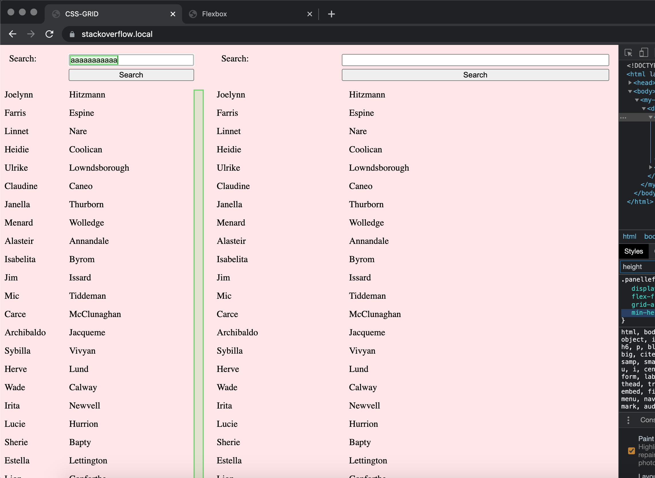
Using Firefox (v88.0) or Safari (v14.0.3), on the other hand, neither in the Flexbox nor the grid example anything other than the input is being repainted.
Since you don't use absolute values for the height of the containers, I suspect it happens due to the calculation of the height and whether the scrollbar needs to be displayed. Chrome seems to behave differently here than other browsers.
A simple fix seems to be to define an absolute height for the containers (vh, although it's a relative unit, seems to work too):
.panelleft,
.panelright {
  height: 100vh;
}
Css grid auto sized row content with overflow
The problem is easy to describe, but may not have a simple solution (depending on your requirements).
The problem is actually clear to see in the title itself:
Css grid auto sized row content with overflow
Auto-sized elements cannot overflow. They are auto sized. This means the element shrinks and expands based on its content size, never having a need to overflow.
There has to be something that sets a fixed length on the container. A boundary that can be crossed, thus triggering an overflow condition.
From MDN:*
In order for
overflowto have an effect, the block-level container must have either a set height (heightormax-height) orwhite-spaceset tonowrap.
Your row heights are insufficient to trigger an overflow:
grid-template-rows: min-content minmax(min-content, max-content) min-content
But something like this would work:
grid-template-rows: 10% 80% 10%
Unfortunately, the code above only works in Chrome. For the layout to also work in Firefox and Edge, do this:
grid-template-rows: 10% minmax(0, 80%) 10%
body {  display: block;  height: 100vh;  width: 100%;  background-color: white;  margin: 0;}
.container {  max-height: 100%;  display: grid;  grid-template-areas: "header header" "side content" "footer footer";  grid-template-columns: 50px auto;  grid-template-rows: 10% minmax(0, 80%) 10%; /* adjustment */}
.header {  grid-area: header;  background-color: rgba(255, 255, 0, 0.3);}
.side {  grid-area: side;  background-color: rgba(0, 255, 0, 0.3);}
.content {  grid-area: content;  background-color: rgba(0, 0, 255, 0.3);}
.overflow {  overflow: auto;}
.content-item {  height: 20px;  margin-bottom: 5px;  background-color: white;}
.footer {  grid-area: footer;  background-color: rgba(255, 0, 255, 0.3);}
<div class="container"> <div class="header">header</div> <div class="side">side</div> <div class="content"> <div class="container container__inner"> <div class="header header__inner">header</div> <div class="side side__inner">side</div> <div class="content content__inner overflow"> <div class="content-item"></div> <div class="content-item"></div> <div class="content-item"></div> <div class="content-item"></div> <div class="content-item"></div> <div class="content-item"></div> <div class="content-item"></div> <div class="content-item"></div> <div class="content-item"></div> <div class="content-item"></div> <div class="content-item"></div> <div class="content-item"></div> <div class="content-item"></div> <div class="content-item"></div> <div class="content-item"></div> <div class="content-item"></div> <div class="content-item"></div> <div class="content-item"></div> <div class="content-item"></div> <div class="content-item"></div> <div class="content-item"></div> <div class="content-item"></div> <div class="content-item"></div> <div class="content-item"></div> <div class="content-item"></div> </div> <div class="footer footer__inner">footer</div> </div> </div> <div class="footer">footer</div></div>Related Topics
An Url to a Windows Shared Folder
CSS Overflow Hidden with Absolute Position
Items That Span All Columns/Rows Using CSS Grid Layout
How to Force Inline Divs to Stay on Same Line
How to Make Firefox Auto-Refresh on File Change
How to Create a Teardrop in HTML
Why Does "Position: Absolute; Left: 0; Right: 0; Width: Xypx; Margin: 0 Auto" Actually Center
How to Fix "Insecure Content Was Loaded Over Https, But Requested an Insecure Resource"
Create Line Numbers on Pre with CSS Only
How to Add The Text "On" and "Off" to Toggle Button
How to Center Content in a Bootstrap Column
Difference Between Onblur and Onchange Attribute in HTML
CSS: Image Link, Change on Hover
Why Do The CSS Width and Height Properties Not Adjust for Padding