CSS Grid Row Height Safari Bug
Short Answer
The problem is that Safari is not recognizing the height: 100% on the img elements.
Explanation
This is not a Safari bug. It's just a different interpretation of the spec.
When dealing with percentage heights, some browsers (like Safari) adhere to the traditional interpretation of the spec, which requires a defined height on the parent.
10.5 Content height: the
height
property
<percentage>Specifies a percentage height. The percentage is calculated with
respect to the height of the generated box's containing block. If the height of the containing block is not specified explicitly (i.e., it depends on content height), and this element is not absolutely positioned, the used height is calculated as ifautowas specified.
In other words, a percentage height on an in-flow element will be recognized only when the parent has a defined height.
Some browsers, such as Chrome and Firefox, have moved past this interpretation and now accept flex and grid heights as an adequate parent reference for a child with a percentage height.
But Safari is stuck in the past. This doesn't mean it's wrong, invalid or a bug.
The last substantive update to the CSS height definition was in 1998 (CSS2). With so many new CSS properties and technologies since that time, the definition has become obsolete, unclear and woefully incomplete. Until the definition is updated for modern use, browser rendering variations can be expected.
Solution
Since Safari doesn't recognize the height: 100% on the img elements, and you can't specify a height on the parent (#thumbnailContainer) because that height is defined by grid-template-rows: 1fr on the top-level container, you can try using flexbox.
By making #thumbnailContainer a flex container, you can define the size of the images (flex items) using flex properties.
#grid { height: 100vh; display: grid; grid-template-rows: 1fr 1fr 1fr;}#thumbnailContainer { display: flex; overflow-x: auto; overflow-y: hidden; min-width: 0; min-height: 0;}img { flex: 0 0 35%; min-width: 0; object-fit: cover;}header, footer { background-color: dodgerblue;}<div id="grid"> <header>Header</header> <div id="thumbnailContainer"> <img src="https://c2.staticflickr.com/8/7591/16903911106_b7ced9d758.jpg"> <img src="https://c1.staticflickr.com/9/8740/16927517701_810fcb2a7c.jpg"> <img src="https://c2.staticflickr.com/8/7637/16902583636_15138a68f0.jpg"> <img src="https://c2.staticflickr.com/8/7614/16927530091_6755845b13.jpg"> <img src="https://c1.staticflickr.com/9/8700/16741099010_d0ecd9df1f.jpg"> <img src="https://c1.staticflickr.com/9/8745/16927567841_74fd20d01d.jpg"> </div> <footer>Footer</footer></div>Why is CSS Grid row height different in Safari?
I've been having a similar issue in Safari 12+, as I was also using padding to force aspect ratios in a grid based layout. I'm not sure if this is exact same problem you were having, but the fix below works for me on your pen in Safari.
TLDR: Put display:grid on the div surrounding your grid container. Here it is in action: https://codepen.io/harrison-rood/pen/rNxXWPb
After tearing my hair out for hours on this, I decided to try placing display:grid on the wrapper around my main grid, and it worked perfectly! I have no idea why this would fix it, but my guess would be that it gives Safari some more context on the parent container and that allows height:100% to refer to the grid context instead of the parent, similar to how Chrome and Firefox handle this by default. This was so frustrating to me that I felt obligated to create a SO account just so I could post this! Hope it helps!
Why does my grid item stretch in safari when it does not in chrome and firefox
So apparently putting each and every image in a container of its one "fixes" that behaviour for Safari.
More information about that behaviour can be found here:
https://stackoverflow.com/a/44773109/7243348
CSS-Grid: grid-template-rows auto with different results in Safari, Firefox and Chrome
Solved this by adding another .container and overflow:hidden to the .cover div.
Not sure, why this has to be added for Safari to fit all the divs inside the square though as there actually is no overflow.
Anyways. Use overflow:hidden for Safari when using grid-template-rows: auto min-content; for the auto row.
  html,body {    height:100%;  }
  .wrapper {    width:50%;  }
  .square {    position:relative;    width: 100%;  }
  .square:after {    content: "";    display: block;    padding-bottom: 100%;    background:green;  }
  .container {    position:absolute;    width:100%;    height:100%;}
  .grid {    display:grid;    position:absolute;    height:100%;    width:100%;    grid-template-rows: auto min-content;    grid-template-columns: 100%;    grid-template-areas:      "cover"      "content";    background:grey;  }
  .cover {    grid-area:cover;    display:block;    overflow:hidden;  }
  .image {    max-height:100%;    height:100%;    border:1px solid red;  }
  .content {    grid-area:content;    background:blue;    color:white;  }
<div class='wrapper'>
<div class='square'> <div class='container'> <div class='grid'> <div class='cover'><img src='https://i.imgur.com/I9UFWodl.png' class='image'></div> <div class='content'>Dynamic Content<br>Can even be multiple lines and the content will stay within the Square</div> </div> </div></div>
</div>Grid Child Height = 100% Behaves Differently in Safari vs. Chrome
The problem seems to have been fixed in Safari 14. I was using 13.
Also setting row2-container height: auto seems to give the desired result as well even in Safari 13. Either way this seems to have been a bug prior to version 14 that is now fixed.
CSS Grid : row not taking full height space available
After lot of tests, I found a way to achieve the result I wanted without touching the HTML layout.
To force the grid algorithm to consume the free space available in the second row it's currently required to use a row height in fractional unit (fr).
So in the CSS I added a row with a height of 0fr (YES, 0 fraction is considered valid and trigger the grid algorithm).
- Now the red square () is on rows 1 & 2.
- The blue title () is on row 1.
- The yellow sub-title () is on row 2 & 3 (the third row is the special
0frrow). - And the green text () is on row 4.
The result: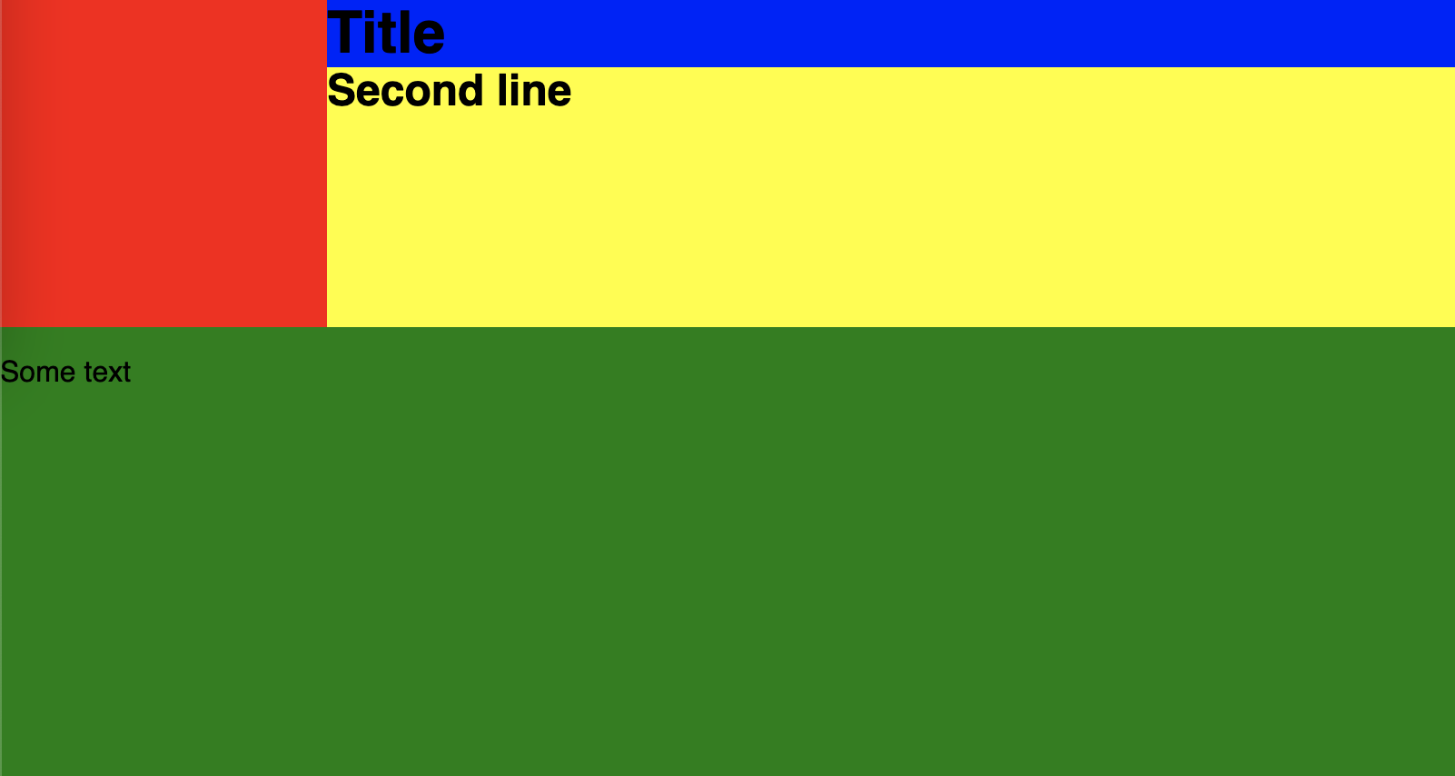
Code snippet:
html {
    height: 100%;
}
body {
    height: 100vh;
}
.container {
    display: grid;
    grid-template-columns: 180px 1fr;
    grid-template-rows: min-content auto 0fr 1fr;
    height:100%;
}

.red-cube {
    background-color: red;
    width: 100%;
    Height: 180px;
    grid-column: 1;
    grid-row: 1 / 3;
}
h1, h2 {
    margin: 0;
    padding: 0;
}
.blue-title {
    background-color: blue;
    grid-column: 2;
    grid-row: 1;
    height: fit-content;
}
.yellow-div {
    background-color: yellow;
    grid-column: 2;
    grid-row: 2 / 4;
    height: 100%;
}
.green-content {
    background-color: green;
    grid-column: 1 / 3;
    grid-row: 4;
    align-self: stretch;
}
<div class="container">
<div class="red-cube"></div>
<h1 class="blue-title">Title</h1>
<div class="yellow-div"><h2>Second line</h2></div>
<div class="green-content"><p>Some text</p></div>
</div>Related Topics
Font-Awesome Icons Not Rendering via the Boostrapcdn
How to Insert HTML Content in Xml Document
How to Remove The Previously Selected Option from a Drop-Down Menu in a Table
Bad Value X-Ua-Compatible for Attribute Http-Equiv on Element Meta
How to Display Alt Text for an Image in Chrome
How to Fill 100% of Remaining Height
Linethrough/Strikethrough a Whole HTML Table Row
How to Hide/Show a Div When a Button Is Clicked
Meta Viewport Just on Portrait
Vertical Align Text in Block Element
Display Background Color for The Page & Align Texts at Center
HTML5 I Tag Validity with Icons
Select Label Using CSS Selector
HTML5 Canvas - Fill Circle with Image
How to Remove The Default Link Color of The HTML Hyperlink 'A' Tag
How to Change Svg Color When It Is an Encoded CSS Background Image