Responsive circle with centered content
Viewport Units
If you use the same viewport unit (either vw or vh) then you should get a responsive circle.
A viewport unit of 100 would be 100% of either the width or height. Therefore it is very similar to using a percentage.
div { width: 10vw; height: 10vw; border-radius: 50%; background: blue;}<div></div>Responsive CSS Circles
Solution:
http://jsfiddle.net/WTWrB/
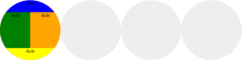
The DIV structure:
We use overflow:hidden in .x2 for spill off background colors in .x3
of child elements.
Notice the content starts inside of .x3
<div class="x0">
    <div class="x1">
        <div class="x2">
            <div class="x3">
                <!-- BEG Content -->
                <div class="x4">
                    dude
                </div>
                <div class="x6">
                    <div class="x7">
                        dude
                    </div>
                    <div class="x8">
                        dude
                    </div>
                </div>
                <div class="x5">
                    dude
                </div>
                <!-- END Content -->
            </div>
        </div>
        <div class="x2"></div>
        <div class="x2"></div>
        <div class="x2"></div>
    </div>
</div>
The CSS:
@media (max-width: 320px)
{
    .x2 {padding: 50%;}
}

@media (min-width: 321px) and (max-width: 800px)
{
    .x2 {padding: 25%;}
}

@media (min-width: 801px)
{
    .x1 {width:800px}
    .x2 {padding: 12.5%;}
}
.x0 {
    float:left;
    width:100%;
}
.x1 {
    margin:0px auto;
}
.x2 {
    overflow:hidden;
    display:block;
    float:left;
    width:auto;
    height:auto;
    position: relative;
    border-radius:50%;
    -moz-border-radius:50%;
    -webkit-border-radius:50%;
    -khtml-border-radius: 50%;
    background:#eee;
}
.x3 {
    position: absolute;
    width: 100%;
    left: 0;
    top:0;
    font-size: 100%;
    float:left;
    height:100%;
    background-color:red;
}
/* BEG Content */
.x3 div{float:left;}
.x4,.x5,.x6 {
    width:100%;
}
.x7,.x8 {
    width:50%;
    float:left;
    height:100%;
}
.x4,.x5,.x7,.x8 {
    text-align:center;
}
.x4 {
    background-color:blue;
    height:20%;
}
.x5 {
    background-color:yellow;
    height:20%;
}
.x6 {
    height:60%;
}
.x7 {
    background-color:green;
}
.x8 {
    background-color:orange;
}
/* END Content */
Make a responsive circle with content inside
The one way is to set a fixed width and height when screen size is less.
Second option is that you decrease the font size when the screen size is less.I have set 991px as breakpoint.You can take your own breakpoints.
@media all and (max-width:991px){.pricessquarered {width:120px!important;height:120px!important;margin-bottom:10px!important;}
.container{flex-direction:column;}
}
.container{display:flex;}
.pricessquarered {  transition:all 0.3s;  display:flex;  margin: 0 auto;  align-items: center;  justify-content: center;  text-align: center;  border: solid 16px #d17461;  padding: 30px;  width: 10vw;  height: 10vw;  color: #d17461;  font-size: 22px;  padding-top: 30px;  border-radius: 100%;}
<div class="container"><div class="pricessquarered"> <div> <h3><span style="color:#d17461">1 image</span></h3> <p> 45€ </p> <hr> <p><span style="font-size:14px; color:black"> USD $50 </span></p> </div></div>
<div class="pricessquarered" style="transition-delay:100ms;"> <div> <h3><span style="color:#d17461">2 image</span></h3> <p> 45€ </p> <hr> <p><span style="font-size:14px; color:black"> USD $50 </span></p> </div></div>
<div class="pricessquarered" style="transition-delay:200ms;"> <div> <h3><span style="color:#d17461">3 image</span></h3> <p> 45€ </p> <hr> <p><span style="font-size:14px; color:black"> USD $50 </span></p> </div></div></div>how can I position circles and keep them in the same arrangement in a responsive design?
Measuring the given image it looks as though it is sized for a viewport with aspect ratio roughly 16:9. While many devices have this sort of ratio in fact while they are being used they often have a greater ratio because there are browser bars and websites are not necessarily seen in full screen mode. On laptops/desktops the user may have multi windows open of varying dimensions.
The aim will have to be to do 'the best we can' to give the same sort of effect.
This snippet by no means goes all the way to that but is given here to help you get started. It does not at all consider portrait mode as I don't know what sort of effect you want for that. The basic trick is to make all dimensions have relative units - and to remember that 1% of width is not the same as 1% of height. (there is an exception for padding which can be useful where % is always in terms of width but currently this snippet does not use that).
Note - the snippet looks bad when not in full screen mode because it has odd aspect ratio (wide compared to height) and if you wanted to cater for that sort of extreme you would need to think about what you want the result to look like - should the circles be shown more, should the distance between them increase but the circles stay the same size etc.
* {
  margin: 0;
  padding: 0;
}

#main {
  margin: 0;
  padding: 0;
    background-color: #EEE1FF;
    --w: 16;
    --h: 9;
    --width: 100vw;
    --height: 100vh;
    width: var(--width);
    height: var(--height);
height: 100vmin;
    position: relative;
    overflow: hidden;
}

.circle {
    margin: 0;
    padding: 0;

    --cd: 9; /* diameter of a circle */
    --cr: calc(var(--cd) / 2);

    position: absolute;
    left: calc((((var(--cx) - var(--cr))/ var(--w)) * 160vmin));
    top: calc((((var(--cy) - var(--cr)) / var(--w)) * 160vmin));

    width: calc((var(--cd) / var(--w)) * 160vmin);
    height: calc((var(--cd) / var(--w)) * 160vmin);
    border-radius: 50%;
    background: #F4ECFE;
}

.circle:nth-child(1){
    --cx: 2.5; /* distance of center from the left */
    --cy: 3.3; /* distance of center from the top */
    z-index: 1;
}

.circle:nth-child(2){
    --cx: 13.7;
    --cy: -0.85;
}

.circle:nth-child(3){
    --cx: 10.5;
    --cy: 8.8;
}
<div id="main">
<div class="circle"></div>
<div class="circle"></div>
<div class="circle"></div>
</div>Responsive circle that maintains aspect ratio when shrunk
Use the padding-bottom aspect ratio trick (read more) to get the circle to maintain its 1:1 ratio.
.container {
  display: flex;
  border: 2px solid black;
  justify-content: center;
  align-items: center;
}

.circle {
  width: 500px;
  background-color: red;
  border-radius: 50%;
}

.circle::before {
  content: '';
  display: block;
  padding-bottom: 100%;
}
<div class="container">
<div class="circle"></div>
</div>Creating responsive circles in web page
Here is the code :
.full{ margin:0 auto; width:70%;} .circle1{ width: 15%; padding-top: 15%; margin:0 42%; background-color: black; border-radius: 50%; display:inline-block; } .circle2{ width: 15%; padding-top: 15%; margin-left: 20%; background-color:darkred; border-radius: 50%; display:inline-block; margin-top:20px; } .circle3{ width: 15%; padding-top: 15%; margin-left: 26%; background-color:gold; border-radius: 50%; display:inline-block; margin-top:20px; margin-right: 15%; } .circle4{ width: 15%; padding-top: 15%; margin-left: 0%; background-color:greenyellow; border-radius: 50%; display:inline-block; margin-top:20px; } .circle5{ width: 15%; padding-top: 15%; margin-left: 26%; background-color:blueviolet; border-radius: 50%; display:inline-block; margin-top:20px; } .circle6{ width: 15%; padding-top: 15%; margin-left: 26%; background-color:deeppink; border-radius: 50%; display:inline-block; margin-top:20px; } .circle7{ width: 15%; padding-top: 15%; margin-left: 20%; background-color:blue; border-radius: 50%; display:inline-block; margin-top:20px; } .circle8{ width: 15%; padding-top: 15%; margin-left: 26%; background-color:aqua; border-radius: 50%; display: inline-block; margin-top: 20px; } .circle9{ width: 15%; padding-top: 15%; margin: 0 42%; background-color:darkorange; border-radius: 50%; display: inline-block; } @media only screen and (max-width: 980px) { .full{width:100%;} }<div class="full"> <div class="circle1"></div> <div class="circle2"></div> <div class="circle3"></div> <div class="circle4"></div> <div class="circle5"></div> <div class="circle6"></div> <div class="circle7"></div> <div class="circle8"></div> <div class="circle9"></div></div>how to make a circle in css and make it responsive as well?
I'm not sure what to tell you other than to try and form an understanding of the tools you are using and of CSS in general. I recommend not trying to use Bootstrap here.
Check out this snippet - should be everything you need.
.Circle { border-radius: 50%; width: 100px; line-height: 100px; border: 1.5px solid #fbcfce; position: absolue; text-align: center; float: left;}.main { margin-left: 120px;}<div class="row"> <span class="Circle">Verify</span> <p class="main"> Verify your student status using your institute ID card or Email ID. </p></div>Related Topics
How to Display Text Around Circle. CSS Shape-Outside
Why Does Width and Height of a Flex Item Affect How a Flex Item Is Rendered
Items That Span All Columns/Rows Using CSS Grid Layout
How to Show HTML or Markdown in a Swiftui Text
Scrolling to an Anchor Using Transition/CSS3
Fixed Body Background Scrolls with The Page on iOS7
HTML + CSS: Numbered List with Numbers Inside of Circles
CSS Prevent Div Flex from Stretching Child
@-Moz-Document Url-Prefix() Not Working
Include HTML Files in R Markdown File
How to Prevent Background Scrolling When Bootstrap 3 Modal Open on Mobile Browsers
CSS Animate Custom Properties/Variables
<Button Type="Submit"> Compatibility
How to Get The HTML Source of a Webpage in Ruby