How to center cards in bootstrap 4?
Add the css for .card
.card {
        margin: 0 auto; /* Added */
        float: none; /* Added */
        margin-bottom: 10px; /* Added */
}
here is the pen
UPDATE:
You can use the class .mx-auto available in bootstrap 4 to center cards.
How to place card-columns in the center of the page when using bootstrap 4.3.1?
You need to set your container div as a flex-box and then you can apply the bootstrap classes you need.
In this case, you want:<div class="card-columns mx-auto d-flex justify-content-center col-12">
So because you want to center your card-columns, it's clear that justify-content-center does the job.
For your card-columns width, you can play with the class col from bootstrap. Basically, it offers a maximum grid of 12 columns and that would take the whole page's view. And now you can then tell each card how many col-span you need them to take by adding col-[0 to 12] to up to a maximum of 12 because you have set their parent tag col-12.
If it had col-8 instead, your cards could only take up to a maximum of 8 columns.
<link rel="stylesheet" href="https://stackpath.bootstrapcdn.com/bootstrap/4.3.1/css/bootstrap.min.css" integrity="sha384-ggOyR0iXCbMQv3Xipma34MD+dH/1fQ784/j6cY/iJTQUOhcWr7x9JvoRxT2MZw1T" crossorigin="anonymous"><script src="https://code.jquery.com/jquery-3.3.1.slim.min.js" integrity="sha384-q8i/X+965DzO0rT7abK41JStQIAqVgRVzpbzo5smXKp4YfRvH+8abtTE1Pi6jizo" crossorigin="anonymous"></script><script src="https://cdnjs.cloudflare.com/ajax/libs/popper.js/1.14.7/umd/popper.min.js" integrity="sha384-UO2eT0CpHqdSJQ6hJty5KVphtPhzWj9WO1clHTMGa3JDZwrnQq4sF86dIHNDz0W1" crossorigin="anonymous"></script><script src="https://stackpath.bootstrapcdn.com/bootstrap/4.3.1/js/bootstrap.min.js" integrity="sha384-JjSmVgyd0p3pXB1rRibZUAYoIIy6OrQ6VrjIEaFf/nJGzIxFDsf4x0xIM+B07jRM" crossorigin="anonymous"></script><main role="main">

  <div class="container-fluid">    <div class="mx-auto card bg-light">      <div class="card-body">        <h2 class="card-title text-center text-uppercase text-info">Cards</h2>        <hr />
        <div class="card-columns mx-auto d-flex justify-content-center col-12">

          <div class="card text-center col-4">            <div class="card-body">              <h5 class="card-title">Card 1</h5>              <p class="card-text">This card has a regular title and short paragraphy of text below it.</p>              <p class="card-text"><small class="text-muted">Last updated 3 mins ago</small></p>            </div>          </div>
          <div class="card text-center col-4">            <div class="card-body">              <h5 class="card-title">Card 2</h5>              <p class="card-text">This card has a regular title and short paragraphy of text below it.</p>              <p class="card-text"><small class="text-muted">Last updated 3 mins ago</small></p>            </div>          </div>

        </div>      </div>    </div>  </div></main>
How to center the cards in bootstrap 5
You are getting exactly what you wrote. 3 stacks, each of 3 columns which are aligned evenly. The reason your output is like that is because your card doesn't take the entirety of your 3 columns that you have assigned.
(Try adding a different bg-color to each col-md-3 class and you'll see that it is evenly distributed).
Your possible options:
- You can make the card take 100% of the 3 columns. Replacing your
width: 18rem;withwidth: 100%, or you can usew-100class of Bootstrap. - You can add a
mx-autoto each card, which will align it to the center of the 3 columns it has.
I'd recommend the 2nd option as it doesn't need you to change the width of the column.
How to center align a bootstrap 4 card horizontal and vertical using bootstrap classes in the row and column?
CSS:
 .row{
    height: 100vh;
 }
HTML :
<div class="row d-flex justify-content-center align-items-center">
        <div class="col-lg-3 col-md-3 col-sm-12">
            <div class="card h-100 login-card">
                <div class="card-body">
                    <h5 class="card-title">Login</h5>
                    <h6 class="card-subtitle text-muted">You can login here</h6>
                </div>
                <table class="table table-borderless table-hover h-75">
                    <tr>
                        <td>Test</td>
                    </tr>
                    <tr>
                        <td>Test</td>
                    </tr>
                    <tr>
                        <td>Test</td>
                    </tr>
                    <tr>
                        <td>Test</td>
                    </tr>
                </table>
            </div>
        </div>
How to center last two cards in bootstrap?
add d-flex align-items-center justify-content-center to parent => card-columns div or you can add mx-auto to last div
<div class="container" style="padding-top:1.1cm">
        <div class="card-columns d-flex align-items-center justify-content-center">

          <div class="card text-center" [routerLink]="['/special/arrangements-salon']">
            <div class="card-body">
              <img [src]="salon" height="100" width="100"><br><label>
                <h5 style="padding-top:6mm">salon</h5>
              </label>
            </div>
          </div>

          <div class="card text-center" [routerLink]="['/special/arrangements-study']">
            <div class="card-body">
              <img [src]="study" height="100" width="100"><br><label>
                <h5 style="padding-top:6mm">gabinet</h5>
              </label>
            </div>
          </div>

          <div class="card text-center" [routerLink]="['/special/arrangements-bedroom']">
            <div class="card-body">
              <img [src]="bedroom" height="100" width="100"> <br><label>
                <h5 style="padding-top:6mm">sypialnia
                </h5>
              </label>
            </div>
          </div>

          <div class="card text-center"  [routerLink]="['/special/arrangements-kitchen']">
            <div class="card-body">
              <img [src]="kitchen" height="100" width="100"> <br><label>
                <h5 style="padding-top:6mm">kuchnia
                </h5>
              </label>
            </div>
          </div>

          <div class="card text-center" [routerLink]="['/special/arrangements-bathroom']">
            <div class="card-body">
              <img [src]="bathroom" height="100" width="100"><br><label>
                <h5 style="padding-top:6mm">łazienka</h5>
              </label>
            </div>
          </div>

        </div>
      </div>
Centering Bootstrap Cards in Mobile View
Please dont fixed the width for your card. use style="width: auto;" instead of style="width: 18rem;" this will solve your problem
<!DOCTYPE html><html lang="en">
<body>  <main>    <!--Cards-->    <div class="card-deck mx-auto">      <!--Games Card-->      <div class="card text-center text-white bg-dark mb-3 d-flex" style="width: auto;">        <a href="#">          <img src="../img/games.png" class="card-img-top" alt="Games">          <div class="card-body">            <p class="card-text"><strong>Games</strong></p>          </div>        </a>      </div>      <!-- Consoles Card-->      <div class="card text-center text-white bg-dark mb-3" style="width: auto;">        <a href="##">          <img src="../img/consoles.png" href="#" class="card-img-top" alt="Consoles">          <div class="card-body">            <p class="card-text"><strong>Consoles</strong></p>          </div>        </a>      </div>      <!-- Getting Started Card-->      <div class="card text-center text-white bg-dark mb-3" style="width: auto;">        <a href="###">          <img src="../img/gettingStarted.png" href="#" class="card-img-top" alt="Getting Started">          <div class="card-body">            <p class="card-text"><strong>Getting Started</strong></p>          </div>        </a>      </div>    </div>
  </main>  <!--JavaScript-->  <script src="https://code.jquery.com/jquery-3.3.1.slim.min.js" integrity="sha384-q8i/X+965DzO0rT7abK41JStQIAqVgRVzpbzo5smXKp4YfRvH+8abtTE1Pi6jizo" crossorigin="anonymous"></script>  <script src="https://cdnjs.cloudflare.com/ajax/libs/popper.js/1.14.7/umd/popper.min.js" integrity="sha384-UO2eT0CpHqdSJQ6hJty5KVphtPhzWj9WO1clHTMGa3JDZwrnQq4sF86dIHNDz0W1" crossorigin="anonymous"></script>  <script src="https://stackpath.bootstrapcdn.com/bootstrap/4.3.1/js/bootstrap.min.js" integrity="sha384-JjSmVgyd0p3pXB1rRibZUAYoIIy6OrQ6VrjIEaFf/nJGzIxFDsf4x0xIM+B07jRM" crossorigin="anonymous"></script>
</body>
</html>
How to center horizontally container cards with bootstrap 4?
We need our justify-content to first assign center property which will bring all our cards in the center and then to assign property of flex-start.
This is not possible to assign to just 1 box.
So I added another box i.e. <div class="flex-left">
Class
outerContainer(Black Border) is assigned property ofjustify-content:center
It will just center the box flex-left like this
Class
flex-lefthas property offlex-wrap:wrap;which will push the overflowing card to next line, which will be on the left hencejustify-content:flex-startis not required
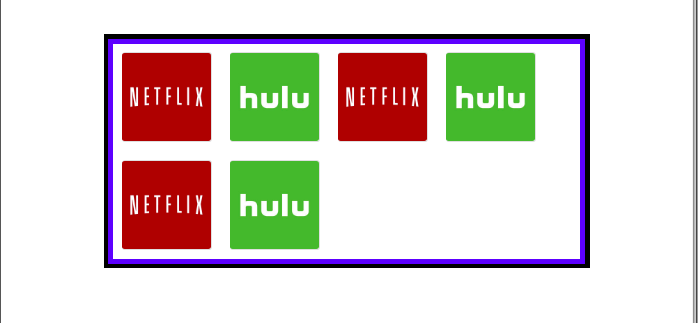
But now the problem is, the will not be aligned in the center if cards starts moving to the next line.
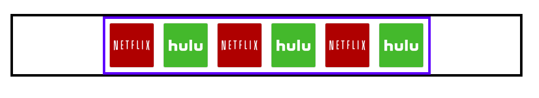
This is what we don't want:
This is what we want: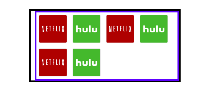
I have added media-queries to it.
and assigned property of margin-left to it.
margin-left Calculation
margin-left:(50% - (([card_margin * 2] + [card_width]) / 2))
First we push float-left by 50% and then bring back, half of the remaining width of float-left.
.card {  width: 100px;  margin: 10px;}
.container {  width: 100%;}
.outerContainer {  margin-top: 40px;  justify-content: center;}
.flex-left {  display: flex;  flex-wrap: wrap;}
@media screen and (max-width: 991px) {  .flex-left {    margin-left: calc(50% - 310px);  }}
@media screen and (max-width: 766px) {  .flex-left {    margin-left: calc(50% - 250px);  }}
@media screen and (max-width: 484px) {  .flex-left {    margin-left: calc(50% - 185px)  }}
@media screen and (max-width: 363px) {  .flex-left {    margin-left: calc(50% - 125px)  }}
<link rel="stylesheet" href="https://maxcdn.bootstrapcdn.com/bootstrap/4.0.0/css/bootstrap.min.css" integrity="sha384-Gn5384xqQ1aoWXA+058RXPxPg6fy4IWvTNh0E263XmFcJlSAwiGgFAW/dAiS6JXm" crossorigin="anonymous">
<div class="container"> <div class="row outerContainer"> <div class="flex-left"> <div class="card"> <a href="https://www.netflix.com/fr/"> <img src="https://cdn1.iconfinder.com/data/icons/metro-ui-dock-icon-set--icons-by-dakirby/256/Netflix.png" alt="Sample Image" class="card-img"> </a> </div> <div class="card"> <a href="https://www.hulu.com"> <img src="https://apprecs.com/ios-meta/app-icons/256/376510438.jpg" alt="Sample Image" class="card-img"> </a> </div> <div class="card"> <a href="https://www.netflix.com/fr/"> <img src="https://cdn1.iconfinder.com/data/icons/metro-ui-dock-icon-set--icons-by-dakirby/256/Netflix.png" alt="Sample Image" class="card-img"> </a> </div> <div class="card"> <a href="https://www.hulu.com"> <img src="https://apprecs.com/ios-meta/app-icons/256/376510438.jpg" alt="Sample Image" class="card-img"> </a> </div> <div class="card"> <a href="https://www.netflix.com/fr/"> <img src="https://cdn1.iconfinder.com/data/icons/metro-ui-dock-icon-set--icons-by-dakirby/256/Netflix.png" alt="Sample Image" class="card-img"> </a> </div> <div class="card"> <a href="https://www.hulu.com"> <img src="https://apprecs.com/ios-meta/app-icons/256/376510438.jpg" alt="Sample Image" class="card-img"> </a> </div> </div> </div></div>Card not being centred in bootstrap 4
You must add the "justify-content-center" class to the element containing the "row" class.
eg.
<div class="row justify-content-center">...</div>
snippet
<link rel="stylesheet" href="https://maxcdn.bootstrapcdn.com/bootstrap/4.0.0/css/bootstrap.min.css" integrity="sha384-Gn5384xqQ1aoWXA+058RXPxPg6fy4IWvTNh0E263XmFcJlSAwiGgFAW/dAiS6JXm" crossorigin="anonymous">
<script src="https://code.jquery.com/jquery-3.2.1.slim.min.js" integrity="sha384-KJ3o2DKtIkvYIK3UENzmM7KCkRr/rE9/Qpg6aAZGJwFDMVNA/GpGFF93hXpG5KkN" crossorigin="anonymous"></script>
<script src="https://cdnjs.cloudflare.com/ajax/libs/popper.js/1.12.9/umd/popper.min.js" integrity="sha384-ApNbgh9B+Y1QKtv3Rn7W3mgPxhU9K/ScQsAP7hUibX39j7fakFPskvXusvfa0b4Q" crossorigin="anonymous"></script>
<script src="https://maxcdn.bootstrapcdn.com/bootstrap/4.0.0/js/bootstrap.min.js" integrity="sha384-JZR6Spejh4U02d8jOt6vLEHfe/JQGiRRSQQxSfFWpi1MquVdAyjUar5+76PVCmYl" crossorigin="anonymous"></script>
<div class="container justify-content-center text-center">
    <div class="justify-content-center text-center">
        <div class="row justify-content-center">
            <div class="col-sm-6 col-md-6 col-lg-3 col-xl-3 mx-lg-3 mt-4">
                    <div class="card text-center mx-auto" style="width: 18rem;">
                        <div class="embed-responsive embed-responsive-16by9">
                            <img alt="Card image cap" class="card-img-top embed-responsive-item" src="https://source.unsplash.com/random/800x600" />
                        </div>
                            <div class="card-body">
                            <h5 class="card-title">Card title</h5>
                            <p class="card-text">Some quick example text to build on the card title and make up the bulk of the card's content.</p>
                            <a href="#" class="btn btn-primary">Add to cart</a>
                        </div>
                    </div>
            </div>
        </div>
    </div>
</div>
Related Topics
HTML Float Right Element Order
Semantically, Which Is More Correct: a in H2, or H2 in A
How to Create a Wavy Shape CSS
Play Audio Local File with HTML
Bootstrap Navbar Link Color Won't Change
Get Parameters in The Url with Codeigniter
How to Play CSS3 Transitions in a Loop
Why Does CSS Grid Layout Add Extra Gaps Between Cells
CSS/HTML: How to Change The Color of The Check Mark Within The Checkbox Input
Jenkins Content Security Policy
Fixed Header, Footer, and Sidebars with Scrolling Content Area in Center
How to Tell Browsers to Honor The Jpeg Exif Orientation
File Opens Instead of Downloading in Internet Explorer in a Href Link
HTML Contenteditable with Non-Editable Islands
Display Background Color for The Page & Align Texts at Center
How to Remove The Dotted Line Around The Clicked a Element in HTML
How to Achieve a <Fieldset>-Like Effect Without Using The <Fieldset> Tag