What can be other ways than @media to make a website responsive suitably if I don't mention target resolution?
Adaptive layouts (Responsive layouts) consists of the following three factors:
1. Flexible Layouts:
The divs you use to create your web page layouts need to consist of relative length units.
This means you shouldn't use fixed widths in your CSS, rather use percentages.
The formula to convert sizes from a design to percentages is (target/context)x100 = result
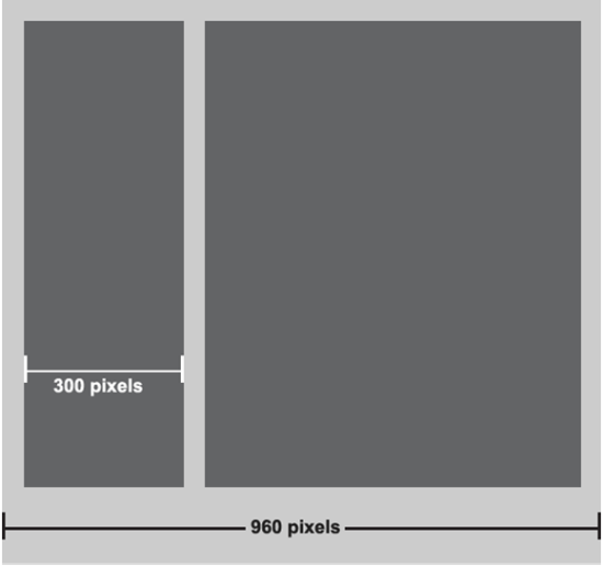
Lets take the picture above as an example of a design. To calculate what the size of the div on the left is going to be calculated like this:
(300px/960px)x100 = 30.25%
The CSS would look something like this:
.leftDiv
{
    width: 30.25%;
    float: left;
}

.rightDiv
{
    width: 65%;
    float: left;
}
For text to automatically resize you can use a unit called VW (ViewWidth)
.myText
{
    font-size: 1vw;
}
This ensures that the text automatically resize relative to the view width.
2.Flexible Media:
Flexible media applies to images, videos and canvasses which automatically resize relative to its parent.
Example:
img, video, canvass
{
    max-width: 100%;
}
This ensures that these elements resize automatically inside its parent.
3. Media Queries:
The next step is to use media queries like you've done in your question, these media queries define certain CSS statements for certain screen sizes. I normally use only three media queries for computers screens, tablets and phone screens. Its not necessary to have more than this because the Flexible Layouts and Flexible Media will ensure relative resizing if done correctly.
You may find this helpful: https://developer.mozilla.org/en-US/docs/Web/Guide/CSS/Media_queries
how to make a responsive website using html/css and javascript
The basics of a responsive layout are the use of percentage insteed of pixels and adding breakpoints with media queries.
In your example, you have 3 divs floating so the css should look like this:
#div1, #div2, #div3 {
    float:left;
    height:200px;
}
#div1 {
    background-color:red;
    width:40%;
}
#div2 {
    background-color:yellow;
    width:40%;
}
#div3 {
    background-color:green;
    width:20%;
}
Always making the sum of all your floating widths 100%.
Then add a breaking point (or as many as you need) like this:
@media (max-width: 600px) {
    #div1, #div2, #div3 {width:100%;}
  }
where you tell your browser to change the css properties of your divs when window width is 600px or lower. In this case you make each div 100% width so they will stack as you want keeping the html order.
JSFIDDLE
How to make sure a website is suitable for all screen resolutions?
I use CSS @media directive, unfortunately, not supported by IE8-. Compliant CSS3 allow you to style differently according to the width of the viewport:
<style type="text/css">
@media screen and (min-width:1px) and (max-width:1365px) {
    ...
}
@media screen and (min-width:1366px) {
    ...
}
</style>
By the way, you have an error in your CSS, you forgot to specify the unit:
body {width:100%;}
How to make website responsive without postback?
A responsive website and the postback are different things.
Answering your question, a ajax request is a solution
in controller add:
[HttpPost]
public JsonResult Remove(Guid id)
{
    cartList.RemoveAll(p => p.ID.Equals(id));

    return Json(new { removed = true });
}
jquery:
    $.ajax({
            url: '/Cart/Remove',
            type: 'POST',
            dataType: 'json',
            data: { id: <here selected ID> },
            success: function (json) {
                if(json.removed) {
                    // your code...
                }

            }
        });
How can I arrange horizontally arranged sections, in my web page, as vertically so as to make my page responsive on devices
The link below solves my problem a bit. I can control when I want the above scroll bars to scroll when I need (or by adding a padding dimension inside this scroll-view parent to offer scroll area).
Prevent scroll of parent scroll view when drag event is happening in its child view, or in some other case where you do not want your scroll view parent to scroll.
There is another short way:
scrollView.requestDisallowInterceptTouchEvent(true);
But it offers less control. if you add a padding dimension inside this scroll-view parent to offer scroll area, it serves what I need.
Related Topics
Chrome Getusermedia Not Requesting Permission Locally
"Compile" CSS into HTML as Inline Styles
Three Horizontal Stripes in CSS
CSS Not Modifying Link Properties
How to Ellipse a Clipping Mask on the Bottom Only
Double Dotted Border While Using Colspan
CSS Position - Top 100% Is Not Equal to Bottom 0
Aligning Elements Left and Center with Flexbox
Strip All HTML Tags Except Links
Some Elements Missing While Downloading from Httpwebrequest
Vertically Centering a Div in Body
Can Auto Margins Work in CSS Grid Like They Do in Flexbox
How to Collapse/Expand a Div Within an Email? What Clients Support This
How to Get a Div Centered with Another Div on the Right of It
How to Disable All Action Buttons While Shiny Is Busy and Loading Text Is Displayed